The Census released the 2017 American Community Survey (ACS) 1-year microdata file on October 18, 2018. It was made available through IPUMS USA in early November. An R Shiny application uses data extracted from IPUMS USA to explore ACS data from 2014 through 2017. Following are descriptions of the currently extracted variables:
  Variable  Type  Description
  --------  ----  -----------
p YEAR     : int  sample year: currently 2014 to 2017
p DATANUM  : int  particular sample from which the case is drawn in a given year. See https://usa.ipums.org/usa-action/variables/DATANUM#codes_section
p SERIAL   : int  identifying number unique to each household record in a given sample.
p CBSERIAL : num  unique, original identification number assigned to each household record in a given sample by the Census Bureau.
p HHWT     : int  indicates how many households in the U.S. population are represented by a given household in an IPUMS sample.
# STATEFIP : int  state where the household was located, using the FIPS coding scheme. See https://usa.ipums.org/usa-action/variables/STATEFIP#codes_section
# COUNTY   : int  county where the household was located, using the ICPSR coding scheme (renamed COUNTYFIP). See https://usa.ipums.org/usa-action/variables/COUNTY#codes_section
# MET2013  : int  metro area where the household was located, using the 2013 definitions for metropolitan statistical areas (MSAs) from the OMB. See https://usa.ipums.org/usa-action/variables/MET2013#codes_section
# PUMA     : int  identifies the Public Use Microdata Area (PUMA) where the housing unit was located. See https://usa.ipums.org/usa-action/variables/PUMA#codes_section
p GQ       : int  classifies all housing units as a vacant units (0), households (1-2), or group quarters (3-5). See https://usa.ipums.org/usa-action/variables/GQ#codes_section
p PERNUM   : int  numbers all persons within each household consecutively in the order in which they appear on the original census or survey form.
p PERWT    : int  indicates how many persons in the U.S. population are represented by a given person in an IPUMS sample.
# SEX      : int  1 = male, 2 = female
# AGE      : int  age in years, 0 = Less than 1 year old, 96 = maximum in 2017
# BPL      : int  U.S. state or territory or the foreign country where the person was born (188 categories). See https://usa.ipums.org/usa-action/variables/BPL#codes_section
a BPLD     : int  U.S. state or territory or the foreign country where the person was born (572 categories). See https://usa.ipums.org/usa-action/variables/BPL#codes_section
# CITIZEN  : int  citizenship status: 0 = N/A (Born in U.S.), 1 = Born abroad of American parents, 2 = Naturalized citizen, 3 = Not a citizen
# YRIMMIG  : int  year in which a foreign-born person entered the United States. See https://usa.ipums.org/usa-action/variables/YRIMMIG#codes_section
# EDUC     : int  respondents' educational attainment, as measured by the highest year of school or degree completed (12 categories). See https://usa.ipums.org/usa-action/variables/EDUC#codes_section
a EDUCD    : int  respondents' educational attainment, as measured by the highest year of school or degree completed (44 categories). See https://usa.ipums.org/usa-action/variables/EDUC#codes_section
# EMPSTAT  : int  employment status: 0 = N/A, 1 = Employed, 2 = Unemployed, 3 = Not in labor force
a EMPSTATD : int  employment status: 00 = N/A, 10 = At work, 12 = Has job, not working, 14 = Armed forces--at work, 15 = Armed forces--with job but not at work, 20 = Unemployed, 30 = Not in Labor Force
# OCC      : int  person's primary occupation, coded into a contemporary census classification scheme. See https://usa.ipums.org/usa-action/variables/OCC#codes_section and https://usa.ipums.org/usa/volii/occ_acs.shtml
# IND      : int  un-recoded variable that reports the type of industry in which the person performed an occupation given in OCC. See https://usa.ipums.org/usa-action/variables/IND#codes_section
# CLASSWKR : int  worker class: 0 = N/A, 1 = Self-employed, 2 = Works for wages
a CLASSWKRD: int  worker class: 00 = N/A, 13 = Self-employed, not incorporated, 14 = Self-employed, incorporated, 22 = Wage, private, 23 = Wage at non-profit, 25 = Federal government, 27 = State government, 28 = Local government, 29 = Unpaid family worker
# WKSWORK2 : int  number of weeks worked the previous year: 0 = N/A (or Missing), 1 = 1-13 weeks, 2 = 14-26 weeks, 3 = 27-39 weeks, 4 = 40-47 weeks, 5 = 48-49 weeks, 6 = 50-52 weeks
# INCWAGE  : int  total pre-tax wage and salary income in current dollars for the previous year. See https://usa.ipums.org/usa-action/variables/INCWAGE#codes_section
c STATE    : chr  Two-character state abbreviation from https://www2.census.gov/geo/docs/reference/state.txt .
c COUNTY   : chr  County name and two-character state abbreviation from https://www2.census.gov/geo/docs/reference/codes/files/national_county.txt .
c METRO    : chr  Metropolitan area name from https://www2.census.gov/programs-surveys/metro-micro/geographies/reference-files/2017/delineation-files/list2.xls .

# = selected, p = preselected, a = added automatically, c = created from lookups
The # symbol denotes the variables that were manually selected and the p and a symbols denote that were automatically preselected or selected in response to the manual selections. The last three variables marked with the symbol c were created by using the STATEFIP, COUNTY, and MET2013 to look up the text representations of states, counties, and metropolitan areas in the indicated files.
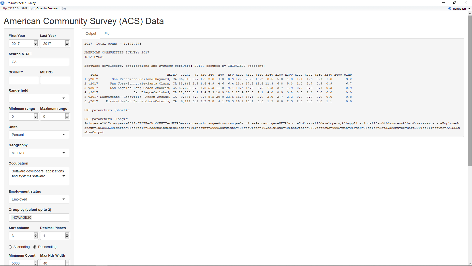
When the acs17 application first comes up, it defaults to looking at incomes for workers with the occupation "Software developers, applications and systems software" in metropolitan areas of California with 5,000 or more such workers (as shown above). The table output by this application will have one row for each selected year and/or geographic location.
The top two inputs on the left side panel show that the minimum and maximum year selected is 2017. Currently, the application can show data for any year from 2014 through 2017. The geography is selected in the input labelled Geography and can be set to STATE, COUNTY, or METRO. As can be seen, it's currently set to METRO. This causes the geographies shown in the second column (not counting the indexes) to be metro areas.
The inputs labelled 'Search STATE', 'COUNTY', and 'METRO' can be used to filter these fields. Hence, the CA in the 'Select STATE' input causes only metro areas in California to be displayed. The data is also filtered by the selection of 5000 in the input labelled 'Minimum Count'. This causes only those metro areas with 5,000 or more of the specified workers to be listed.
The input labelled 'Occupation' can be set to the major occupation groups shown at this link which are in the data. The data for the acs17 application is currently limited to this subset of occupations due to memory issues on the server but may be expanded if possible. The occupation select list also includes some subgroups of these major groups such as "Software developers, applications and systems software". That is what the occupation is set to by default.
The input labelled "Employment status' can be set to filter the workers shown. It can be currently set to 'All', 'Employed', 'Unemployed', and 'In labor force'. The 'All' selection includes all people, including those not in the labor force.
The input labelled 'Group by' is the key way of selecting the columns for the table. In this case, the columns are obtained by grouping the workers by their annual income (INCWAGE) in groups of $20,000. The headers of the columns default to 'k' followed by the lower limit of each group in thousands of dollars. The maximum group is 'k400.plus' for $400,000 and above. Note that groups for which there were no workers (k300, k320, k340, k360, and k380) are missing. The third column with the header 'Count' will always contain the total count for the columns to the right of it.
In the default output, the fourth column and up contain percentages of the total count for each column. Hence, the sum of these numbers will be 100 percent, discounting any round-off error. This output of percents is set by the input labelled 'Units' which is set to 'Percent'. Setting this to 'Percent in group' will have a different affect if the 'Group by' input contains more than one selection. This will be shown in a later example. Selecting 'Count' for units will change the output of these columns to the actual counts. Then, their sum will add up to the total count shown in the third column.
The input labelled 'Sort column' specifies the column by which the rows should be sorted. Since it's set to 3, the rows are sorted by the third column (total counts). Setting it to a minus number counts the columns from the right. Hence, a setting it to -1 causes the rows to be sorted by the last column. The radio buttons labelled 'Ascending' and 'Descending' beneath this input will cause the sorting to be ascending or descending, respectively. Finally, the input labelled 'Decimal places' will set the number of decimals to use when the units is in percents. For units of 'Count', no decimal places are required.
Below the table are shown the URL parameters which can be used to obtain this page, along with the inputs. Since no parameters are listed for the short format, this page can be obtained via a URL https://econdata.shinyapps.io/acs17/. The long format lists all of the parameters and can be copied to make a record of all of the inputs, even the defaults. However, this page could likewise be obtained using these parameters as in this URL.
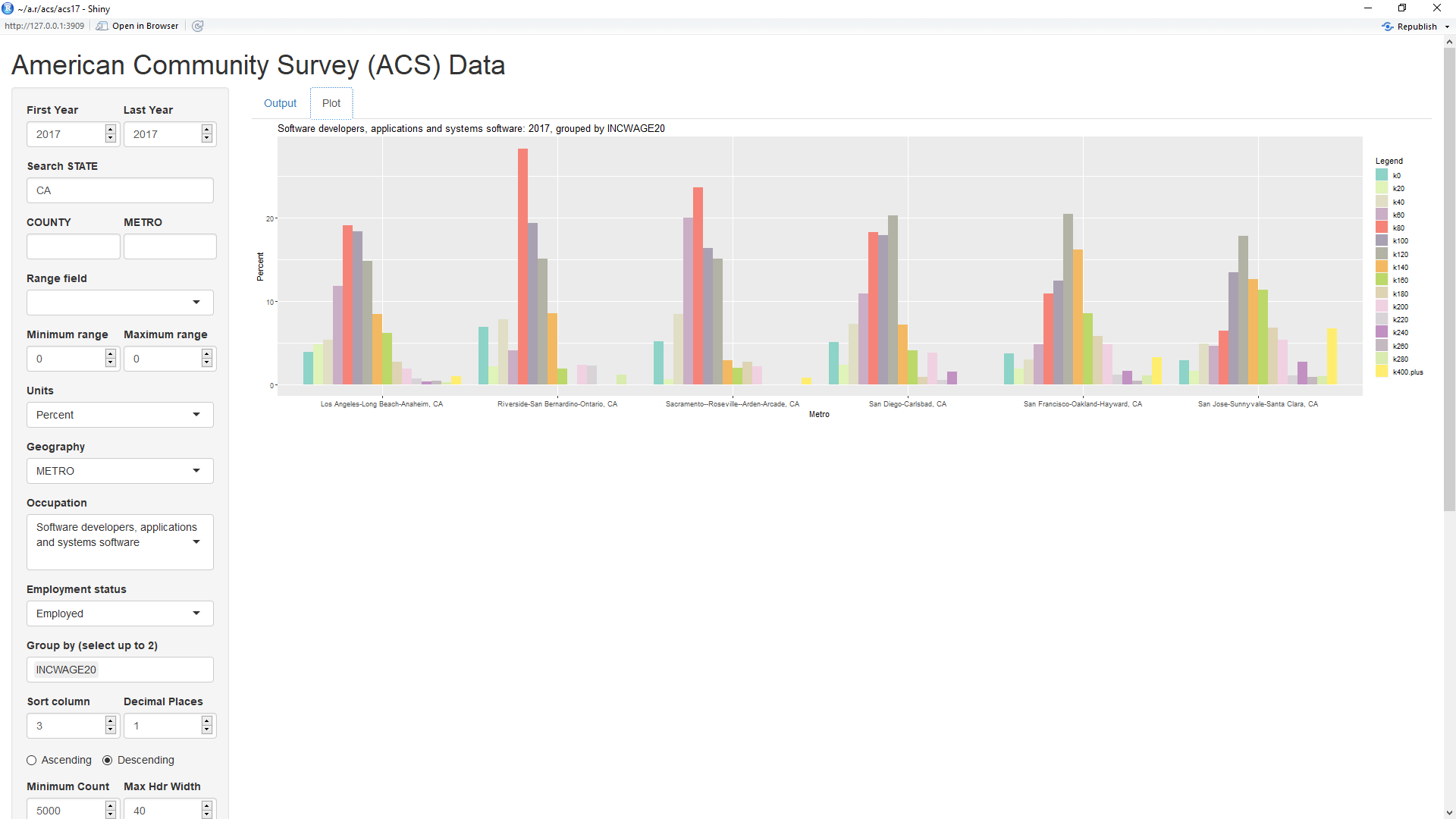
Selecting the Plot tab near the top of the page will show the above default plot of the data. Currently, the default plot type is a bar plot. A later example shows a line graph, the other current choice for plot type. The limits on the y axis can be changed via the inputs labelled 'Y Minimum' and 'Y Maximum' and the colors can be changed via the input labelled 'Color'. If Color is set to a single word, that word must be one of the RColorBrewer palettes listed at the bottom of this cheatsheet. As can be seen, it's default value is 'Set3' which provides up to 12 different colors. Input 'Color' can also be set to a list of any of the colors shown on page 4 in the cheatsheet. The colors must be separated by columns and, if the list does not contain enough colors, those colors will be repeated. Hence, setting Color to 'blue1,red2,green3' (without the quotes) will cause those three colors to be repeated.
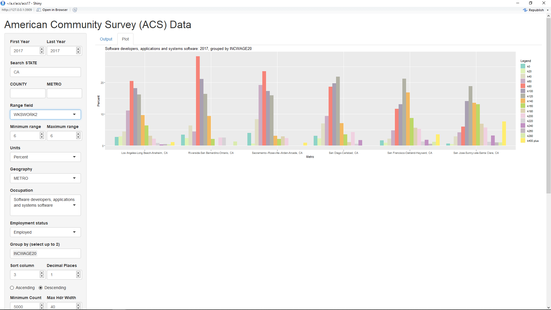
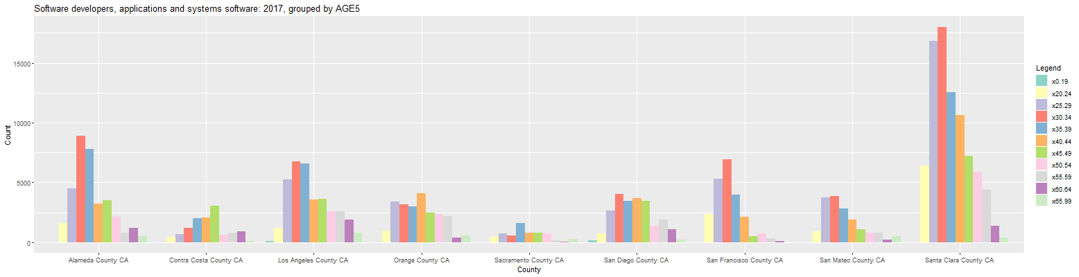
One odd thing visible in the bar plot is that a number of workers appear to be working for less than $20 thousand per year. It would seem likely that these are not workers who are working for the full year. Hence, it might make sense to filter the data to only those workers who worked close to a full year. As can be seen in the first table above, the field WKSWORK2 equals 6 for those workers who worked between 50 and 52 weeks during the year. By setting the inputs labelled 'Minimum range' and 'Maximum range' to 6 and setting the input labelled 'Range field' to WKSWORK2, the data is limited to just these workers. This causes the percentage of workers making very low incomes to sharply decrease in the resultant plot below:
One thing evident from the above plot is that the most common 20k salary category for software developers in the first three metro areas (Los Angeles-Long Beach-Anaheim, Riverside-San Bernardino-Ontario, and Sacramento--Roseville--Arden-Arcade) is $80,000 to $100,000. In contrast, the most common 20k salary category for software developers in the last three metro areas (San Diego-Carlsbad, San Francisco-Oakland-Hayward, and San Jose-Sunnyvale-Santa Clara) is a much higher $120,000 to $140,000.
To limit the plot to a single metro area, you can enter a pattern to match into the input labelled 'METRO'. For example, entering 'San Jose' (without the quotes) into the METRO input will result in the plot being limited to the metro area of 'San Jose-Sunnyvale-Santa Clara, CA'. The plot is responsive to the browser that contains it. Hence, if you wish to make the plot less wide, you can do so by simply making the browser less wide.
The prior plot can be changed to look at the ages of software developers in California counties by making the following changes:
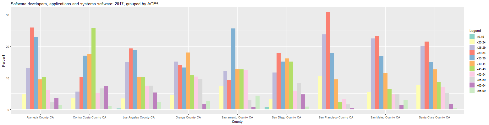
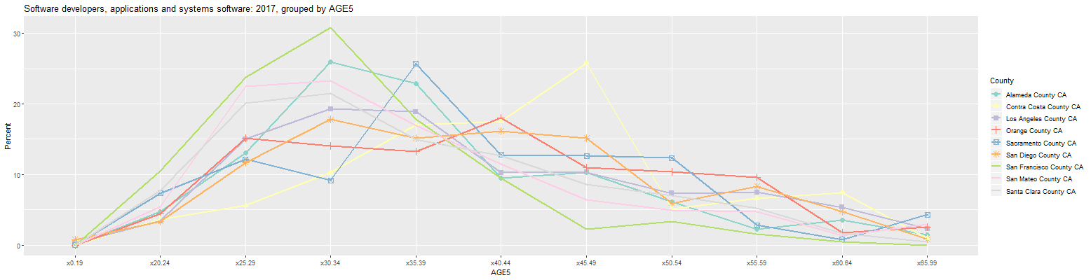
This page can also be obtained by going to this link. As can be seen, 30 to 34 was the largest age cohort for software developers in six of the nine counties. In San Francisco, San Mateo, and Santa Clara counties, each of the 25 to 29 and the 30 to 34 age cohorts contain over 20 percent of the software developers. Alameda County was slightly older with the 30 to 34 and the 35 to 39 age cohorts containing over 20 percent of the software developers. The largest age cohorts in Sacramento, Orange, and Contra Costa counties were 35 to 39, 40 to 44, and 45 to 49, respectively.
Changing the input labelled 'Units' to 'Count' causes the plot to change as follows:
This is useful for quickly seeing where the largest number of workers are located. As can be seen, Santa Clara county has far and away the most software developers. Changing the Units input back to 'Percent' and clicking on the Output tab shows the following numbers:
Software developers, applications and systems software: 2017, grouped by AGE5 (percent)

   Year                  COUNTY  Count x0.19 x20.24 x25.29 x30.34 x35.39 x40.44 x45.49 x50.54 x55.59 x60.64 x65.99
1 y2017   Santa Clara County CA 83,645   0.0    7.7   20.1   21.5   15.0   12.7    8.6    7.0    5.3    1.6    0.5
2 y2017   Los Angeles County CA 35,014   0.3    3.5   15.0   19.3   18.9   10.3   10.3    7.3    7.5    5.4    2.3
3 y2017       Alameda County CA 34,208   0.0    4.8   13.1   26.0   22.9    9.5   10.3    6.1    2.3    3.6    1.5
4 y2017     San Diego County CA 22,735   0.8    3.4   11.7   17.8   15.1   16.2   15.1    5.9    8.3    4.8    0.9
5 y2017        Orange County CA 22,656   0.0    4.4   15.1   14.0   13.2   18.0   11.0   10.4    9.6    1.7    2.6
6 y2017 San Francisco County CA 22,428   0.0   10.4   23.8   30.8   17.9    9.5    2.3    3.3    1.5    0.5    0.0
7 y2017     San Mateo County CA 16,601   0.0    5.4   22.5   23.2   16.9   11.5    6.5    4.9    4.8    1.4    2.9
8 y2017  Contra Costa County CA 11,948   0.0    3.7    5.6   10.3   17.0   17.5   25.8    5.1    6.6    7.5    1.0
9 y2017    Sacramento County CA  6,197   0.0    7.4   12.1    9.1   25.7   12.8   12.6   12.3    2.8    0.8    4.3

URL parameters (short)=
?geo=COUNTY&group=AGE5
The major counties that make up Silicon Valley are Santa Clara, Alameda, San Mateo, and San Francisco. As can be seen, these were the four counties in which the 30 to 34 age cohort contained over 20 percent of the software developers. However, Contra Costa County is just north of Alameda County and Sacramento County is just north of that. In any event, the size of the age cohorts in all of the counties can be more easily compared by changing the input labelled 'Plot Type' to 'Line Graph'. That results in the following graph:
The green line in the above graph shows that San Francisco County had the largest 30 to 34 age cohort of over 30 percent. The graph also clearly shows that the largest age cohorts in Sacramento, Orange, and Contra Costa counties were 35 to 39, 40 to 44, and 45 to 49, respectively.
The prior tables and plots all look just at 2017, the latest available year. It's also possible to look at another year from 2014 through 2016 by changing the inputs 'First Year' and 'Last Year' to the desired year. If 'First Year' is set less than 'Last Year', the application will look at all years between and including the two years. However, any plots or graphs will not display correctly unless the user limits the data to a single geographic location. For example, changing the line graph displayed above by simply changing 'Min Year' to 2014 will result in the following graph:
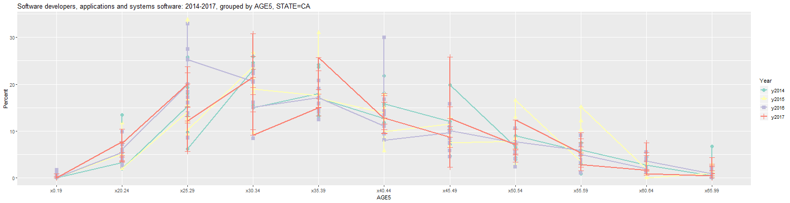
The problem is that each age group along the x-axis has a value for all 9 counties shown in the prior graph. The graph can be limited to just San Francisco County by entering 'San Francisco' into the input labelled 'COUNTY'. This results in the following graph:
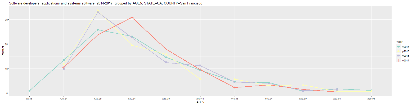
Clicking on the Output tab then shows the following numbers:
Software developers, applications and systems software: 2014-2017, grouped by AGE5, STATE=CA, COUNTY=San Francisco (percent)

   Year                  COUNTY  Count x0.19 x20.24 x25.29 x30.34 x35.39 x40.44 x45.49 x50.54 x55.59 x60.64 x65.99
1 y2014 San Francisco County CA 16,901   1.0   13.5   25.9   23.1   14.6    9.4    4.6    4.3    0.8    1.7    1.1
2 y2015 San Francisco County CA 20,616    NA   11.7   33.7   19.5   15.9    5.8    5.7    3.0    3.3    0.7    0.7
3 y2016 San Francisco County CA 20,299    NA    9.8   32.9   22.6   12.5   11.2    4.5    4.0    1.0    1.4     NA
4 y2017 San Francisco County CA 22,428    NA   10.4   23.8   30.8   17.9    9.5    2.3    3.3    1.5    0.5     NA

URL parameters (short)=
?minyear=2014&COUNTY=San%20Francisco&geo=COUNTY&group=AGE5&geomtype=Line%20Graph
As can be seen, the most common age cohort for software developers in San Francisco was 25 to 29 in 2014 through 2016 and increased to 30 to 34 in 2017. The percentages for ages 45 and older generally grew smaller, however. In any event, the URL parameters listed above indicate that the above table can be recreated at this link. However, this currently seems to return an error due to a memory problem with the online application. For that reason, it may currently only be possible to look at data for 2015 through 2017 via this link. Because of this, the following examples will only look at 2015 through 2017.
Changing the 'First Year' input to 2015 and the Occupation' input to 'Computer and Mathematical Occupations' in the last graph results in the following graph:
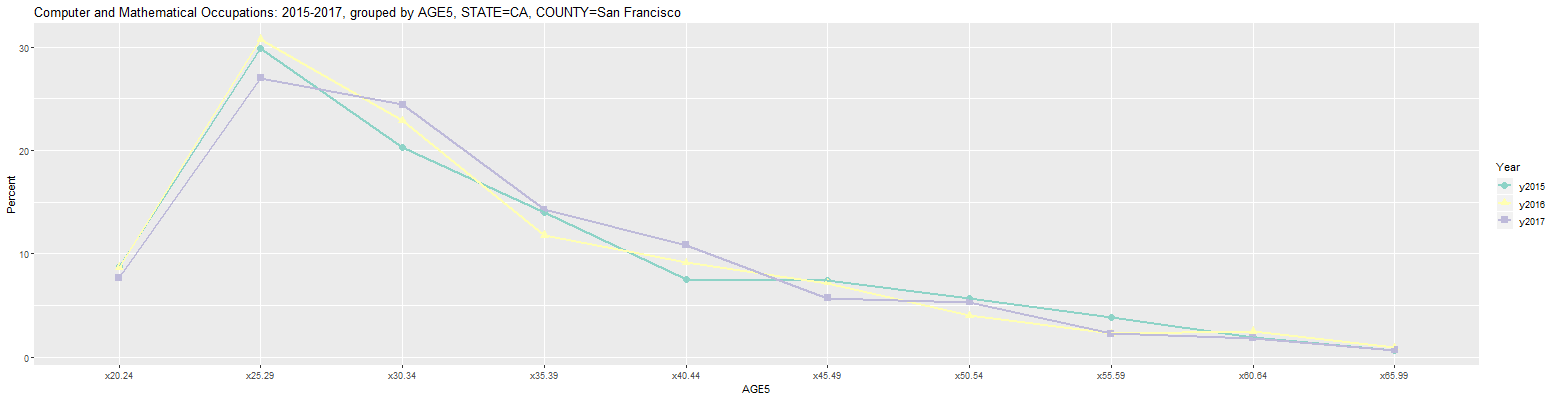
As can be seen, 2017 brought a much smaller change to the age cohort percentages for all Computer and Mathematical Occupations in San Francisco. The largest change was a small drop for the 25 to 29 age cohort from 30.7 to 27.0 percent.
Clicking on the Output tab then shows the following numbers:
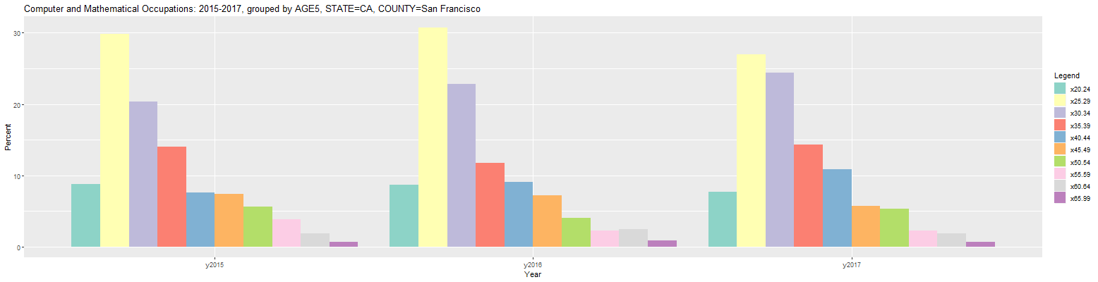
Computer and Mathematical Occupations: 2015-2017, grouped by AGE5, STATE=CA, COUNTY=San Francisco (percent)

   Year                  COUNTY  Count x20.24 x25.29 x30.34 x35.39 x40.44 x45.49 x50.54 x55.59 x60.64 x65.99
1 y2015 San Francisco County CA 40,421    8.8   29.9   20.3   14.0    7.5    7.4    5.7    3.8    1.9    0.7
2 y2016 San Francisco County CA 37,610    8.7   30.7   22.9   11.8    9.1    7.2    4.0    2.3    2.5    0.9
3 y2017 San Francisco County CA 42,508    7.7   27.0   24.4   14.3   10.8    5.7    5.3    2.3    1.9    0.7

URL parameters (short)=
?minyear=2015&COUNTY=San%20Francisco&geo=COUNTY&occ=Computer%20and%20Mathematical%20Occupations&group=AGE5&geomtype=Line%20Graph
Finally, clicking back on the Plot tab and changing the 'Plot Type' input from 'Line Graph' to 'Bar Plot' results in the following plot:
It's currently possible to group by one or two categories in this application. For example, the SEX category can be added after the AGE5 category in the 'Group by' input in the prior graph. It should be possible to do this by simply placing the cursor after the AGE5 selection and selecting SEX. If the selection list does not come up, it may be necessary to delete AGE5 and then select AGE5, followed by SEX. Once that is done, change the 'Occupation' input back to 'Software developers, applications and systems software'. The following bar plot should then be output:
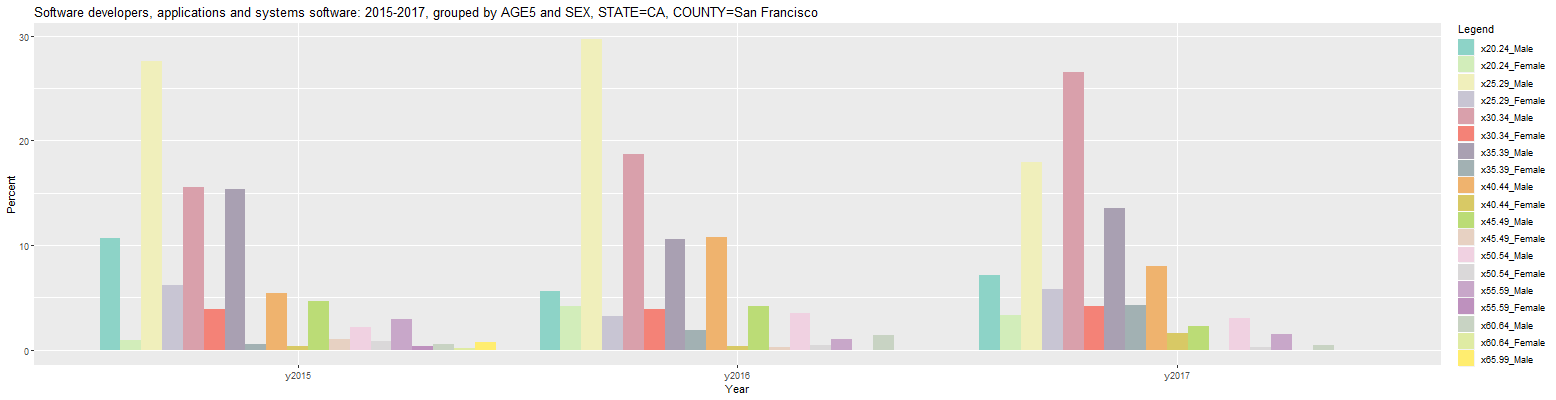
As can be seen, each entry in the Legend to the right consists of the category in the first group appended to the category in the second group, separated by an underscore. However, the resulting bar plot shows each age cohort divided by sex which does not appear to be terribly useful. This can be improved by switching to order of the 'Group by' inputs to 'SEX AGE5' (without the quotes). This results in the following bar plot:
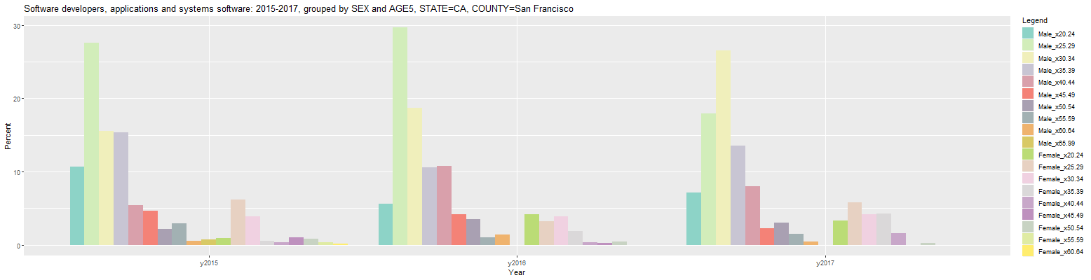
Now, the resulting par plot shows each sex divided by age cohort with the male software developers on the left and the female developers on the right for each year. The male bars are much taller because there are more males than females working as software developers and the percentages are for all workers in each year, both male and female. The percentages can be changed to those within each member of the primary group (SEX) by changing the 'Units' input from 'Percent' to 'Percent in group'. This results in the following bar plot:
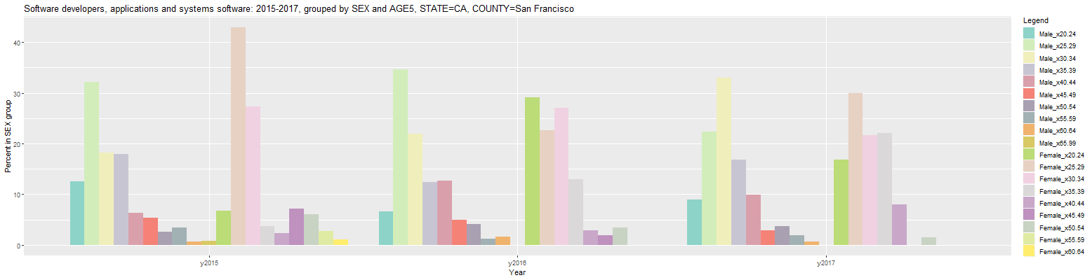
Clicking on the Output tab reveals another issue. Due to the combining of the categories in each group to form the new categories shown in the Legend above, the headers in the table are relatively long. As a result, each line of the table wraps on the display. This effect can be mitigated by setting the 'Max Hdr Width' input to the smallest value that provides sufficient information. Setting it to 7 will create shorter headers where the first 3 characters of the first category is appended to the first 3 characters of the second category, separated by an underscore and creating a total header of 7 characters. This results in the following table:
Software developers, applications and systems software: 2015-2017, grouped by SEX and AGE5, STATE=CA, COUNTY=San Francisco (percent in SEX group)

   Year                  COUNTY  Count Mal_x20 Mal_x25 Mal_x30 Mal_x35 Mal_x40 Mal_x45 Mal_x50 Mal_x55 Mal_x60 Mal_x65 Fem_x20 Fem_x25 Fem_x30 Fem_x35 Fem_x40 Fem_x45 Fem_x50 Fem_x55 Fem_x60
1 y2015 San Francisco County CA 20,616    12.5    32.2    18.1    18.0     6.3     5.4     2.5     3.4     0.6     0.8     6.7    42.9    27.2     3.7     2.3     7.2     6.0     2.8     1.1
2 y2016 San Francisco County CA 20,299     6.6    34.7    21.9    12.4    12.6     4.9     4.1     1.2     1.7      NA    29.1    22.6    27.1    12.9     2.8     2.0     3.5      NA      NA
3 y2017 San Francisco County CA 22,428     8.9    22.3    33.0    16.8     9.9     2.8     3.8     1.9     0.6      NA    16.9    29.9    21.7    22.1     8.0      NA     1.5      NA      NA

URL parameters (short)=
?minyear=2015&COUNTY=San%20Francisco&units=Percent%20in%20group&geo=COUNTY&group=SEX|AGE5&hdrwidth=7
Clicking back on the Plot tab and changing the 'Plot Type' input to 'Line Graph' results in the following line graph:
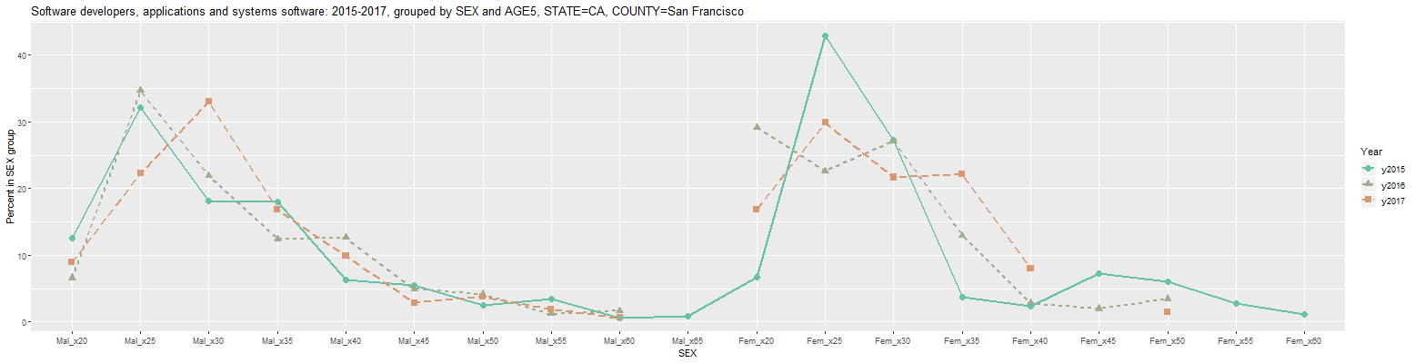
In the above graph, the 'Color' input was changed to Set2 and the 'Use linetype' checkbox was checked to make the lines more visible. As can be seen from the above table and plot, there are a number of missing values (designated by NA in the table) for 2016 and 2017, chiefly for women software developers. This means that the sample did not include any responses in those categories. This problem can be mitigated by looking at larger groups when possible. For example, changing the 'Occupation' input to 'Computer and Mathematical Occupations' results in the following graph:
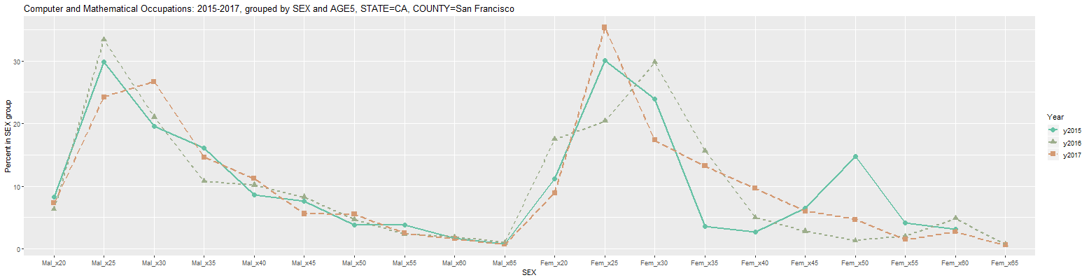
Clicking on the Output tab results in the following table:
Computer and Mathematical Occupations: 2015-2017, grouped by SEX and AGE5, STATE=CA, COUNTY=San Francisco (percent in SEX group)

   Year                  COUNTY  Count Mal_x20 Mal_x25 Mal_x30 Mal_x35 Mal_x40 Mal_x45 Mal_x50 Mal_x55 Mal_x60 Mal_x65 Fem_x20 Fem_x25 Fem_x30 Fem_x35 Fem_x40 Fem_x45 Fem_x50 Fem_x55 Fem_x60 Fem_x65
1 y2015 San Francisco County CA 40,421     8.3    29.8    19.6    16.2     8.6     7.6     3.8     3.8     1.6     0.8    11.2    30.1    24.0     3.6     2.7     6.5    14.7     4.1     3.1      NA
2 y2016 San Francisco County CA 37,610     6.4    33.4    21.0    10.8    10.2     8.3     4.7     2.4     1.9     1.0    17.5    20.4    29.8    15.7     5.0     2.8     1.3     2.0     4.9     0.7
3 y2017 San Francisco County CA 42,508     7.3    24.2    26.7    14.6    11.2     5.6     5.5     2.5     1.6     0.7     8.9    35.3    17.4    13.2     9.6     6.0     4.7     1.5     2.7     0.6

URL parameters (short)=
?minyear=2015&COUNTY=San%20Francisco&units=Percent%20in%20group&geo=COUNTY&occ=Computer%20and%20Mathematical%20Occupations&group=SEX|AGE5&hdrwidth=7&color=Set2&geomtype=Line%20Graph&linetype=TRUE
This application is under continuing development. If anyone should run into any issues or have any suggestions for additional features, feel free to let me know via the Contact box at the bottom of this page.