Analyzing Data from FRED (Federal Reserve Economic Data)
Analyzing Data from the Monthly Treasury Statement
Analyzing Data from the U.S. Budget Historical Tables
Analyzing Market Data with the Yahoo API
Analyzing Data from the Monthly Treasury Statement for February 2026
Analyzing Data from the Monthly Treasury Statement for June 2026
Analyzing Data from FRED (Federal Reserve Economic Data)
On September 7, 2026, Fortune posted an article titled "'Uncharted territory': The $40 trillion U.S. national debt just got uglier as interest payments rise to $1.25 trillion a year". The full article is reposted on Yahoo Finance and begins as follows:
The federal interest burden has reached a new height, exceeding even the 1991 record, but analysts warn the risks associated with servicing the ever-growing national debt today are much higher than they were 35 years ago, analysts warn.
A recent analysis from investment management firm Doubleline noted that in 2025, the federal net interest payment on the U.S.'s now-$40 trillion national debt reached 18.5% of revenue, surpassing 1991's record 18.4%. That means the U.S. is collecting nearly 19% of all taxes and revenue just to pay off interest on its ballooning debt, equivalent to $1.25 trillion—more than the entire 2026 defense budget.
These numbers can be verified via the following interactive graph generated on the FRED (Federal Reserve Economic Data) web site:
As can be seen, the federal net interest payment reached 18.52534 percent of federal receipts in 2025. That is greater than the prior high of 18.4313 percent of receipts in 1991. The blue line shows that federal net interest as a percent of GDP (Gross Domestic Product) is very nearly at a high. It reached 3.15758 percent of GDP in 1991 and 3.15344 percent of GDP in 2025. The above graph was generated via the following steps:
Further on, in a section titled "Why today's debt interest is different from the previous 1991 record", the article states:
In 1991, the debt held by the public was about 44% of the U.S. GDP; today, the debt held by the public has topped $32 trillion, more than 100% of GDP. That lower rate is still costing the government a greater share of its budget, because the debt itself has grown so much.
These numbers can be verified via the following interactive graphs generated on the FRED web site:
As can be seen, the graphs show the gross debt as $39.065 trillion and 122.6% of GDP in 2025. For the debt held by the public, they show $31.455 trillion and 98.7% of GDP. These latter two numbers are a bit below the $32 trillion and 100% of GDP because those higher numbers came from an article written on September 7, 2026. To get more recent numbers, it's possible to reference the Monthly Treasury Statement.
The above graphs were generated via the following steps:
Analyzing Data from the Monthly Treasury Statement
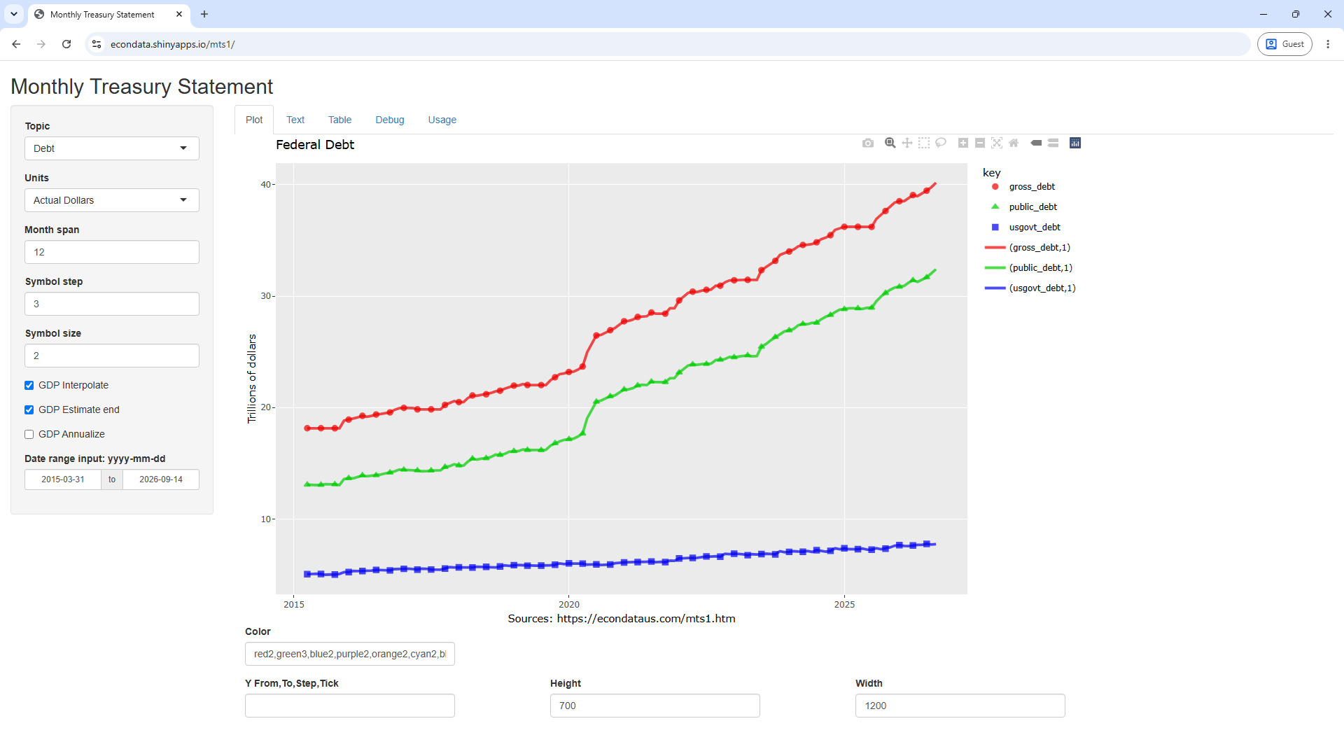
The main page for the Monthly Treasury Statement points to the current Monthly Treasury Statement. A PDF of the current Monthly Treasury Statement or data tables from it can be downloaded from this page. Also, all of the values back to early 2015 can be seen by going to the R Shiny app at https://econdata.shinyapps.io/mts1/. For example, going to that URL, setting Topic to "Debt" and setting Units to "Actual Dollars" should display the following graph:
Mousing over the points for 2026-08-31 or clicking on the Table tab shows the gross debt was $40.18 trillion and public debt (debt held by the public) was $32.41 trillion on 2026-08-31.
Changing Units to "Percent of GDP" should then display the following graph:
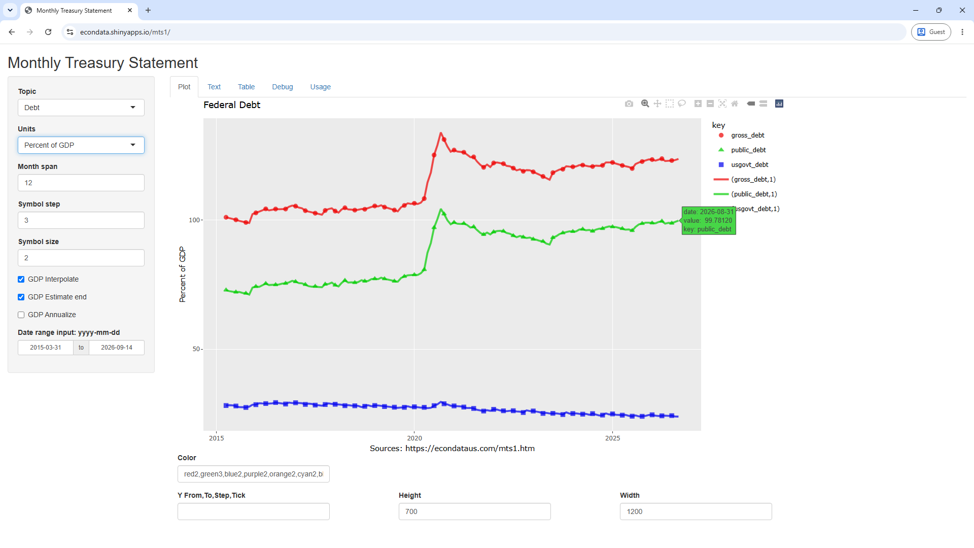
Mousing over the points for 2026-08-31 or clicking on the Table tab shows the gross debt was 123.67% GDP and public debt (debt held by the public) was 99.78% of GDP on 2026-08-31.
Changing Topic to "Treasury Outlays" and setting Units to "Percent of Receipts" should display the following graph:
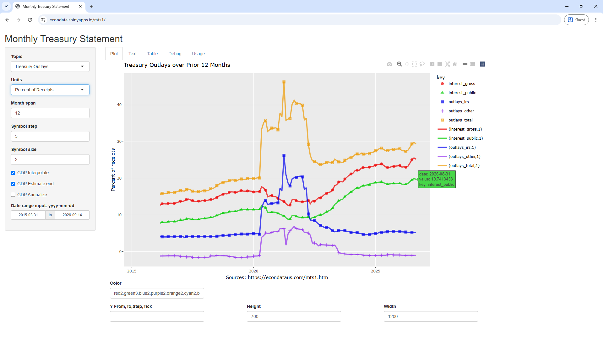
Mousing over 2025-09-30 on the green line or clicking on the Table tab shows the net interest (interest_public) was 18.6% of receipts on that date. That is nearly equal to the 18.5% of receipts mentioned in the article. Regarding this, the FY2025 Financial Report states "adjustments to the budget deficit may occur in subsequent releases of the MTS".
More importantly, mousing over 2026-08-31 on the green line or clicking the Table tab shows that net interest reached 19.74% of receipts on 2026-08-31. In addition, mousing over 2026-08-31 on the red line or clicking the Table tab shows that gross interest reached 25.21% of receipts on 2026-08-31. Hence, net interest nearly reached 1/5 of receipts and gross interest reached just over 1/4 of receipts. The difference between net interest and gross interest is chiefly that the latter includes interest the Treasury pays to federal government trust funds and other government accounts, while net interest largely removes those intragovernmental payments and makes some other adjustments.
Analyzing Data from the U.S. Budget Historical Tables
The change in the debt since 1940 can be seen by looking at the Historical Tables in the annual United States Budget. This can be done by going to the R Shiny app at https://econdata.shinyapps.io/bud1/, setting Topic to Debt and setting Units to "Percent of GDP". This should create the following graph:
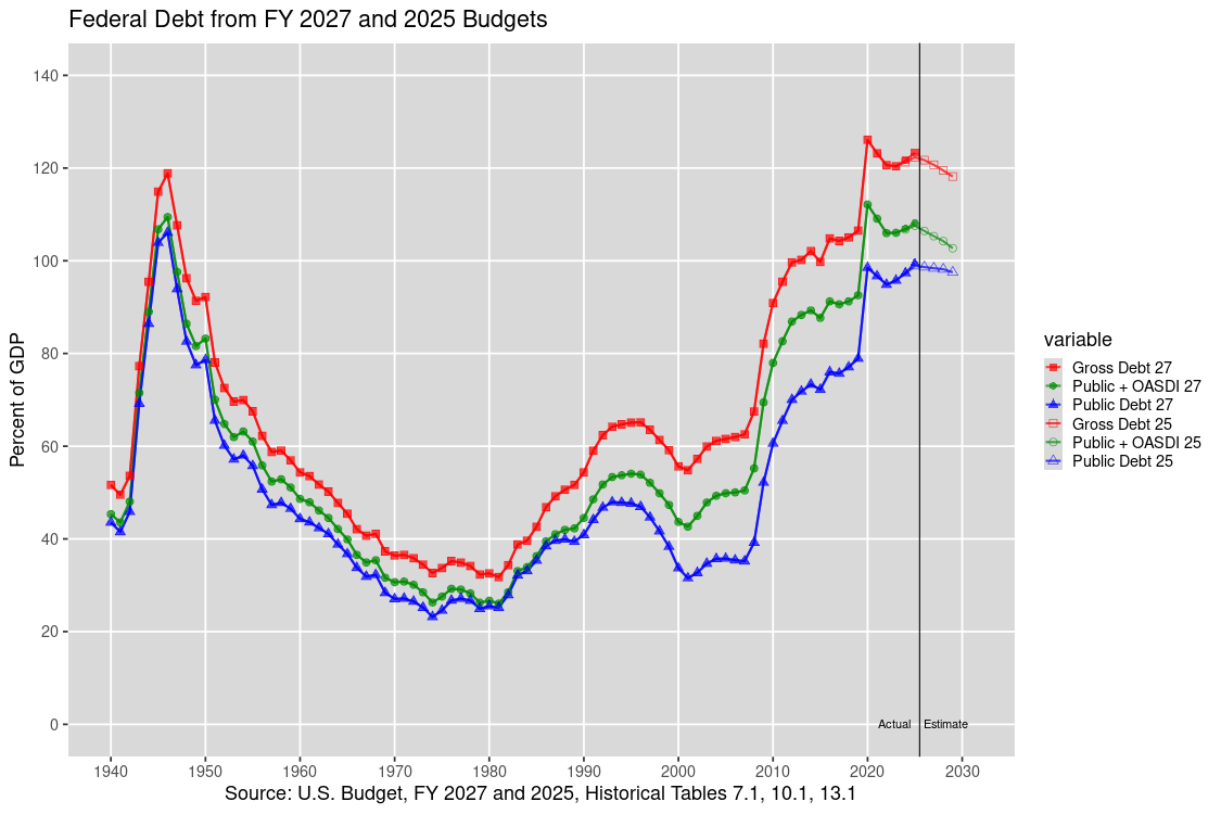
In the above graph, the solid symbols to the left of the vertical line (in the "Actual" sector) are the actual historical values of the debt. The solid symbols to the right of the vertical line (in the "Estimated" sector) are the projected values from the 2024 U.S. Budget and the empty symbols are the projected values from the prior 2023 U.S. Budget. As can be seen, the projected debt has gone up since the prior budget.
Most noteworthy perhaps is that the debt has reached a level as a percent of GDP not seen since the end of World War II. Once the war ended, the gross federal debt fell to a low of 31.8 percent of GDP in 2081 but then nearly doubled to 62.4 percent of GDP by 1992 when it was raised as a major item of discussion in the 1992 Presidential election by Ross Perot. Several books came out about the danger of the debt around that time, including "Facing Up" by Peter G. Peterson and "Backruptcy 1995" by Harry E. Figgie. The above graph shows that the gross debt then declined, reaching a low of 54.8 percent of GDP in 2001. In 2001, the U.S. federal budget ran it's last unified budget surplus. In fact, a January 2001 Washington Post article reported how "Federal Reserve Chairman Alan Greenspan yesterday endorsed the idea of a major federal tax cut as not only fiscally prudent but also necessary". The fear seemed to be that if "the surpluses don't end when the debt does, there could be a serious economic disruption". Of course, the graph shows that the debt has only increased since then, most rapidly in the financial crisis of 2008 and the COVID epidemic in 2020.
Graphs of numerous budget items can be found at this link. Following is one of the other graphs which shows the outlays for major budget functions since 1970:
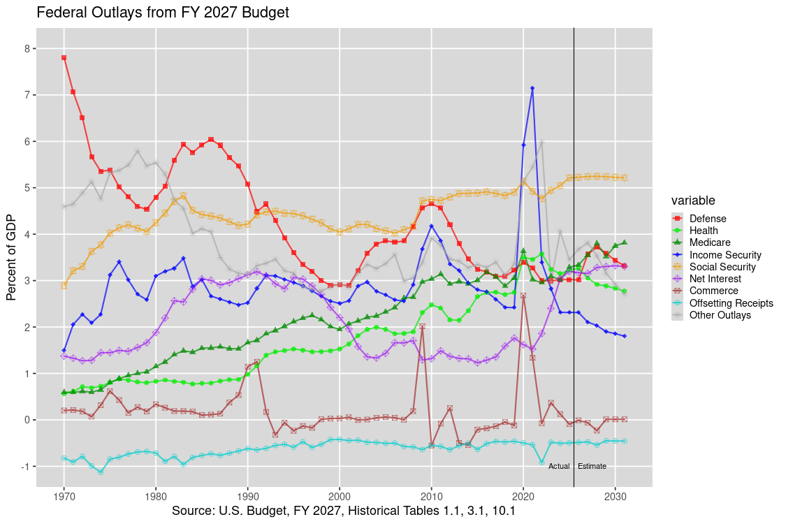
The purple line shows that Net Interest peaked just above 3 percent (3.191%) of GDP in 1991 reached a low just above 1 percent (1.234%) of GDP in 2015. It rose just below 2 percent (1.904%) in 2022 and was projected to rise up to nearly 3 percent (2.9835%) of GDP in 2028 in the 2024 U.S. Budget. The 1.904% of GDP figure for 2022 is very nearly equal to the 1.907% of GDP figure for 2022-07-31 outlays of interest_public in the table above. This is represented by the green line in the graph preceding that table and represents only that interest paid to the public, excluding intergovernmental interest paid by the federal government to the trust funds.
Also noticable in the graph above is that Commerce outlays spiked in 1975, 1991, 2009, and 2020. Those years marked the end of recessions and the high spikes in 1991, 2009, and 2020 were likely related to expenditures to deal with the Savings and Loans Crisis, the Financial Crisis, and the COVID epidemic. 2009 and 2020 were also followed by spikes in Income Security outlays in 2010 and 2021. Also noticable in the steady increase in Medicare and Health (which includes Medicaid) outlays since 1970. Social Security outlays were fairly steady through 2008 but have been rising since then. Finally, "Other Outlays" was fairly stable as a percentage of GDP from 1990 to 2019 but spiked in 2020 through 2022. Other graphs at this link suggest that this spike was chiefly due to increased outlays in Education and General Government.
Clicking on the related links at the link labeled "Top Outlays, 1970-2028" will bring up the above graph followed by a table which contains the numbers mentioned in the paragraph that follows the above graph.
Analyzing Market Data with the Yahoo API
The recent rise in the interest rates paid by bonds has had a marked effect on their value. This is discussed at this page. As noted, a graph showing the change in value of several bond ETFs can be examined via the following steps:
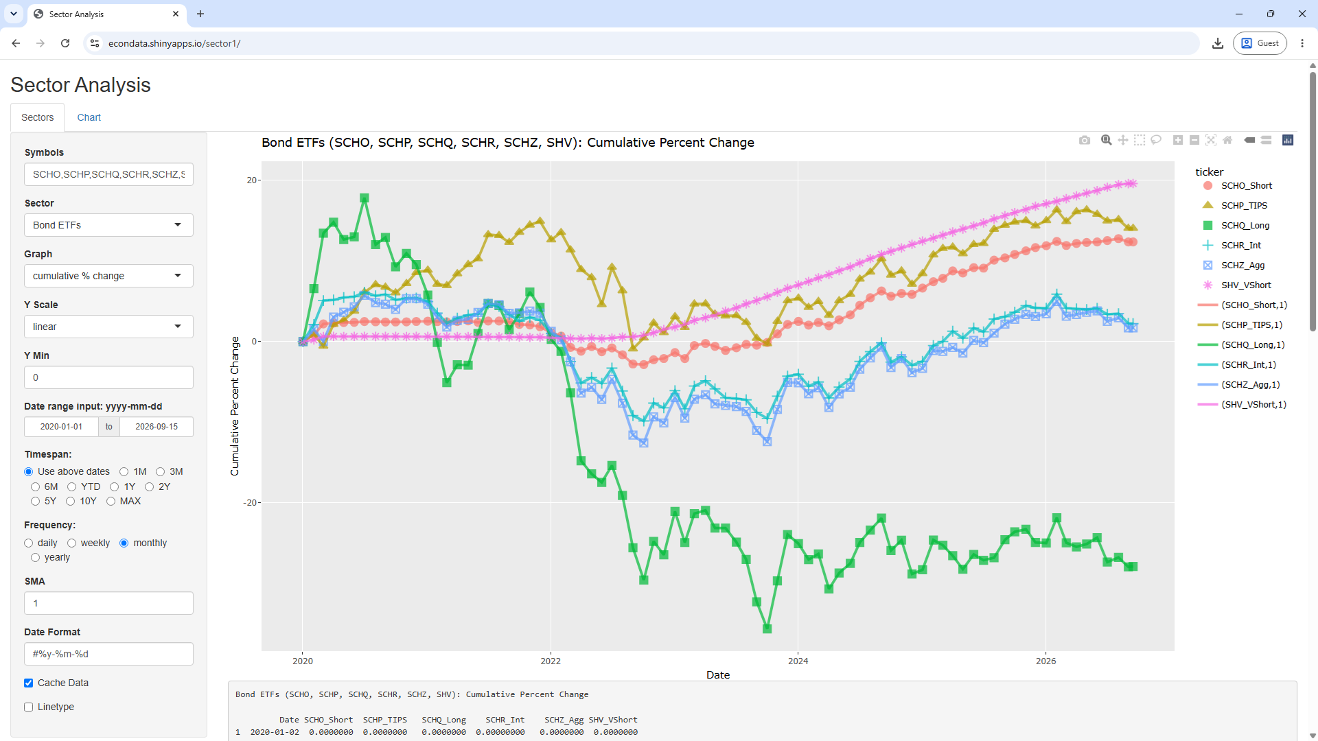
Following is a further discussion of this graph from https://econdataus.com/sector1.htm:
As can be seen, nearly all of the Bond ETFs fell from the end of 2021 through the end of 2022. The one exception was SHV which, according to this link, had an ultrashort duration of about 0.27 years. This January 7, 2023 article starts with the following key points:
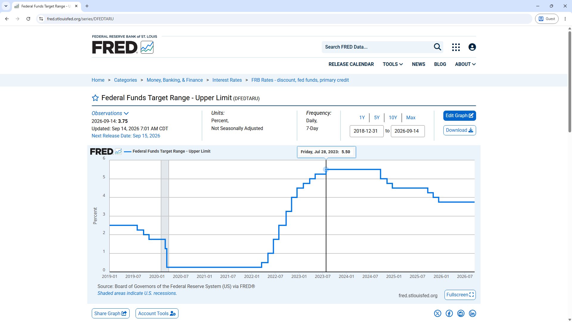
Regarding 2023, the article did go on to state:
The Federal Reserve is poised to continue raising interest rates, but the increase is unlikely to be as dramatic or rapid - in which case the impact on bonds would be more muted, advisors said.
As the bond ETFs graph shows, the value of long-term bonds did drop futher in 2023 but the drop was more muted as the article suggested. Since about October 19, 2023, the value of bonds have been rising.
The sector graphs look at the adjusted prices which should adjust them for any dividends or splits. Still, it's possible to verify the graphs by looking at the results on Morningstar via the following steps:
This should display the following graph:
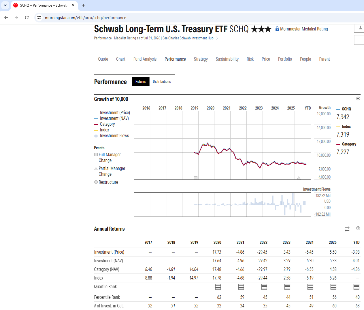
As can be seen, the above graph is similar to the green line for SCHQ in the Bond ETFs graph above. The fact that value of SCHQ went down sharply in 2022 and have stayed fairly flat since then is likely due chiefly to the fact that their yield went up sharply in 2022 and continued up, though less sharply, since then. This can be seen in the following graph.