The Employment Situation Summary is described at this link as follows:
The U.S. Bureau of Labor Statistics (BLS) releases the Employment Situation Summary, better known as the employment, or jobs report, at 8:30 a.m. ET on the first Friday of every month. The report is based on surveys of households and employers. It estimates the number of people on payrolls in the U.S. economy, the average number of hours they worked weekly, and their average hourly earnings, along with several versions of the unemployment rate.
The most recent Employment Situation Summary can be found at https://www.bls.gov/news.release/empsit.nr0.htm. Following the summary are links to Employment Situation Summary Table A. Household data, seasonally adjusted and Employment Situation Summary Table B. Establishment data, seasonally adjusted. The meaning of "seasonally adjusted" is explained at this link. Following the links to these two summary tables are links to detailed tables A-1 through A-16 for the Household Survey data and tables B-1 through B-9 for the Establishment Survey data. Following is the beginning of Table A-1:
Note that columns 2 to 4 contain numbers that are "Not seasonally adjusted" and columns 5 to 10 contain numbers that are "Seasonally adjusted".
Reproducing Numbers from the Employment Situation Summary in Shiny
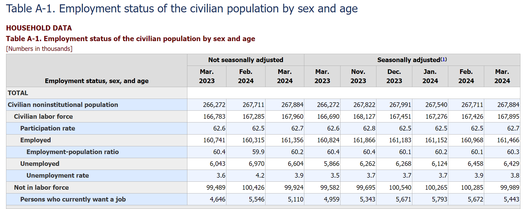
Many of the "not seasonly adjusted" numbers in Table A-1 can be reproduced via the publicly available Shiny app at https://econdata.shinyapps.io/cps_monthly1/. Following is the initial page that comes up when that app is accessed:
Following is the table in the above page with columns added for corresponding values in Table A-1 above:
All Persons: 2023-2024, grouped by EMPSTAT, AGE 16-99 (percent)

                          Table A-1
                           Civilian                        Table A-1
                        Labor Force                     Unemployment
   Year_Mo       Count  (thousands) Employed Unemployed         Rate
1  2023-01 165,069,905                  96.1        3.9
2  2023-02 166,177,943                  96.1        3.9
3  2023-03 166,783,207      166,783     96.4        3.6          3.6
4  2023-04 166,220,828                  96.9        3.1
5  2023-05 166,702,251                  96.6        3.4
6  2023-06 167,910,035                  96.2        3.8
7  2023-07 168,353,639                  96.2        3.8
8  2023-08 168,049,264                  96.1        3.9
9  2023-09 167,718,080                  96.4        3.6
10 2023-10 167,774,401                  96.4        3.6
11 2023-11 167,976,734                  96.5        3.5
12 2023-12 166,660,598                  96.5        3.5
13 2024-01 166,427,532                  95.9        4.1
14 2024-02 167,285,357      167,285     95.8        4.2          4.2
15 2024-03 167,960,219      167,960     96.1        3.9          3.9
As can be seen, the 3 Civilian labor force numbers in the not seasonally adjusted columns of Table A-1 match the generated Count numbers, rounded to the nearest thousands. Also, the 3 Unemployment rate numbers from Table A-1 match those in the generated Unemployed column.
The Shiny app generates these numbers from the monthly data files at this link using the Data Dictionary linked to at the top of that page. The data for each month is usually available within a week of the release of that month's job report.
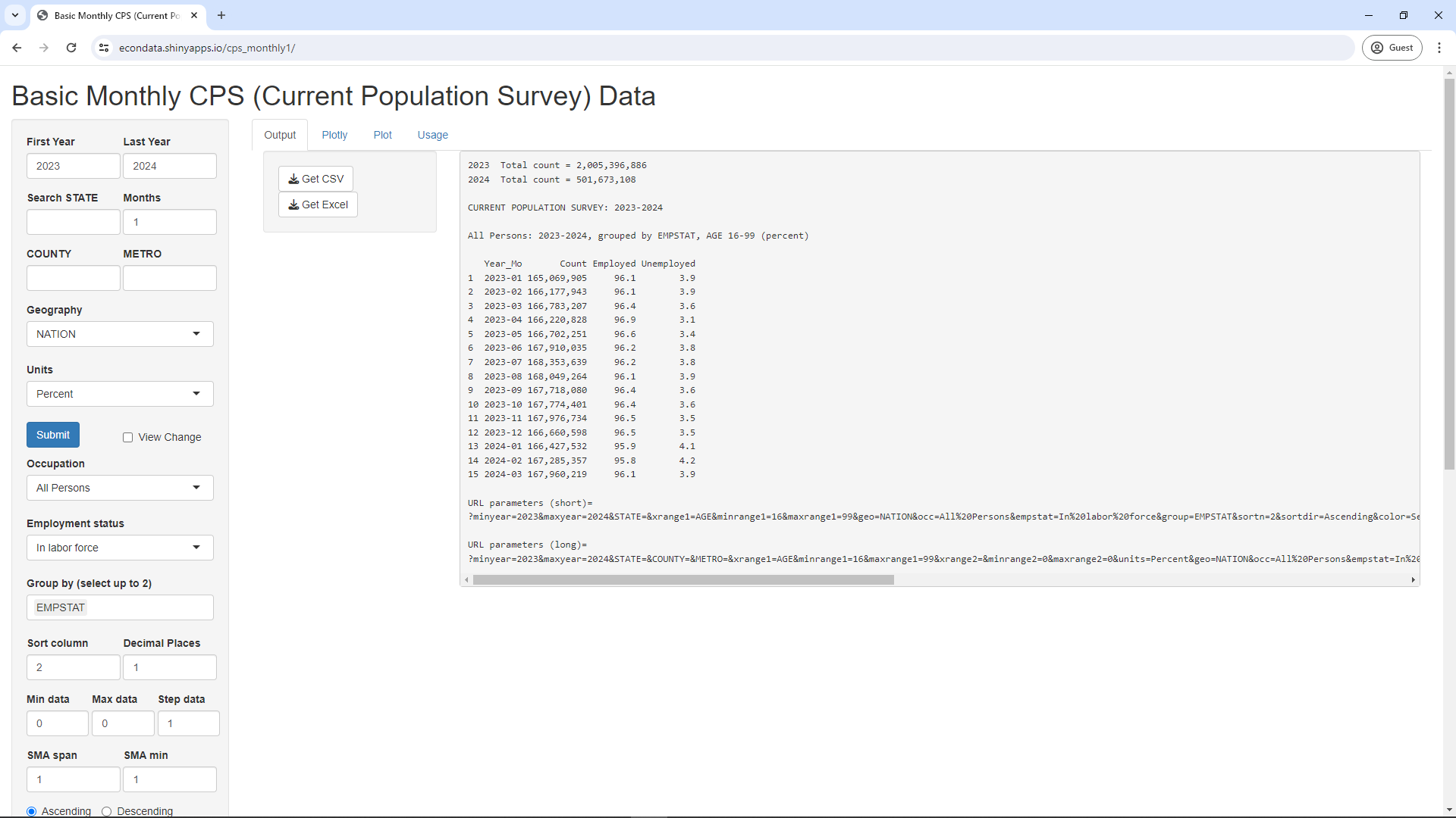
Changing the Units select list to Count, the Employment status select list to All, and clicking the Submit button will result in the following page:
All Persons: 2023-2024, grouped by EMPSTAT, AGE 16-99 (count)

                          Table A-1                Table A-1               Table A-1                       Table A-1
                           Civilian
			Noninstitut.                                                                          Not in
                         Population                 Employed              Unemployed                     Labor force
   Year_Mo       Count  (thousands)    Employed  (thousands) Unemployed  (thousands) Not.in.labor.force  (thousands)
1  2023-01 265,961,720              158,691,547               6,378,358                     100,891,815
2  2023-02 266,111,907              159,712,565               6,465,378                      99,933,964
3  2023-03 266,271,876      266,272 160,740,630      160,741  6,042,577      6,043           99,488,669       99,489
4  2023-04 266,443,193              161,074,745               5,146,084                     100,222,365
5  2023-05 266,618,231              161,002,386               5,699,864                      99,915,980
6  2023-06 266,800,905              161,559,139               6,350,896                      98,890,870
7  2023-07 267,002,315              161,981,640               6,372,000                      98,648,676
8  2023-08 267,213,250              161,426,705               6,622,559                      99,163,986
9  2023-09 267,427,697              161,669,304               6,048,777                      99,709,617
10 2023-10 267,642,080              161,676,321               6,098,081                      99,867,679
11 2023-11 267,822,020              162,149,298               5,827,436                      99,845,286
12 2023-12 267,991,084              160,753,981               5,906,617                     101,330,486
13 2024-01 267,540,215              159,649,766               6,777,766                     101,112,683
14 2024-02 267,711,141      267,711 160,315,160      160,315  6,970,197      6,970          100,425,784      100,426
15 2024-03 267,884,190      267,884 161,356,417      161,356  6,603,802      6,604           99,923,971       99,924
As can be seen, the 3 Civilian noninstitutional population numbers in the not seasonally adjusted columns of Table A-1 match the generated Count numbers, rounded to the nearest thousands. This also holds true for the 3 Employed, Unemployed, and Not in labor force numbers.
Graphing the Unemployment Rate over Time
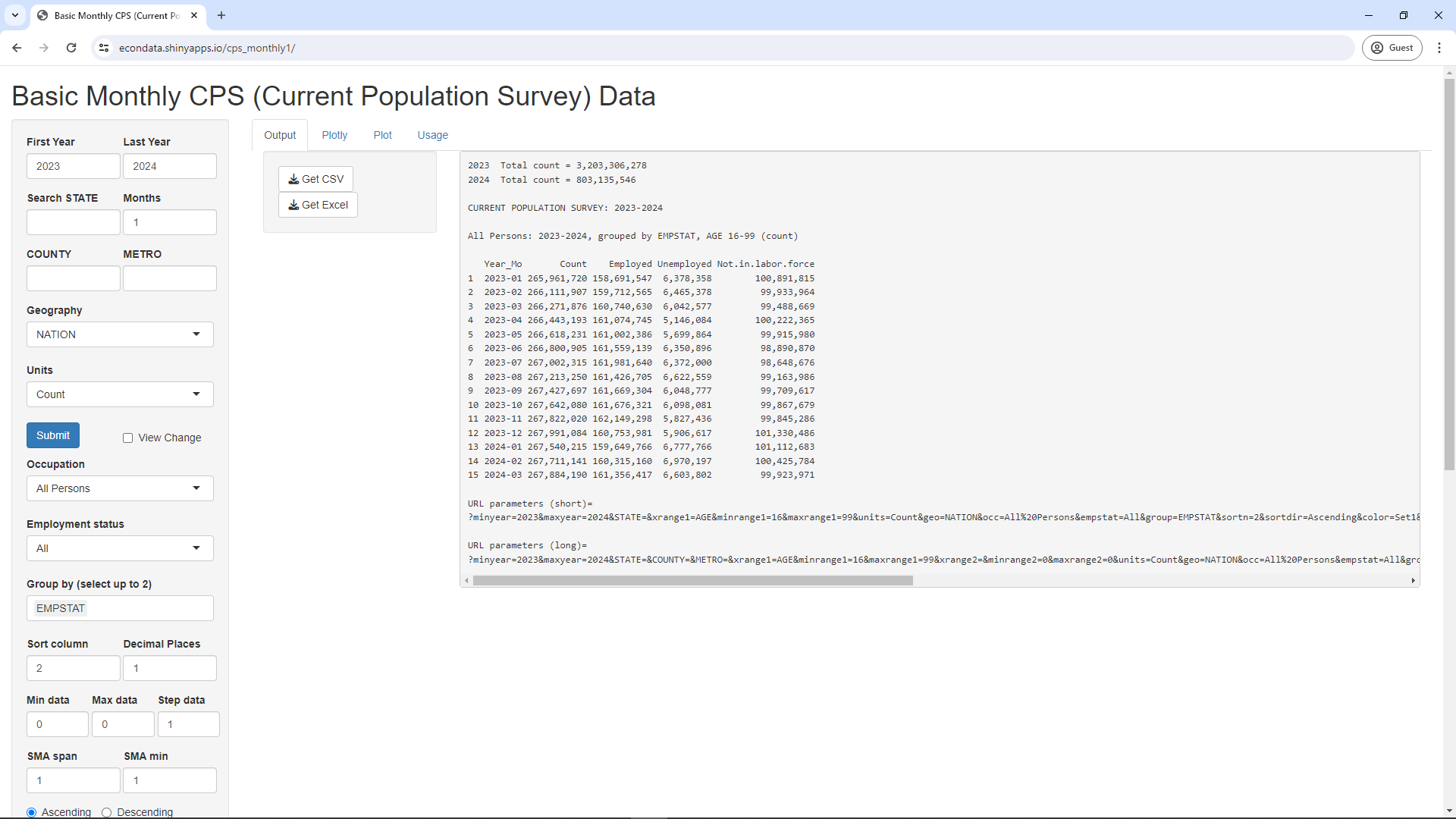
The unemployment rate over time can be graphed via the following steps:
Note that the unemployment rate generally trended down from 2015 to February of 2020 when it then spiked up to a maximum in April of 2020 due to COVID. It then declined by 2023 to its pre-COVID low. Also, note that the unemployment rate tends to go up around January and June of each year. This appears to be the major seasonal pattern and is likely not visible in the seasonally adjusted data.
Regarding seasonal adjustments, the following message is posted by a former IPUMS staff member on an IPUMS forum:
This article goes into great detail on the seasonal adjustment procedures used for labor force statistics by the BLS. Starting with IPUMS CPS microdata, you'll first need to calculate the aggregate statistics you are interested in by month, and then run the whole time series through a seasonal adjustment program such as X-13 ARIMA SEATS.
Hence, seasonally adjusting the data is not a trivial operation and this Shiny app currently does not perform that adjustment. On the other hand, the Employment Situation Summary does usually refer to the seasonally adjusted data. For example, the first line in the March 2024 report states that "the unemployment rate changed little at 3.8 percent". The 3.8 percent matches the seasonally adjusted unemployment rate in Table A-1 whereas the 3.9 percent for the rightmost point in the graph above matches the "not seasonally adjusted" employment rate in that table.
Have Native-born Americans Gained Zero Net Jobs since May 2018?
On March 8, 2024, a user named zerohedge posted a tweet on Twitter (now X) that contained the following graph:
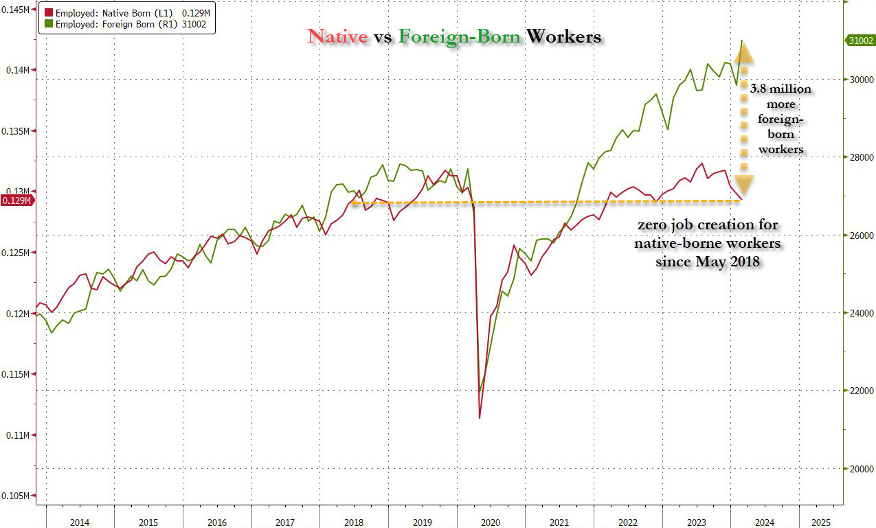
In reference to this graph, the tweet stated:
Most shocking, since May 2018, there have been ZERO jobs created for native-born Americans. All jobs in the past 6 years have gone to immigrants, legal and illegal.
On April 23, the Washington Post posted an opinion piece by columnist Catherine Rampell that was titled You don't want immigrants? Then tell grandma she can never retire. The first graph in that piece was similar to the above graph. That graph can be largely replicated in this Shiny app via the following steps:
Whereas zerohedge suggested that this graph shows that native-born Americans are being passed over for jobs in favor of immigrants, Rampell suggests that the native-born Americans for those jobs do not exist. She states:
The arithmetic is clear: Boomers are retiring and U.S. birthrates have plummeted. Absent immigration, the U.S. working-age population would be either flat or soon shrinking.
Further on, Rampell states:
In fact, the share of native-born Americans considered "prime working age" (25 to 54 years old, so after traditional college-going years and preretirement) who have jobs is higher than it was pre-pandemic. There just aren't enough of us, in total, to fill all the jobs that employers are creating as boomers retire.
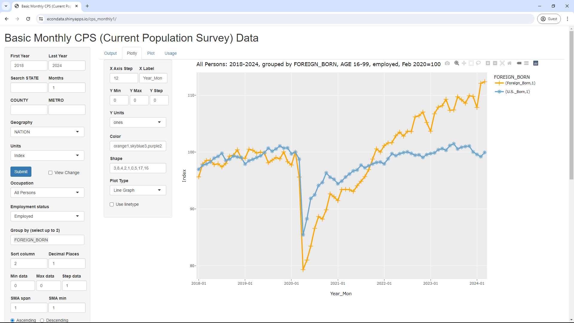
She follows this with another graph that can be largely replicated in this Shiny app via the following steps:
The above steps will display the following page:
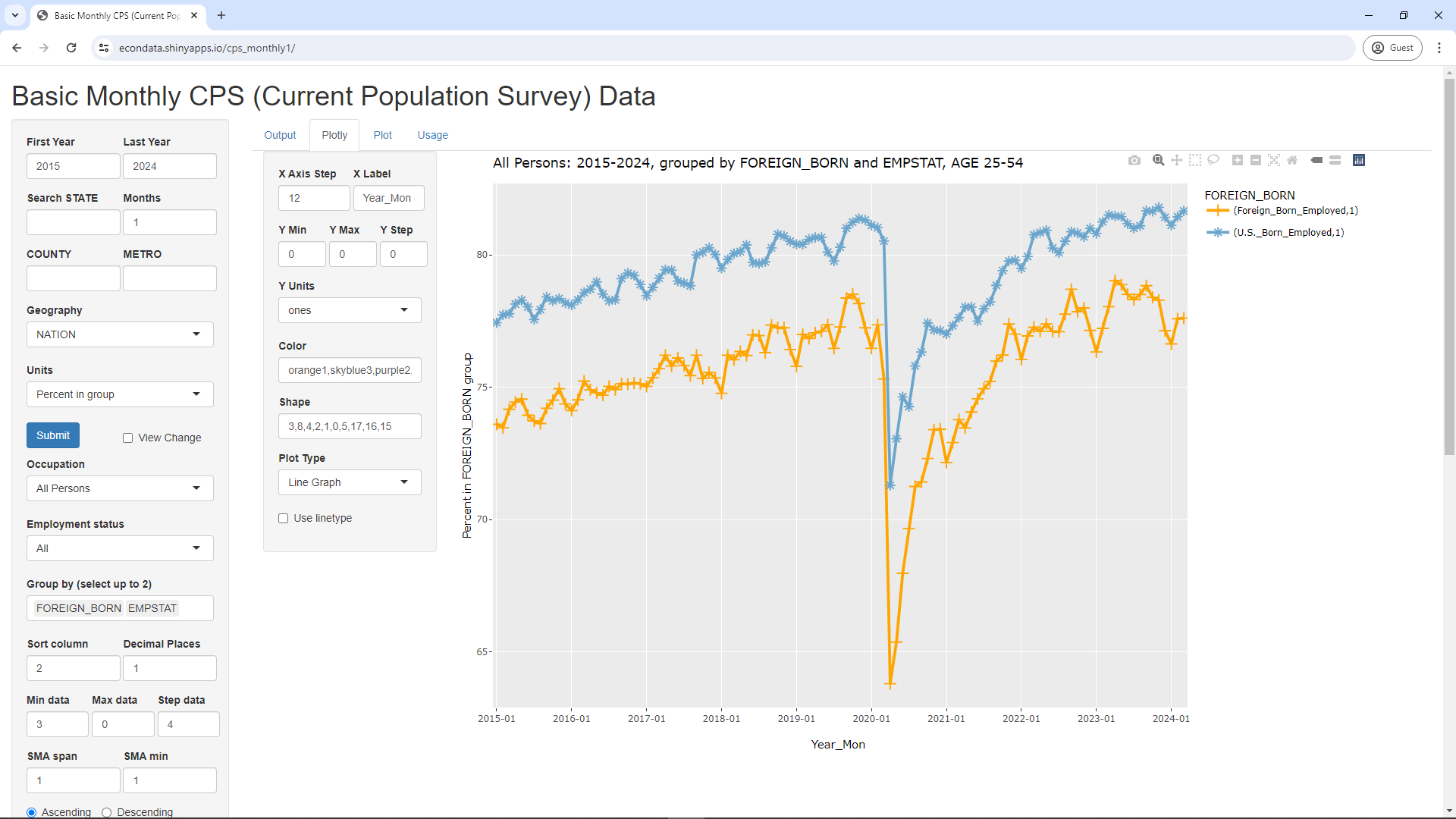
As can be seen, this graph is largely the same as the second graph in Rampell's opinion piece. The main difference is that the above graph only goes back to 2015. That's because that is as far back as the app's data currently goes. In any case, one interesting thing in the graph is that the percentage of prime-working-age workers who are employed is about 4 percent higher for natives than for immigrants. The likely reason for this can be seen by changing the FOREIGN_BORN entry to CITIZENSHIP in the Group by (select up to 2) select box and clicking the Submit. That will change the above graph to the graph below:
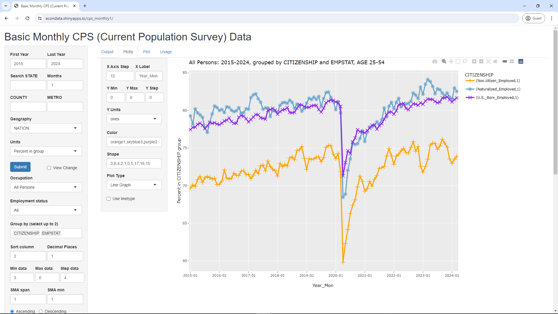
The above graph splits the foreign-born category into non-citizens and naturalized citizens. As can be seen, the prime-age employment-population ratio of naturalized citizens is very nearly the same as that of U.S. born citizens over time, perhaps a percent or so more on average recently. The prime-age employment-population ratio of non-citizens, on the other hand, is about 5 percent less. This may be largely due to non-citizens who have very recently arrived and/or do not have work authorization.
The above graph does seem to suggest that recent immigration has not had a negative effect on prime-age native workers as a whole. However, it does show at least one potential problem. Non-citizens currently have a prime-age employment-population ratio that's about 5 percent less than citizens. It would seem reasonable to think that this gap will eventually close if these non-citizens remain, especially if they become citizens. Might the additional jobs required to close that gap have any effect on the job prospects of citizens? It's hard to know. Much may depend on the number of non-citizens compared to the number of citizens. But the point is that it's not possible to draw any finmal conclusions since the situation is still in flux.
Also, it does seem worth making some attempt to measure the effect on all native workers, including those who are 55 and above. Many workers with sufficient savings may retire before age 65. However, many likely work until at least 65, being unable to pay for their healthcare and living expenses before receiving Medicare and Social Security. A significant number may need to work some past the age of 65. Changing the Maximum range1 from 54 to 99 and clicking the Submit button results in the following graph:
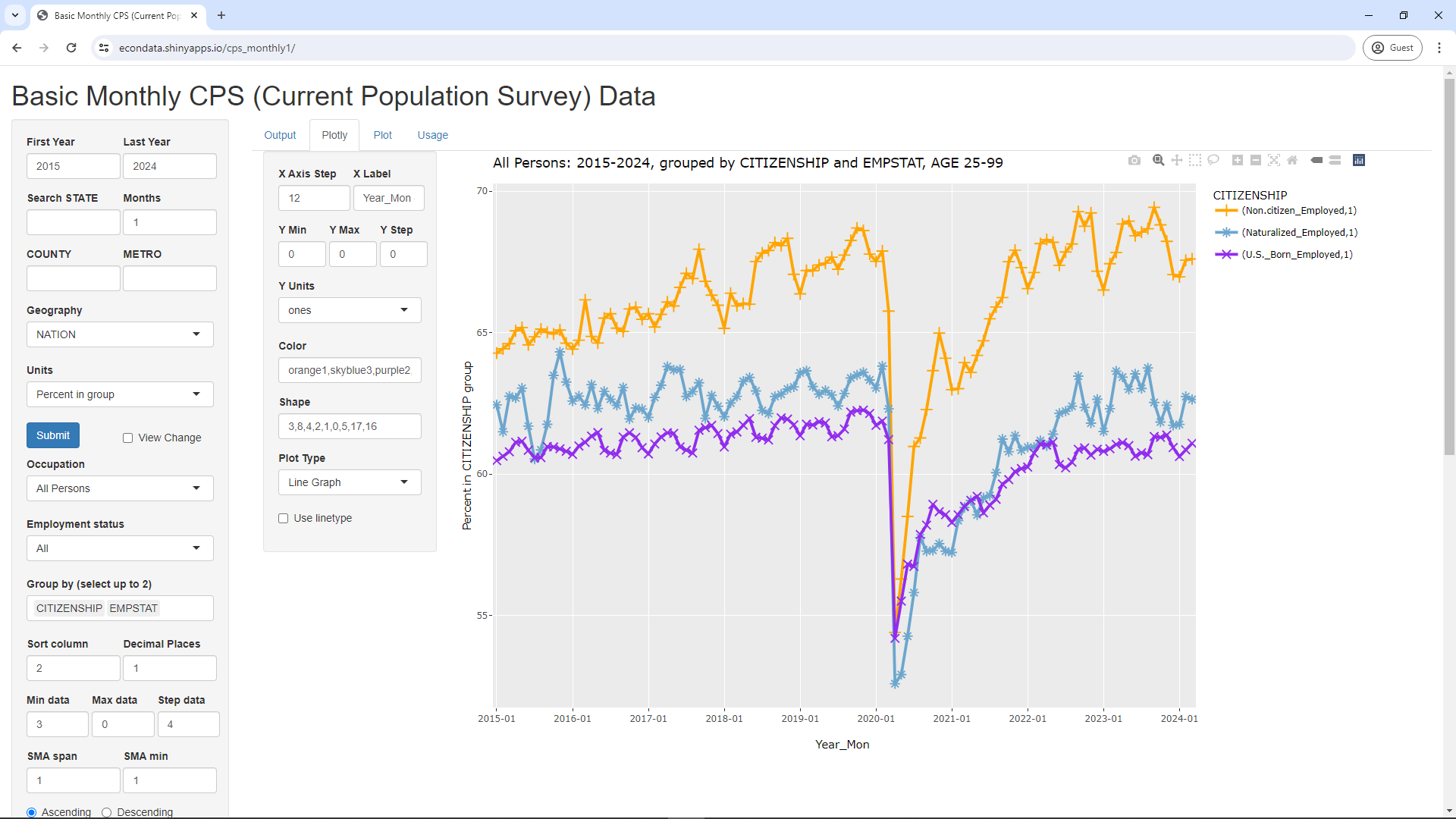
As can be seen, the employment-population ratio of U.S. born citizens is now about 5 percent BELOW non-citizens and 1 to 2 percent below naturalized citizens. However, changing the Employment status from All to Not retired and clicking the Submit button results in the following graph:
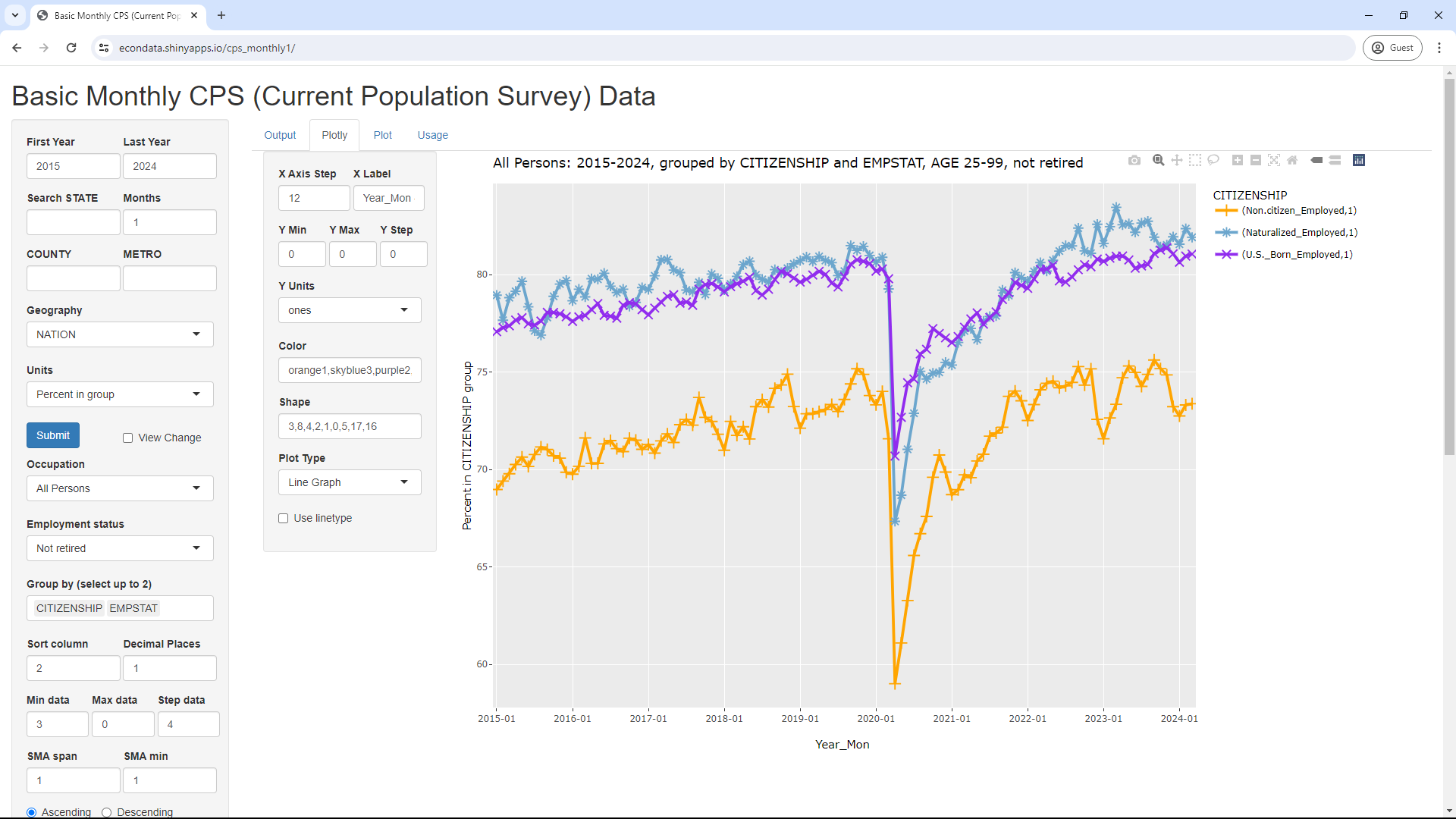
As can be seen, the employment-population ratio of U.S. born citizens is now nearly the same as naturalized citizens and about 5 percent greater than non-citizens, same as was the case with prime-age workers. Similar to before, this suggest that recent immigration has not had a noticeably negative effect on all native workers as a whole. But, as before, it's unclear what the effect will be if and when the 5 percent gap closes. Also, this is only looking at the average effect over all locations and occupations. Only further study can reveal whether there are specific locations and occupations that experience negative effects.
Finally, the article's statement that "Absent immigration, the U.S. working-age population would be either flat or soon shrinking" can be checked via the following steps:
The above steps will display the following page:
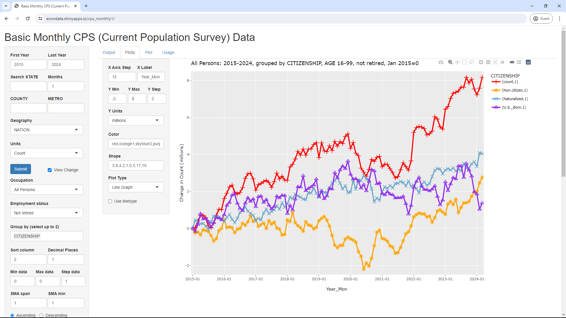
As can be seen, the U.S. born working-age population (taken as 16 and older) is flat or shrinking from mid-2019 on, at least up to March of 2024. Other age ranges for the working-age population have similar results.