Ray Lutz's Look at Turnout in Clark County
On January 6, 2025, Ray Lutz, founder of Citizens Oversight, posted a Substack article titled "Convincing evidence of likely manipulation of 2024 Presidential votes in Nevada". Following is the first paragraph:
We've been playing around with data from the state of Nevada in an effort to find any strong evidence that the data looks fishy. To refresh your memory, in Nevada, we had fairly anomalous results, since the state went to the D-Party candidate over Trump in 2016 and 2020. And all of a sudden, in this election, it is flipped, with Trump winning the state.
Further on, he posts the following graph, which his article explains.
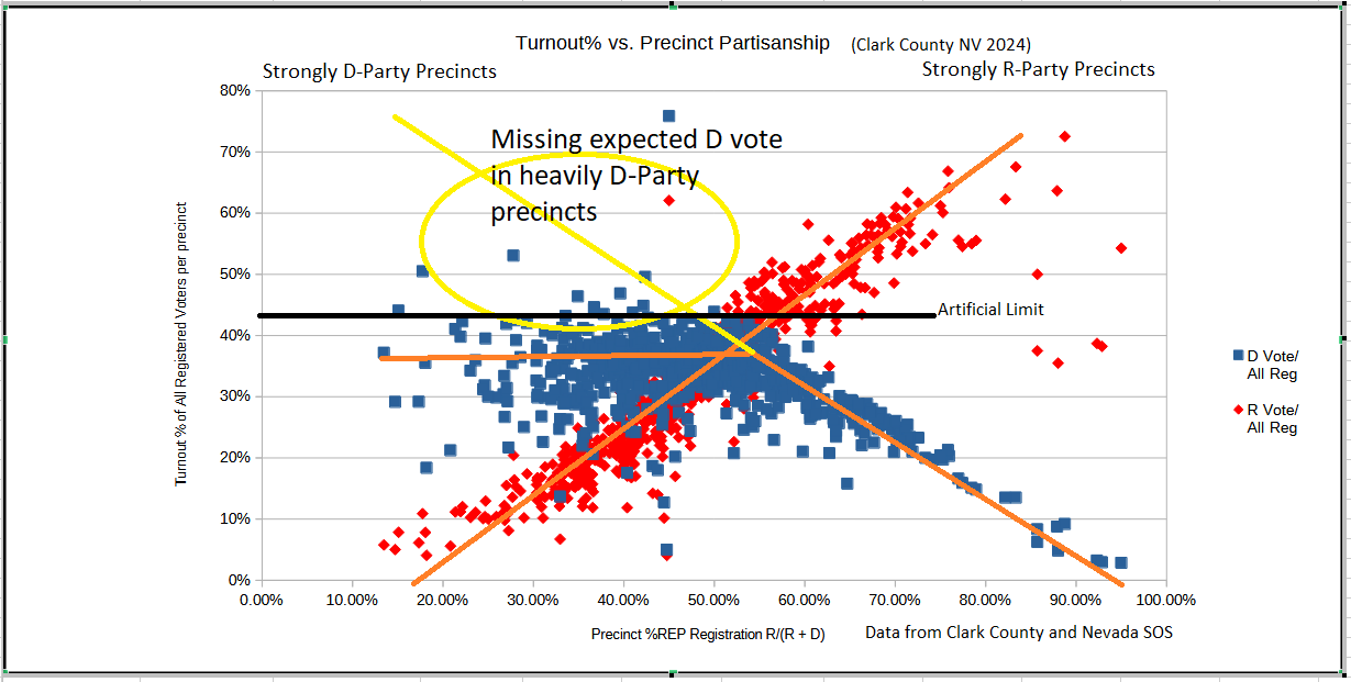
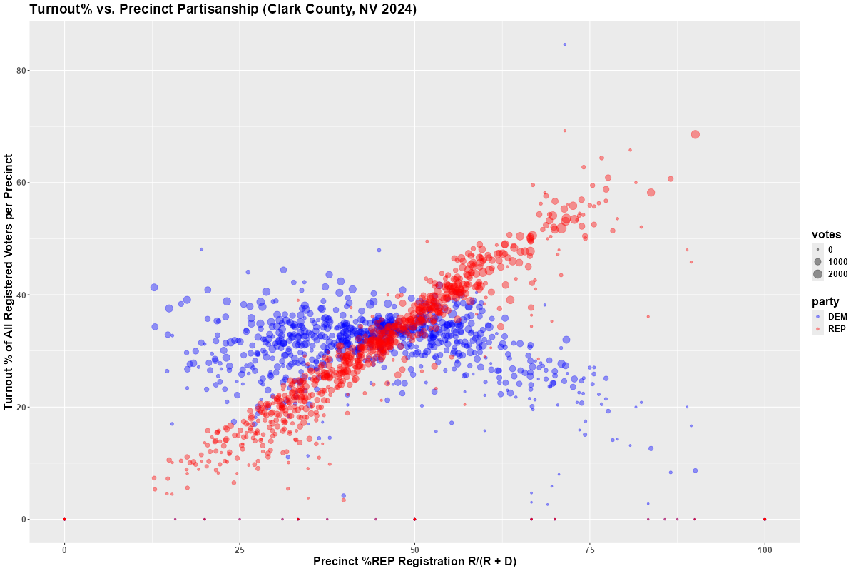
I've been able to replicate the basics of the graph below:
Regarding his graph, Ray states the following:
What is absolutely stunning about this plot is the fact that in strong D-party precincts, turnout percentages consistently plateau below 45%, suggesting a systematic irregularity.
It seems there is an artificial limit to the turnout % allowed in those precincts, to less than 45%. The limit is so stark, it is chilling.
The data you see here is only for Clark County, which is a huge part of Nevada (around 66% of the state), and strongly D-leaning. Harris did win in this county. But her win here was not enough to offset the other third of the votes in the state, given this artificial limit.
Following are the data sources that were used create the replicate graph:
Comparing the 2024 Senate and Presidential Races in Clark County
According to Wikipedia, Republican Donald Trump defeated Democrat Kamala Harris by 46,008 votes in the 2024 Presidential race in Nevada. However, according to Wikipedia, Democrat Jacky Rosen defeated Republican Sam Brown by 24,059 votes in the 2024 Senate race in Nevada. The following graph shows the shift in the margin vote share from the Senate race to the Presidential race in Clark County.
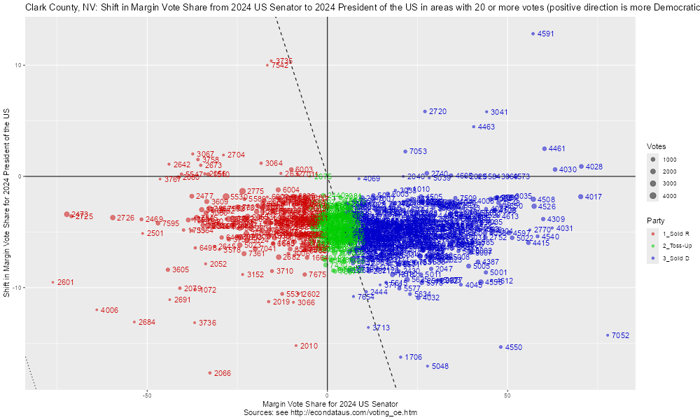
The positive direction is more Democratic along both axes in the above graph. Hence, all of the precincts below the x-axis, including the great majority of those in Clark County, had higher vote margins for Trump than for Brown. By eye, it appears that the average shift in vote margin for Trump was about 5 percent.
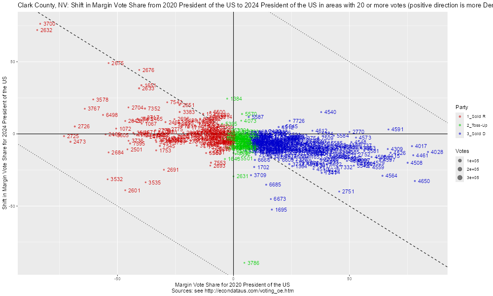
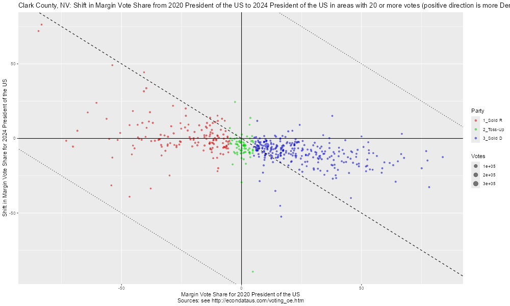
In the same way, it's possible to compare the 2020 and 2024 presidential races in Clark County. As mentioned above, Wikipedia shows Republican Donald Trump defeating Democrat Kamala Harris by 46,008 votes in the 2024 Presidential race in Nevada. However, Wikipedia shows Democrat Joe Biden defeating Republican Donald Trump by 33,596 votes in the 2020 Presidential race in Nevada. The following graph shows the shift in the margin vote share from the Presidential race in 2020 to the Presidential race in 2024 in Clark County.
The positive direction is more Democratic along both axes in the above graph. By eye, it appears that the solid Republican precincts did not shift much on average, being dispersed on both sides of the x-axis. However, the solid Democrat precincts can be seen to have shifted significantly Republican on average, being mostly below the x-axis.
The following graph shows the same shift but without the precinct labels.
Without the labels, it is even clearer that the great majority of the solid Democrat precincts shifted Republican from 2020 to 2024. This pattern was seen in many counties in other states such as in Wisconsin.
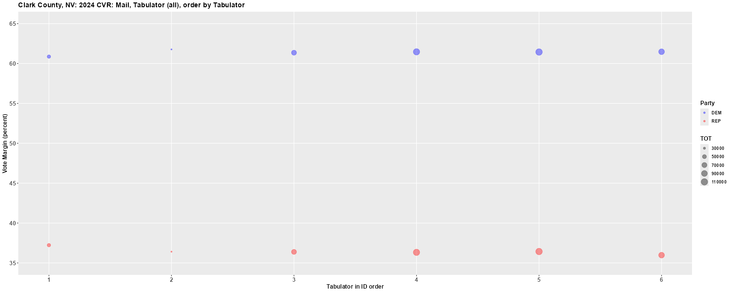
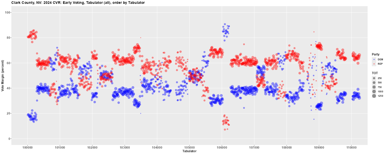
As previously mentioned, the Cast Vote Record for the November 5, 2024 election in Clark County, Nevada can be found posted on the Clark County, Nevada web site. There is a post on Reddit titled "Leaked Ballot-level Data Exposes Alarming Evidence of Vote Switching Fraud in Clark County, Nevada!" that generates several plots using this data. Following are the first 3 plots as replicated by an R Shiny application using the same data. Below is the first plot looking at Mail In ballots and the description given in the Reddit article:
In Figure 1, you can see that 443,823 mail-in votes were processed across just six tabulators. With so few tabulators, the results are averaged, and Kamala won with 61.4% against Trump's 36.4%. This data accounts for 47.7% of the population's votes.
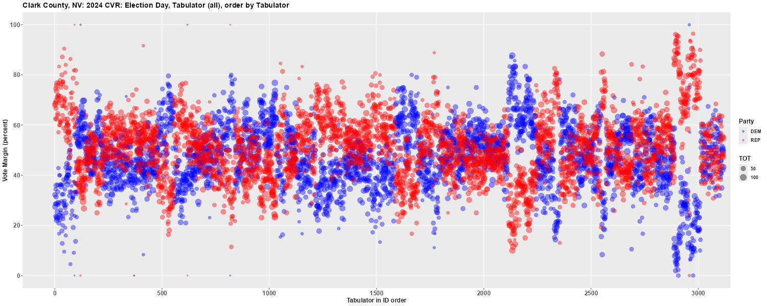
Below is the second plot looking at Election Day ballots and the description given in the Reddit article:
In Figure 2, you'll see Election Day results from 3,116 tabulators. Here, the distribution is normal, with plenty of random variation expected from a large population.
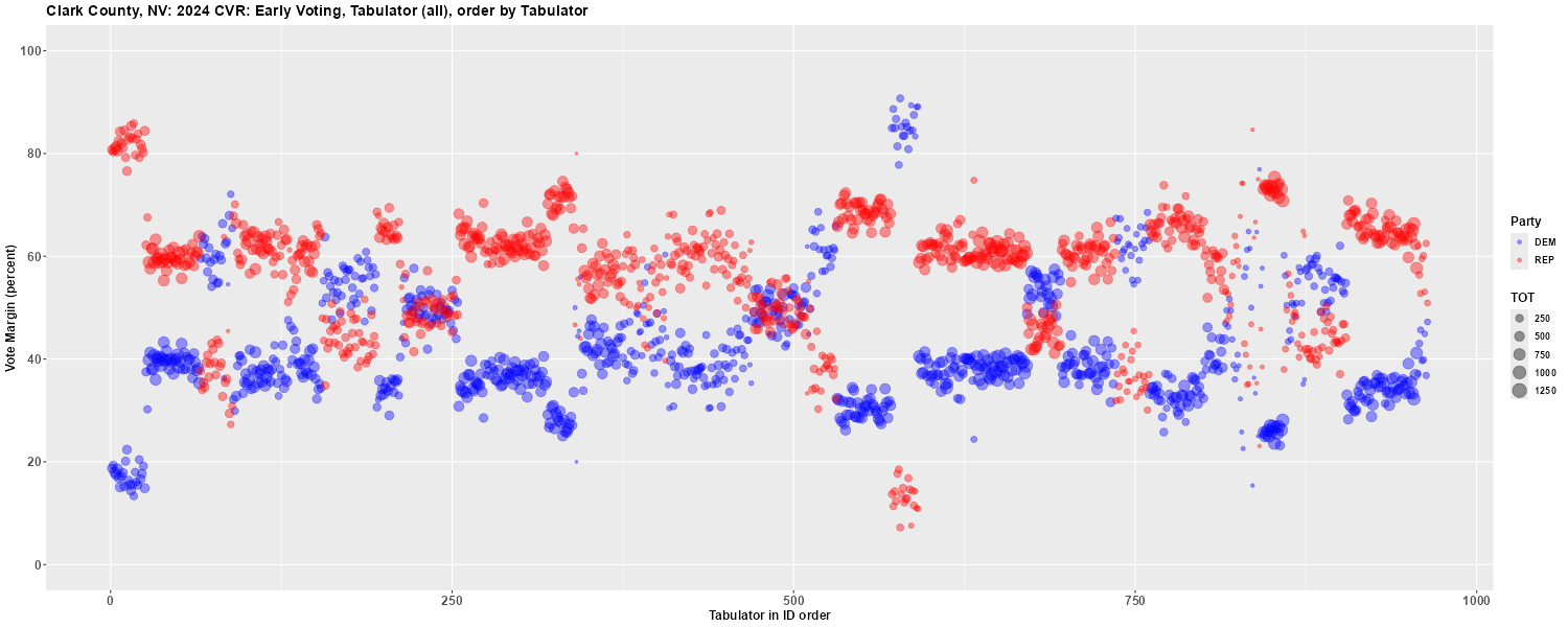
Below is the third plot looking at Early Vote ballots and the description given in the Reddit article:
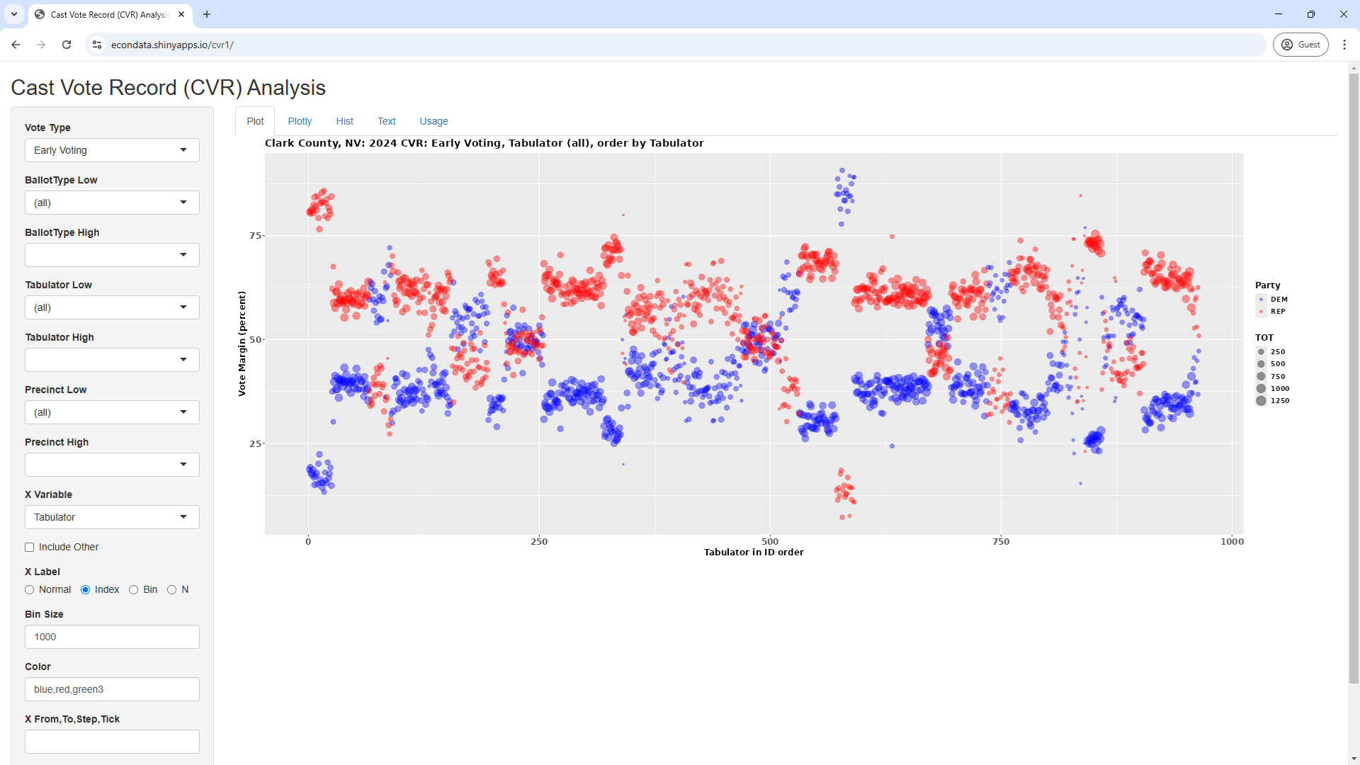
Figure 3 shows 964 tabulators used to process early voting. What stands out immediately is the severe clustering and absence of middle-range percentages, which points to abnormal vote switching. This confirms the first hypothesis that votes were manipulated, with Trump's numbers artificially inflated at the expense of Kamala and "Other" candidates. The tabulator IDs confirm the manipulation, as they follow a specific clustering pattern. Two anomalies stand out: One where Trump's numbers spiked in tabulators with smaller volumes (IDs 10013 to 10273) and another where Kamala's numbers were disproportionately high in tabulators with lower volumes (IDs 106033 to 106223). The cause of these anomalies remains unclear, but it's possible that the manipulation was more aggressive in a small and applied in reverse in others.
The references to tabulator IDs can be better seen in the plot below which shows the actual tabulator IDs rather than the indices starting from 1:
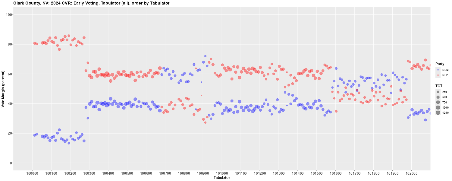
The Reddit article mentions an "absence of middle-range percentages, which points to abnormal vote switching". In fact, there appears to be an overabundance of certain percentages, especially 40 and 60 percent. The following plot focuses on the first 200 Early Voting tabulators:
As can be seen, tabulators 100,000 to just below 100,300 seem clustered in the 20 and 80 percent areas (Dem/Rep). The tabulators from there to just below 100,700 are clustered in the 40 and 60 percent areas (Dem/Rep), then swap parties to cluster in the 60 and 40 percent areas (Dem/Rep) up to 100,900, and then swap parties back to the 40 and 60 percent areas up to tabulator 101,600. From there to just below tabulator 102,000, they seem to cluster around the 55 and 45 percent areas (Dem/Rep).
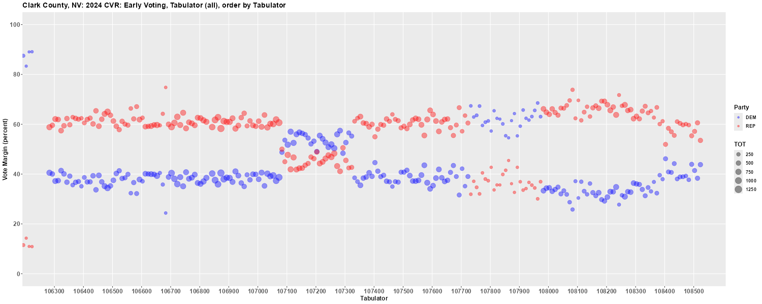
The following plot shows another long stretch that seems to cluster in the 40 and 60 percent areas (Dem/Rep) but sometimes swapping parties to the 60 and 40 percent areas such as from tabulator 107,700 to just below 108,000.
This clustering in the 40 and 60 percent areas, especially with the occassional swapping of parties, seems that it could be indicative of some sort of manipulation.
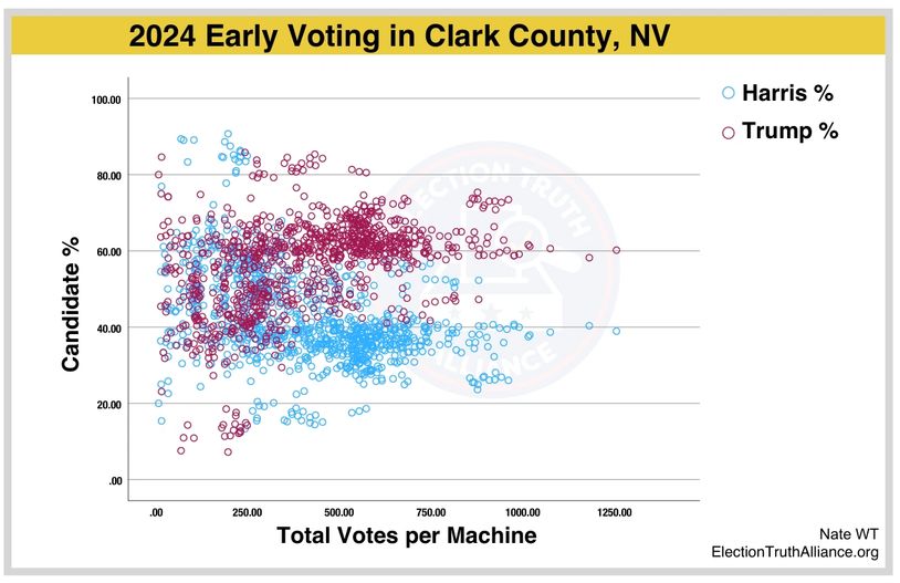
Election Truth Alliance, a non-profit, non-partisan organization founded in December of 2024, posted an analysis of the Clark County, Nevada election results which included the following plot:
Some of this analysis can be reproduced via an R Shiny application at https://econdata.shinyapps.io/cvr1/. Going to that URL currently displays the following initial page:
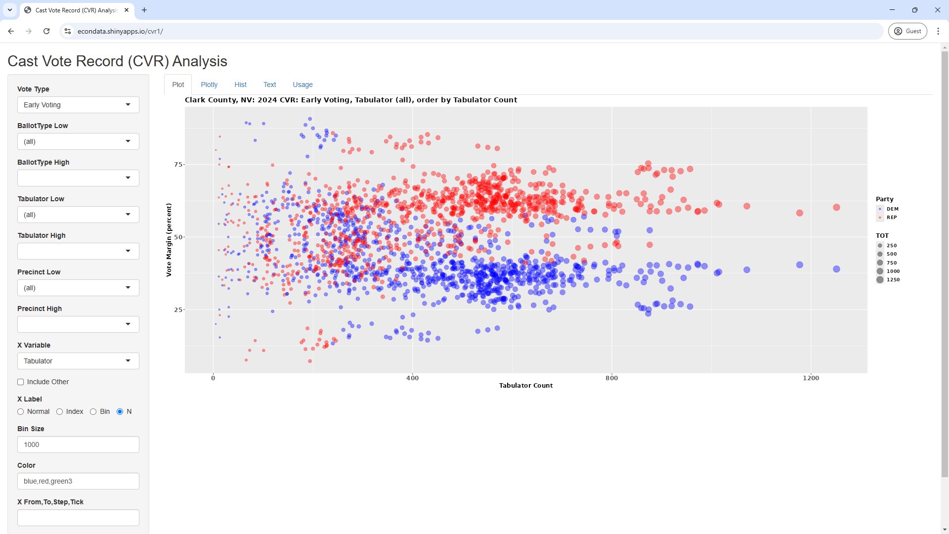
This plot shows the Democrat and Republican vote share for every tabulator used in Clark County for Early Voting. The tabulators are sorted in numerical order which are then replaced by indices, starting at 1. The following table shows the Republican Vote Share for the first 28 tabulators.
What seems strange, however, is that it appears from the plot that the vote share returned to being about 60 percent Republican and 40 percent Democrat several times going along the x-axis of the plot, with the tabulators ordered by TabulatorNum. It's a little hard to think of why this would happen unless all of these tabulators were used in the same or very similar precincts or voting centers or that there was some process that randomized a large percentage of the early vote and distributed it among these tabulators.
Changing the "X Label" radio button from "Index" to "N" will then display the following page:
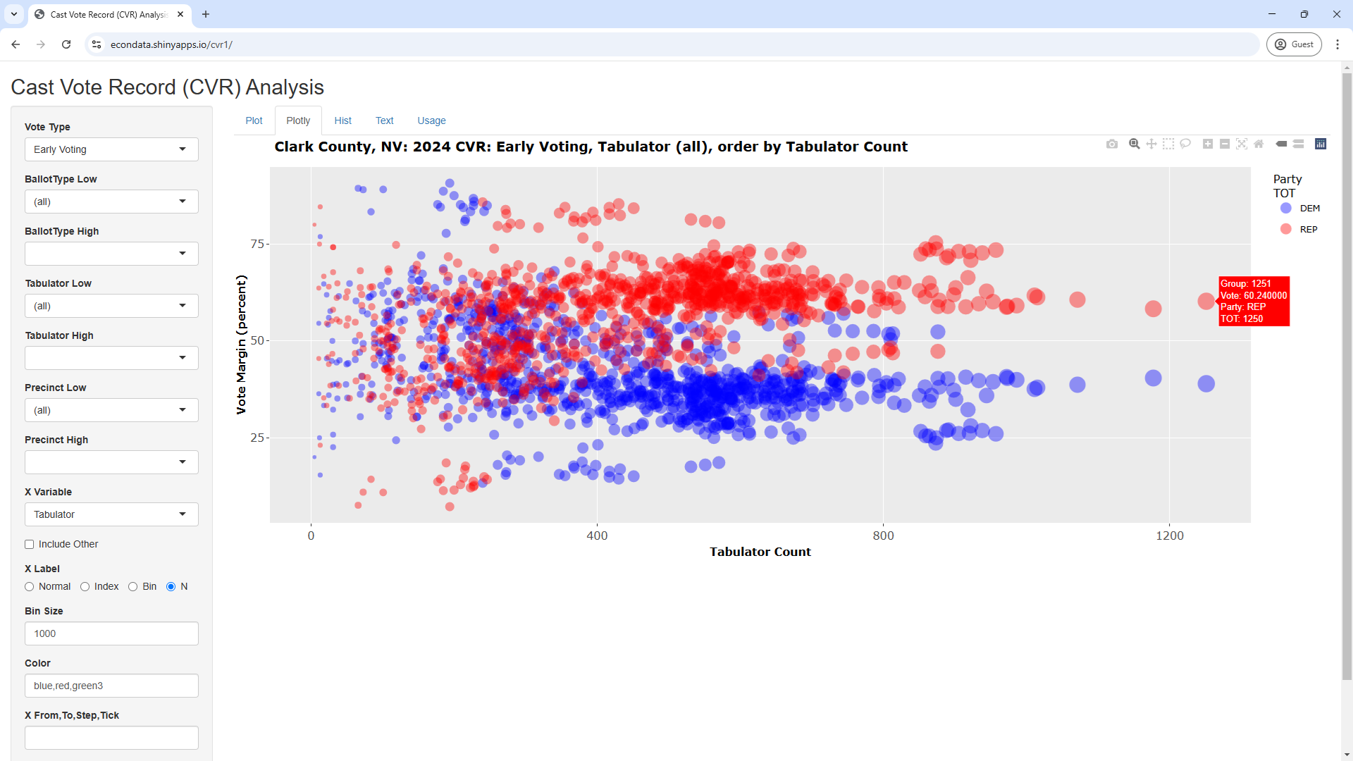
This appears to duplicate the above plot from the Election Truth Alliance analysis. Each tabulator still has to points on the plot but the x value is now the total number of ballots read by that tabulator. Clicking the Plotly tab now will display the following interactive version of the plot:
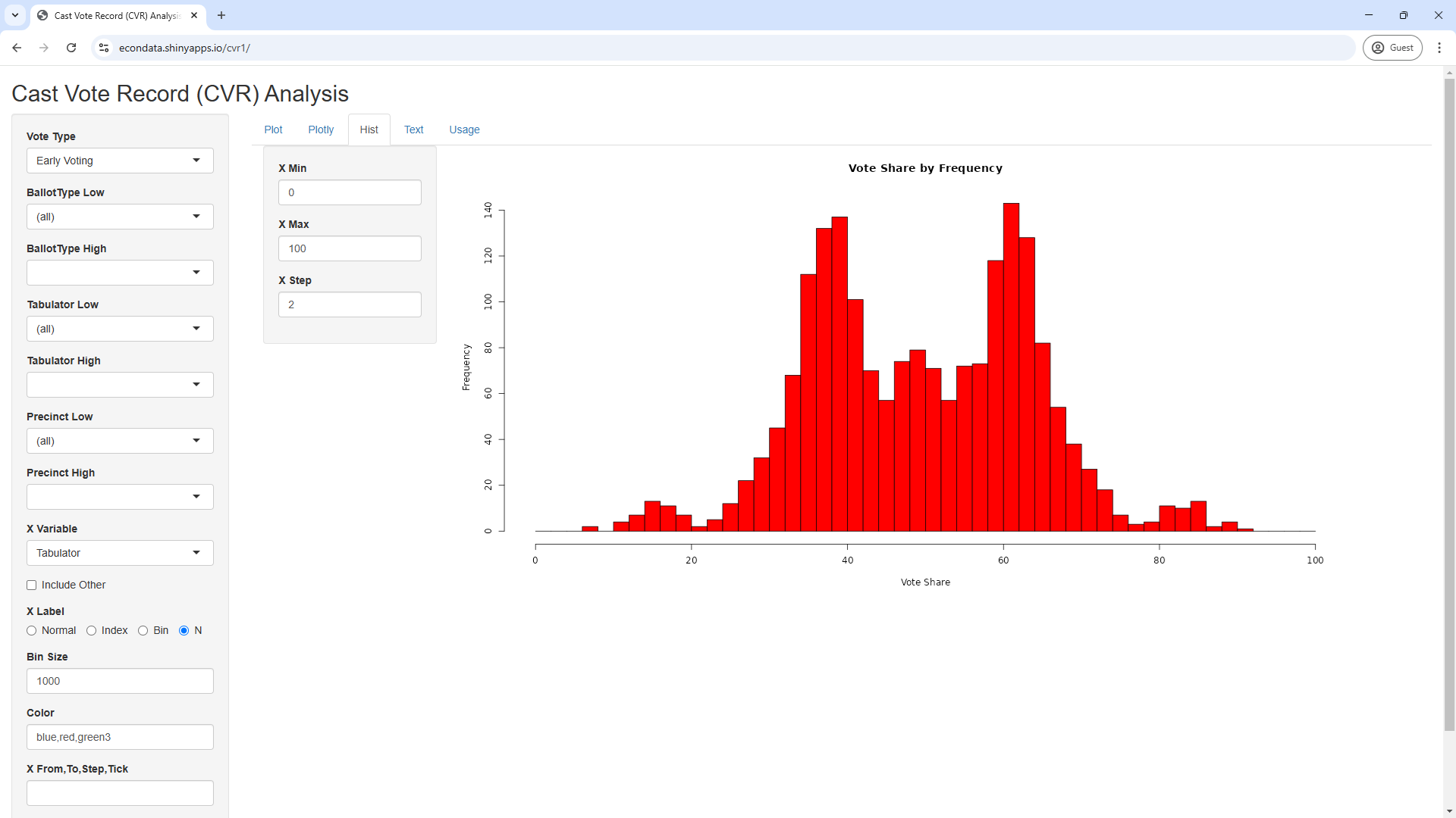
Clicking on the Hist tab now will display the following histograph:
This histogram shows the frequency of the vote shares shown in the current Plot and Plotly plots. As can be seen, the vote shares on the current plots spike just below 40 percent and just above 60 percent.
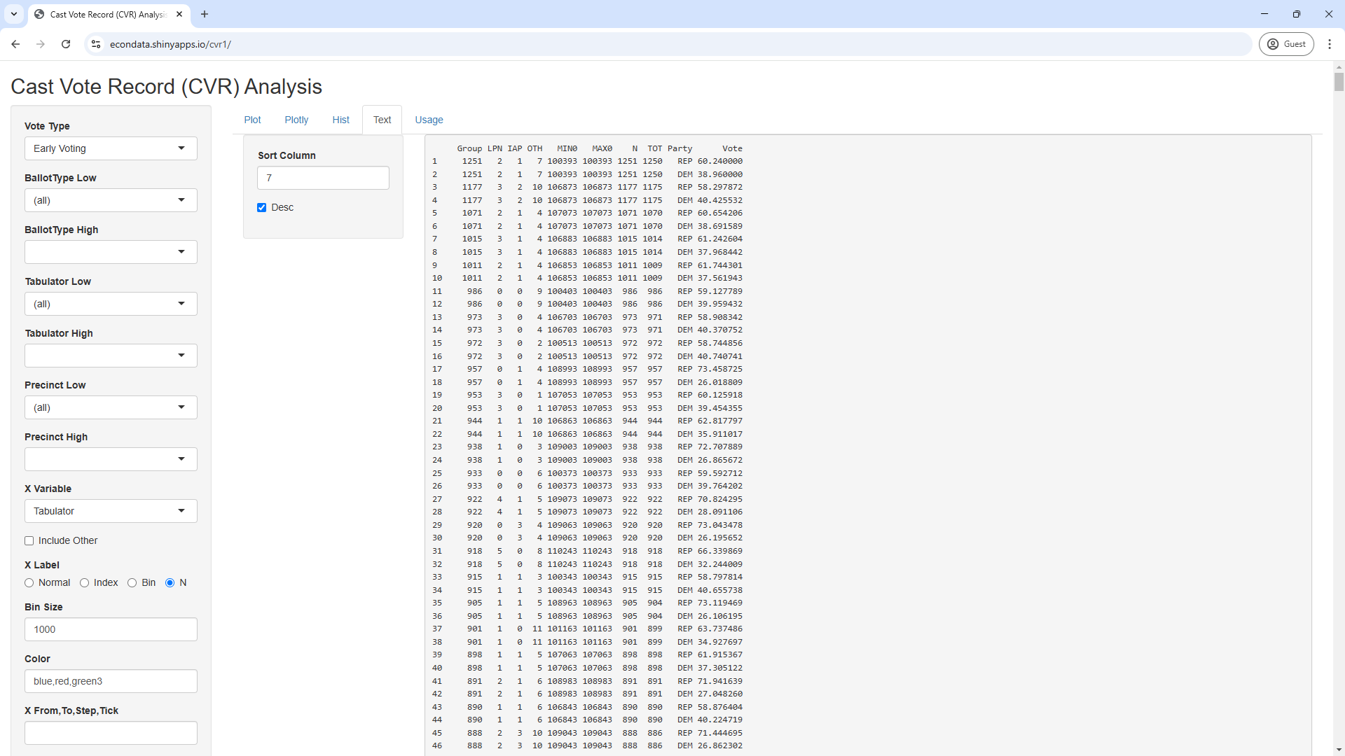
Clicking on the Text tab now will display the following histograph:
This shows a table of values from the current plots which can be sorted by any column. In this case, they are sorted by the number of ballots read by each tabulator. As can be seen, the maximum number of ballots read by a tabulator was 1251 ballots read by Tabulator 100393. It might be instructive to see if this tabulator observed similar vote shares over that entire 1251 votes. This can be estimated via the following steps:
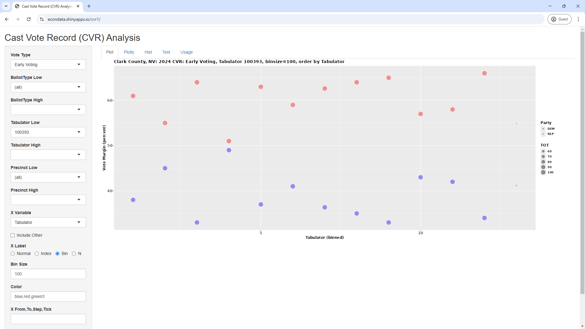
This plot is showing the average vote shares for every 100 ballots of the 1251 ballots. This results in 13 points for Democrat and Republican vote shares with the last point for each party being barely visible. The plot suggests that the tabulator read similar vote shares over the entire 1251 ballots or that, at least, there was not a discernible difference between the vote shares at the beginning and at the end of the sequence. It could be useful to see if this likewise applies to other tabulators.
Note: The code for the R Shiny application at https://econdata.shinyapps.io/cvr1/ can be found at https://github.com/rdavis27/cvr1.
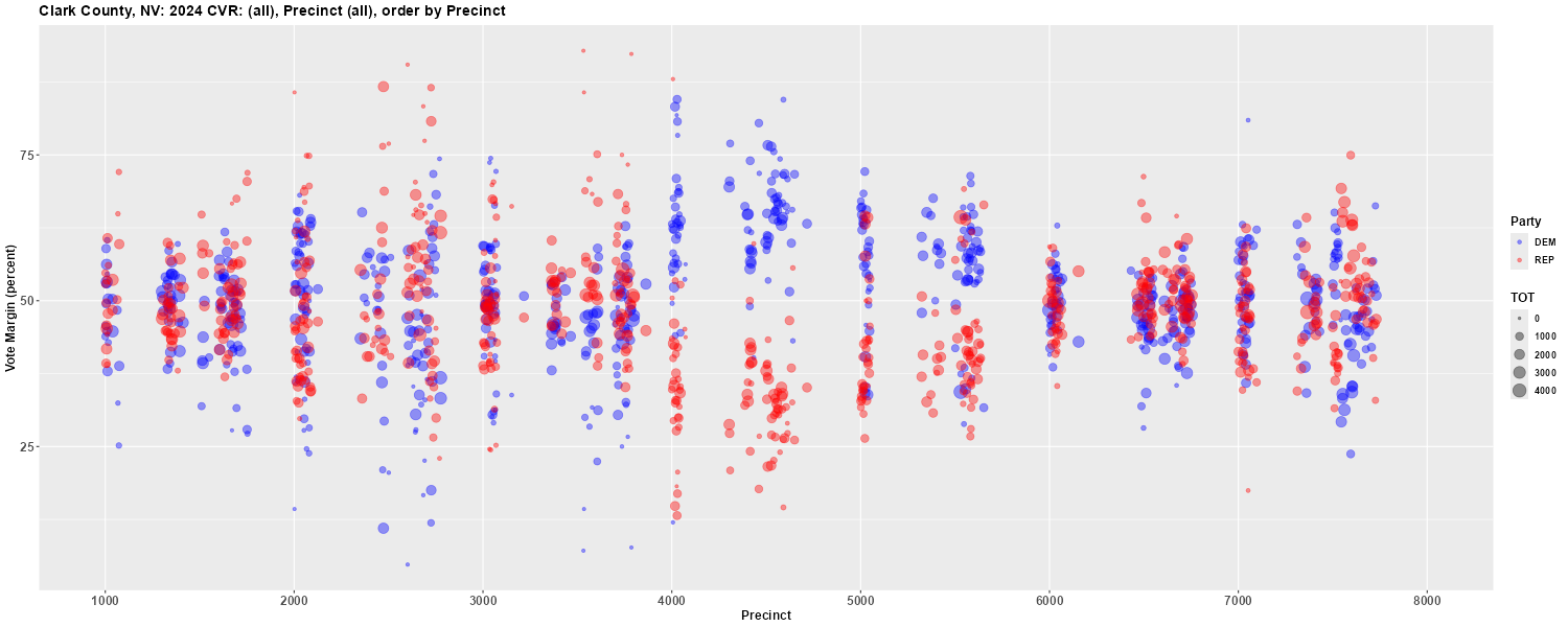
The plot below groups all votes by precinct and it appears that, as a whole, the precincts in the 4000's and 5000's lean Democrat.
The plot below groups election day votes by precinct and it appears that, once again, the precincts in the 4000's and 5000's lean Democrat. The other precincts appear to lean Republican in the election day vote.
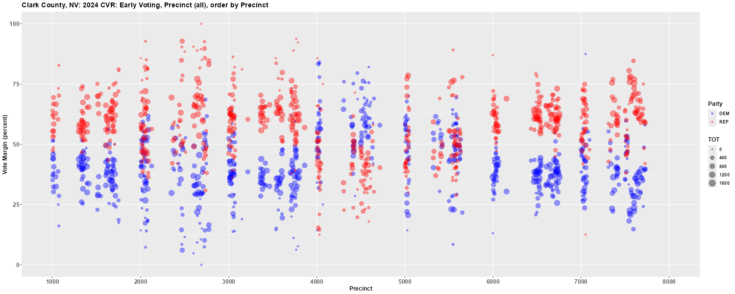
The plot below groups the early vote by precinct and it appears that, in the early vote, only the precincts in the 4000's lean Democrat. The other precincts appear to lean Republican in the early vote. It's unclear why the precincts in the 5000's seem to lean Democrat in the election day vote but lean Republican in the early vote.
Comparing the 2020 and 2024 Presidential Races in Clark County
Looking at the Cast Vote Record for the 2024 Presidential Race in Clark County by Tabulator
Looking at the Cast Vote Record for the 2024 Presidential Race in Clark County by Tabulator Count
Group LPN IAP OTH   MIN0   MAX0    N  TOT Party      Vote
    1   0   0   2 100013 100013  379  379   REP 80.738786
    2   0   0   1 100023 100023  279  279   REP 80.286738
    3   0   0   6 100053 100053  551  550   REP 80.909091
    4   1   1   4 100063 100063  531  531   REP 81.355932
    5   0   1   4 100073 100073  570  570   REP 80.526316
    6   0   0   3 100083 100083  432  432   REP 82.407407
    7   0   1   2 100093 100093  451  451   REP 84.257206
    8   0   0   3 100103 100103  368  367   REP 82.016349
    9   0   1   3 100113 100113  398  398   REP 81.155779
   10   1   0   0 100123 100123  355  355   REP 84.507042
   11   0   2   0 100133 100133  318  318   REP 79.245283
   12   1   1   2 100143 100143  380  380   REP 76.578947
   13   0   1   3 100153 100153  417  417   REP 82.733813
   14   1   1   3 100163 100163  394  393   REP 83.206107
   15   0   0   1 100173 100173  430  430   REP 85.348837
   16   0   1   4 100183 100183  347  347   REP 82.997118
   17   0   0   2 100193 100193  240  240   REP 85.833333
   18   0   0   6 100203 100203  261  261   REP 79.693487
   19   0   0   3 100213 100213  273  273   REP 82.783883
   20   0   0   2 100223 100223  272  272   REP 83.823529
   21   0   0   1 100233 100233  274  274   REP 79.197080
   22   3   2   1 100243 100243  384  384   REP 81.770833
   23   0   1   4 100253 100253  367  367   REP 80.926431
   24   0   1   1 100263 100263  292  292   REP 80.136986
   25   1   0   2 100273 100273  417  417   REP 84.412470
   26   0   0   1 100283 100283  329  328   REP 62.195122
   27   0   2   3 100293 100293  226  225   REP 67.555556
   28   3   3   4 100303 100303  764  763   REP 58.846658
Hence, it appears that the first 25 tabulators (whose original numbers are in MIN0 and MAX0) had Republican vote shares near 80 percent and comprise the red clump of dots in the upper left. Since they have similar vote shares, it would seem likely that these tabulators were all used in the same precinct or voting center.
These steps will display the following plot:
Looking at the Cast Vote Record for the 2024 Presidential Race in Clark County by Precinct

2024 U.S. Election