Analysis of Presidential Vote Shares in Rockland County, New York in 2024
On June 26, 2025, Newsweek posted an article titled "Exclusive: 2024 Election Results Lawsuit Advances as Documents Requested". It describes a lawsuit concerning the 2024 Presidential and Senate elections in Rockland County, New York and begins as follows:
The lead plaintiff in a legal case questioning the accuracy of the 2024 election, has submitted 15 pages of document requests as part of the discovery process.
SMART Legislation, the action arm of nonpartisan watchdog group SMART Elections, also submitted a series of questions to the Rockland County Board of Elections in New York this week, according to court filings reviewed by Newsweek.
"The best way to reassure the public about the accuracy of the election results in Rockland County, New York, is to conduct a full, transparent, hand recount of the 2024 Presidential and Senate elections," Lulu Friesdat, the founder and executive director of SMART Legislation, said in a statement to Newsweek. "That is why we have requested it, and so far, the judge seems to agree."
Election Truth Alliance is a non-profit, non-partisan organization founded in December of 2024 that has worked with SMART Elections. They have posted a YouTube video titled Rockland County, New York | 2024 | SMART Elections Lawsuit | Election Truth Alliance Livestream Clip. At about 55 seconds into the video, the speaker displays the following plot:
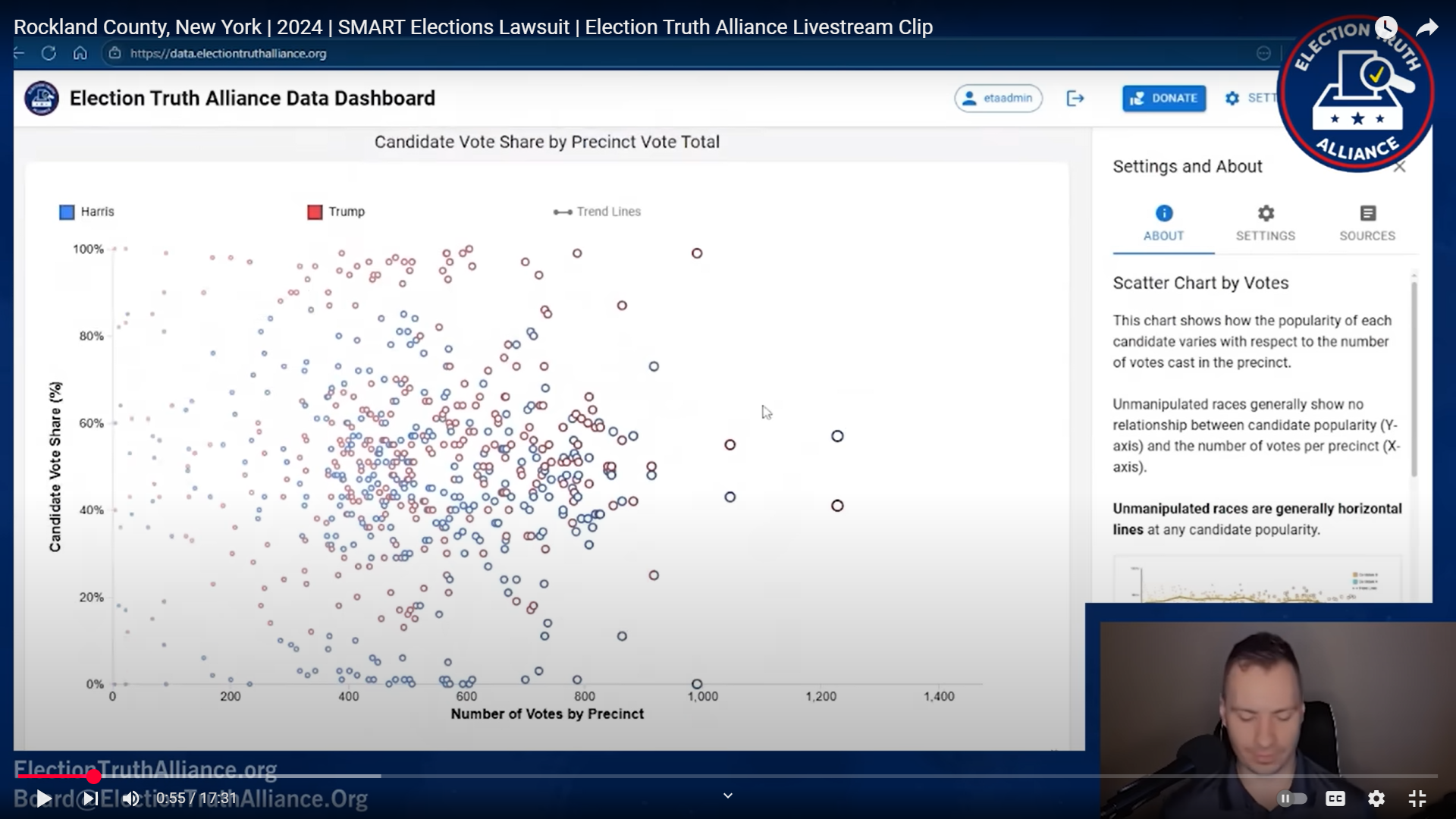
This scatter plot shows the vote shares or the main presidential candidates (Harris and Trump) by the number of total votes by precinct. The speaker points out that most of the precinct vote shares seem to be distributed fairly normally, centered arount 50 percent, but that there are a number of Harris vote shares are very low, close to zero percent and a number of Trump vote shares are very high, near 100 percent.
It is possible to check these numbers in the Python Shiny application at https://econdata.shinyapps.io/voting_data1/. Going to that URL and selecting NY for STATE should set the default selections of 2024 for YEAR, 1105_GE_vtype for ELECTION, Rockland for COUNTY, Total for VOTETYPE, and U.S. President for OFFICE. Those selections will display the following plot:
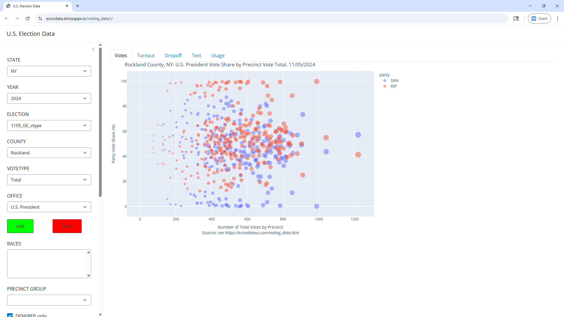
As can be seen, this plot looks to be very nearly identical to the one from the Election Truth Alliance video. In addition, the precincts for which the Harris total vote share was close to zero can be found via the following steps:
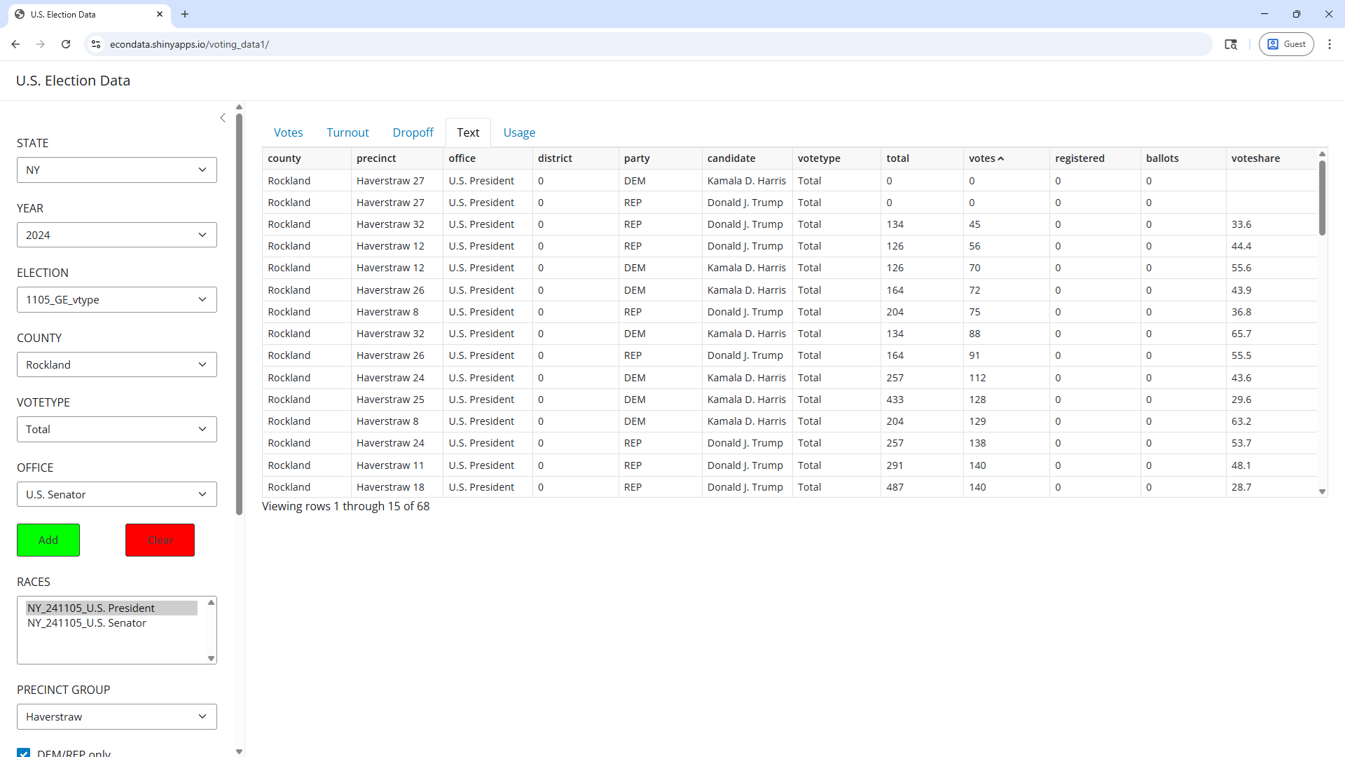
- Click on the Text tab. This displays a table showing key info for all of the data in the plot.
- Click once on the voteshare title in the upper right of the table. A down arrow (v) appears next to the voteshare title to indicate that the table is now sorted from the highest to lowest voteshare.
- Click again on the voteshare title. An up arrow (^) now appears next to the voteshare titles, indicating that the table is now sorted from the lowest to highest.
- Scroll down the table past the rows with zero for total and votes and blanks for voteshares. These are missing values, explained in a later section.
Scrolling past the missing values will display the following:
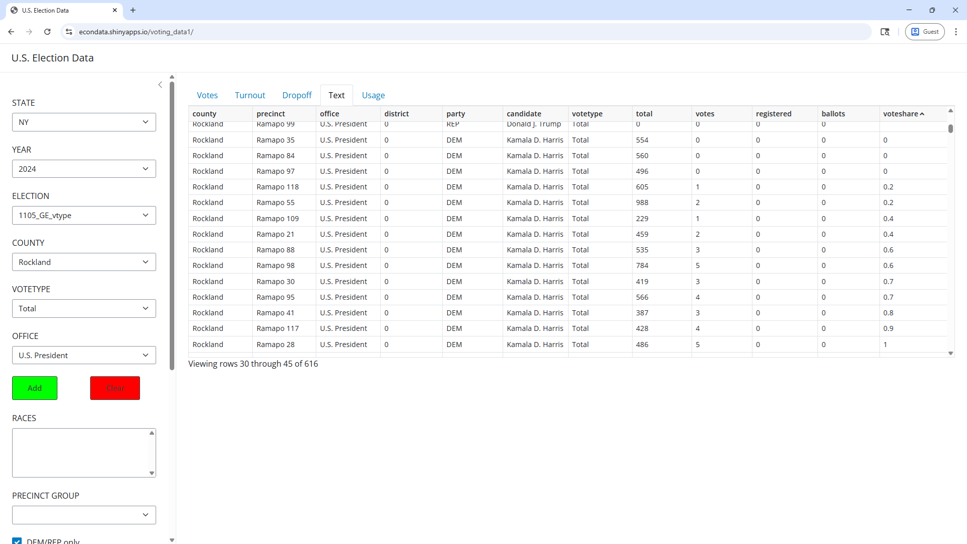
As can be seen, the lowest 14 vote shares are all for Kamala Harris and occurred in Ramapo precincts. Three had zero votes for Harris and another 10 were below 1 percent.
The code for the Python Shiny application at https://econdata.shinyapps.io/voting_data1/ can be found at https://github.com/rdavis27/voting_data. Using this code, the application can be run locally as well.
On June 10, 2025, Newsweek posted an article titled "2024 Election Results Under Scrutiny as Lawsuit Advances". Following is an excerpt from that article:
Max Bonamente, a professor of physics and astronomy at the University of Alabama in Huntsville and the author of the Statistics and Analysis of Scientific Data, said in a paper that the 2024 presidential election results were statistically highly unlikely in four of the five towns in Rockland County when compared with 2020 results.
Further on the article states:
Max Bonamente said in a paper on the voting data from Rockland County: "These data would require extreme sociological or political causes for their explanation, and would benefit from further assurances as to their fidelity."
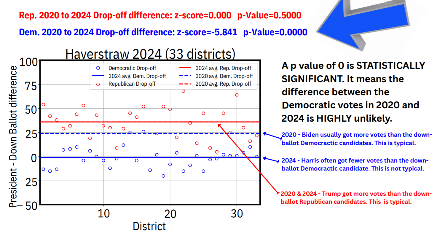
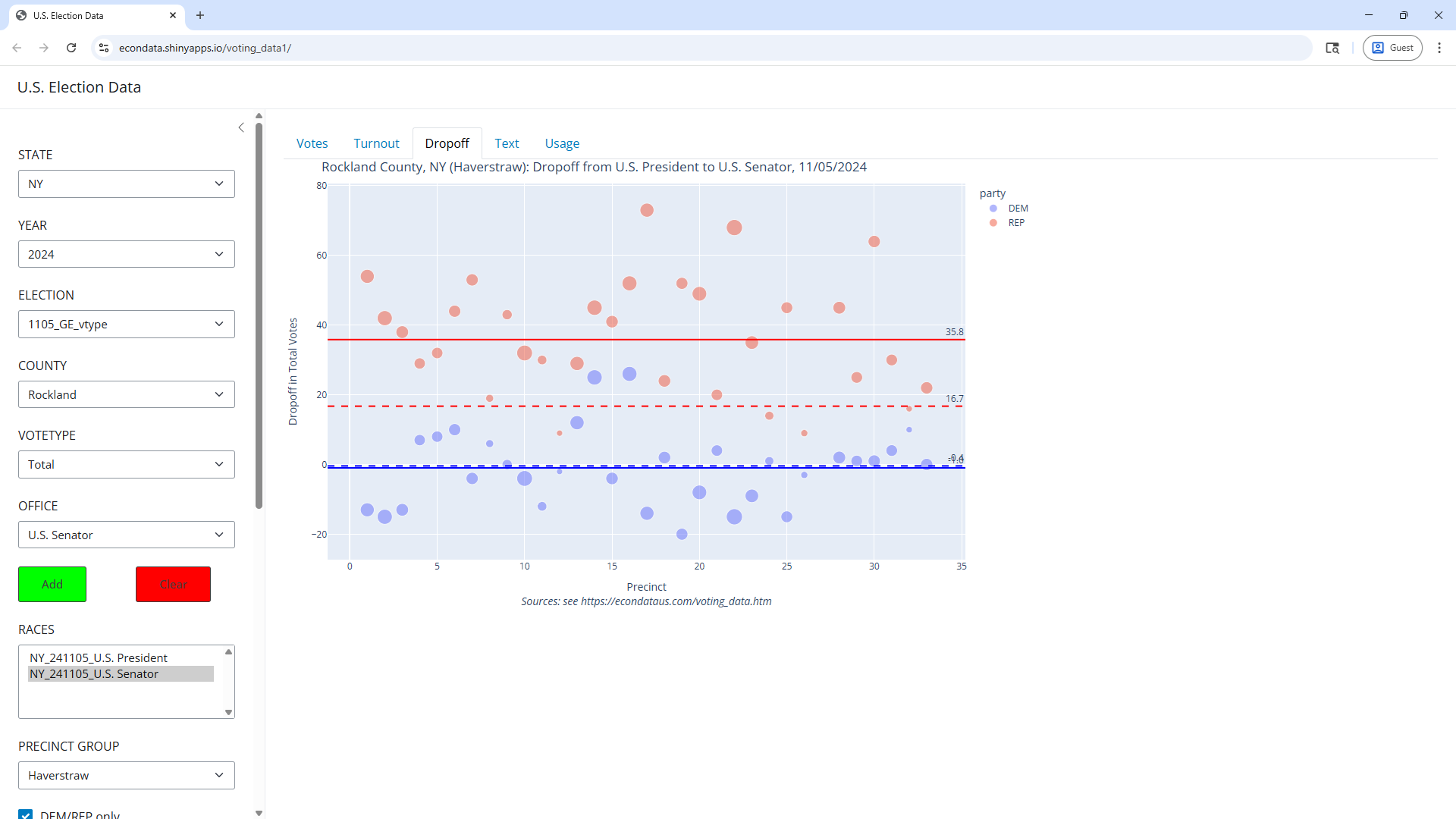
the paper contains plots showing the drop-offs in the 87 precincts of Clarkstown, 33 precincts of Haverstraw, 51 precincts of Orangetown, and 14 precincts of Stony Point. Following is the plot for the 33 precincts of Haverstraw:
This plot can likewise be reproduced in the Python Shiny app. However, because it involves data from two races (the Presidential and Senate races), they cannot be fully defined by the STATE through the OFFICE select lists as these select lists can only specify one race at at time. Instead, the two races can be specified as follows:
This should produce the following plot:
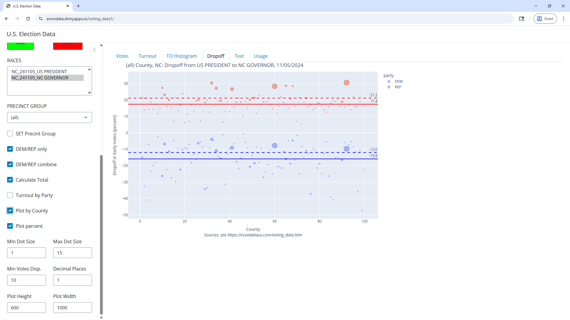
The solid blue and red horizontal lines in the plot above are labelled -1.0 and 35.8, respectively. These appear to match the solid lines in the paper. They are the average drop-offs and are calculated by taking the sums of the precinct drop-offs divided by the number of precincts, calculated separately for the Democrat (blue) and Republican (red) candidates. However, the dashed blue and red horizontal lines are labelled -0.4 and 16.7 and are the drop-offs for the entire precinct group. These are the drop-offs that are commonly cited. For example, an article in the Economic Times states the following:
A drop-off of 1-2% is considered normal. In Rockland County, however, analysts found figures that were anything but. Harris received 9% fewer votes than Gillibrand-a negative drop-off rate-while Donald Trump received 23% more votes than the Republican Senate candidate.
If you switch PRECINCT GROUP to "(all)" and expand the graph on the area containing the horizontal lines, you'll see that the dashed lines are at -8.4% for Harris and 22.7 percent for Trump, pretty much equal to the numbers in the excerpt above.
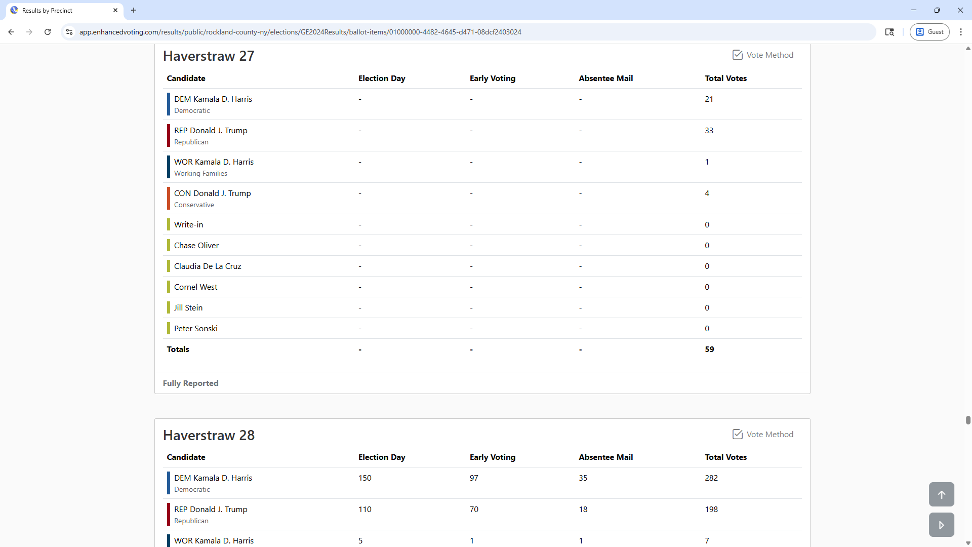
A careful comparison of this plot with the one from the paper above shows that all of the location of all points appear to be identical except for precinct 27 which is missing in the above plot. Clicking on the Text tab and "NY_241105_U.S. President" in the RACES select list and then pressing the votes title twice will display an up arrow next to the votes title indicating that the table is now sorted from the lowest to the highest number of votes as seen below:
As can be seen, precinct Haverstraw 27 shows zero votes for both Harris and Trump. By the way, you can get a plot that more closely resembles that in the paper by clicking back on the Dropoff tab, unchecking the "Dot Size by Total" checkbox, and changing "Max Dot Size" to 10. This should display the following plot:
The next section looks at the source of the Rockland County data and the reason that precinct Haverstraw 27 shows zero votes.
The reason that precinct Haverstraw 27 shows zero votes for both Harris and Trump is likely due to the original source data. The source for the Rockland County data is the JSON file that can be downloaded by clicking the "Media Export" link at the bottom of Rockland County's Election Night Reporting page for that election or the a corresponding Result Reports page. The contents of this JSON file can be viewed by opening it in a Chrome browser and clicking on the Pretty-print checkbox in the upper left. Searching for "Haverstraw 27" and going to the first occurance will show the following contents:
As can be seen, Rockland County's ENR page shows Total Votes for precinct Haverstraw 27 but does not show the vote countes for Election Day, Early Voting, and Absentee Mail. This program takes it's input from CSV files in which the columns are county, precinct, office, district, party, candidate, votes, and votetype and each row contains the number of votes for each case of the other columns. The current program that converts the original JSON file to this type of CSV file only grabs the data for the votetypes of Election Day, Early Voting, and Absentee Mail and calculates the total votes by summing the votes for these 3 votetypes. I plan to change this program to grab the total votes shown above. This should fix this particular problem of missing data in very small precincts.
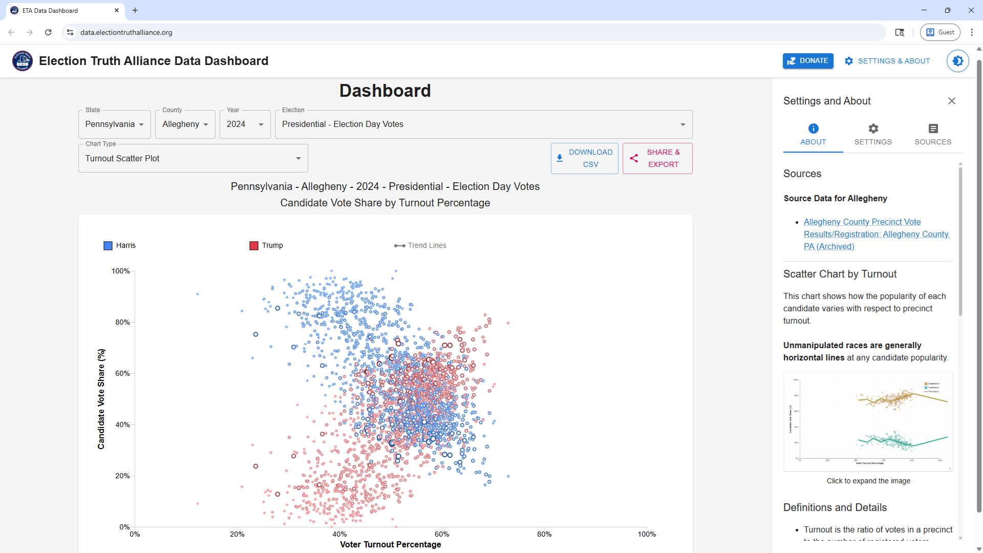
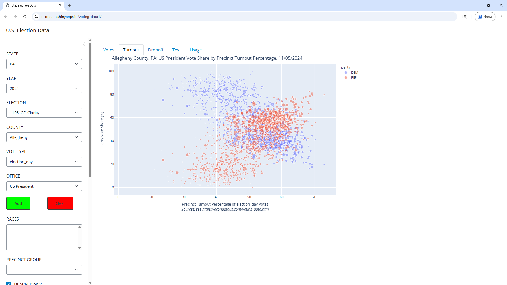
The Election Truth Alliance has a data dashboard that can be used to explore various sets of U.S. election data. For example, candidate vote share versus voter turnout percentage of Allegheny County, Pennsylvania in the 2024 presidential election can be viewed via the following steps:
This plot can be reproduced in the Python Shiny app via the following steps:
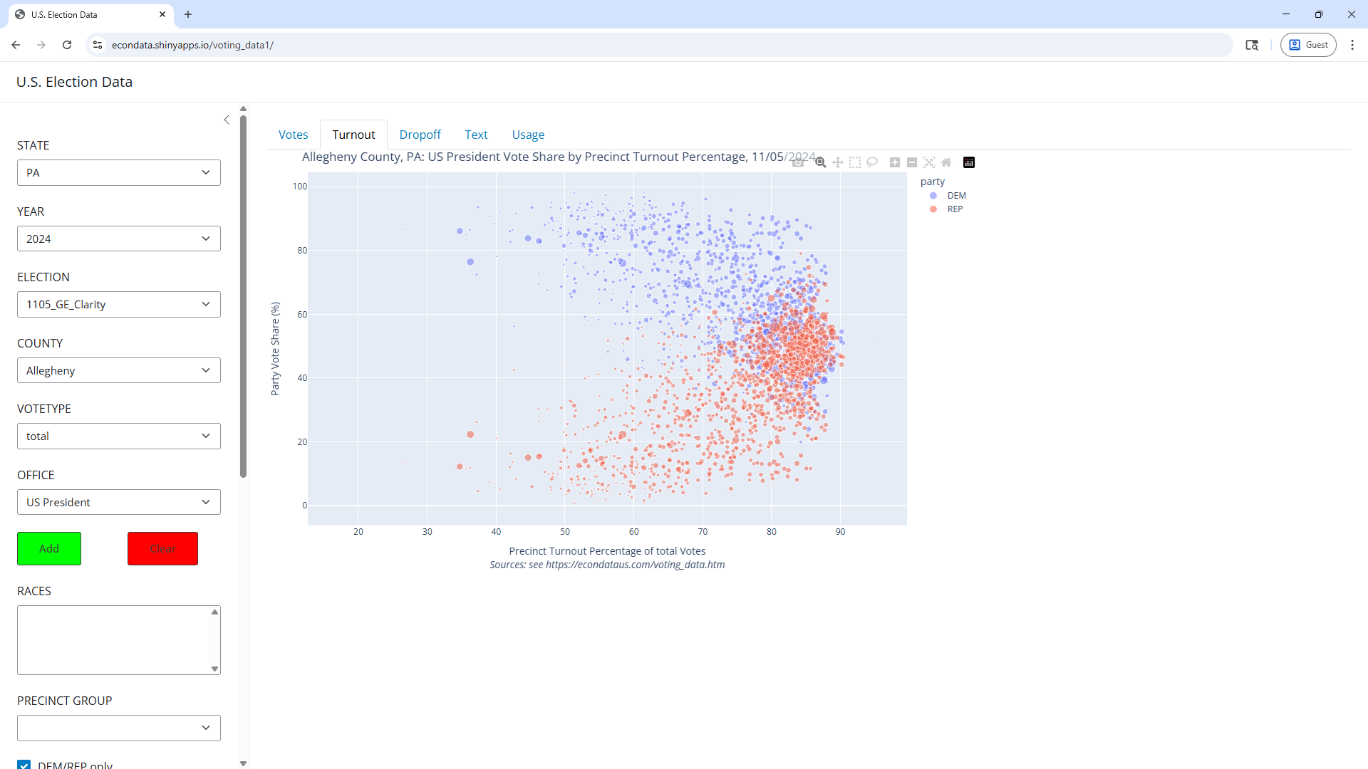
As can be seen, this appears identical to the plot created by the ETA dashboard with nearly all precincts having a turnout under 70 percent. However, this only includes the election day votes. Changing VOTETYPE to total displays the following plot:
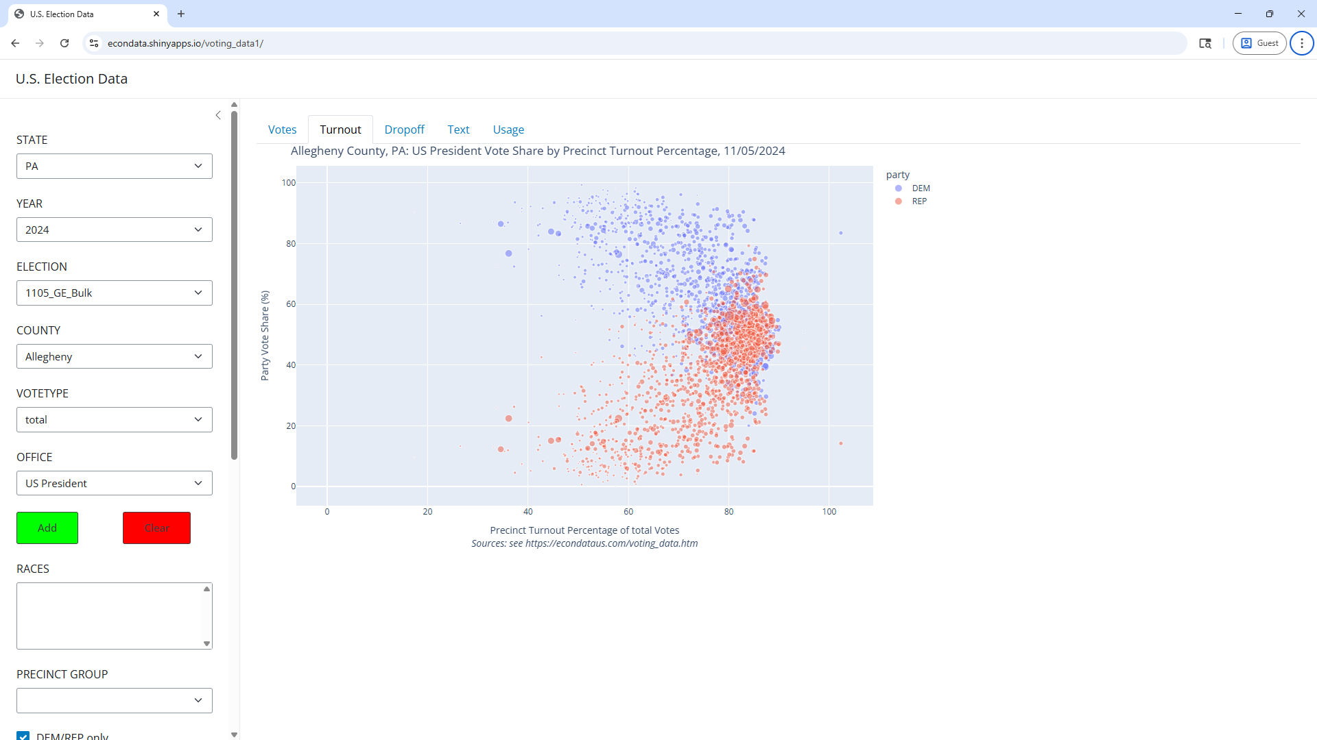
As can be seen, the turnout in many precincts is now up to 90 percent. This same basic data can be viewed by changing ELECTION to 1105_GE_Bulk and setting COUNTY to Allegheny. This displays the following plot:
As can be seen, this plot looks nearly identical. However, it can be seen that there is now a precinct with a turnout over 100. Hovering over the blue or red dot shows this to be precinct 11760.
The data for the first plot was obtained by going to the Clarity Election Night Reporting page and clicking on the Detail XLS link in the right panel. The data for the second plot was obtained by going to a Historical Elections Data on the Pennsylvania government site and clicking on the Download the 2024 General Voter Election Returns Precinct Data link.
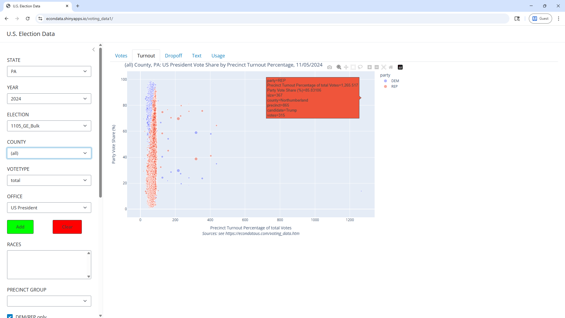
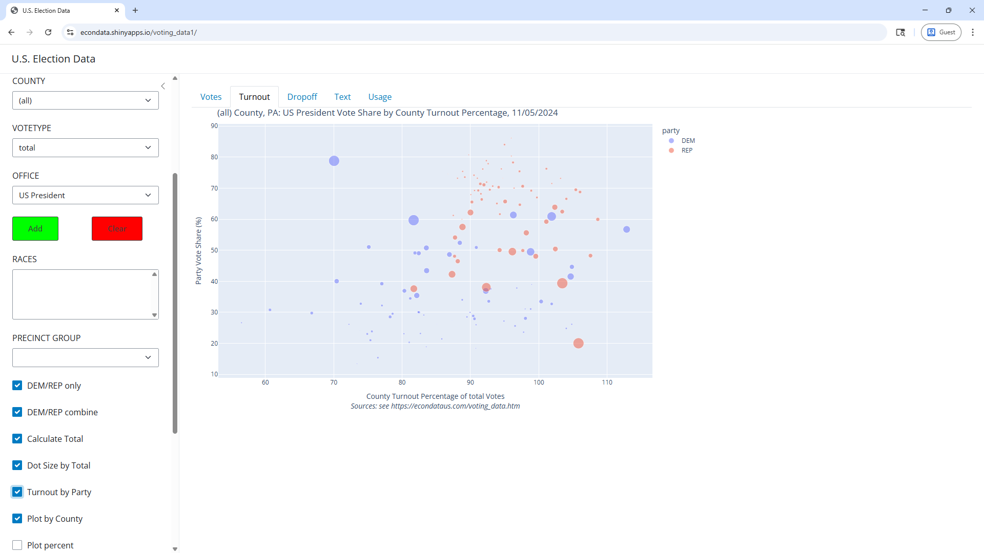
Changing COUNTY from Allegheny to "(all)" in the last plot of the prior section will display turnout information for all of Pennsylvania. To recount, following are all of the steps:
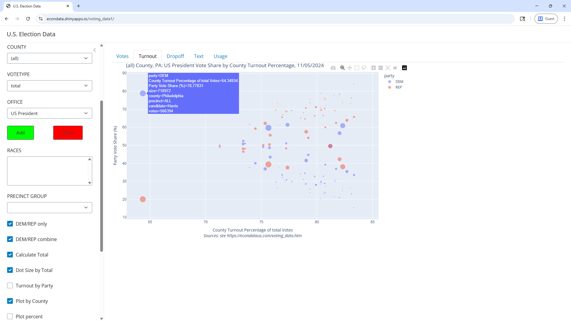
As can be seen, there are now a number of precincts with turnouts above 100 percent. The blue and red points for precinct 11760 in the last plot of the prior section can be seen just over 100 percent turnout at voteshares of slightly over 80 percent and just under 20 percent. The hover popup shows that precinct 865 of Northumberland County shows a turnout of over 1,265 percent! In fact, the precincts showing over 100 percent turnout are likely special precincts that accept ballots from voters who did not register in that precinct. Hence, it may be best to look at the turnout by county. Checking the "Plot by County" checkbox will diplay the following plot:
As can be seen, the county turnout percentages appear to be between 64 percent and 85 percent. As visible from the hover popup, Philadelphia County has the lowest turnout by far of about 64.35 percent.
One notable thing about the Bulk Data on which this plot is based is that it contains registration data by precinct and party. The Clarity data specified by the ELECTION setting of 1105_GE_Clarity has registration data but only by precinct, not by party. The turnout by party can be viewed by checking the "Turnout by Party" checkbox. This causes the following plot to be displayed:
This plot calculates the turnout under the assumption that all registered voters vote for the party for which they registered, at least on average. This, of course, may vary widely from the actual case. Still, it may be worth looking further at cases where the turnout by party is exceptionally low or high. In this plot, the Democrat and Republican turnouts for Philadelphia County were about 70 and 106 percent, respectively. This does seem odd since the overall turnout was about 64 percent. This could have been effected due to an exceptionally low turnout as measured for third-party candidates. Still, it would be worth checking these numbers against the original election data to make sure that they are correct.
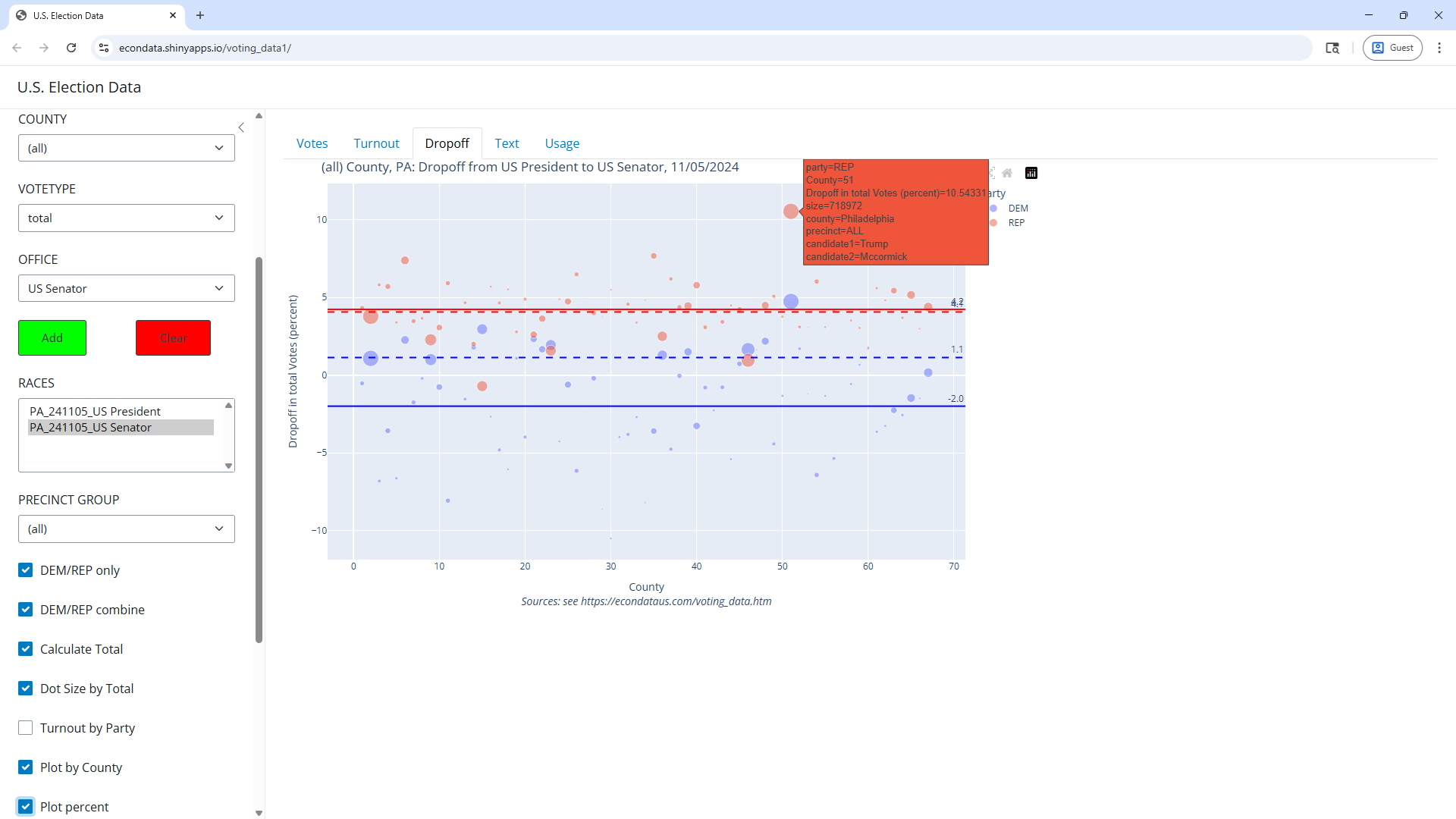
The following steps can be followed to look at the dropoff for all of Pennsylvania:
The counties are numbered in alphabetical order such that Allegheny County is 2 and Philadelphia County is 51. The numbers above the solid horizontal lines indicate that the average Republican dropoff was 2149.1 votes per county and the average Democrat dropoff was 577.9 votes per county. Multiplied by 67, the numbers of counties in Pennsylvania, gives total Republican and Democrat dropoffs of about 143,990 and 38,719, respectively.
Checking the "Plot percent" checkbox at this point will display the following plot:
As seen, the dashed lines are numbered 1.1 percent for Democrats and 4.1 percent for Republicans. This pretty much matches the 1.13 and 4.07 percent dropoffs listed for Pennsylvania on the Smart Elections web site.
Election data from the 2024 U.S. presidential election in Texas can be viewed via the following steps:
In the labels and the steps above, CDP refers to the Capitol Data Portal, the source of the data, at https://data.capitol.texas.gov/topic/elections. The About tab at that page states the following:
The data from each election in this directory are reported by 2024 general election VTDs (voter tabulation districts). VTDs are geographic approximations of voting precincts and are used to provide links among the census geography used to build districts, census population data, and election data. The Comprehensive Election Datasets resource provides a compressed file with all available election data reported by the 2024 general election VTDs, as well as compressed files with all available data for each earlier vintage of VTDs from this decade.
These datasets are developed and complied by the Research Division of the Texas Legislative Council for redistricting purposes; they are derived from election returns provided by the counties and the office of the secretary of state. There may be small differences between the data presented here and official election results; official results should be obtained from the Texas Secretary of State and county election officials.
Hence, there may be small differences between this data and official election results. However, it is difficult to compile data for all of the 254 counties in Texas and this data serves as cose estimate.
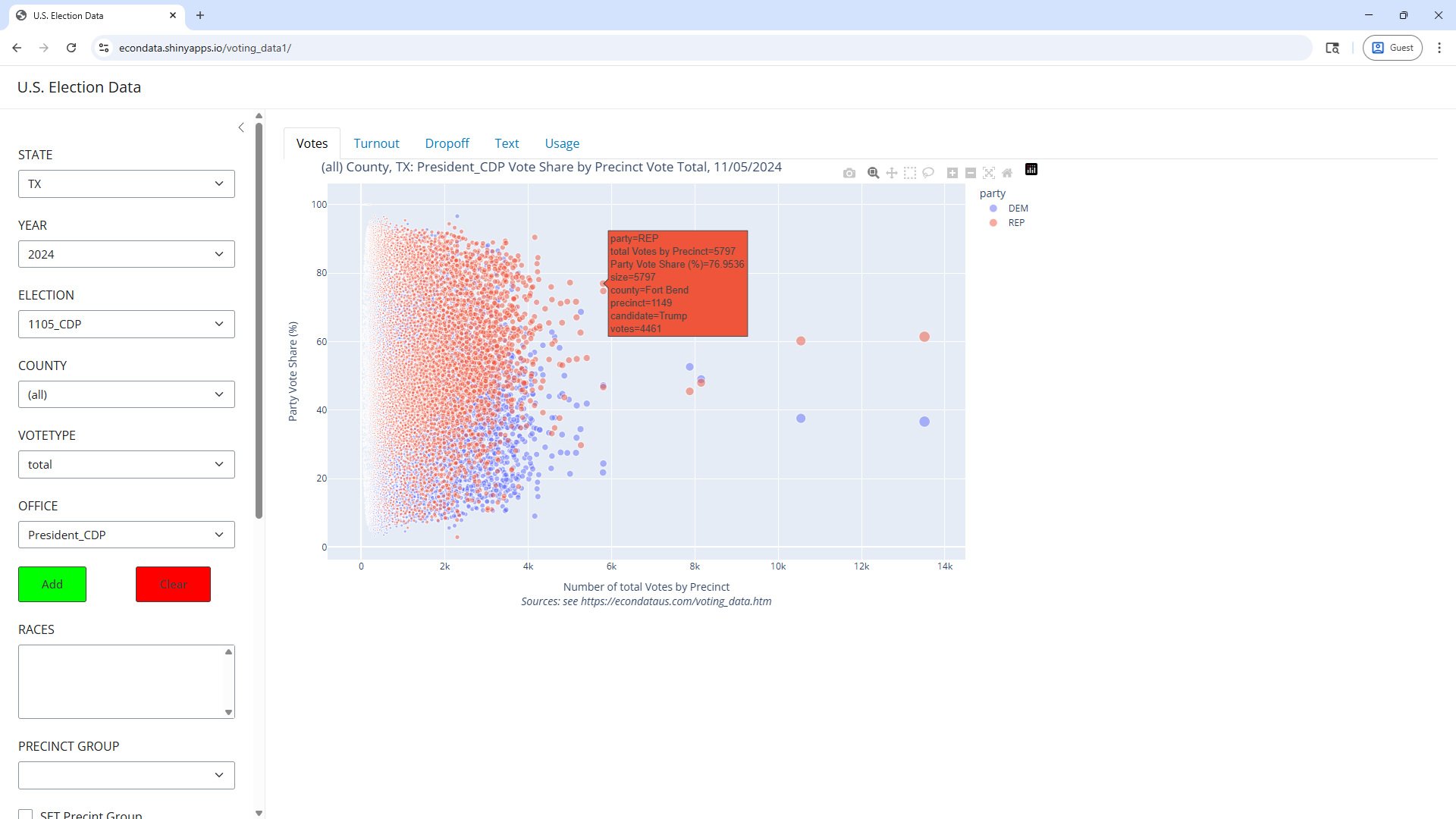
The above plot shows the Democrat and Republican votes shares of the precinct vote totals in all Texas precincts in the 2024 presidential election. Hovering the mouse just to the right of the point shown above shows that it is for a Precinct 1149 in Fort Bend County, Texas. In fact, hovering over the other points along that same vertical line (just over 6,000 votes) or to the right shows that they are all precincts in Fort Bend County except for the red point just below it and its corresponding blue point which refer to Precinct 215A in Hunt County, Texas. An article titled "Fort Bend County Commissioners have violated Texas Election Code in redistricting voting precincts" states the following:
According to the Texas election code, voting precincts in a county with a population over 100,000 must contain no less than 100 registered voters and no more than 5,000 registered voters.
When reviewing the Fort Bend County Registered Voter data procured from the FBC Election Office on November 4, 2024 it was found that out of 174 voting precincts there are a total of 37 precincts that do not meet compliance (nearly 21% of the voting precincts), Morgan wrote in a letter to the county judge and four commissioners.
There are 33 precincts over the 5,000 threshold with most having over 6,000 registered voters. Furthermore, there are four egregious precincts that have less than three registered voters and several extremely overpopulated precincts with the most egregious being 18,579 registered voters, 14,920 registered voters and 12,550 registered voters.
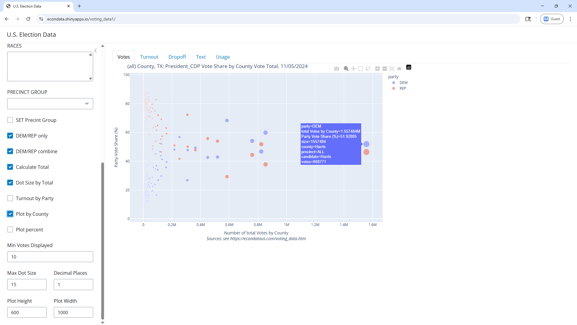
In any event, checking the "Plot by County" checkbox and hovering the mouse just to the left of the rightmost blue point should display the following plot:
As can be seen, Harris County had just over 1.55 million votes and just over 52 percent of those were for the Democrat, Kamala Harris.
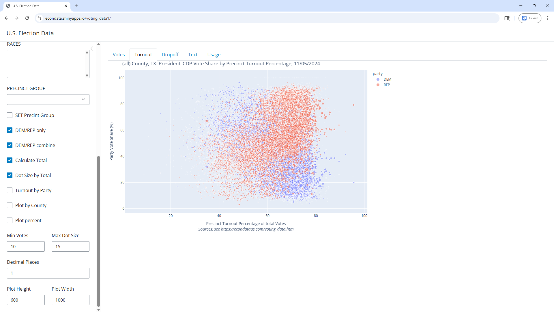
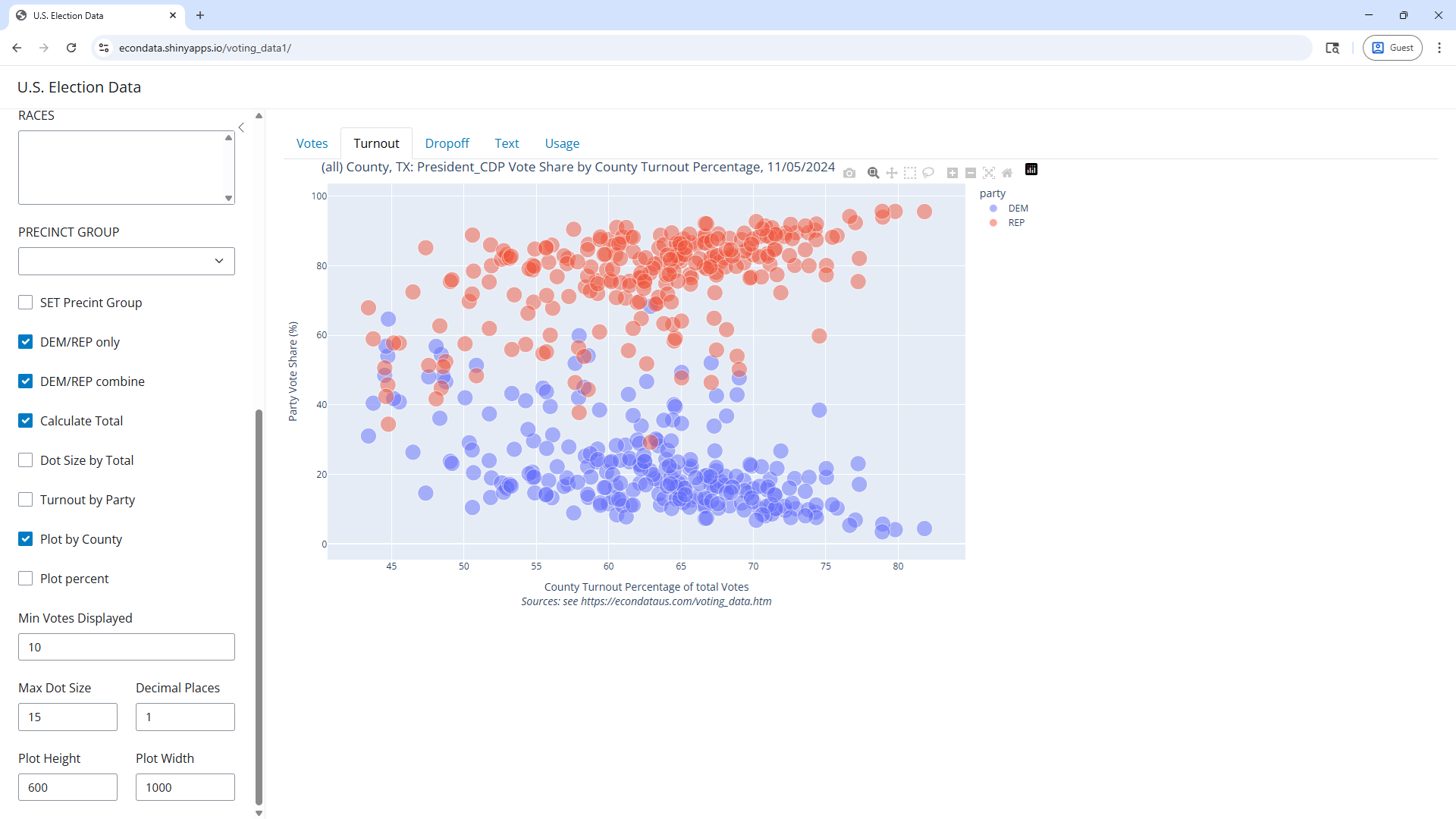
Unchecking the "Plot by County" checkbox and selecting the Turnout tab should now display the following plot:
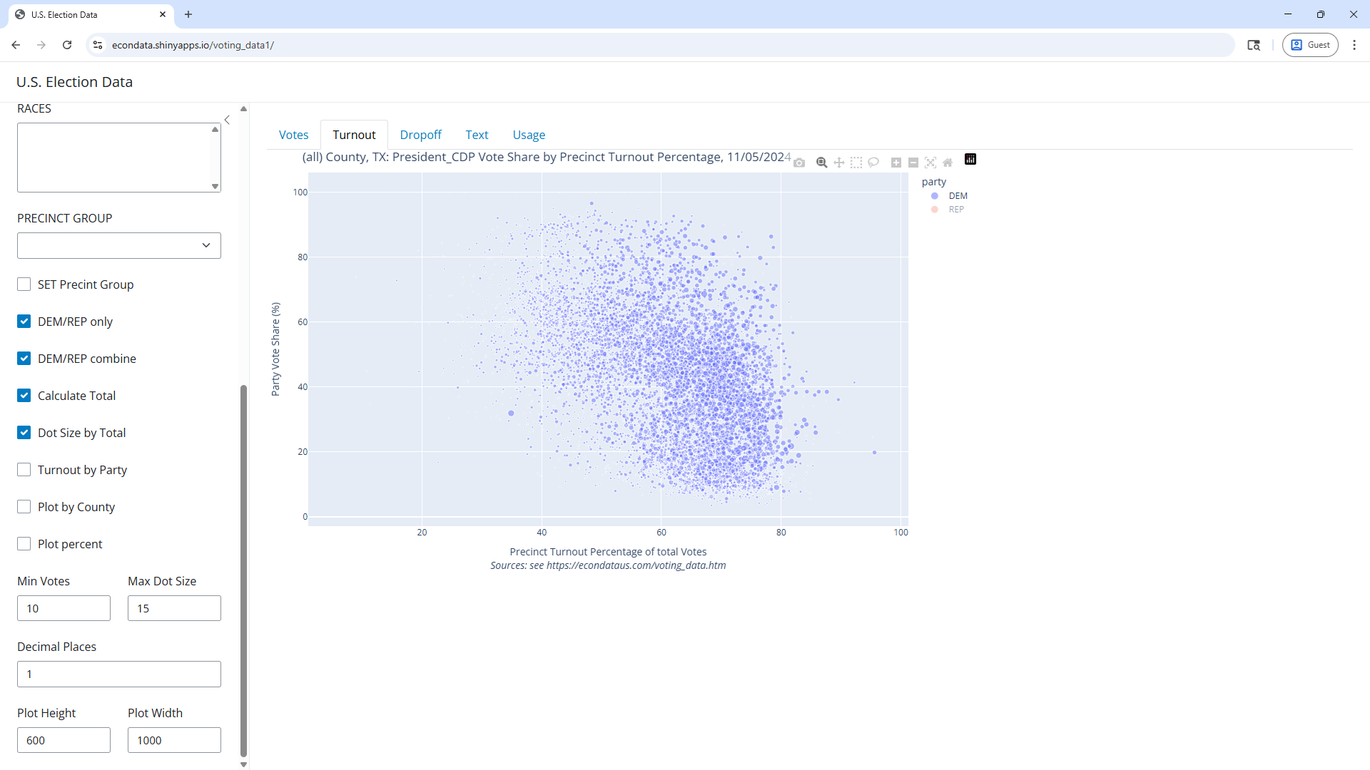
As can be seen, Trump (red) did better in precincts with high turnout and Harris (blue) did better in precincts with lower turnouts. All of the blue points can be seen by clicking on the red dot labelled REP in the upper right corner:
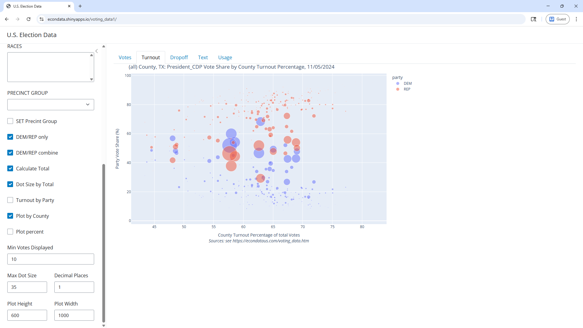
Clicking the red dot labelled REP again, checking the "Plot by County" checkbox, and increasing "Max Dot Size" to 35 should now display the following plot:
Increasing "Max Dot Size" to 35 made more of the counties visible. As can be seen. the large dots of the large counties look to be somewhat evenly distributed between Democrats and Republicans but the small counties favor Republicans with a voteshare that looks to average about 80 percent versus 20 percent. In this plot, turnouts of a few counties are visible around 75 percent and one county is barely visible at about 77 percent.
Setting "Max Dot Size" back to 15 and unchecking "Dot Size by Total" should display the following plot:
This makes all counties visible and they have turnouts as high as about 82 percent. That county on the far right is King County with 129 Trump votes, 6 Harris votes, and a turnout of 81.82 percent.
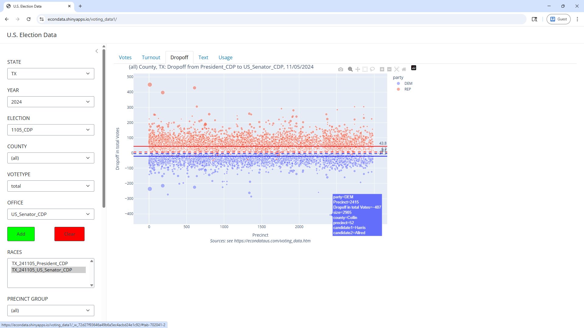
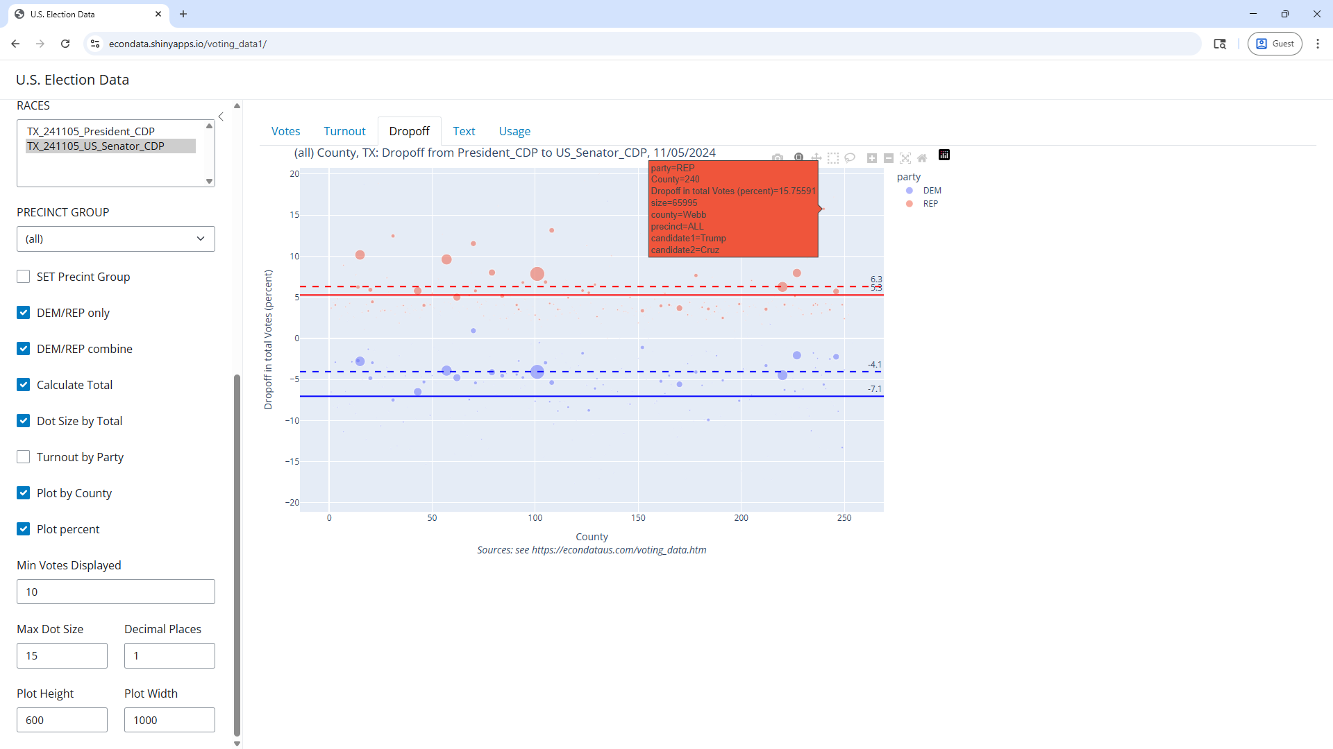
The dropoff between the Presidential and Senate candidates in Texas can be seen via the following steps:
As can be seen, the great majority if the red points and blue points are above and below the x-axis, respectively. The few that break this pattern can be seen more clearly by clicking the blue dot labelled DEM or the red dot labelled REP in the upper right corner. Hence, the great majority of precincts had more votes for Trump than for Ted Cruz, the Republican candidate for Senate. Conversely, the great majority of precincts also had FEWER votes for Harris than for Collin Allred, the Democrat candidate for Senate.
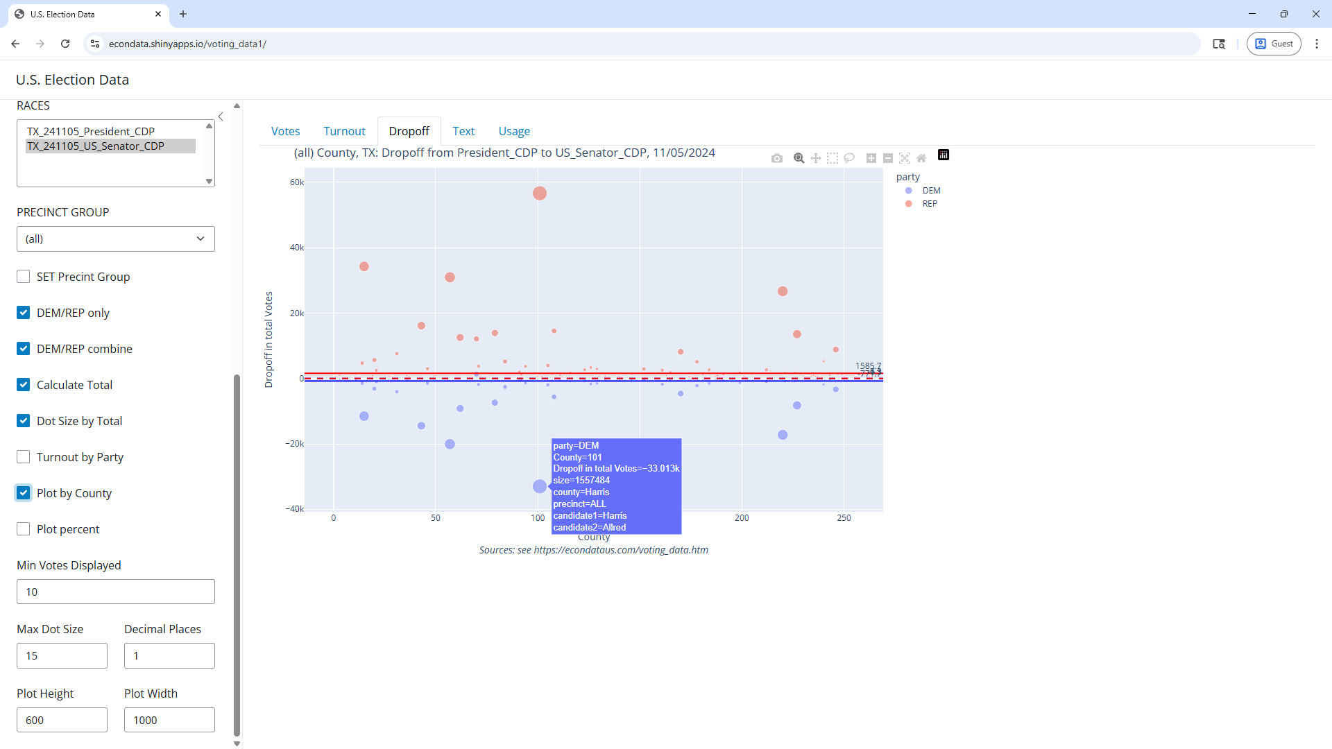
Checking the "Plot by County" checkbox should display the following plot:
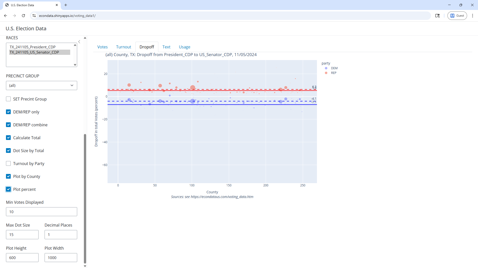
This shows the dropoff from the Presidential to the Senate candidate by county. As can be seen, Harris County had the biggest negative dropoff of over 33,000 votes (from Harris to Allred) amoung large counties. It also had the biggest increase of over 56 thousand votes (from Trump to Cruz) amoung large counties. The fact that Harris County should have the biggest positive dropoff is not too surprising since it does have more votes than any other county. But since dropoffs are usually positive from the President to any down-ballot race, the negative dropoff is somewhat surprising. In any event, checking the "Plot percent" checkbox should display the following plot:
The plot shows that the average dropoff of the Republican and Democrat candidates was positive 5.3% (Trump to Cruz) and negative 7.1% (Harris to Allred), respectively. These are calculated by taking the sums of the precinct drop-offs divided by the number of precincts, calculated separately for the Democrat (blue) and Republican (red) candidates. In contrast, the dashed red and blue horizontal lines are labelled positive 6.3% and negative 4.1% and are the drop-offs for the entire state.
By moving the mouse cursor to just above the 20 precent line on the y-axis, pressing and holding the mouse button, moving the cursor to just below the -20 percent line on the y-axis, and releasing the mouse button, you can expand the y-axis to go from -20 to 20 percent. This will result in a plot that looks close to the one below:
Now the numbers on the horizontal lines are easier to read and the position of the points can be seen in more detail.
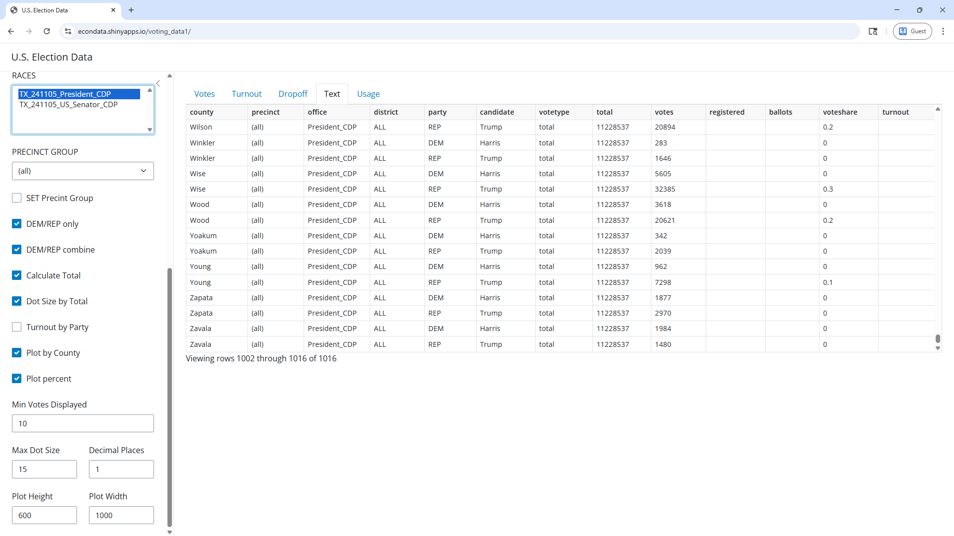
Highlighting TX_241105_President_CDP in the RACES select list, selecting the Text tab, and scrolling to the bottom of the table should result in the following view:
The number 11,228,537 in the total column shows the sum for the Democrat and Republican candidates in the 2024 Presidential race in Texas. The reason that it includes just the Democrat and Republican candidates is that the "DEM/REP only" checkbox is checked. If it were unchecked, the total would be 11,404,528. In any case, the 11,228,537 is just 310 less than the 11,228,847 total (6,393,597 Trump plus 4.835,250 Harris) shown on Wikipedia and other sources. Hence, the Capitol Data Portal numbers appear to be a very close estimate of the actual results, at least judging from the total.
Note: Additional analysis of the 2024 General Election in Texas can be found at https://econdataus.com/voting_oe24.htm#pres24tx. It uses another Shiny program but is written in R.
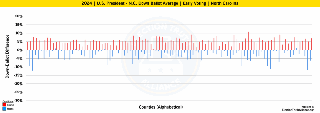
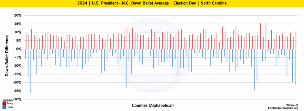
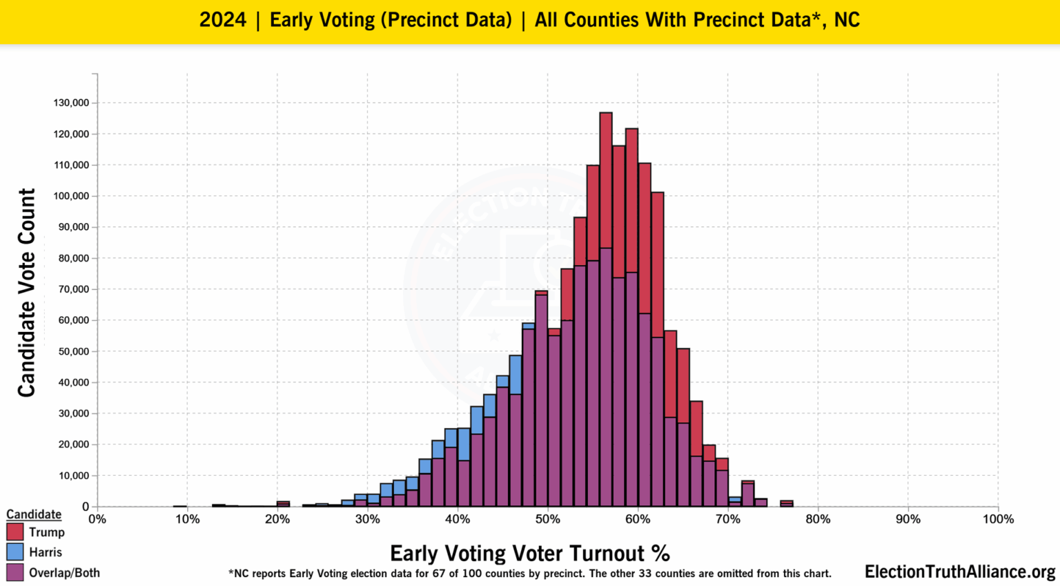
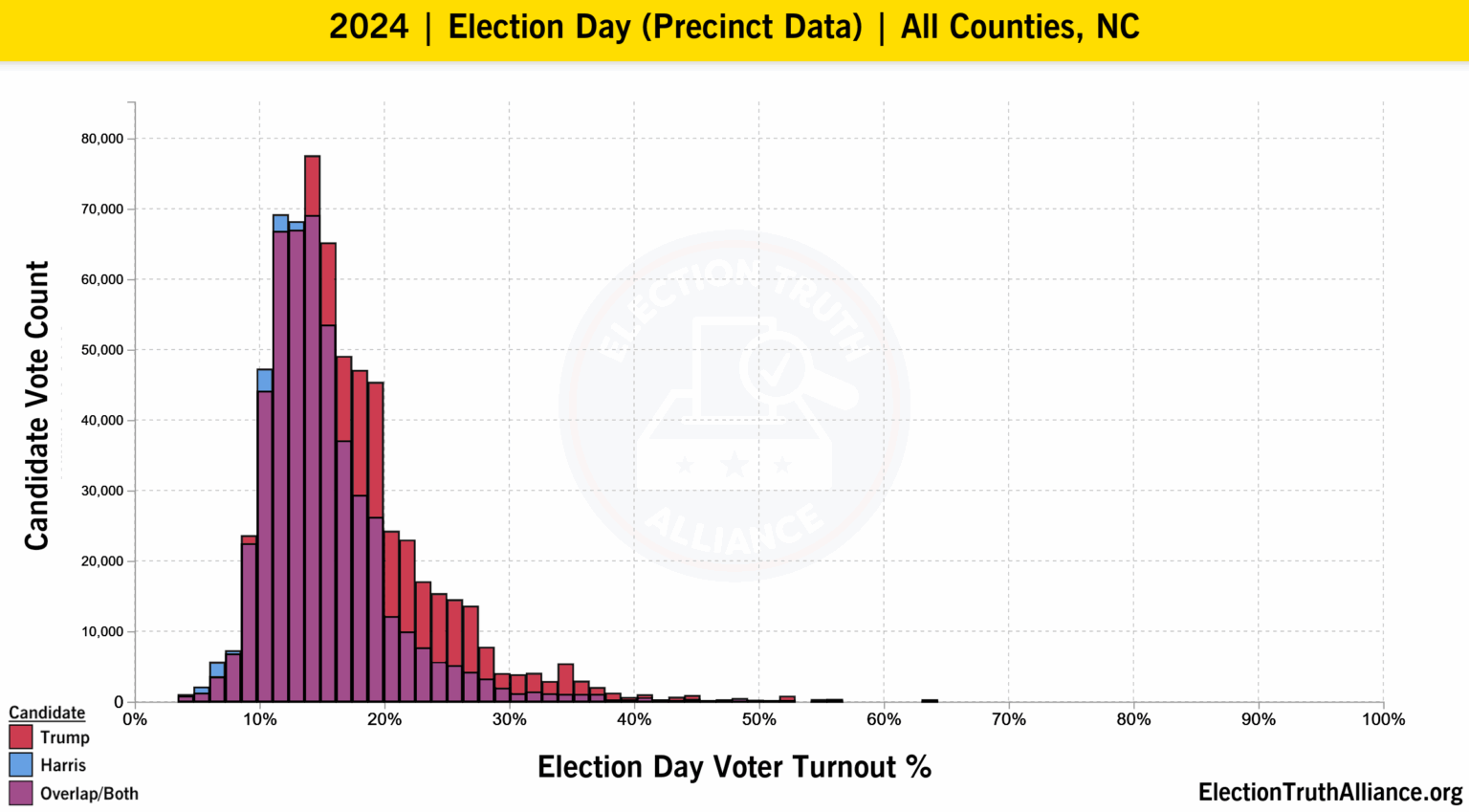
The Election Truth Alliance (ETA) posted the following two plots on an analysis titled "North Carolina | 2024 U.S. Election Analysis | Shortform":
Regarding these plots, the analysis states the following:
In many cases in North Carolina, Democratic down-ballot candidates received more votes than the Democratic candidate for President – often with an unusual degree of consistency across all counties. This is the case for both Early Voting (most common in North Carolina) and Election Day votes.
Both charts show a higher degree of consistency and uniformity than we would expect; however, Election Day down-ballot difference is particularly pronounced.
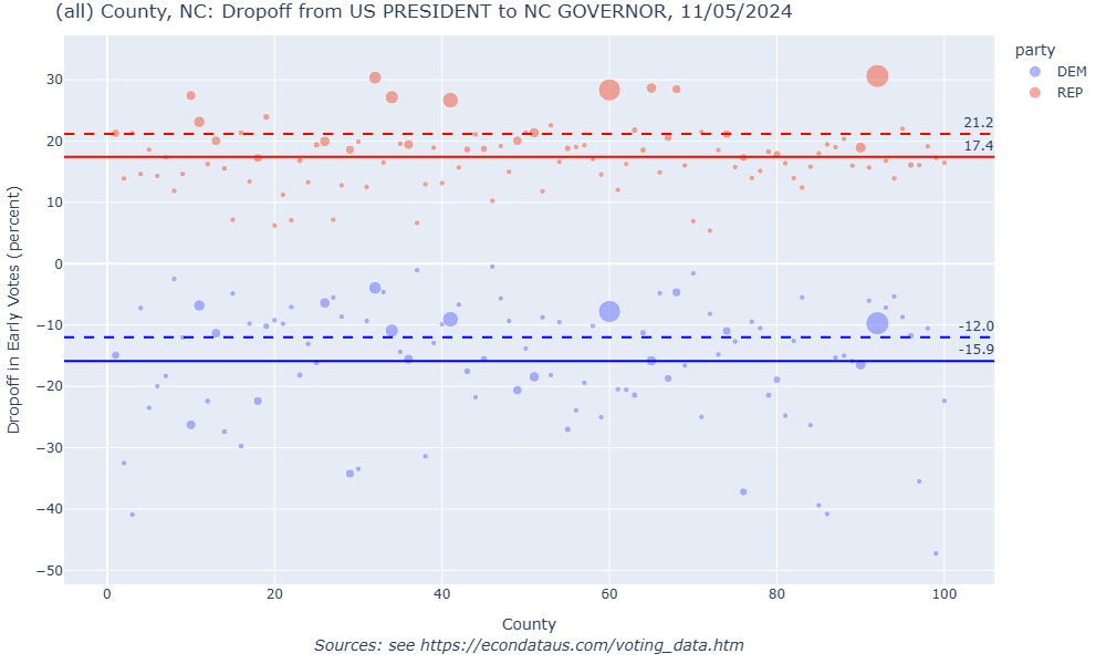
The dropoff between the Presidential and Governor candidates in North Carolins in 2024 can be seen via the following steps:
Changing VOTETYPE to ElectionDay will show the same type plot for Election Day Voting. Below are the plots for the dropoff from President to Governor for Early and Election Day voting:
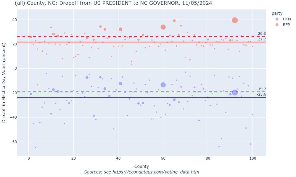
While down-ballot difference can be measured for any candidate, the ETA prefers when possible to measure down-ballot difference in relation to the next statewide down-ballot candidate – for instance, the candidate for Senator or Governor.
In North Carolina, however:
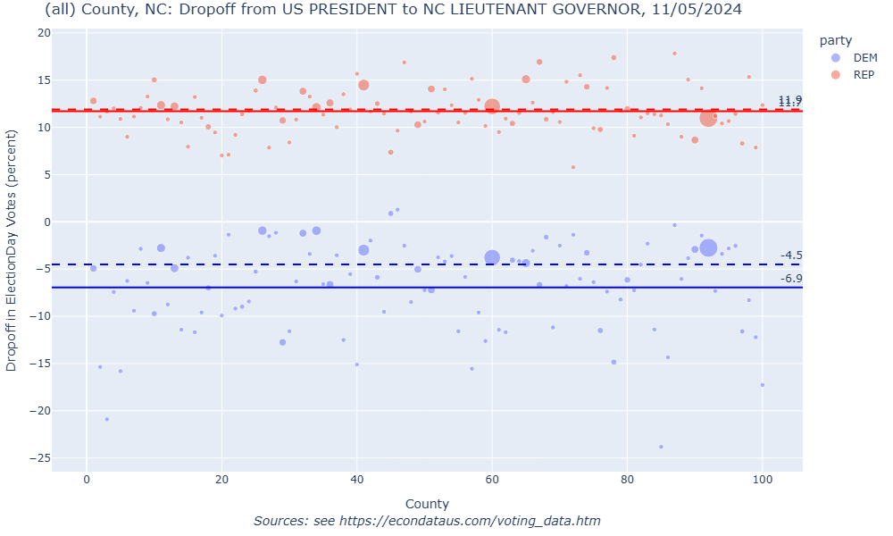
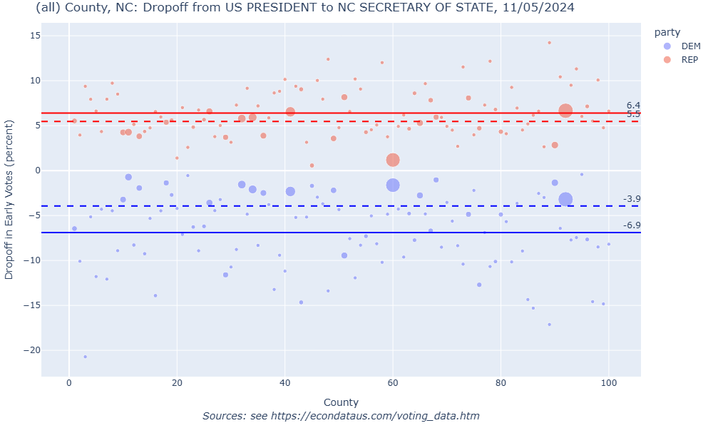
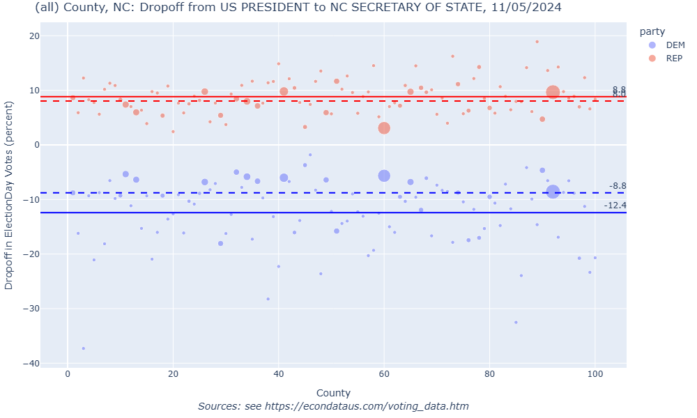
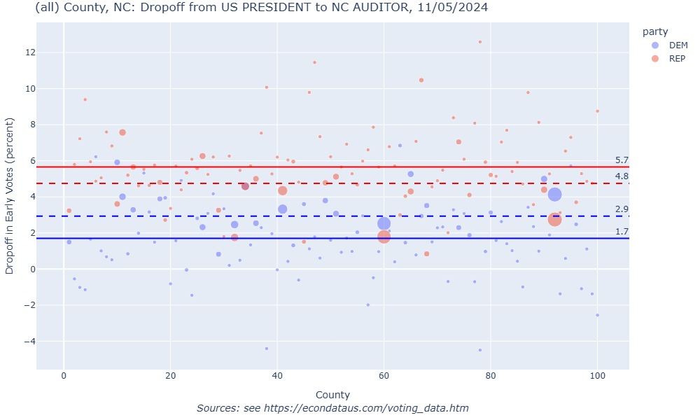
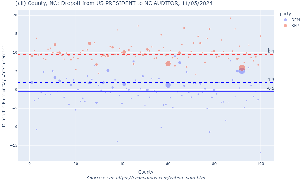
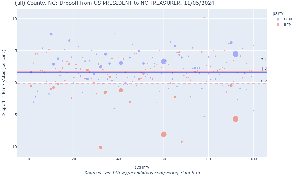
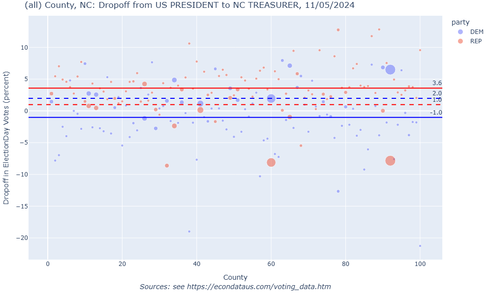
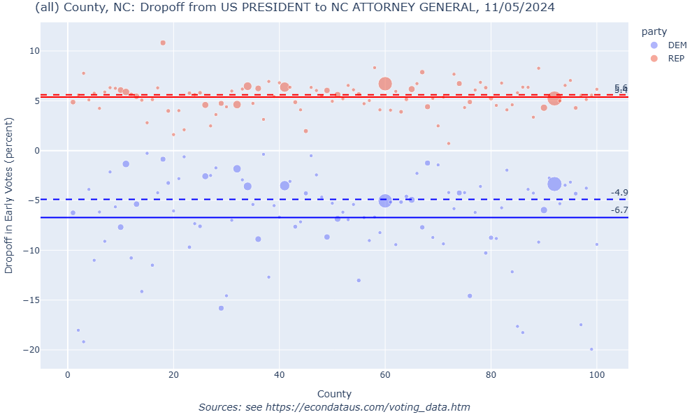
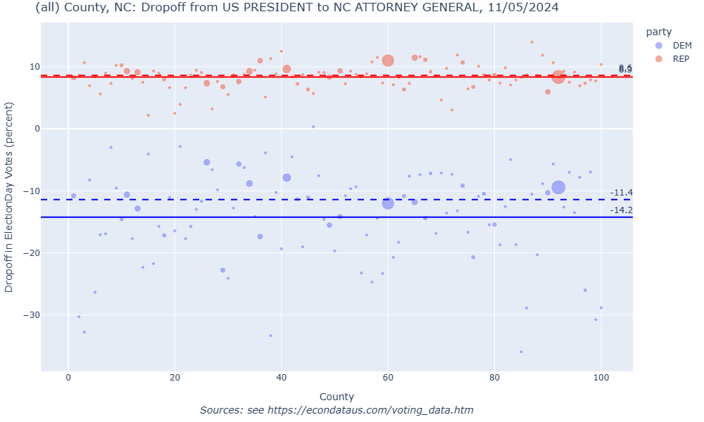
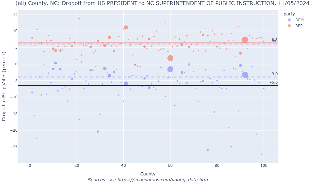
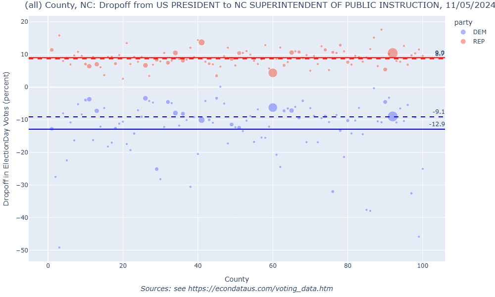
For the above reasons, the analysis looks at the dropoff between the Presidential race and the average of the next 6 down-ballots races after Governor. In order, those races are Lieutenant Governor, Secretary of State, Auditor, Treasurer, Attorney General, and Superintendent of Public Instruction. This application does not currently compute such averages but following are the plots for each of those 6 down-ballot races, both for Early and Election Day voting:
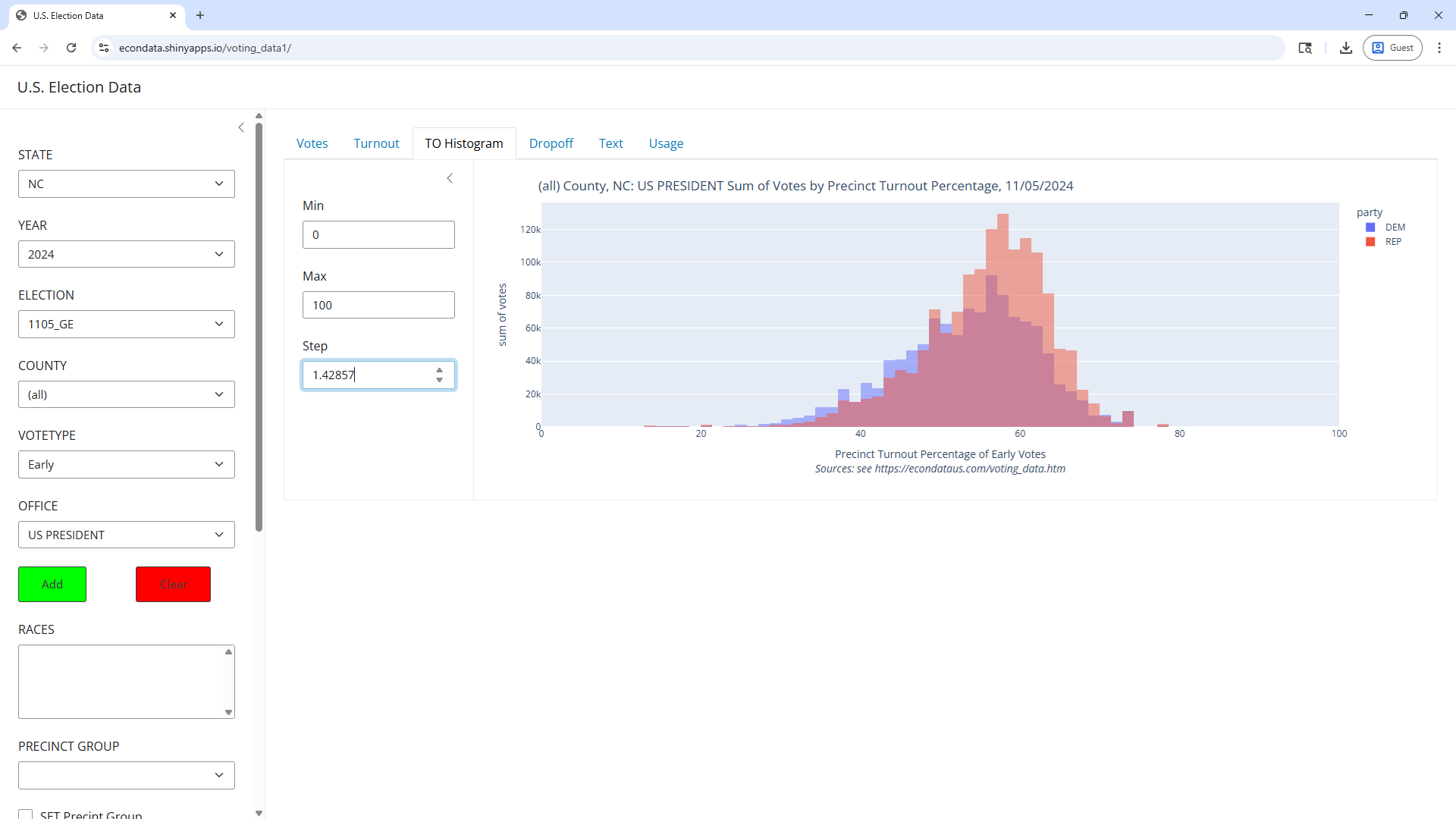
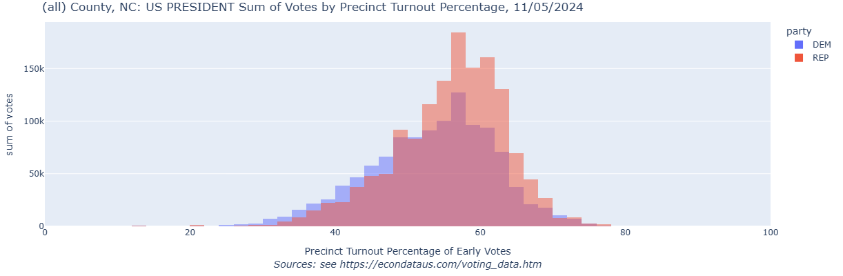
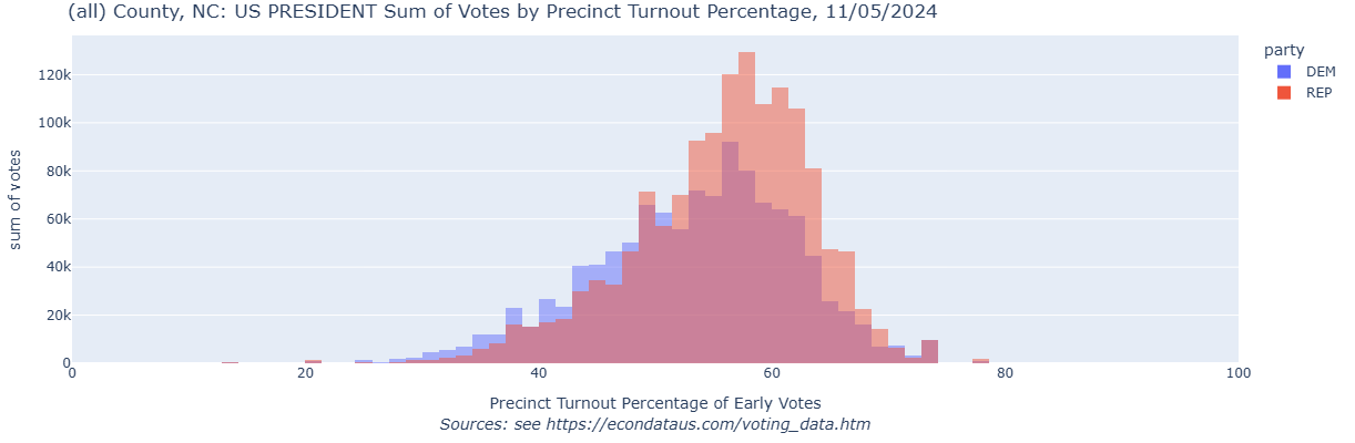
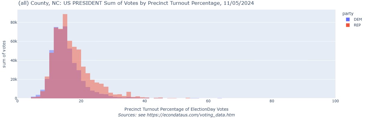
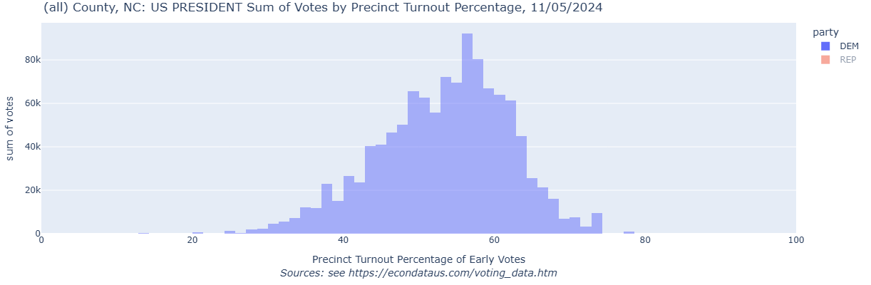
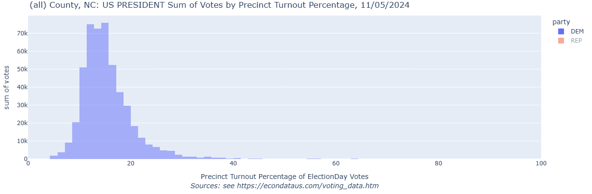
Voter turnout in the 2024 Presidential race in North Carolina can be examined via the following steps:
This histogram looks similar to the first of the following two histograms from ETA's analysis titled "North Carolina | 2024 U.S. Election Analysis | Longform":
The ETA analysis states the following in regards to these two histograms:
In North Carolina, however, the two primary methods of voting - Early Voting and Election Day - both display turnout patterns consistent with vote manipulation, albeit to different extents.
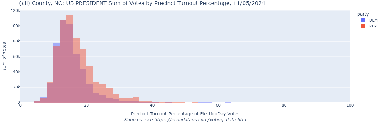
The analysis goes on to explain the reason for this. In any case, the following histogram on the left is obtained by following the prior steps (from the beginning of this section) except for setting Step to 1.42857. Changing VOTETYPE from Early to ElectionDay will then result in the histogram on the right.
Analysis of Dropoff between the Presidential and Senate races in Rockland County, New York in 2024

Source of the Rockland County Data and the Cause of Missing Data
              {
                "id": "353",
                "name": "Haverstraw 27",
                "isVirtual": false,
                "voteCount": 21,
                "reportingStatus": "Fully Reported",
                "groupResults": [
                  {
                    "groupName": "Election Day",
                    "voteCount": null,
                    "isFromVirtualPrecinct": false
                  },
                  {
                    "groupName": "Early Voting",
                    "voteCount": null,
                    "isFromVirtualPrecinct": false
                  },
                  {
                    "groupName": "Absentee Mail",
                    "voteCount": null,
                    "isFromVirtualPrecinct": false
                  }
                ]
              },
              {
                "id": "356",
                "name": "Haverstraw 28",
                "isVirtual": false,
                "voteCount": 282,
                "reportingStatus": "Fully Reported",
                "groupResults": [
                  {
                    "groupName": "Election Day",
                    "voteCount": 150,
                    "isFromVirtualPrecinct": false
                  },
                  {
                    "groupName": "Early Voting",
                    "voteCount": 97,
                    "isFromVirtualPrecinct": false
                  },
                  {
                    "groupName": "Absentee Mail",
                    "voteCount": 35,
                    "isFromVirtualPrecinct": false
                  }
                ]
              },
This shows a total voteCount of 21 for Haverstraw 27 but the voteCounts for "Election Day", "Early Voting", and "Absentee Mail" all show as null. On the other hand, all voteCounts are shown for Haverstraw 28. This is likely because the some or all of the voteCounts for specific votetypes are considered to be so low as to create privacy concerns. These voteCounts are for Kamala Harris. Searching for the next occurance of "Haverstraw 27" will show the following contents:
              {
                "id": "353",
                "name": "Haverstraw 27",
                "isVirtual": false,
                "voteCount": 33,
                "reportingStatus": "Fully Reported",
                "groupResults": [
                  {
                    "groupName": "Election Day",
                    "voteCount": null,
                    "isFromVirtualPrecinct": false
                  },
                  {
                    "groupName": "Early Voting",
                    "voteCount": null,
                    "isFromVirtualPrecinct": false
                  },
                  {
                    "groupName": "Absentee Mail",
                    "voteCount": null,
                    "isFromVirtualPrecinct": false
                  }
                ]
              },
              {
                "id": "356",
                "name": "Haverstraw 28",
                "isVirtual": false,
                "voteCount": 198,
                "reportingStatus": "Fully Reported",
                "groupResults": [
                  {
                    "groupName": "Election Day",
                    "voteCount": 110,
                    "isFromVirtualPrecinct": false
                  },
                  {
                    "groupName": "Early Voting",
                    "voteCount": 70,
                    "isFromVirtualPrecinct": false
                  },
                  {
                    "groupName": "Absentee Mail",
                    "voteCount": 18,
                    "isFromVirtualPrecinct": false
                  }
                ]
              },
This shows a total voteCount of 33 for Haverstraw 27 but the voteCounts for "Election Day", "Early Voting", and "Absentee Mail" again show as null. As before, all voteCounts are shown for Haverstraw 28. These voteCounts are for Donald Trump. The above voteCounts of 21 for Harris and 33 for Trump can be seen by going to the Rockland County's Election Night Reporting page for that election, clicking on the "View results by election district" link below the "Electors for President and Vice President" results, scrolling down to the "Haverstraw 27" section, and clicking on the "Vote Method" checkbox. This should display the following:
Analysis of Presidential Turnout in Allegheny County, Pennsylvania in 2024
This should display the following plot:
This should display the following plot:
Analysis of Presidential Turnout by County in Pennsylvania in 2024
This should display the following plot:
Analysis of Presidential Dropoff by County in Pennsylvania in 2024
This should display the following plot:

Analysis of Presidential Vote Shares in Texas in 2024
This should display the following plotx:
Analysis of Presidential Turnout in Texas in 2024
Analysis of Presidential Dropoff in Texas in 2024
This should display the following plot:
Analysis of Presidential Dropoff in North Carolina in 2024
This should display the following plot:
Analysis using Voter Turnout Histograms in North Carolina in 2024
This should display the following voter turnout histogram:
If anyone should run into any issues or have any suggestions for additional features, feel free to let me know via the Contact Form in the left margin of this page.
2024 U.S. Election