The OpenElections Project
Analyzing a Single Race with OpenElections Data
Analyzing Voter Turnout with OpenElections Data
Looking into Problems with OpenElections Data
Missing Data
Incorrectly Structured Data
Adding New Data
Analyzing a Single Race with New Data
Analyzing Voter Turnout with New Data
Comparing Multiple Races from a Single Election
Looking at the Dropoff from the Presidential to the Senate Race by County
Comparing Multiple Races from Multiple Elections
Analyzing the 2024 Presidential Election in Texas with Version 2 of Applicaton
The following summary of the OpenElections project can be found on their GitHub page:
The goal of OpenElections is to create the first free, comprehensive, standardized, linked set of election data for the United States, including federal, statewide and state legislative offices. The current options for election data can be difficult to find and use or financially out-of-reach for most journalists and civic hackers. We want the people who work with election data to be able to get what they need, whether that's for stories and data analysis or web applications and interactive graphics.
I previously created an R Shiny app for analyzing election data that is documented at this link. One major limitation, however, is that it can only analyze election data which has been parsed and stored in files that it can access. In order to address that limitation, I have taken the code from that app and modified it to access the OpenElections data online. There is a public online version of this app at https://econdata.shinyapps.io/voting_oe24/. Having been derived from the app described at this link, much of the new app's functionality will be very similar. However, the UI has had to change a fair amount. The remainder of this document will describe how to use the new app, chiefly by giving a number of examples using OpenElections data.
Analyzing a Single Race with OpenElections Data
Currently, navigating to https://econdata.shinyapps.io/voting_oe24/ will initially display the following page:
The message indicates that the user must select the desired STATE, YEAR, ELECTION, COUNTY, and OFFICE to define a race. The selections must be made in that order and each selection will generally populate the options for the next selection. Upon selection all of those items, click on the "ADD RACE" button to add the defined race to the RACES select box. In this example, the initial selections can be accepted and the user need only click the "ADD RACE" button. This displays the following page:
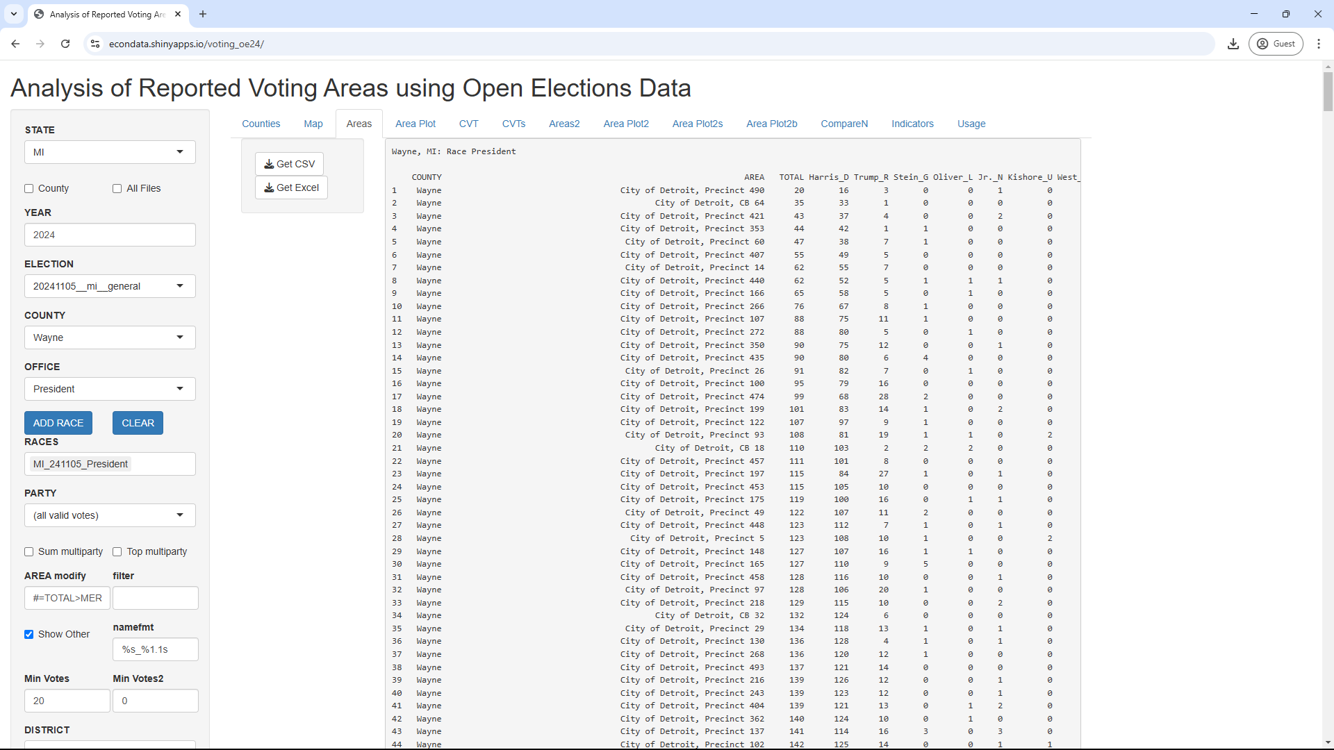
As can be seen, the columns consist of COUNTY, AREA, TOTAL, Harris_D, Trump_R, Stein_G, Oliver_L, and other Presidential candidates. Not visible are the last two columns of DEM_CVT and REP_CVT. COUNTY is Wayne in this case and AREA refers to the precinct names (except for Wisconsin where it refers to the ward names). TOTAL is the total votes and the next nine columns are the last names of the candidates followed by an underscore and a character to indicate the party. DEM_CVT and REP_CVT are cumulative vote shares used in CVTs (cumulative vote tallys).
Clicking on the "Area Plot" tab will then display the following page:
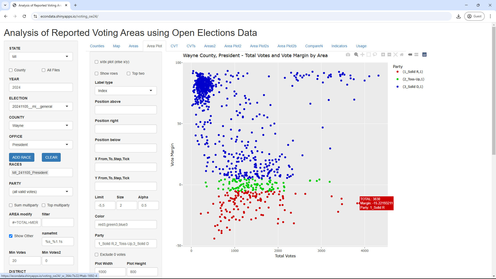
This shows the total votes versus the vote margin in every precinct in Wayne County in the President's race. Hovering over any of the precincts causes a popup to be displayed which shows the total votes and percent margin. That is the cause of the popup visible next to the precinct in the lower right. Looking at the 4th to the last entry in the list on the Areas tab shows this to be Grosse Ile Township, Precinct 1.
The plot above shows that there is a cluster of strongly Democrat precincts with 500 or less total votes in the upper left. Most of the other precincts contain up to a bit over 2,000 total votes. However, there is a string of strongly Democrat precincts with over 2,000 total votes in the upper right.
Clicking on the CVT tab will display the following page:
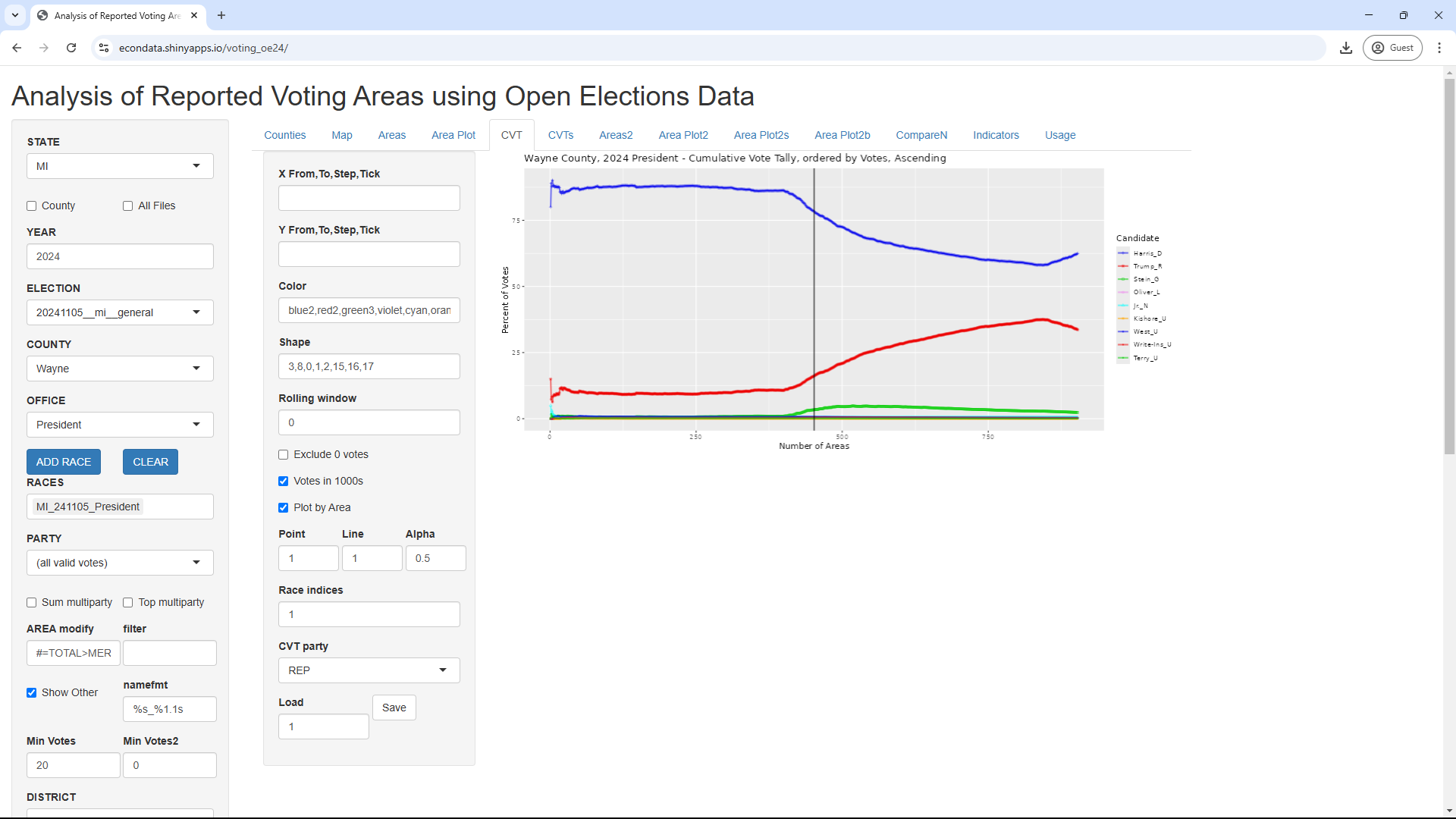
The use of CVTs (Cumulative Vote Tallies) are described at this link. The CVT plot shows that precincts with the fewest total votes tend to be strongly Democrat. However, just before the vertical midpoint line, the red line starts rising. This is due to the fact that relatively more of the mid-sized precincts lean Republican. At the very end, the red line tilts back down a bit. This is undoubtably due to the string of strongly Democrat precincts in the upper right of the prior Area Plot.
Analyzing Voter Turnout with OpenElections Data
The turnout of a single race in a single county can be displayed via the following steps:
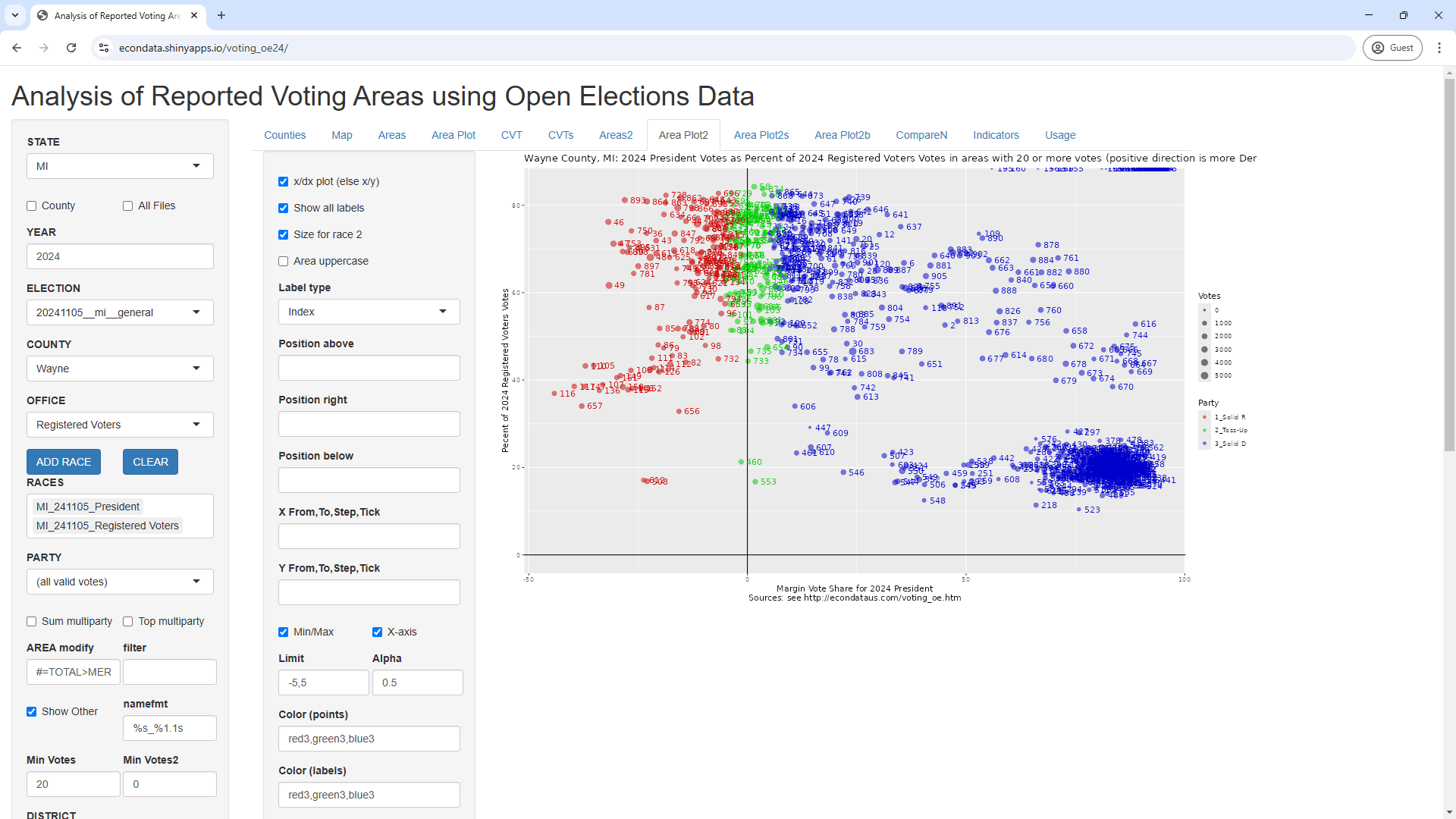
The y-axis shows the turnout in every precinct and is calculated by dividing the total votes for President by the total number of registered voters in each precinct. As can be seen, most of the precincts had a turnout between 40 and 80 percent. However, there is a clump of strongly Democrat precincts that had a turnout around 20 percent. It's hard to know the reason for this clump of low-turnout, solid-Democrat precincts without further investigation.
Looking into Problems with OpenElections Data
After following the steps in the prior section to produce the plot above, change COUNTY from "Wayne" to "Oakland". This will display the following plot:
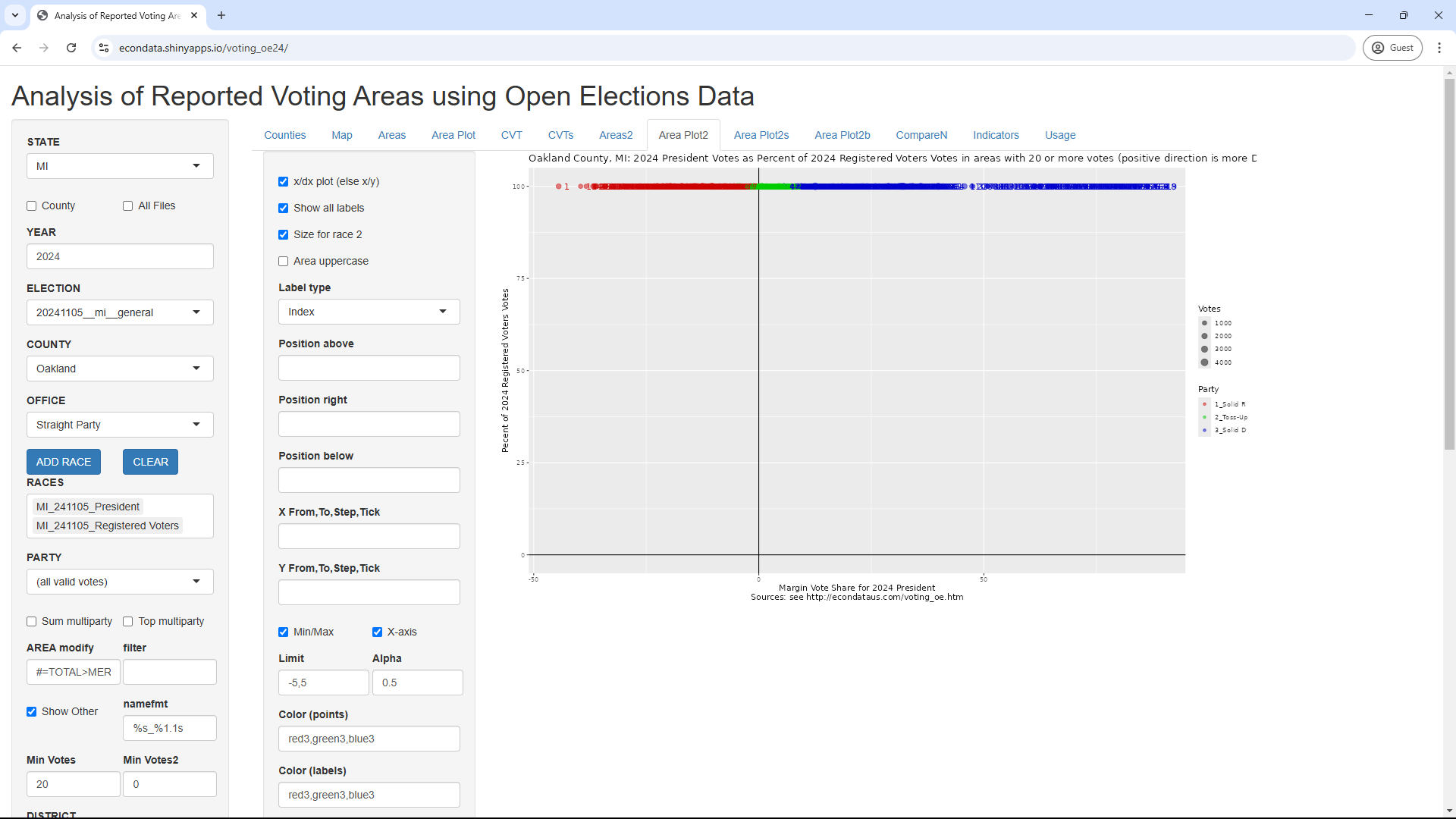
As can be seen, all of the points are now in a horizontal line at 100 percent on the y-axis. Less noticable may be that OFFICE has now changed from "Registered Voters" to "Straight Party". In fact, clicking on the OFFICE select list reveals that "Registered Voters" is no longer a selection. This is an example of a problem caused by missing OpenElections data. An examination of the OpenElections data reveals that Oakland County does not contain any "Registered Voters" data. It may be that the data was obtained from county websites and that the Oakland County website did not have data on registered voters. In any case, all of the counties that are missing data on registered voters can be found via the following steps:
MI: 2024 President Votes as Percent of 2024 Registered Voters Votes (Percent ratio)

           COUNTY   AREA   Dem   Rep MARGIN1 TOTAL1 Dem.1 Rep.1 MARGIN2    TOTAL2 DEM_SH      REP_SH MAR_SH TOT_SH
1          ALCONA COUNTY 28.61 70.26  -41.65  98.88     0     0       0    10,663    Inf         Inf  70.14  70.14
2           ALGER COUNTY 39.46 59.26  -19.80  98.73     0     0       0     7,703    Inf         Inf  68.26  68.26
3         ALLEGAN COUNTY 35.60 62.76  -27.17  98.36     0     0       0   101,976    Inf         Inf  70.63  70.63
4          ALPENA COUNTY 35.02 63.61  -28.59  98.63     0     0       0    25,412    Inf         Inf  67.85  67.85
5          ANTRIM COUNTY 37.43 61.15  -23.72  98.57     0     0       0    23,738    Inf         Inf  71.24  71.24
6          ARENAC COUNTY 29.05 69.62  -40.57  98.67     0     0       0    11,802    Inf         Inf  77.64  77.64
7          BARAGA COUNTY 34.35 64.15  -29.80  98.50     0     0       0     6,951    Inf         Inf  62.32  62.32
8           BARRY COUNTY 32.08 66.41  -34.33  98.50     0     0       0    53,251    Inf         Inf  72.53  72.53
9          BENZIE COUNTY 44.91 53.57   -8.66  98.48     0     0       0    17,258    Inf         Inf  74.58  74.58
10        CALHOUN COUNTY 42.47 56.56  -14.09  99.03     0     0       0   112,922    Inf         Inf  60.45  60.45
11           CASS COUNTY 32.42 66.29  -33.87  98.71     0     0       0    94,963    Inf         Inf  29.40  29.40
12     CHARLEVOIX COUNTY 40.71 57.60  -16.89  98.31     0     0       0    24,397    Inf         Inf  72.46  72.46
13      CHEBOYGAN COUNTY 33.68 64.73  -31.05  98.41     0     0       0    23,112    Inf         Inf  71.21  71.21
14       CHIPPEWA COUNTY 36.96 61.18  -24.22  98.14     0     0       0    28,466    Inf         Inf  64.59  64.59
15        CLINTON COUNTY 44.83 53.42   -8.59  98.26     0     0       0    66,393    Inf         Inf  75.42  75.42
16       CRAWFORD COUNTY 32.43 66.14  -33.71  98.56     0     0       0    12,765    Inf         Inf  66.49  66.49
17      DICKINSON COUNTY 31.04 67.28  -36.24  98.33     0     0       0    23,913    Inf         Inf  64.17  64.17
18          EMMET COUNTY 43.68 54.42  -10.74  98.11     0     0       0    31,372    Inf         Inf  73.01  73.01
19        GOGEBIC COUNTY 40.71 57.76  -17.05  98.47     0     0       0    13,983    Inf         Inf  59.47  59.47
20      HILLSDALE COUNTY 23.66 75.04  -51.38  98.70     0     0       0    32,372    Inf         Inf  76.70  76.70
21       HOUGHTON COUNTY 40.61 57.62  -17.01  98.23     0     0       0    27,848    Inf         Inf  69.68  69.68
22         INGHAM COUNTY 63.75 34.10   29.65  97.84     0     0       0   223,383    Inf         Inf  66.39  66.39
23          IONIA COUNTY 33.33 65.19  -31.87  98.52     0     0       0    49,858    Inf         Inf  68.24  68.24
24           IRON COUNTY 34.71 64.00  -29.29  98.71     0     0       0    11,059    Inf         Inf  63.60  63.60
25        JACKSON COUNTY 38.59 59.88  -21.30  98.47     0     0       0   129,053    Inf         Inf  64.96  64.96
26       KEWEENAW COUNTY 42.75 55.51  -12.76  98.27     0     0       0     2,122    Inf         Inf  76.06  76.06
27         LAPEER COUNTY 29.43 69.18  -39.74  98.61     0     0       0    75,542    Inf         Inf  73.48  73.48
28       LEELANAU COUNTY 53.08 45.34    7.74  98.43     0     0       0    20,094    Inf         Inf  88.19  88.19
29        LENAWEE COUNTY 37.74 60.76  -23.01  98.50     0     0       0    82,006    Inf         Inf  67.16  67.16
30     LIVINGSTON COUNTY 37.38 61.32  -23.94  98.70     0     0       0   168,904    Inf         Inf  78.42  78.42
31           LUCE COUNTY 25.71 72.55  -46.84  98.26     0     0       0     5,844    Inf         Inf  51.18  51.18
32       MACKINAC COUNTY 36.90 61.76  -24.87  98.66     0     0       0    10,598    Inf         Inf  68.38  68.38
33       MANISTEE COUNTY 41.17 57.09  -15.92  98.26     0     0       0    23,434    Inf         Inf  65.39  65.39
34      MARQUETTE COUNTY 53.49 44.76    8.73  98.25     0     0       0    56,240    Inf         Inf  69.36  69.36
35          MASON COUNTY 38.47 59.75  -21.28  98.22     0     0       0     2,145    Inf         Inf 845.03 845.03
36        MECOSTA COUNTY 34.14 64.14  -30.00  98.28     0     0       0    33,368    Inf         Inf  67.49  67.49
37      MENOMINEE COUNTY 32.52 66.07  -33.55  98.59     0     0       0    21,238    Inf         Inf  61.62  61.62
38      MISSAUKEE COUNTY 21.25 77.21  -55.95  98.46     0     0       0    13,010    Inf         Inf  70.35  70.35
39       MONTCALM COUNTY 29.75 68.72  -38.97  98.48     0     0       0    46,138    Inf         Inf  75.52  75.52
40    MONTMORENCY COUNTY 26.59 71.85  -45.26  98.44     0     0       0     9,334    Inf         Inf  68.58  68.58
41       MUSKEGON COUNTY 48.36 50.15   -1.79  98.51     0     0       0    95,754    Inf         Inf  99.40  99.40
42         OCEANA COUNTY 34.16 64.14  -29.98  98.31     0     0       0    22,784    Inf         Inf  65.33  65.33
43         OGEMAW COUNTY 28.30 70.23  -41.93  98.54     0     0       0    18,953    Inf         Inf  66.70  66.70
44      ONTONAGON COUNTY 34.16 64.49  -30.33  98.65     0     0       0     5,787    Inf         Inf  66.42  66.42
45         OSCODA COUNTY 27.21 71.50  -44.29  98.71     0     0       0     7,891    Inf         Inf  65.86  65.86
46         OTSEGO COUNTY 31.58 66.84  -35.26  98.41     0     0       0    24,216    Inf         Inf  66.07  66.07
47         OTTAWA COUNTY 39.02 59.46  -20.44  98.48     0     2      -2   237,953    Inf   5,306,650  75.02  75.02
48   PRESQUE ISLE COUNTY 34.66 63.56  -28.90  98.22     0     0       0    10,941    Inf         Inf  80.07  80.07
49      ROSCOMMON COUNTY 32.91 65.84  -32.92  98.75     0     0       0    23,947    Inf         Inf  67.12  67.12
50        SANILAC COUNTY 25.50 73.11  -47.62  98.61     0     0       0    29,357    Inf         Inf  79.58  79.58
51    SCHOOLCRAFT COUNTY 33.30 65.25  -31.95  98.55     0     0       0     7,542    Inf         Inf  64.94  64.94
52      ST. CLAIR COUNTY 31.91 66.50  -34.59  98.41     0     0       0   131,539    Inf         Inf  73.48  73.48
53        TUSCOLA COUNTY 27.84 70.79  -42.95  98.63     0     0       0    43,951    Inf         Inf  69.95  69.95
54          WAYNE COUNTY 62.49 33.61   28.88  96.11     0     0       0 1,480,511    Inf         Inf  58.04  58.04
55        WEXFORD COUNTY 31.92 66.51  -34.59  98.43     0     0       0    29,414    Inf         Inf  66.29  66.29
56            BAY  Other 42.01 56.72  -14.71  98.73     0     0       0         0    Inf         Inf    Inf    Inf
57        BERRIEN  Other 22.50 26.41   -3.91  48.91     0     0       0         0    Inf         Inf    Inf    Inf
58         BRANCH  Other 28.03 70.41  -42.38  98.44     0     0       0         0    Inf         Inf    Inf    Inf
59          CLARE  Other 15.17 33.86  -18.70  49.03     0     0       0         0    Inf         Inf    Inf    Inf
60          DELTA  Other 16.96 32.07  -15.11  49.04     0     0       0         0    Inf         Inf    Inf    Inf
61          EATON  Other 46.76 49.84   -3.08  96.60     0     0       0         0    Inf         Inf    Inf    Inf
62        GENESEE  Other 51.31 47.12    4.19  98.43     0     0       0         0    Inf         Inf    Inf    Inf
63        GLADWIN  Other 29.03 69.71  -40.68  98.74     0     0       0         0    Inf         Inf    Inf    Inf
64 GRAND TRAVERSE  Other 48.11 49.82   -1.72  97.93     0     0       0         0    Inf         Inf    Inf    Inf
65        GRATIOT  Other 16.75 32.32  -15.57  49.07     0     0       0         0    Inf         Inf    Inf    Inf
66          HURON  Other 29.09 69.66  -40.57  98.75     0     0       0         0    Inf         Inf    Inf    Inf
67          IOSCO  Other 16.86 32.04  -15.18  48.90     0     0       0         0    Inf         Inf    Inf    Inf
68       ISABELLA  Other 26.17 22.81    3.36  48.98     0     0       0         0    Inf         Inf    Inf    Inf
69      KALAMAZOO  Other 28.79 19.99    8.80  48.79     0     0       0         0    Inf         Inf    Inf    Inf
70       KALKASKA  Other 27.76 70.55  -42.80  98.31     0     0       0         0    Inf         Inf    Inf    Inf
71           KENT  Other 25.70 23.04    2.66  48.74     0     0       0         0    Inf         Inf    Inf    Inf
72           LAKE  Other 16.49 32.46  -15.97  48.95     0     0       0         0    Inf         Inf    Inf    Inf
73         MACOMB  Other 41.86 55.43  -13.57  97.29     0     0       0         0    Inf         Inf    Inf    Inf
74        MIDLAND  Other 20.64 28.18   -7.54  48.83     0     0       0         0    Inf         Inf    Inf    Inf
75         MONROE  Other 17.74 31.22  -13.48  48.96     0     0       0         0    Inf         Inf    Inf    Inf
76        NEWAYGO  Other 13.82 35.06  -21.23  48.88     0     0       0         0    Inf         Inf    Inf    Inf
77        OAKLAND  Other 53.72 43.25   10.47  96.97     0     0       0         0    Inf         Inf    Inf    Inf
78        OSCEOLA  Other 12.54 36.34  -23.80  48.88     0     0       0         0    Inf         Inf    Inf    Inf
79        SAGINAW  Other 23.35 24.14   -0.79  47.49     0     0       0         0    Inf         Inf    Inf    Inf
80     SHIAWASSEE  Other 18.73 30.20  -11.46  48.93     0     0       0         0    Inf         Inf    Inf    Inf
81   ST. JOSEPH'S  Other 32.20 66.11  -33.90  98.31     0     0       0         0    Inf         Inf    Inf    Inf
82      VAN BUREN  Other 20.71 28.23   -7.53  48.94     0     0       0         0    Inf         Inf    Inf    Inf
83      WASHTENAW  Other 70.74 26.49   44.25  97.22     0     0       0         0    Inf         Inf    Inf    Inf
84          TOTAL  TOTAL 40.43 41.54   -1.11  81.97     0     4      -4 7,810,340    Inf 140,245,550 172.92 172.92
As can be seen, the last 28 counties (BAY through WASTENAW) contain zero for TOTAL2 and Inf for the last two columns (the turnout). An inspection of the OpenElections data reveals that it contains no registration data for these 28 counties.
Due to its variety and lack of standardization, election data can be very difficult to parse. An introduction to the issue of standarization can be found at this link. Due to this difficulty in parsing, there can be cases when the data is not structured correctly. An example of data that appears to be misstructured can be seen via the following steps:
This will display the following plots:
This should display the CVTs of the 9 Michigan counties that have the most votes. However, Kent, Kalamazoo, Saginaw, and Monroe counties all show totals that are greater for Other than for Dem (Democrat) or Rep (Republican). The reason for this can be seen by clicking on the Areas tab and setting COUNTY to each of the 9 counties. It turns out that Kent, Kalamazoo, Saginaw, and Monroe counties all include Cast_U as one of the candidates and this column contains numbers far higher than the other candidates. In fact, it turns out that Cast_U comes from "Ballots Cast" being included as a candidate. The actual data can be found online at this link. Searching the file reveals that "Ballots Cast" are included in the candidate column of those four counties (and some others) instead of the expected office column.
As described in the prior section, OpenElections data may be missing data or contain some misstructured or otherwise erroneous data. This may be most likely with newer data where there has not yet been time to parse the data or where the parsed data has received less scrutiny. In addition, there may be a need to reproduce all or some portion of the data from the original state or county data in order to verify it. For these cases, it's possible to write programs that will parse and convert the source data from the state or county into a format that can be accessed by the program.
All of the examples up to this point have used the public online version of this app at https://econdata.shinyapps.io/voting_oe24/. In order to have the app access newly created data, the code for the app needs to be downloaded from https://github.com/rdavis27/voting_oe and run on a local machine. This will give the user access to the data subdirectory which is where new data files are stored.
The program at https://github.com/rdavis27/voting_oe/blob/main/makedata/pa2024/make_pa2024all.R will download election and registration data for Pennsylvania for the 2024 general election, parse it, and create the file 20241105__pa__GE__precinct.csv in the data directory for use by the application. The data comes from this Bulk Election Data page on the Pennsylvania Government website. However, that website states the following:
The D epartment o f State provides public access to both unofficial and official election returns submitted by the county boards of elections. Beginning on election night, unofficial countywide election returns are posted by the depar tment as th ey are received from the counties. Returns remain unofficial until certified. Official countywide election returns are tabulated by the department and certified under the Seal of the Secretary of the Commo nwealth to the appropriate officer(s). A summary of the certified election returns is published on the department's website at Pennsylvania Elections - Summary Results (pa.gov). Prec inct-level election returns are reported by county election officials through the department's Elections and Campaign Finance system. Official precinct election returns are maintained by the county boards of elections
Checking the total votes in the bulk data, it appears that this data in unofficial. However, the following table shows how close the totals are to the official data:
           Total    Democrat                                 Republican
Year        Bulk        Bulk    Official   Change   %Change        Bulk    Official    Change   %Change
----   ---------   ---------   ---------   ------   -------   ---------   ---------   -------   -------
2024   7,031,737   3,420,865   3,423,042    2,177      0.06   3,543,041   3,543,308       267      0.01
2020   6,916,044   3,457,343   3,458,229      886      0.03   3,379,320   3,377,674    -1,646     -0.05
2016   6,114,296   2,925,758   2,926,441      683      0.02   2,970,378   2,970,733       355      0.01
2012   5,734,022   2,985,454   2,990,274    4,820      0.16   2,672,742   2,680,434     7,692      0.29
2008   6,006,568   3,275,699   3,276,363      664      0.02   2,655,380   2,655,885       505      0.02
2004   5,747,431   2,925,060   2,938,095   13,035      0.45   2,781,957   2,793,847    11,890      0.43
2000   4,911,538   2,486,468   2,485,967     -501     -0.02   2,279,403   2,281,127     1,724      0.08
Analyzing a Single Race with New Data
Precinct data for Allegheny County in the newly Pennsylvania data can be displayed via the following steps:
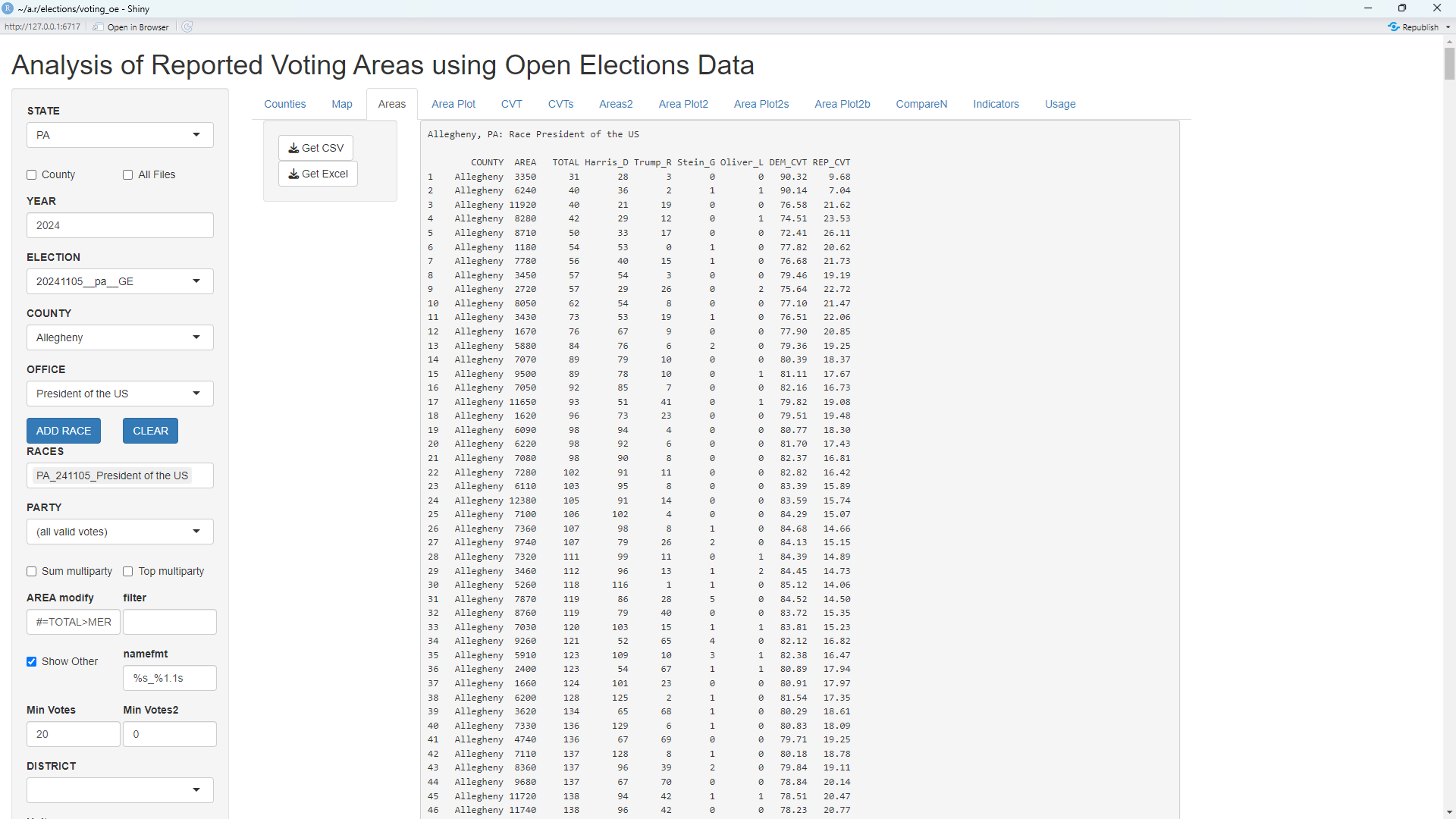
As can be seen, the columns consist of COUNTY, AREA, TOTAL, Harris_D, Trump_R, Stein_G, Oliver_L, DEM_CVT, and REP_CVT. COUNTY is Allegheny in this case and AREA refers to the precinct names (except for Wisconsin where it refers to the ward names). TOTAL is the total votes and the next four columns are the last names of the candidates followed by an underscore and a character to indicate the party. DEM_CVT and REP_CVT are cumulative vote shares used in CVTs (cumulative vote tallys).
Clicking on the "Area Plot" tab will then display the following page:
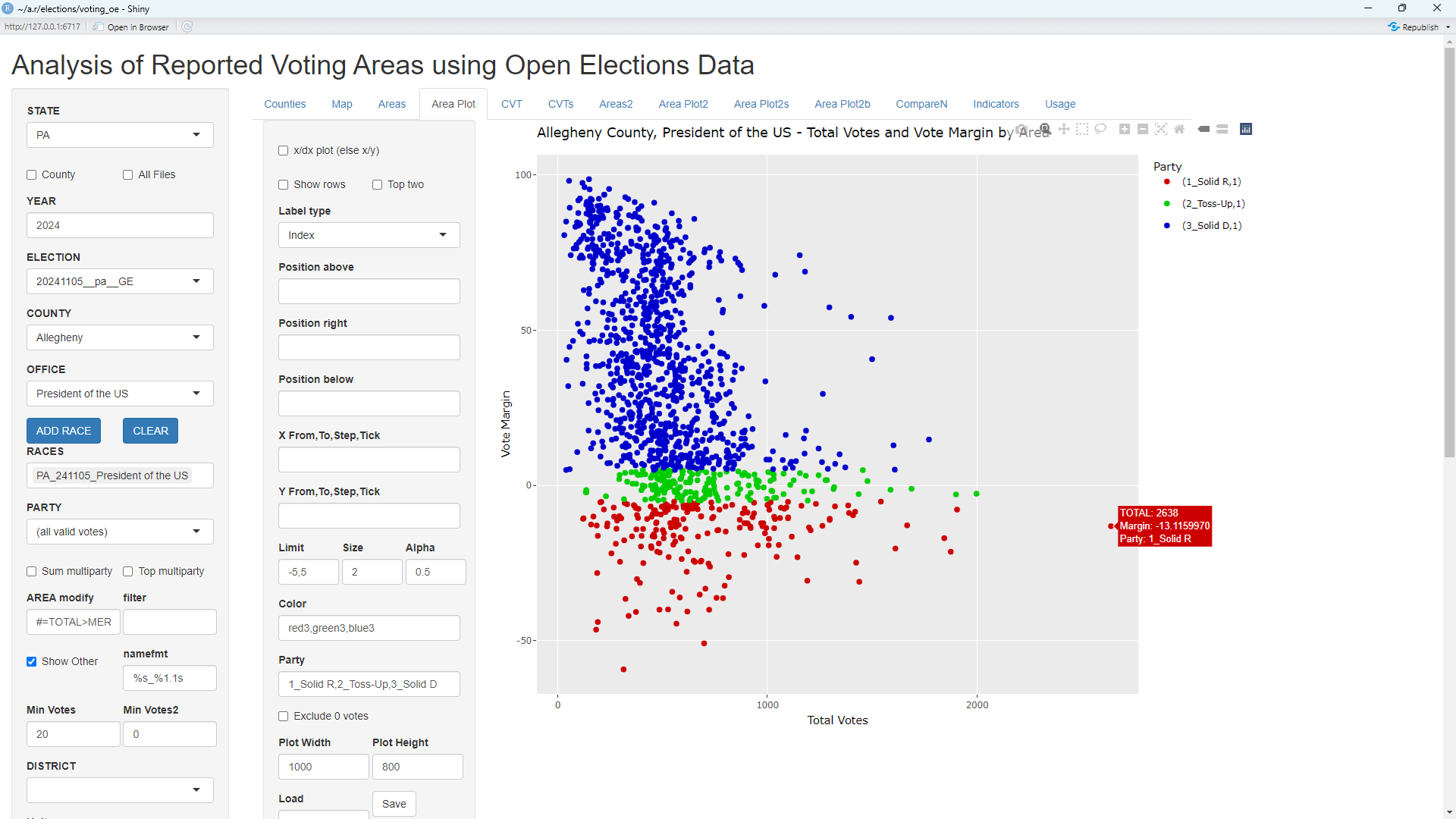
This shows the total votes versus the vote margin in every precinct in Allegheny County in the President's race. Hovering over any of the precincts causes a popup to be displayed which shows the total votes and percent margin. That is the cause of the popup visible next to the precinct on the far right. Looking at the precinct in the list on the Areas tab shows this to be Precinct 4870.
The plot above shows that the solid Democrat precincts tend to be smaller on average than the Toss-Up and solid Republican precincts. Clicking on the CVT tab now will display the following page:
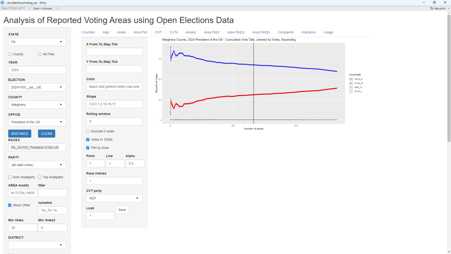
The use of CVTs (Cumulative Vote Tallies) are described at this link. The CVT plot shows that precincts with the fewest total votes tend to be strongly Democrat. This is in agreement with the prior Area Plot.
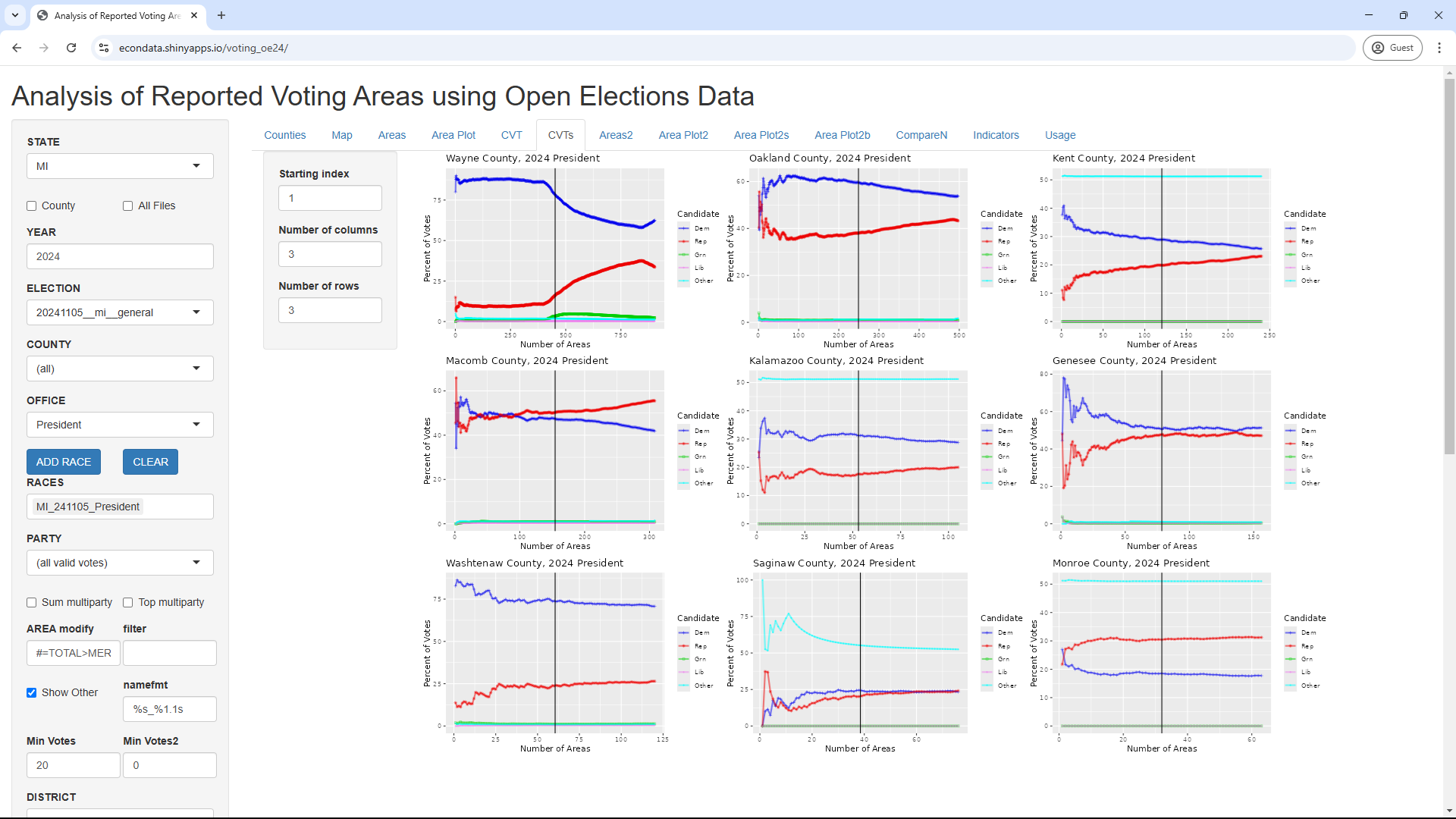
The CVT plots for the 9 counties with the most votes can be displayed via the following additional steps:

Analyzing Voter Turnout with New Data
The turnout of a single race in a single county can be displayed via the following steps:
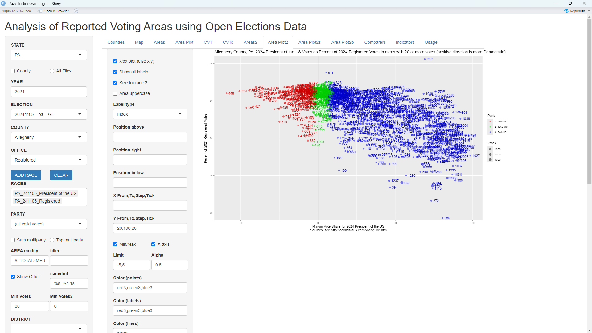
The y-axis shows the turnout in every precinct and is calculated by dividing the total votes for President by the total number of registered voters in each precinct. As can be seen, the solid Republican precincts look to have had about 80 percent turnout on average. However, the turnout in the solid Democrat precincts seemed to drop off down to about 40 percent. The turnout plots for the 9 counties with the most votes can be displayed via the following additional steps:
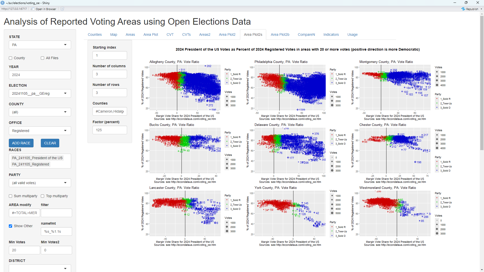
Changing "Starting index" to 10 will then display the plots for the 9 counties with the next highest votes:
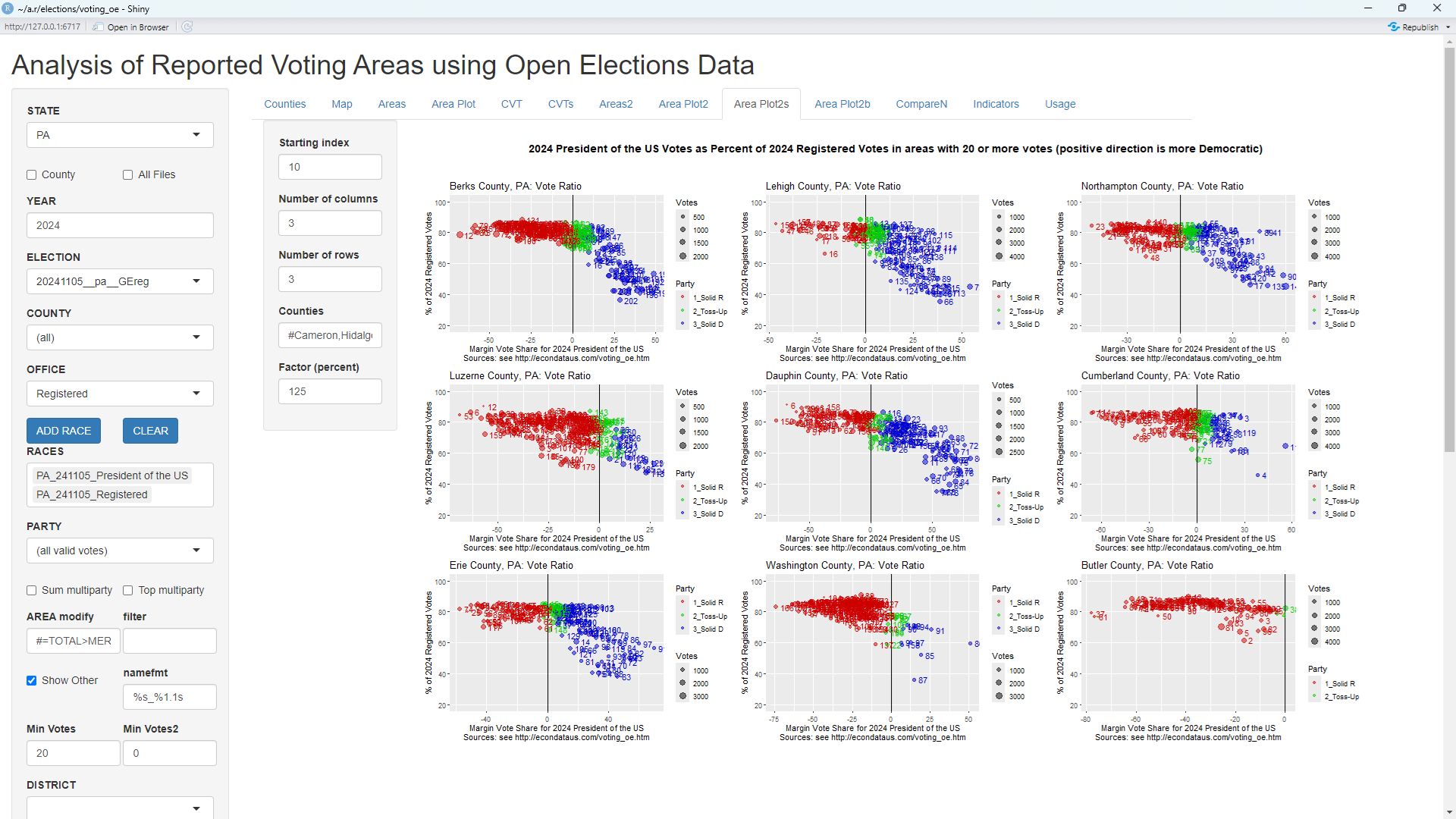
Especially in 6th county (Chester) through the 16th county (Erie), the pattern looks a bit like a gun facing left, with the barrel on the left at about 80 percent turnout and the handle on the right reaching down to about 40 percent. There may be reasons why Republican voters might have tended to have higher turnout in Pennsylvania but it's difficult to think of anything that would cause the turnout of ALL voters to drop off sharply at just the point where the precincts start to lean Democrat. Still, looking at the turnout in earlier years reveals that this pattern is not totally new. One can get the corresponding turnout plots for 2008 via the following additional steps:
This will display the following plots:

The gun patterns are less distinct and the "barrels" are noticably shorter. Still, the turnout is noticably less in most of the solid Democrat precincts. Also, this is in 2008, the year that Obama beat McCain in Pennsylvania by over 10 points. Hence, it would seem that turnout was likely not the key determinant in Trump's win in 2024. It would also be worth looking at any changes in the vote margins since 2020.
Comparing Multiple Races from a Single Election
Looking at the Dropoff from the Presidential to the Senate Race by County
A Reddit post titled "A deeper look into PA voting irregularities" states the following:
In a previous post I went over how many times the Democratic total votes for Senator was greater than the Democratic total votes for President in PA (Nevada too). I don't mean ticket splitting. In every election, voters generally decrease in numbers, even if just a little from the biggest races, like for President downward. In PA, 47 counties have more Democratic Senate Votes than Democratic Presidential Votes.
Take Cameron County, 580 D Senate Votes, and 538 D Presidential Votes. (More Senate votes than President votes) Where R Senate Votes were 1558 and R Presidential 1654. (More President votes, which is the norm). I didn't understand why this pattern was happening ONLY for Democrat votes, but also mostly in smaller counties - under 60,000 voters.
The following plots shows the percent drop from the Presidential to the Senate race for Democrat, Republican, and Total voters in Pennsylvania in 2024 by county.


As stated in the Reddit post, 47 of the 68 counties had a negative drop signifying that there were more Democratic Senate Votes than Democratic Presidential Votes. Cameron County had the fifth largest negative drop. The DEM_SH column in the following table shows the counties with the five largest negative drops:
PA: % Drop in Democrat Votes from 2024 President of the US to 2024 US Senator (Count % drop)

           COUNTY   AREA       Dem       Rep  MARGIN1     TOTAL1     Dem.1     Rep.1 MARGIN2     TOTAL2 DEM_SH REP_SH  MAR_SH TOT_SH
1         GREENE COUNTY     4,592    12,319   -7,727     17,236     5,075    11,643  -6,568     17,145 -10.52   5.49   15.00   0.53
2         FULTON COUNTY     1,102     7,039   -5,937      8,177     1,197     6,773  -5,576      8,116  -8.62   3.78    6.08   0.75
3        JUNIATA COUNTY     2,290     9,721   -7,431     12,104     2,478     9,251  -6,773     12,042  -8.21   4.83    8.85   0.51
4        CAMBRIA COUNTY    21,177    49,408  -28,231     71,136    22,887    46,482 -23,595     71,004  -8.07   5.92   16.42   0.19
5        CAMERON COUNTY       538     1,654   -1,116      2,219       580     1,558    -978      2,214  -7.81   5.80   12.37   0.23
As can be seen, the vote numbers in the post above match the table and Cameron County had a drop of negative 7.81 percent. Following are the corresponding plots for 2020:


As can be seen in the plots above, the pattern was broken in 2008 when there was a large positive dropoff in Democrat votes and a large negative dropoff in Republican votes. Hence, the current negative dropoff in Democrat votes may be an item of concern, possibly indicative of some level of voter suppression, vote manipulation, or change in voter sentiment. But it does not appear to be a totally new phenomena. Finally, following are the corresponding plots for 2004 and 2000:


Comparing Multiple Races from Multiple Elections
The vote margins in the 2020 and 2024 Presidential races in Pennsylvania can be compared via the following steps:
This will display the following plot:
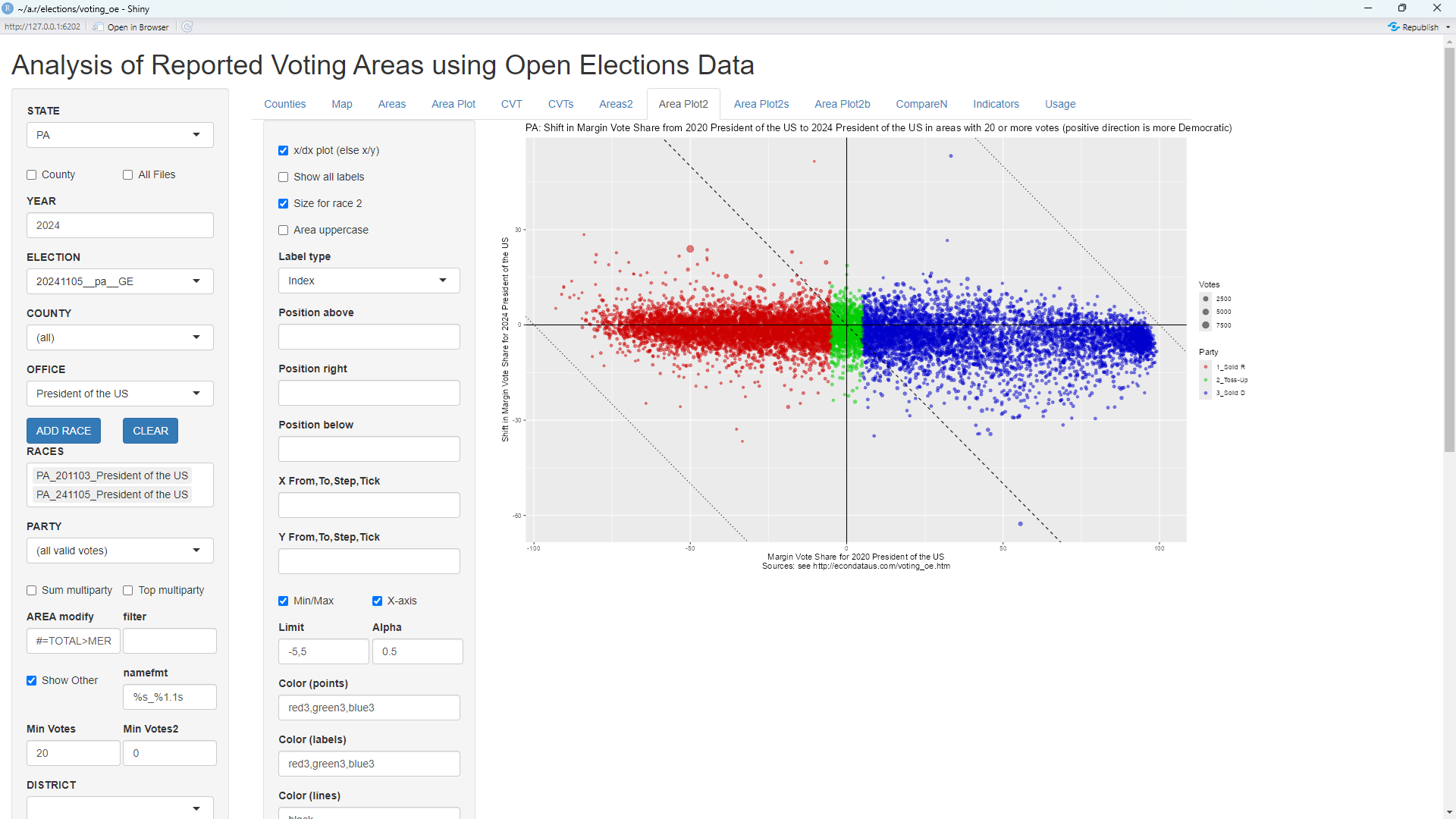
The plot shows that the solid Republican and toss-up precincts appear to have changed little in their support on average, perhaps shifting slightly Republican (down). However, the solid Democrat precincts appear to have shifted much more, perhaps about 5 percent on average. It's possible to look at the shifts by county via the following additional steps:
This will display the following plots:

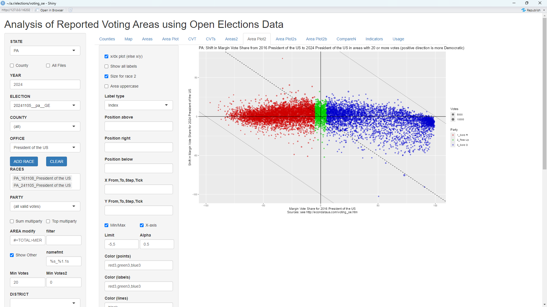
This shows that all of the solid Democrat and Toss-up precincts and the great majority of the solid Republican precincts shifted Republican (down). The amount appears to be about 2.5 percent for the solid Republican precincts and about 4 percent for the others. This would appear to be a major contributor to Trump's win in Pennsylvania in 2024. In contrast, the following two plots compare 2016 and 2024 in the same way:
The above plot shows that the solid Republican and toss-up precincts appear to have shifted slightly Democrat (up) since 2016. This appears also true of the less solid Democrat precincts but the more solid Democrat precincts appear to have shifted noticably Republican on average.
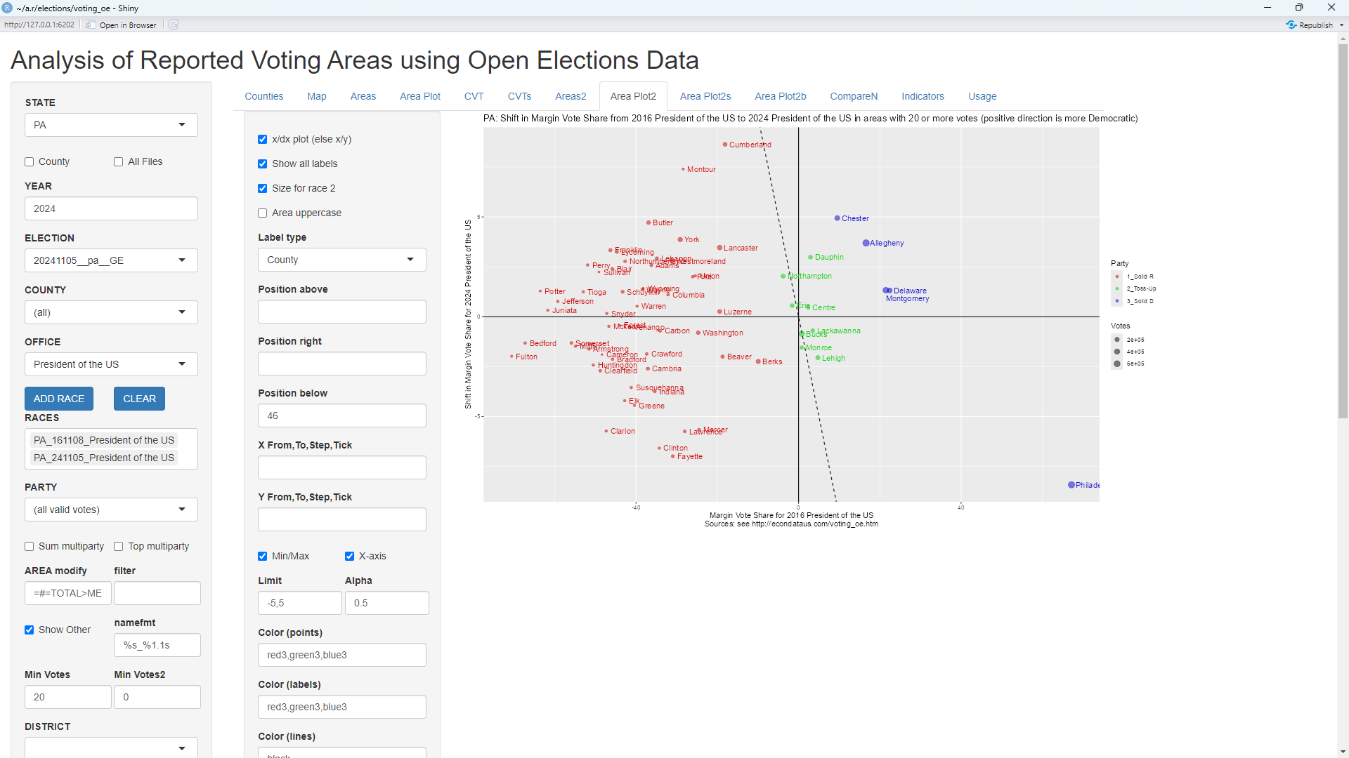
The above plot shows that there appears to have been much less change on average among all of the counties since 2016. Philadelphia, however, can be seen to have shifted about 8 percent Republican during that period.
The change in the precincts of the 9 counties with the most votes can be seen via the following steps:

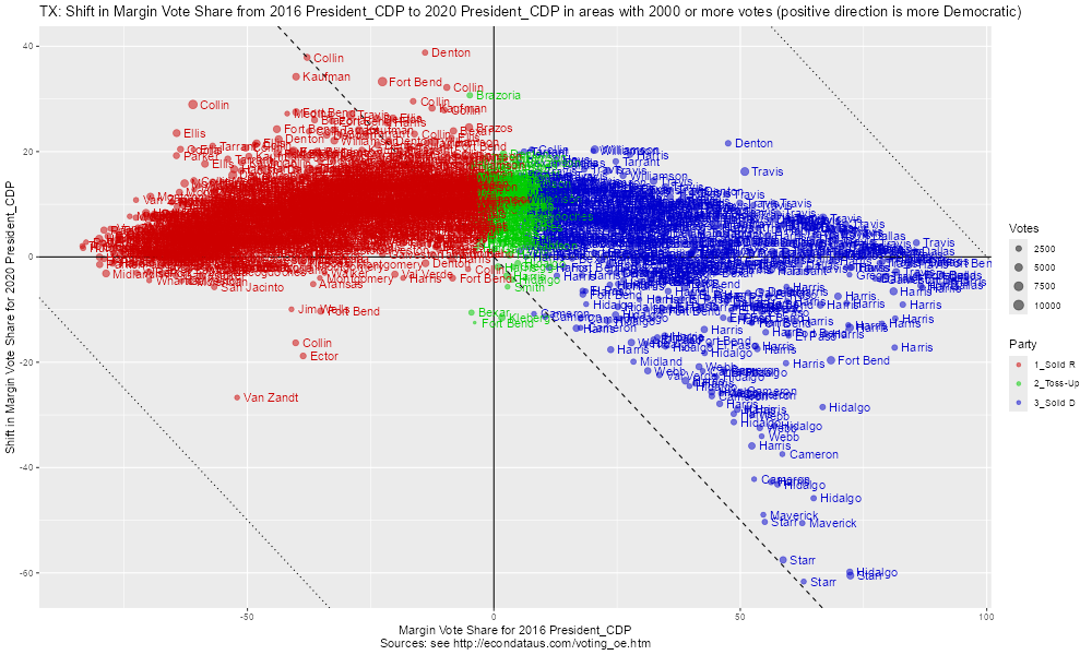
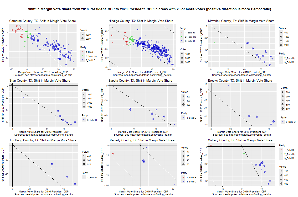
As can be seen, the solid Republican precincts in all of the counties except Philadelphia appear to have shifted slightly Democrat (up) since 2016. However, the solid Democrat precincts have generally shifted Republican (down). The shift may be most noticable in the last 3 counties (Lancaster, York, and Berks) where the precincts have shifted so far Republican so as to approach the dashed line. The dashed line is essentially where the y-axis is in 2024. Hence, those precincts still lean Democrat but will have flipped to leaning Republican if they cross over the dashed line. This pattern is reminiscent of a pattern seen in comparing the 2016 and 2020 presidential races in Texas as seen in the following 9 graphs from this page.
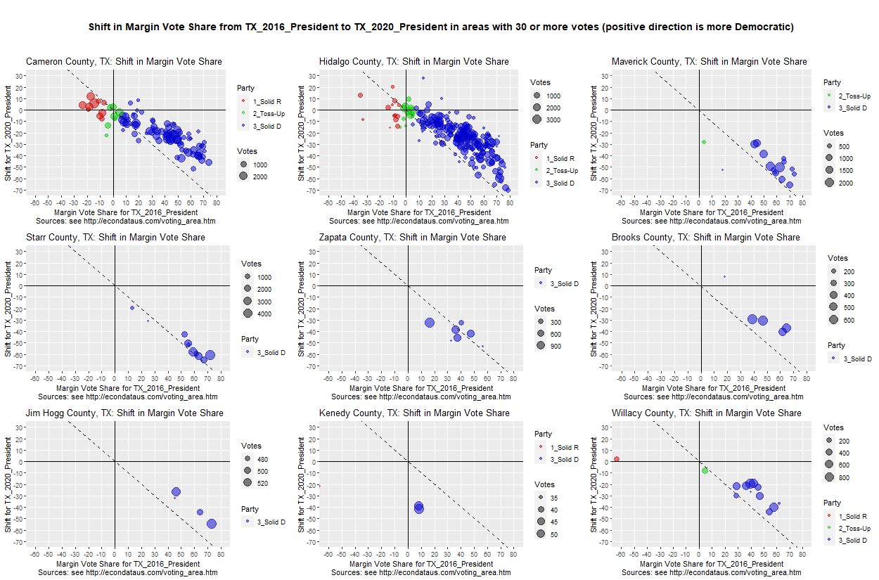
The above 9 counties consist of the 8 southernmost counties in Texas, plus Maverick County. The pattern differs a little bit from the pattern seen in Pennsylvania in that the Texas counties contain few Republican precincts.
Analyzing the 2024 Presidential Election in Texas with Version 2 of Applicaton
An article titled 233 of Texas' 254 counties swung toward Trump in 2024 election was posted by TV station KXAN in Austin on November 27, 2024. This shift of Texas counties in 2024 can be seen using version 2 of this application via the following steps:
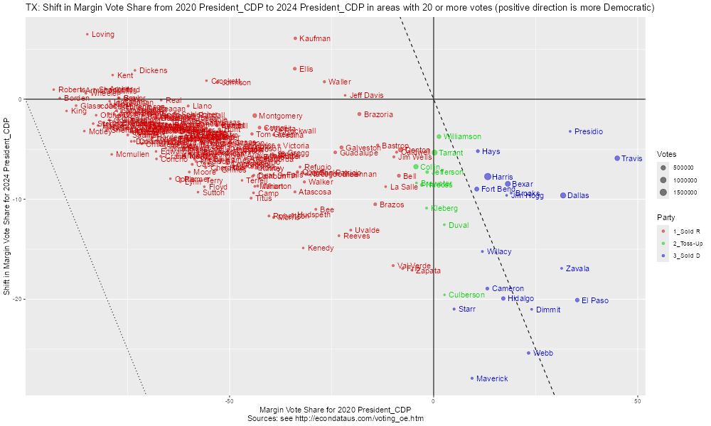
In the above plot, all of the counties below the x-axis swung toward Trump. As stated in the article, this includes all but a handful of Texas' 254 counties. In the labels, CDP refers to the Capitol Data Portal, the source of the data, at https://data.capitol.texas.gov/topic/elections. The About tab at that page states the following:
The data from each election in this directory are reported by 2024 general election VTDs (voter tabulation districts). VTDs are geographic approximations of voting precincts and are used to provide links among the census geography used to build districts, census population data, and election data. The Comprehensive Election Datasets resource provides a compressed file with all available election data reported by the 2024 general election VTDs, as well as compressed files with all available data for each earlier vintage of VTDs from this decade.
These datasets are developed and complied by the Research Division of the Texas Legislative Council for redistricting purposes; they are derived from election returns provided by the counties and the office of the secretary of state. There may be small differences between the data presented here and official election results; official results should be obtained from the Texas Secretary of State and county election officials.
Hence, there may be small differences between this data and official election results. However, it is difficult to compile data for all of the 254 counties in Texas and this data serves as cose estimate.
Going through the above steps except entering 2016 and 2020 for the YEAR and entering 20161108__tx__CDP and 20201103__tx__CDP for ELECTION should display the following plot:
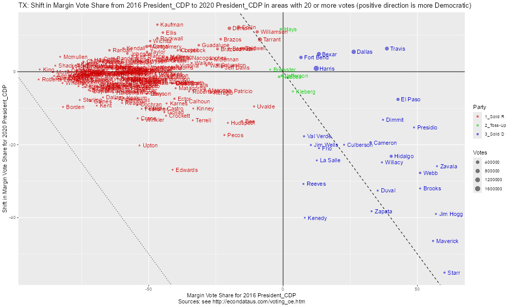
As can be seen, fewer counties swung toward Trump in 2020. In addition, it appears that red (majority Republican) counties stayed about the same on average but many of the blue (majority Democrat) counties swung toward Trump, especially the smaller counties and those in south Texas. However, some of those Democrat counties swung much further toward Trump in 2020 with Maverick and Starr counties swinging over 45 percent versus over 20 percent in 2024.
Following the prior listed steps but skipping the last step and leaving '#' as the beginning of the text in "AREA modify" should display the following plot:
As can be seen, the red (majority Republican) precincts look to have swung slightly toward Trump on overage but blue (majority Democrat) precincts swung more with the majority of them swinging toward Trump. One precinct in Harris County swung by over 100 percent with a number of precincts, notably some in Travis and Harris counties, swung over 50 percent.
Going through these same steps (including skipping the last step) except entering 2016 and 2020 for the YEAR and entering 20161108__tx__CDP and 20201103__tx__CDP for ELECTION should display the following plot:
The above plot shows that red (majority Republican), green (toss-up), and over half of the blue (majority Democrat) precincts swung toward Biden on average but that a significant number of Texas precincts, notably in south Texas counties, swung heavily toward Trump.
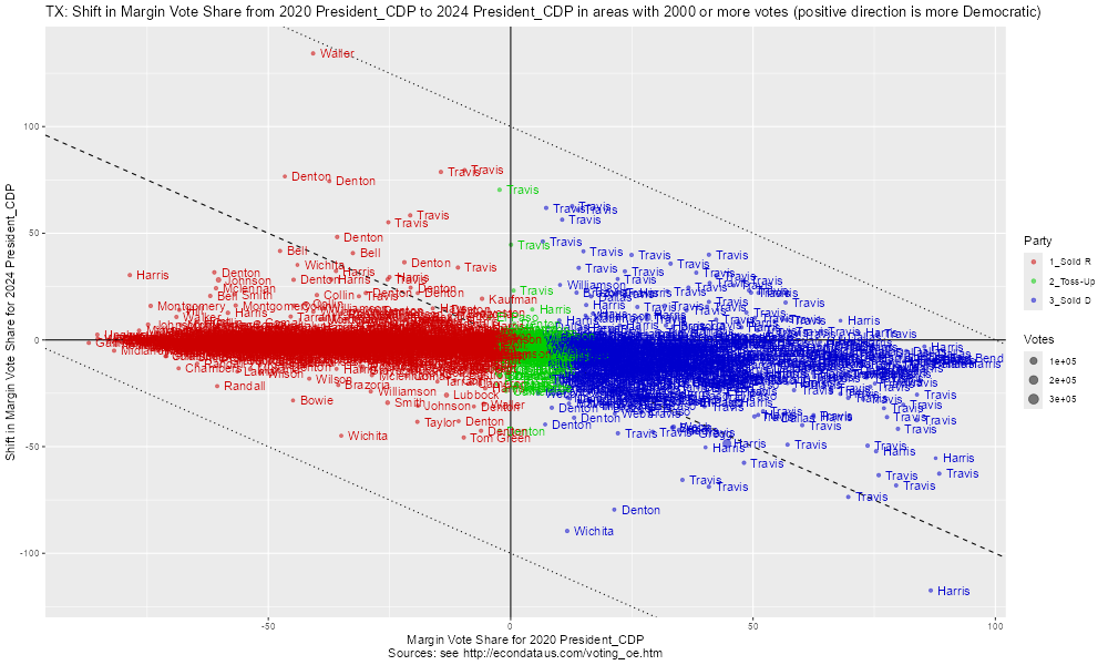
The shift of Texas precincts in 2024, grouped by the largest counties, can be seen via the following steps:
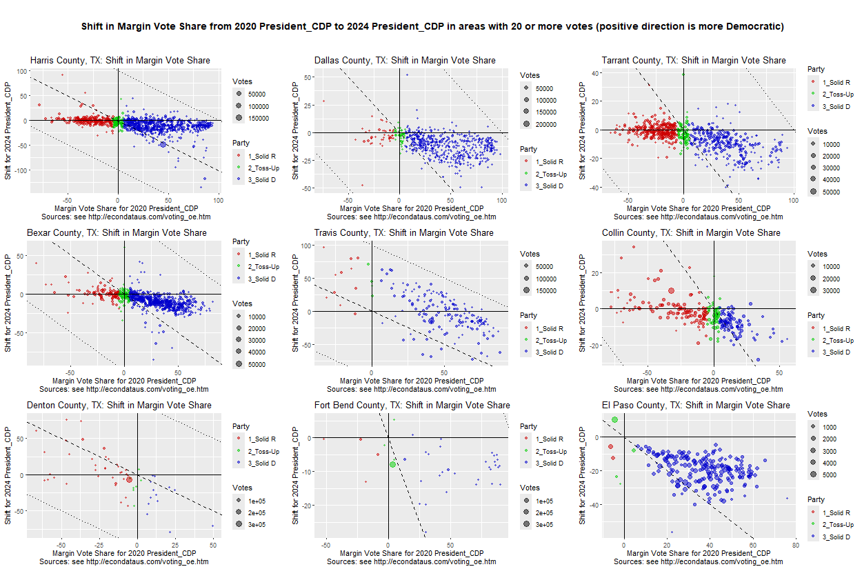
As can be seen, all of the couties except for Travis tend to follow the pattern of the red (majority Republican) precincts having little change on average but the blue (majority Democrat) precincts shifting decidedly Republican on average. Several of the counties, most notably Travis, Denton, Fort Bend, and Harris contain large dots. These are "Other" precincts which includes all precincts whose names do not match between the two years. These are likely affected by redistricting or some other process which changed the names of some precincts.
Going through the above steps except entering 2016 and 2020 for the YEAR and entering 20161108__tx__CDP and 20201103__tx__CDP for ELECTION and skipping the last step should display the following plot:
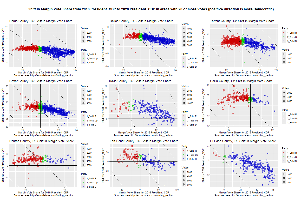
As can be seen, it appears that red (majority Republican) precincts tended to swing toward Biden. Blue (majority Democrat) precincts tended to sway toward Biden in Travis, Collin, and Denton counties and toward Trump in Harris and El Paso counties. The other 4 counties (Dallas, Tarrant, Bexar, and Fort Bend) seemed pretty evenly divided on average in 2020.
Following the steps above but setting Counties on the second side panel from the left to 'Cameron,Hidalgo,Maverick,Starr,Zapata,Brooks,Jim Hogg,Kenedy,Willacy' (the default without the leading '#') should display the following plot:
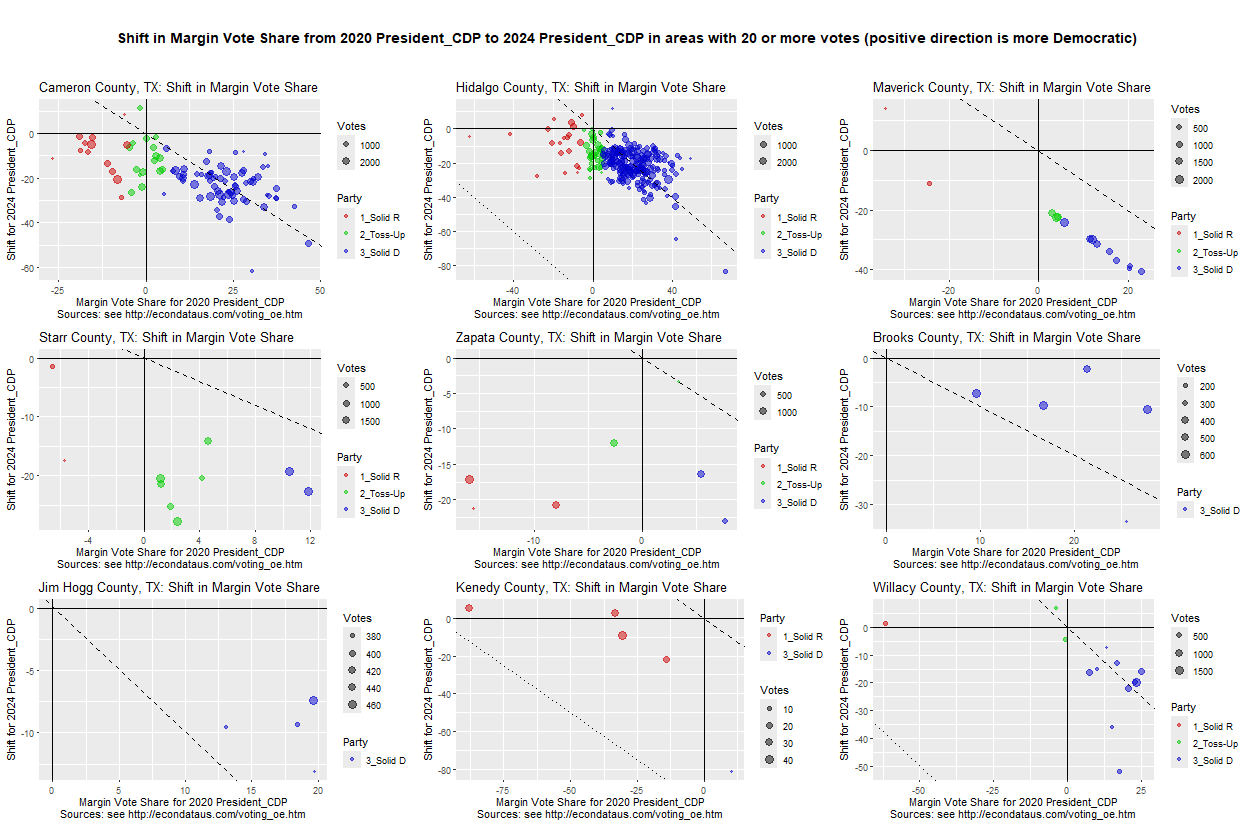
These counties include Maverick and the 8 southmost counties in Texas. As can be seen, most of the red (majority Republican) precincts shifted toward Trump though they were more evenly divided in Kenedy and Willacy counties. In Cameron, Hidalgo, and Willacy counties, about half of the Democrat precincts became majority Republican precincts (to the left and below the dashed line). In Maverick, Starr, and Zapata counties, they all became Republican precincts.
Going through these same steps (including resetting Counties) except entering 2016 and 2020 for the YEAR and entering 20161108__tx__CDP and 20201103__tx__CDP for ELECTION should display the following plot:
As can be seen, it appeared that red (majority Republican) precincts had retained the same vote share as in 2016 on average but that the vote share of the blue (majority Democrat) precincts had shifted to a somewhat similar vote share in 2020. That vote share was weakly Democrat in all but Zapata and Kenedy counties where they had shifted majority Republican on average.
The strange case where the vote margins in all but two precincts in Maverick County changed from differing margins to nearly the same in 2020 is described at this link. As described there, the Texas Legislative Council said that this odd lining up of vote shares was due to the fact that they had estimated the vote shares since they lacked the final precinct results. These estimates were on the Capitol Data Portal on June 2nd of 2021 but were updated by September 5th of 2021.
It seems that this same situation has reoccurred and can be seen via the following steps:
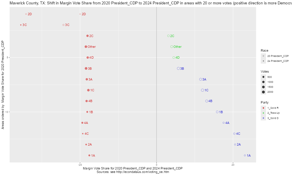
As can be seen, all but the top two small precincts (2D and 3C) changed from various Democrat vote shares to nearly the same vote share just short of 20 percent Republican. This is similar to the original case in 2020, described at this link. It will be instructive to see if the data is once again updated with numbers that cause this uniformity of vote share to disappear.
Going through these same steps except entering 2016 and 2020 for the YEAR and entering 20161108__tx__CDP and 20201103__tx__CDP for ELECTION should display the following plot:
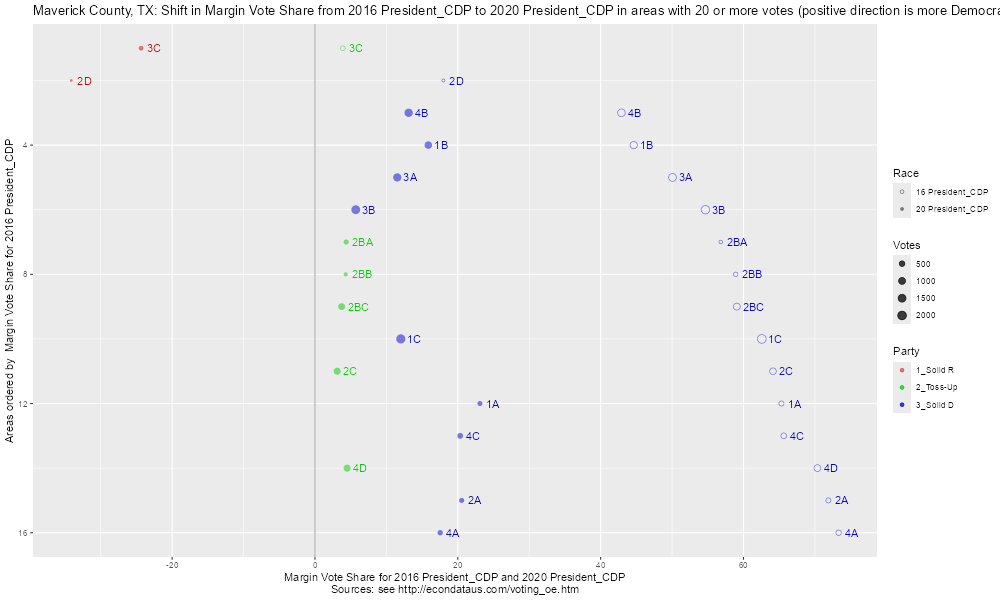
This plot shows the final shift for Maverick County from 2016 to 2020. Although the uniformity of vote share did go away, the range of vote share in all but the two small precincts (3C and 2D) did shrink from about 40 percent to about 20 percent.
In any event, this shift in the vote share from 2020 to 2024 does suggest that the recent proposed redistricting in Texas is not simply trying to squeeze more seats out of the same voter demographics. That is, the Republicans are not just doing what they could have done in the prior redistricting. They now have the additional knowledge of the shift toward Republicans that occurred in the 2024 election. Regardless of whether it was due to normal political factors, voter suppression, possible vote manipulation, or some combination of these and other factors, the shift in the vote means that a redrawing of the district lines can be done in such a way so as to improve Republican prospects over what was possible when the prior map was drawn.
Note: Additional analysis of the 2024 General Election in Texas can be found at https://econdataus.com/voting_data.htm#tx_vs. It uses another Shiny program but is written in Python.