
1. Findings Reported by Wall Street Journal Article
On May 22, 2014, the Wall Street Journal posted an online article titled "Skilled Foreign Workers a Boon to Pay, Study Finds". The article begins as follows:
Want a pay raise? Ask your employer to hire more immigrant scientists.
That's the general conclusion of a study that examined wage data and immigration in 219 metropolitan areas from 1990 to 2010. Researchers found that cities seeing the biggest influx of foreign-born workers in science, technology, engineering and mathematics—the so-called STEM professions—saw wages climb fastest for the native-born, college-educated population.
Further on, the article gives the study's primary finding:
Mr. Peri, along with co-authors Kevin Shih at UC Davis, and Chad Sparber at Colgate University, studied how wages for college- and noncollege-educated native workers shifted along with immigration. They found that a one-percentage-point increase in the share of workers in STEM fields raised wages for college-educated natives by seven to eight percentage points and wages of the noncollege-educated natives by three to four percentage points.
Further on, the article states:
The research attempts to isolate the cause and effect of a shift in the supply of immigrants-rather than increased demand by employers- by tallying how the number of skilled workers changed over time in each area.
The areas with the biggest influx of foreign STEM workers were Austin, Texas; Raleigh-Durham, N.C.; Huntsville, Ala.; and Seattle. The cities had inflation-adjusted wage gains of 17% to 28% for their native college-educated workers. At the other end of the spectrum, 33 cities saw a decline in foreign STEM workers and 25 of those cities saw an outright decline in wages for their college-educated populations.
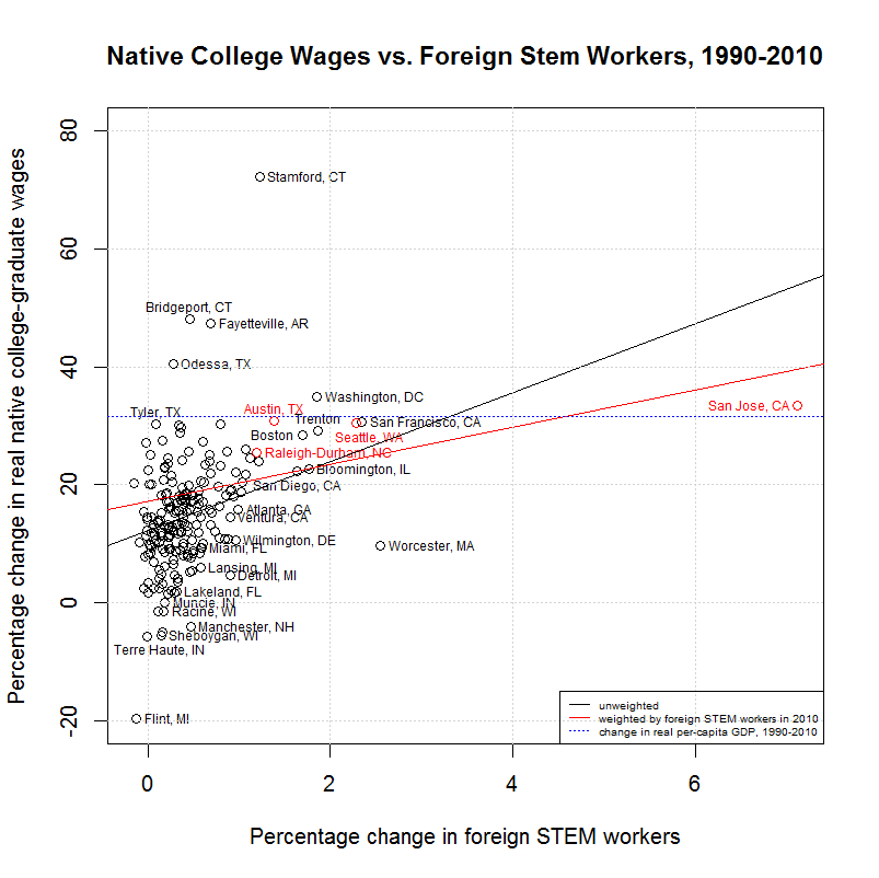
2. Chart Included to Illustrate First Finding
The article includes the following chart which purports to show a correlation between an increase in foreign workers in STEM (science, technology, engineering, and mathematics) and an increase in weekly wages for native-born, college-educated workers.
As can be seen, Austin, Texas appears in the upper right and Newburgh-Middletown, N.Y. appears in the lower left. In fact, these cities are the furthest to the right and left of the chart, respectively. As a source for the data, the chart just lists the University of California, Davis, the workplace of Peri and Shih. However, a blog post on the WSJ article gives the study referenced by the WSJ article as "Foreign STEM Workers and Native Wages and Employment in U.S. Cities", a recent study by Peri, Shih, and Sparber. An online appendix for that paper states the following regarding the data's source:
All data on wages, employment, rent, occupation, industry, nativity, and education come from IPUMS. Specifically, we extract samples of workers from the 1970, 1980, 1990, and 2000 Census, the 2005 American Community Survey (ACS), and the 2008-2010 3-Year ACS (which we refer to as 2010).
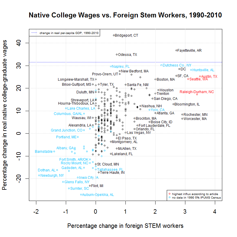
3. Replicating the Chart With IPUMS Data
If you google IPUMS, you'll find that its US data can be downloaded at this link. I did that and used the free statistics programming language and software environment called R to try and reproduce the above chart. Following is the result:
4. Differences Between the Original and Replicated Chart
As can be seen, there are a number of major differences between the two charts. First of all, San Jose is shown to have the far greatest influx of foreign STEM workers in the second chart with about a 7.5 percent change. Why does San Jose not appear in the first chart or receive any mention in the WSJ article? Was it not amoung the "219 metropolitan areas from 1990 to 2010" mentioned in the article? In fact, the 219 metropolitan areas was the one item that could be exactly duplicated. The aforementioned appendix states that "[we] focus our analysis on 219 Metropolitan Statistical Areas (MSAs) that are consistently identified from 1980-2010, excluding individuals who do not live in identified MSAs". It lists the samples from 1980-2010 just before that as the "1980, 1990, and 2000 Census, the 2005 American Community Survey (ACS), and the 2008-2010 3-Year ACS". This table shows 303 metropolitan areas for which there were IPUMS records for one or more of these five samples. However, those colored red, green, or blue contain NA (no data) for one or more of the samples. When these 84 rows are removed, exactly 219 rows "that are consistently identified" remain.
A check of this list shows that San Jose does have data representing over a million people for each of the five samples. It also shows that Huntsville, Alabama (mentioned in the article) and Newburgh-Middletown, NY (shown on the far left in the chart) contain no data for 1990 and are hence not in the group of 219 metropolitan areas. Why was San Jose omitted from the chart and why were these two cities shown or mentioned? It would be interesting to know who created and chart and what data they used to do so. In any event, some of the data appears to be erroneous and/or missing from the WSJ chart.
Another major difference between the charts is that Austin, Texas is at the far right with about a 3.5 percent change in foreign STEM workers in the first chart. In the second chart, however, it's closer to the left side with just about a 1.5 percent change. Both charts do show Austin at about 30 percent for the change in real native college-graduate wages. In any case, Raleigh-Durham, N.C., Huntsville, Alabama and Seattle are mentioned as the other three "areas with the biggest influx of foreign STEM workers" in the WSJ article. Seattle has the fourth biggest influx in the second chart but Raleigh-Durham appears to have about the 13th biggest influx in the second chart.
There is one possibility for the difference in the percent change of foreign STEM workers in Austin and Raleigh-Durham. The second chart uses the narrow O*NET 4% definition of STEM occupations given in the second column of of Table A2 in the online appendix for the paper. This seems to be the most reasonable definition to use since that is the definition used in the first three tables of the paper and footnote 16 on page 8 of the paper explains that "[i]n the summary statistics and in the empirical analysis we mainly use the O*NET 4% STEM definition, unless we note otherwise". However, the WSJ article does not state which definition is used and it's possible that a broader definition is being used. Still, San Jose would be over 7.5 percent in that case and is missing from the first chart using any definition. Also, it's unclear how values for Huntsville, Alabama and Newburgh-Middletown, NY could have been calculated since they have no data for 1990.
5. Linear Regression of IPUMS data
Getting more to the substance of the charts, the Wall Street Journal chart suggests a linear relationship between the increase in foreign STEM workers and the increase in the real wage of native college-graduates. It does not show a regression line but it does look like, if one were drawn, it might support the article's contention that the study "found that a one-percentage-point increase in the share of workers in STEM fields raised wages for college-educated natives by seven to eight percentage points". The second chart does contain regression lines that are summarized in the following table:
Native College Wages vs. Foreign Stem Workers, 1990-2010

                      CORREL
INTERCEPT    SLOPE     COEF   P-VALUE  Y VARIABLE ~ X VARIABLE [, WEIGHTS]
---------  --------  -------  -------  -----------------------------------
Native College Wages vs. Foreign Stem Workers, 1990-2010
  12.2571    5.8456   0.3791   0.0000  native_coll_wkwage_change ~ immig_stem_change
  17.1149    3.1644   0.3791   0.0000  native_coll_wkwage_change ~ immig_stem_change, weights=immig_stem
The first line shows that a simple regression of the data (the black line in the chart) has a slope of 5.8 which is a little below the 7 to 8 suggested in the article. However, it is common to use a weighted regression in order to give more weight to those points that represent larger samples. The second line in the table shows that a simple regression of the data weighted by the final number of foreign stem workers (the red line in the chart) has a slope of 3.2, less than half of the 7 to 8 percent suggested by the article. It seems reasonable to look at a regression weighted by the number of foreign stem workers since this is the variable that is being proposed as playing a role in the increase in wages.
In any event, it is also important to look at the correlation coefficient and p-value. Correlation coefficients of -1 and 1 indicate the strongest possible negative and positive correlation and a correlation coefficient of 0 indicates the weakest possible correlation. Regarding p-values, following is one rough description of how to interpret them:
0.10  < P          No evidence against the null hypothesis. The data appear to be consistent with the null hypothesis.
0.05  < P < 0.10   Weak evidence against the null hypothesis in favor of the alternative.
0.01  < P < 0.05   Moderate evidence against the null hypothesis in favor of the alternative.
0.001 < P < 0.01   Strong evidence against the null hypothesis in favor of the alternative.
        P < 0.001  Very strong evidence against the null hypothesis in favor of the alternative.
Hence, there is strong evidence that there is a correlation between the variables. Still, as explained in this article, one must be careful in interpretting the meaning of this correlation. As explained in the next section, correlation does not imply causation.
The dotted blue line simply shows the amount the per-capita GDP increased from 1990 to 2010 (in chained 2009 dollars) according to Federal Reserve data. As shown in this post, wages and per-capita GDP did rise at similar rates from 1947 to the mid-to-late 1970s. Hence, this shows that native college wages did not increase remarkably in most metropolitan areas from 1990 to 2010, regardless their relationship to the increase in foreign STEM workers.
Finally, it is important to underline the fact that correlation does not imply causation. For example, it may be certain metropolitan areas develop STEM-heavy industries for a variety of reasons. That would create a demand for workers which could result in a greater increase of foreign and native STEM workers. This demand could also raise related wages (or keep them from dropping like areas with less demand). There are undoubtedly other possibilities that need to be considered. It is therefore reckless to imply that the increase in foreign STEM workers causes a rise in native wages based just on this data.
7. Spreadsheet from Author Missing San Jose, CA and Stamford, CT
Mr. Peri was kind enough to send me an Excel spreadsheet containing the x-coordinate (change in foreign STEM workers as % of total employment), y-coordinate (% change in weekly wages of native college educated), and identifier (metropolitan area) of every point in the graph. I compared the metropolitan areas in the spreadsheet to the previously mentioned list of 303 metropolitan areas. The rightmost numerical column contains a 1 for every metropolitan area that appears in the spreadsheet and chart. The column just to the left of that contains a 1 for each of the 219 metropolitan areas used in the study. As can be seen, every one of the 303 metropolitan areas that contain an NA for 2010 (colored red) does not contain a 1 in the rightmost numerical column meaning that it does not appear in the chart. However, those areas which have NAs in 1990 but not in 2010 (colored blue) do contain 1 in that column. This suggests that these areas are getting their 1990 values from some sample other than 1990 5% IPUMS sample. This sample is where the paper on which the chart is based got its 1990 data according to page 1 of its appendix. In any event, it is possible that some other 1990 sample is being used for many of the points in the chart. This may be part of the explanation of why the values for Austin are so different between the two charts. Mr. Peri did provide the spreadsheet but did not answer any questions about these issues.
As mentioned, every one of the 304 metropolitan areas that contain an NA for 2010 is not listed in the second column. However, there are three others. Those are San Jose, CA, San Luis Obispo, CA, and Stamford, CT. San Luis Obispo does contain NAs for 1980 and 1990 but so do a number of other areas. Still, due to those NAs, San Luis Obispo is not one of the 219 metropolitan areas shown in the second chart. San Jose and Stamford do contain values for all five samples. San Jose is the highest value on the x-axis and Stamford is the highest value on the y-axis on the second chart. Both are beyond the axis limits on the first chart. It's unclear why these values were omitted. In any event, they do counter the trend shown in the first chart. Hence, it would have been responsible to show a chart of all of the areas and, if desired, show another chart that, like the first chart, zoomed in on the region that contains most of the points. At the very least, the omission of the three points should have been mentioned in the article. The excel spreadsheet that I was given was missing entries for San Jose, CA, San Luis Obispo, CA, and Stamford, CT and I believe that this is what was given to the Wall Street Journal. However, I don't know whether their omission was communicated verbally or via some other means to the Journal. What is clear is that they were not communicated to the Journal's readers.
8. Spreadsheet from Author Includes Data from Unidentified Source
The following charts shows a chart created using the spreadsheet provided by Mr. Peri:

On a side note, the two charts above show a small item of interest about the Wall Street Journal chart. Note that many of the points in the first chart above appear to line up in vertical columns. This is the same as the Wall Street Journal chart. Looking at the area with the most points between 0 and 1 on the x-axis reveals that all of the points appear to have x-coordinates with no more than one decimal place. Hence, the only possible x-values between 0 and 1 are 0.0, 0.1, 0.2, and so on up to 0.9 and 1.0. I found that this was because the spreadsheet had all of the values formatted to display 1 decimal place. When this is exported to a csv file, excel appears to export the values as they appear and that causes everything beyond one decimal place to be lost. The second chart above was created by simply formatting the data to display 3 decimal places before exporting the data. Hence, the data in this chart is accurate to 3 decimal places, making it much more accurate.
More importantly, the points and metropolitans colored blue are those for which no data existed in the 1990 5% IPUMS sample. As can be seen, they make up the great majority of the points. The Wall Street Journal article states:
At the other end of the spectrum, 33 cities saw a decline in foreign STEM workers and 25 of those cities saw an outright decline in wages for their college-educated populations.
Since all but two of these points had no data in the 1990 5% IPUMS sample, it seems critical to identify what data was used to create the spreadsheet. It would seem that one possibility is that these points represent changes between 2000 and 2010, entirely omitting 1990 to 2000. This would explain why these points are largely in the lower left of the chart, representing declining native wages and numbers of foreign STEM workers. 2000 to 2010 had generally much lower levels of both items compared to the late nineties. It would seem hard to believe that Peri's spreadsheet would mix 2000 to 2010 data with 1990 to 2010 data as that would seem to invalidate the entire chart. I did ask Mr. Peri for the source of the spreadsheet but received no response.
Following are the general conclusions of this analysis:
This did clarify an issue for me. At the top left of Mr. Peri's site are links to Refereed Publications, Non Refereed Publications, and Recent Working Papers. According to this link, a peer-reviewed publication is one that has been reviewed (before acceptance for publication) by a jury of experts in the author's field (or "peers" of the scholar). On the other hand, Wikipedia describes a working paper as a preliminary scientific or technical paper, often released to share ideas about a topic or to elicit feedback before submitting to a peer reviewed conference or academic journal. In looking through Peri's refereed publications, I did not see the study that he sent me among the three listed as "forthcoming". However, I did find an earlier version of it among his working papers.
Similarly, another study which I analyzed and found serious problems with is a working paper. The study is "Immigration and American Jobs", written by economist Madeline Zavodny and my analysis is here. Zavodny's web site has a link to Journal Articles and Reports & Unpublished Work. The study appears under Reports & Unpublished Work. Note that the name of this page is wp.htm where wp presumably stands for working paper.
Hence, two of the most cited studies on this issue are mere working papers which have likely received little, if any, independent scrutiny. In fact, the data and calculations needed to replicate the studies is not even publicly available. I was able to obtain that data for the Zavodny study on request but was unable to obtain it for the Peri study. However, none of the organizations which reference the studies make any mention of this. Ideally, such organizations should be responsible and not report findings from studies that have received no public scrutiny. But, at the very least, those organizations should clearly label such studies as working papers which have not been independently verified. Likewise, the authors of such working papers should, if they make them public, do what they can to see that they are not misrepresented. And if they want a truly informed discussion of the papers, they should post the data that is necessary to replicate them.
Update: In fact, the Peri paper was released by the Journal of Labor Economics on July 1, 2015. However, that paper did have several serious problems with it. An analysis of those problems can be found here.