Comparison of Races in Texas
Comparing the 2016 and 2020 Presidential Race in Texas
On November 4, 2020, The Texas Tribune posted an article titled "Joe Biden's struggles along the Texas border raise questions about Democrats' outreach there". It described 2020 Presidential election results along the Texas-Mexico border, stating:
In perhaps the most stunning result, Trump flipped Zapata County, which lies immediately north of the Valley. Trump carried the small county by 5 points after Clinton won it by 33 in 2016 and Barack Obama by 43 in 2012.
Farther up the Rio Grande, Biden won Maverick County - home to Eagle Pass - by 9 points after Clinton secured a blowout there by 56 points in 2016.
Then on November 9, 2020, The Washington Post posted an article titled "Why Texas's overwhelmingly Latino Rio Grande Valley turned toward Trump". In describing what happened along the Rio Grande, that article stated:
Biden won majorities in most counties, but by dramatically smaller margins than Hillary Clinton in 2016. Clinton won Starr and Hidalgo counties by commanding margins - 60 and 40 percentage points, respectively. Biden won Starr County by five points and Hidalgo by 17.
The bluest of blue counties along the river, Zapata County, flipped to President Trump, who won 52.5 percent of the vote. It was the first time since Reconstruction that a Republican presidential candidate won Zapata County.
Finally, on November 10, 2020, The New York Times posted an article titled "Hispanic Voters Deliver a Texas Win for Trump". It contained a graphic titled "Change in win margin along the southern Rio Grande" which showed the change in three border counties from 2016 to 2020. It showed Starr County changing from +60D to just +5D, Hidalgo County changing from +41D to +17D, and Cameron County changing from +33D to +13D.
It is possible to check these numbers in the Shiny application at https://econdata.shinyapps.io/voting_area/. Going to that URL and selecting TX for STATE, TX_2016_President and TX_2020_President for RACE (in that order), "(all)" for COUNTY, and typing an = before the # character in the "AREA modify" text box will output the following on the "Areas2" tab:
Following are the lines for five counties mentioned in the prior articles, along with the total for the state:
TX: Shift in Margin Vote Share from TX_2016_President to TX_2020_President (Percent)

           COUNTY   AREA Clinton Trump MARGIN1 TOTAL1 Biden Trump.1 MARGIN2 TOTAL2 DEM_SH REP_SH MAR_SH TOT_SH     TOT1_N     TOT2_N
31        Cameron COUNTY   64.61 32.06   32.56  96.67 56.04   42.89   13.15  98.92  -8.58  10.83 -19.41   2.25     91,804    114,326
108       Hidalgo COUNTY   68.12 27.89   40.23  96.01 58.04   40.98   17.06  99.02 -10.08  13.09 -23.18   3.01    174,408    220,884
159      Maverick COUNTY   76.52 20.72   55.79  97.24 54.21   44.80    9.41  99.01 -22.31  24.08 -46.38   1.77     13,588     15,359
214         Starr COUNTY   78.97 18.91   60.06  97.87 52.00   47.00    5.00  99.00 -26.97  28.09 -55.06   1.13     11,763     17,498
253        Zapata COUNTY   65.66 32.75   32.91  98.41 47.09   52.42   -5.34  99.51 -18.57  19.67 -38.25   1.10      3,142      3,878
255         TOTAL  TOTAL   43.17 52.15   -8.98  95.32 46.46   52.04   -5.58  98.49   3.28  -0.12   3.40   3.17 17,963,720 22,634,104
In the above table, MARGIN1 refers to the Democratic margin in the first race and MARGIN2 refers to the Democratic margin in the second race. All of the margins mentioned in the articles are equal to those in the table except the NYT figure of 41 instead of 40 for Hidalgo in 2016.
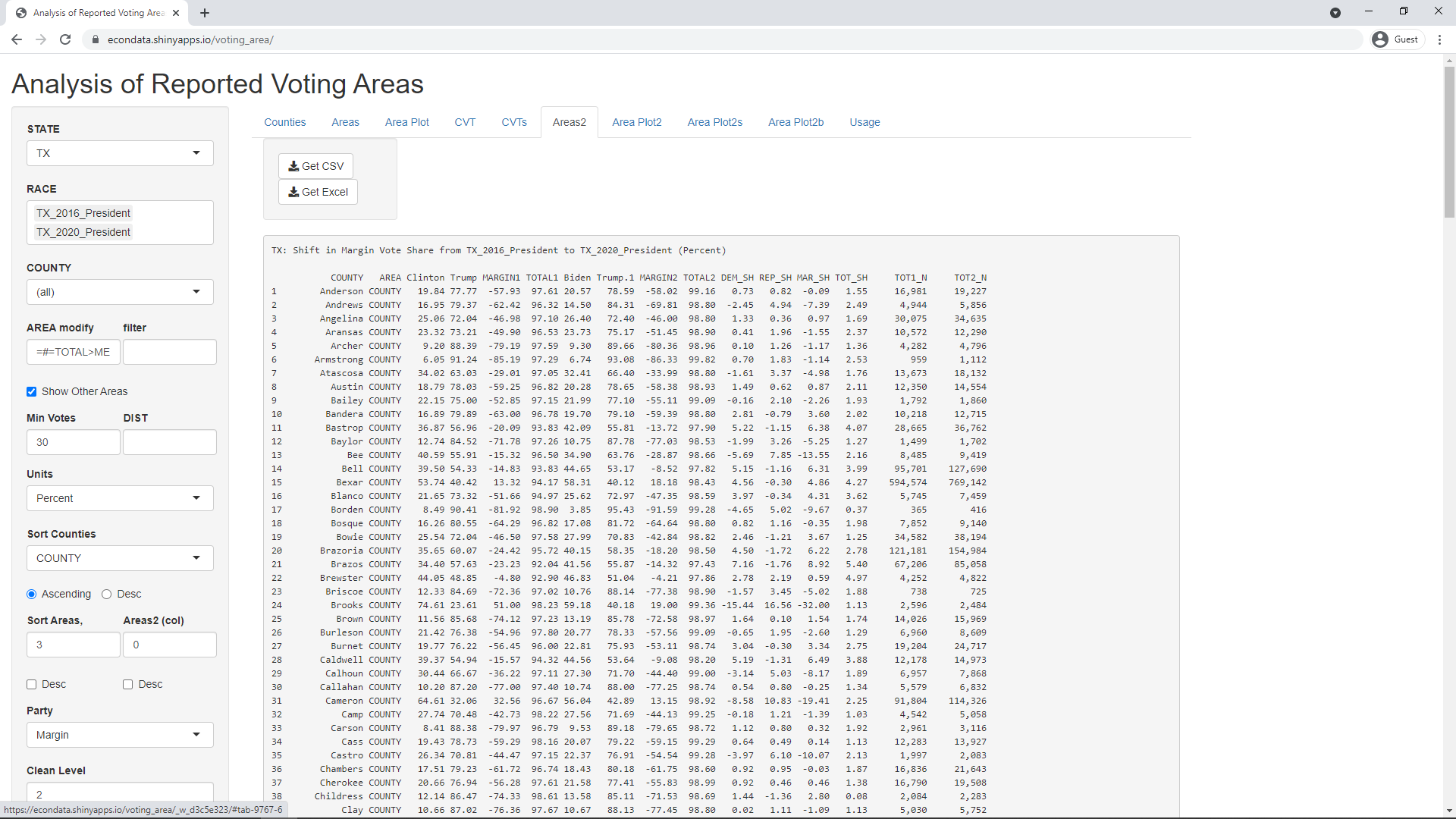
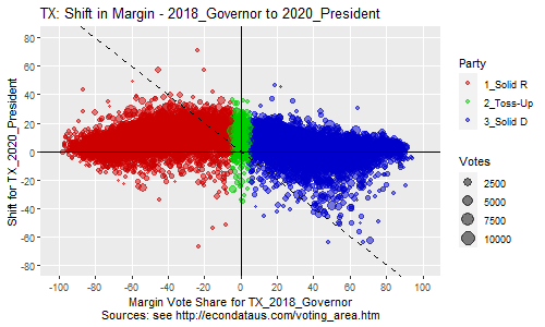
Going to the "Area Plot2" tab, changing "Label type" to County, setting "Position above" to 7,14 and setting "Position below" to 11,61,115,122,178,196,248 will generate the following plot:
This document refers to this type of plot as an x/dx plot. As the labels indicate, the X-axis shows the margin in the first race (2016 Presidential) and the Y-axis shows the change in the margin (dx) between the margin of the first race and the margin of the second race (2020 Presidential). In this case, "margin" is the Democratic vote share minus the Republican vote share, in percent. On the X-axis, values less than -5% are considered "Solid Republican", values between -5% and 5% are considered "Toss-Up", and values greater than 5% are considered "Solid Democratic". Each dot represents a "voting area" which can be a precinct, a ward, or a collection of precincts or wards. Those voting areas above the X-axis are those that "blue-shifted" or whose support became more Democratic between the first and second races. In contrast, those voting areas below the X-axis are those that "red-shifted" or whose support became more Republican between the first and second races.
As can be seen in the plot above, Starr, Maverick, and Zapata Counties red-shifted by 38 percent or more between the 2016 and 2020 Presidential elections. The shift is shown by the value on the Y-axis in the plot and by the variable MAR_SH in the table. Cameron and Hidalgo can be seen to have red-shifted by 19 and 23 percent, respectively. One item of interest is that Zapata lies in the lower triangle bounded by the Y-axis on the left and the dashed line on the right. This triangle will always contain voting areas that flipped from Democratic to Republican. The dashed line can be thought of as a pseudo Y-axis for the second race. Hence, being between these lines means that the voting area is to the right of normal Y-axis (Democratic) for the first race and the to left of the pseudo Y-axis (Republican) for the second race. As can be seen, 7 other counties also flipped from Democratic to Republican. The opposite triangle above the X-axis shows those voting areas that flipped from Republican to Democratic. As can be seen, those included Hays, Tarrant, and Williamson Counties.
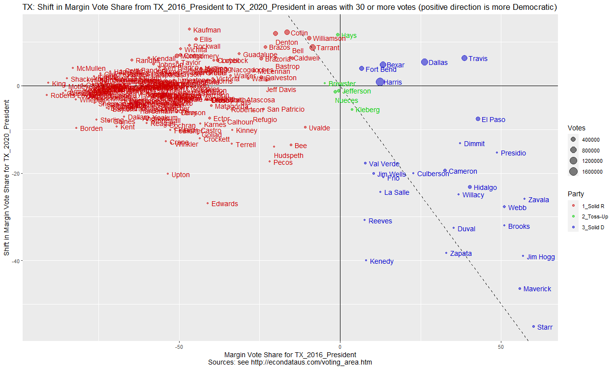
Removing the = before the # in the "AREA modify" input, unchecking the "Show all labels" checkbox, and clearing the "Position above" and "Position below" inputs will result in the following plot:
As can be seen, the more moderate precincts, closer to the Y-axis, seemed to have moved slightly above the X-axis, becoming more Democratic. In fact, the last line of the table above shows that this resulted in all of Texas blue-shifting by 3.4% between 2016 and 2020. However, the plot shows that this was countered by a number of Democratic precincts in the lower-right having red-shifted well over 50 percent.
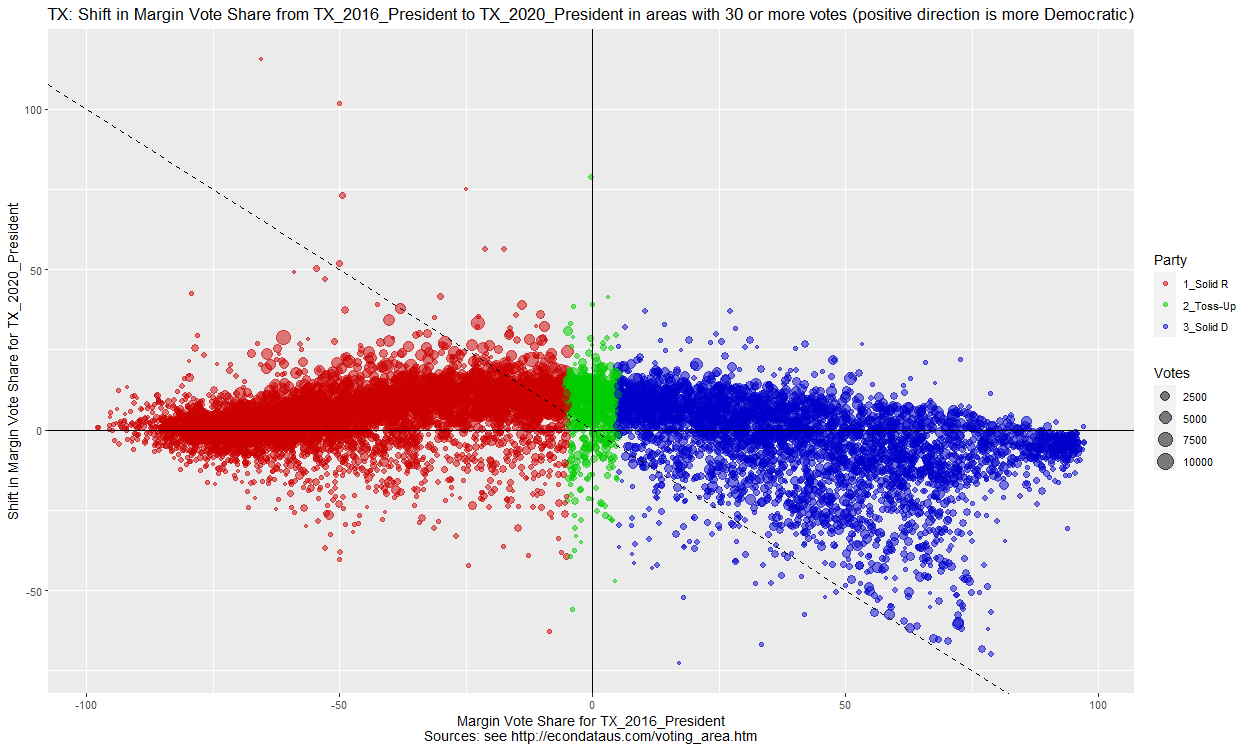
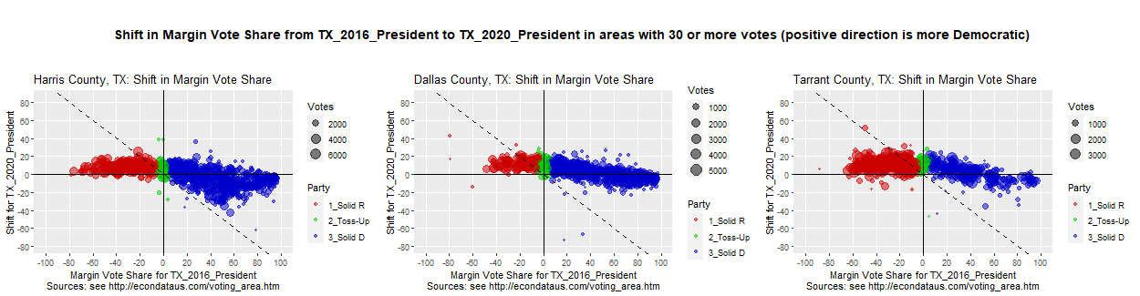
Clicking on the next tab to the right, the Area Plot2s tab, will display small versions of the first 9 counties in alphabetical order. This can be expanded to include all 254 Texas counties by leaving "Number of columns" set to 3 and changing "Number of rows" to 85. It may take 2 or 3 minutes to generate all of the plots. Setting "Number of rows" back to 3 and changing "Sort Counties" to VOTES will display the top 9 counties with the most votes as follows:
As can be seen, Harris County is the county with the most votes and its plot has a shape similar to the plot of all of Texas above. Its county seat is Houston, the largest city in Texas. The plots of Dallas, Tarrant, Bexar, and Fort Bend Counties look similar. The plots of Travis, Collin, and Denton Counties are mostly above the X-axis, signifying a blue-shift from the 2016 to the 2020 Presidential race. However, the plot of El Paso County is mostly below the X-axis, signifying a red-shift since 2016.
It's possible to specify the counties and their order by entering their names in a comma-separated list in the Counties text input. For example, entering the list "Cameron,Hidalgo,Maverick,Starr,Zapata,Brooks,Jim Hogg,Kenedy,Willacy" (without the quotes) will result in the following output:
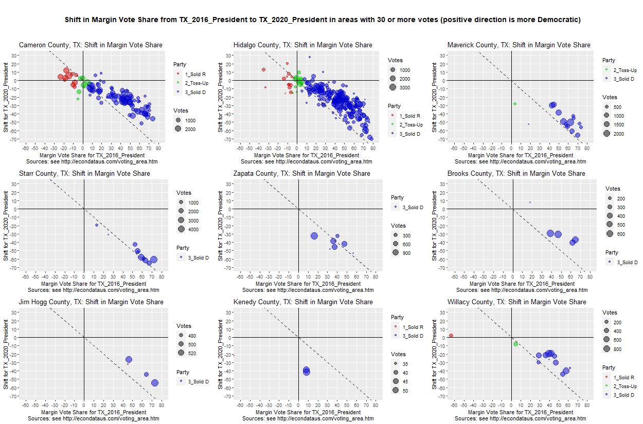
This list of counties consists of the 8 southernmost counties in Texas, plus Maverick County. It includes the 5 counties listed in the table above. In this plot, the scales were all set to be the same by setting "X From,To,Step,Tick" to -60,80,10 and setting "Y From,To,Step,Tick" to -70,30,10. Both of these inputs are on the "Area Plot2" tab. If the Counties text input is empty or starts with a # character, it will be ignored.
As can be seen, the Democratic precincts in all nine counties tended to red-shift toward the dashed line. This dashed line marks the point at which those Democratic precincts would have flipped to Republican precincts. The red-shift tended to stop just short of that line except for in Zapata and Kenedy Counties, both of which flipped to Republican.
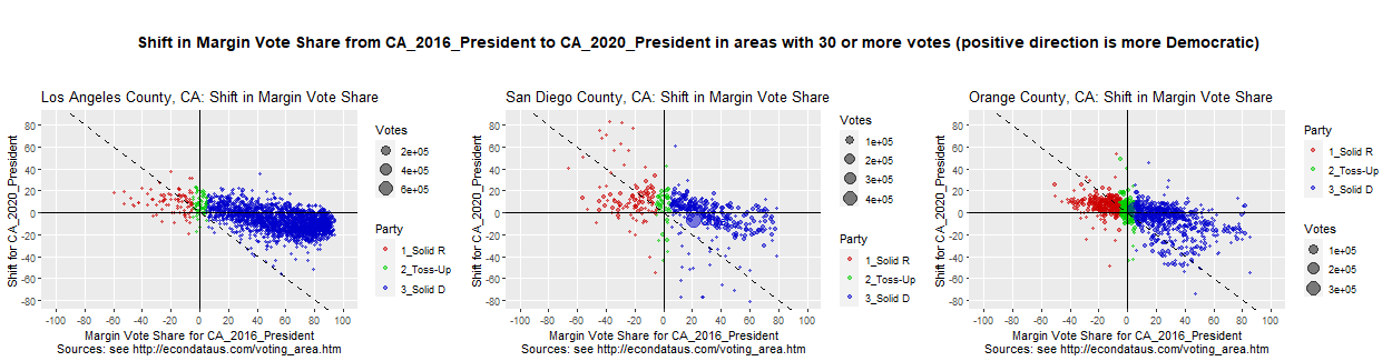
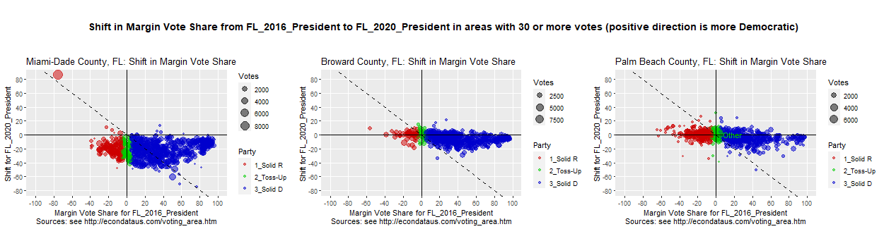
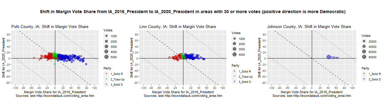
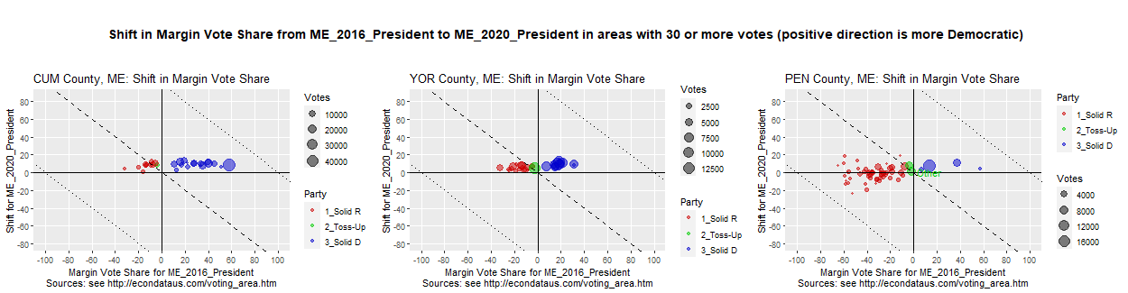
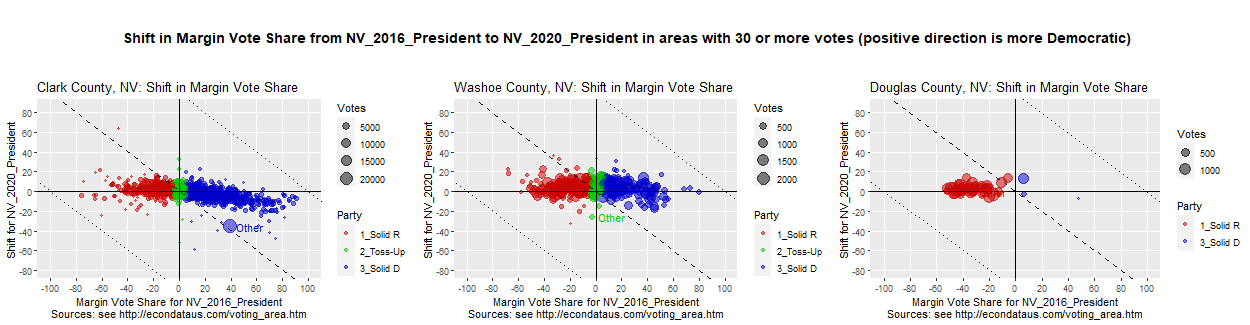
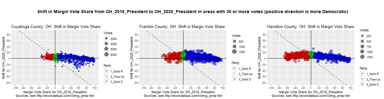
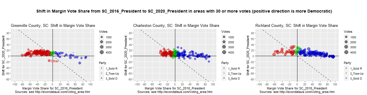
To better judge whether the shifts in the vote share for recent Presidential races in Texas is unusual, it may help to look at the shifts in other states. Following are the shifts in the three counties with the most votes in the 6 states for which I currently have the data, including Texas:
As can be seen, it does not seem to be unusual for there to be a slight downward slope from left to right sometimes. But the shift in mid-range Democratic precincts in Harris County seem a little unusual as does the strong red-shift in all precincts in Miami County, Florida. Of course, 3 counties in each of 6 states is a small sample and more states will be added as it is obtained.
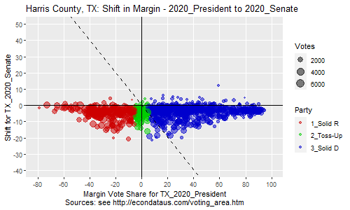
Having compared the 2016 and 2020 Presidential Race in Texas, it can be instructive to compare races from 2018 to the 2020 Presidential Race so as to determine what changes occurred in the past two years. Of course, there are some problems with the fact that this comparison is with a non-presidential candidate and an off-year electorate. It therefore seems a good idea to compare with several candidates so as to minimize the differences that are caused by one or more unique candidates. The following plots compare the 2020 Presidential race to three different elections that occurred in Texas in 2018. Those are the 2018 elections of Ted Cruz for Senate, Ken Paxton for Attorney General, and Greg Abbott for Governor.
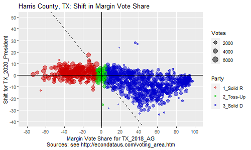
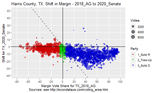
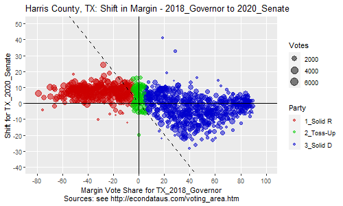
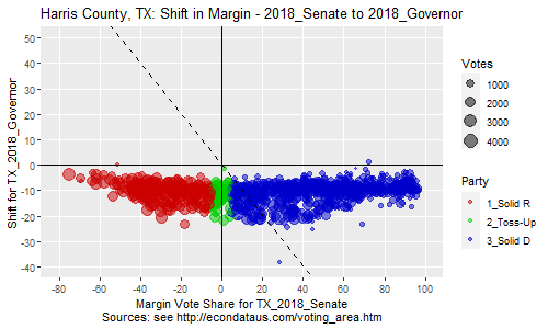
The following plots show the same information for Harris County, the county with the most votes and the home of Houston.
As can be seen, nearly all precincts red-shifted from Trump to Cornyn. Likewise, below is a comparison of all pairs of the 3 Republican candidates in 2018:
The plots comparing 5 races in Texas are a small sample but do suggest that no specific candidate was the cause of the strong red-shift in the mid-range of Democratic precincts. This seems to be more likely due to some combination of the time period (2018-2020), the location (Texas), and/or other factors.
Note: All of the above plots were generated by setting STATE, RACE, and COUNTY as appropriate, and unchecking "Show all labels". Then on the "Area Plot2s" tab, setting "Number of columns" and "Number of rows" to 1, "Height (pixels)" to 300, and "Width (pixels)" to 500.
An article titled 233 of Texas' 254 counties swung toward Trump in 2024 election was posted by TV station KXAN in Austin on November 27, 2024.
A plot showing the shift in the margin vote share of Texas' counties from 2020 to 2024 can be generated via the following steps:
The x-axis of this plot shows the vote share percent of each county in 2020 and the percent that it shifted in 2024. As can be seen, a great majority of them shifted Republican (down) in 2024 as stated in the article. This can be compared to the shift from 2016 to 2020 via the following steps:
As can be seen, the red Republican-leaning counties and the green toss-up counties appear to have, on average, remained about the same from 2016 to 2020. That is, they did not not swing obviously Democratic (up) or Republican (down) on average. The blue Democratic-leaning counties also shifted both up and down but the greater majority, especially those in south Texas and/or along the southern border shifted down. Much of this may have been offset by the fact that may of the largest blue counties like Harris, Bexar, Dallas, and Travis shifted up.
However, the prior plot before that showed that the great majority of Texas' counties shifted Republican (down) in 2024 with the amount of the shift down increasing as the counties became more Democratic. The reasons for this shift is unclear but it does look like the pattern that would result if all Republican voters from 2020 continued to vote Repulican but a set percentage of Democratic voters from 2020 switched. It would seem worth calculating a regression line for the shift and seeing how closely this would fit such a formula.
The precinct data for Texas was obtained from Capitol Data Portal. The data was initially downloaded between June 2nd and June 5th, 2021. It was downloaded again between September 3rd and 5th, 2021 and it was found that some of it had changed. The old data is still loaded in the application but those races now have the date that it was downloaded appended to the race's name. For example, TX_2020_President was changed to TX_2020_President_210602 and the new data was placed in TX_2020_President. That allows both sets of data to be used and compared to each other.
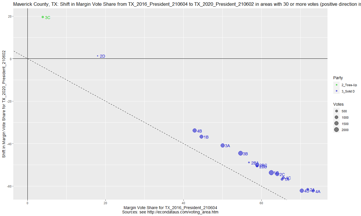
The data from June can be looked at by selecting TX for STATE, TX_2016_President_210604 and TX_2020_President_210602 for RACE (in that order), and Maverick for COUNTY. Clicking on the "Area Plot2" tab and changing "Label type" to "Area" will then cause the following plot to be output:
As can be seen, this plot looks similar to the one in the top right of the nine plots below but the points are much more equidistant from the dashed line. This is an x/dx plot and unchecking the "x/dx plot (else x/y)" checkbox will output the following x/y plot of the data:
Here, the margins of the 2016 Presidential race are plotted on the x-axis and the margins of the 2020 Presidential race are plotted on the y-axis. As can be seen, all of the 2020 margins except those for 2 small precincts are between about 8 and 11 percent. Now, clicking on the "Area Plot2b" tab will output the following x/x plot of the data:
Here, the margins of both the 2016 and 2020 Presidential races are plotted on the x-axis. Again, the 2020 margins of all but the top 2 small precincts are between about 8 and 11 percent. Now, change the two races selected in RACE to be TX_2016_President and TX_2020_President. This will switch to using the data downloaded in September of 2021 and cause the following x/x plot of that updated data to be output:
Checking the plot and the Areas2 tab shows that the 2020 margins of all but the top 2 small precincts now vary between about 3 and 23 percent, a much larger range than the prior 8 and 11 percent. It's possible to see which data changed for 2020 by changing the two races selected in RACE to TX_2020_President_210602 and TX_2020_President, selecting "(all)" for COUNTY, clicking on the "Area Plot2" tab, checking the "x/dx plot (else x/y)" checkbox, and selecting County for "Label type". This will output the following x/dx plot:
As can be seen, the biggest changes were made to 2020 data for Maverick County though there were changes made for other counties. Selecting Maverick for COUNTY, Count for Units, and clicking the Areas2 tab will display the following table:
The main thing that I was wondering was if you know what caused the errors in the original data and when these errors were first discovered and communicated to the TLC. It's difficult to understand what would cause the margins in all but two of the counties to become so uniform. Also, it's difficult to understand why it would take over 6 months for the problem to be detected and fixed.
That same day, I got a reply. The reply is fairly complex so I've posted it at this link after removing any personal identifying information. As best as I can understand, the reply states that the original data for Maverick County was based on county-level data because the precinct-level data was not available or not complete. The county data was allocated to the precincts by using 2010 Census data since the 2020 Census data was not yet available. It would seem likely that this data was used to divide the total votes between precincts. There is no mention of using precinct data from prior elections to estimate how those total votes were divided between candidates. Hence, it would seem likely that the votes were divided between candidates in the precincts using the percentages that were observed in the county as a whole. This would explain why all but two precincts had about the same margins.
However, this does not explain the two precincts that had different margins. It could not be that the TLC had the correct precinct numbers for these two precincts since the margins in those precincts required large changes. The TLC appeared to have had some reason to estimate the margins of those two precincts to have been different from the others. In addition, the tweet from the Maverick County Republican Party that "[t]he Texas legislative Council messed up somehow" suggests that there was at least some misunderstanding between them and the TLC.
Speaking of misunderstanding, it would have been helpful if the TLC could have indicated more clearly that the election data was unofficial and that some of it could be very inaccurate. They do state at this link that "[t]here may be small differences between the data presented here and official election results." The reply gives a stronger warning, stating the following:
The council's collection of election data for redistricting is not represented as the source for official results; official results should always be obtained directly from the counties/and or Secretary of State. County officials and the Secretary of State are the sources of record for election data in Texas.
This stronger warning may be somewhere on the site but I haven't seen it. The New York Times seemed likewise unaware of the problem since, as described in the section below, they used this data in their Interactive 2020 Election Map and did not list caveats for Texas in their "State-by-state data availability and caveats" section at this link. In fact, the list of caveats in this section points to the larger problem that not all election data is available. Even that data which is available is in different formats that make it difficult, if not impossible, to fully use.
In any event, Maverick County was not the only county that had this pattern in their election data. They just had the most precise version of the pattern. The set of 9 plots below show that nearly all of the southernmost 8 Texas counties had this pattern to some extent.
On August 23, 2021, the non-profit publication WhoWhatWhy posted an article titled "The Real Steal: Electoral Forensics and the 2020 Election", written by Jonathan Simon, author of the book "CODE RED: Computerized Elections and The War on American Democracy". The article links to a paper by the same name. On page 12 of that paper is a plot similar to the following plot:
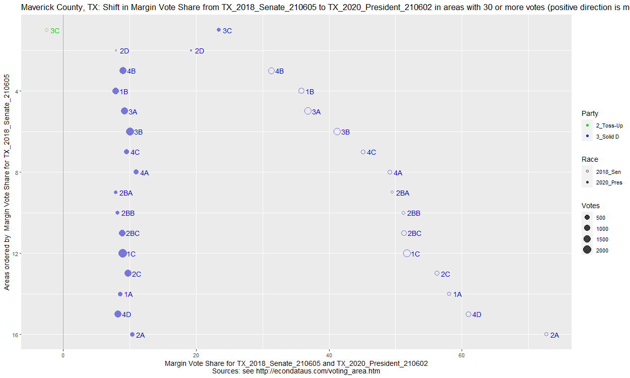
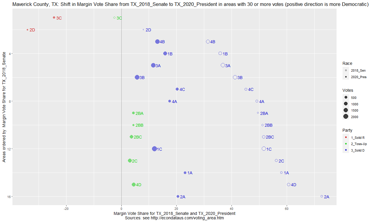
Here, the margins of both the 2018 Senate race and 2020 Presidential race are plotted on the x-axis. Again, the 2020 margins of all but the top 2 small precincts are between about 8 and 11 percent. Now, change the two races selected in RACE to be TX_2018_Senate and TX_2020_President. This will switch to using the data downloaded in September of 2021 and cause the following x/x plot of that updated data to be output:
Checking the plot and the Areas2 tab shows that the 2020 margins of all but the top 2 small precincts now vary between about 3 and 23 percent, a much larger range than the prior 8 and 11 percent. The following tables show the margins in the 2018 Senate race and the 2020 Presidential race in both the original data downloaded in June and the updated data downloaded in September:
The 2018 and 2020 U.S. House of Representative races in Maverick County can be compared by selecting TX for STATE, TX_2018_House_210624 and TX_2020_House_210624 for RACE (in that order), and Maverick for COUNTY. Clicking on the "Area Plot2" tab and changing "Label type" to "Area" will then cause the following plot to be output:
Here, the margins of the 2018 and 2020 House races are plotted on the x-axis. The table on the Areas2 tab shows that the 2020 margins (labeled MARGIN2) of all but the top precinct are between 17.54 and 20.54 percent, a range of just 3 percent. One other oddity is that only one point appears for precinct 2D. This is because that precinct reported exactly 30 Democratic and 20 Republican votes in both the 2018 and 2020 House races. Hence, their dots and numbers exactly overlay each other in the plot!
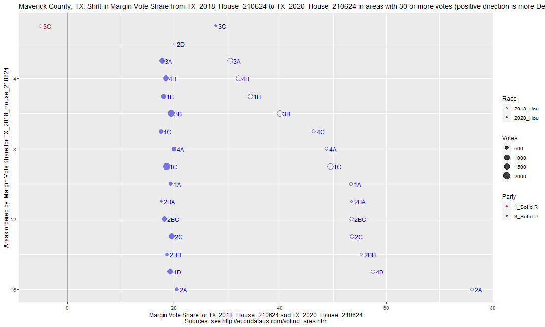
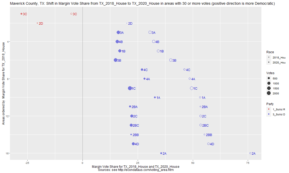
Now, change the two races selected in RACE to be TX_2018_House and TX_2020_House. This will switch to using the data downloaded in September of 2021 and cause the following x/x plot of that updated data to be output:
Checking the plot and the Areas2 tab shows that the 2020 margins of all but the top 2 small precincts now vary between about 15.1 and 35.6 percent, a much larger range than the prior 17.4 and 20.4 percent. There is still the odd fact that the 3rd to 6th precincts had margins in a range of 9.3% (30.7-40) in 2018 that closed to just 1.8% (15.1-16.9) in 2020. Also, the 9th and 11th to 15th precincts had margins in a range of 7.6% (49.4-57) in 2018 that closed to just 1.5% (21.5-23) in 2020.
The following tables show the margins in the 2018 and 2020 House races in both the original data downloaded in June and the updated data downloaded in September:
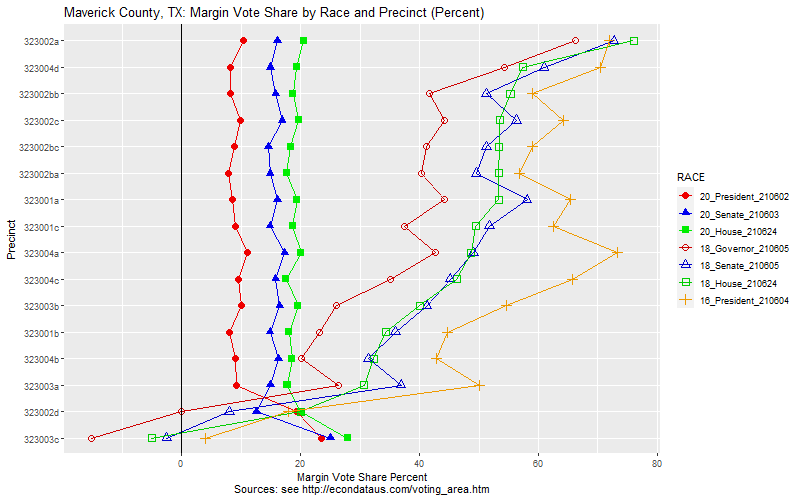
The following plots show the margin vote share percents by precinct for major races from 2016 and 2020. The first plot below shows the original, unrevised data that was downloaded at the beginning of June 2021, about 6 months after the 2020 election.
It was the near identical margins (between about 8 and 11 percent) for the 2020 Presidential race in all but 2 of the precincts that initially raised suspicions. The plot shows nearly identical margins for the 2020 Senate and House races as well.
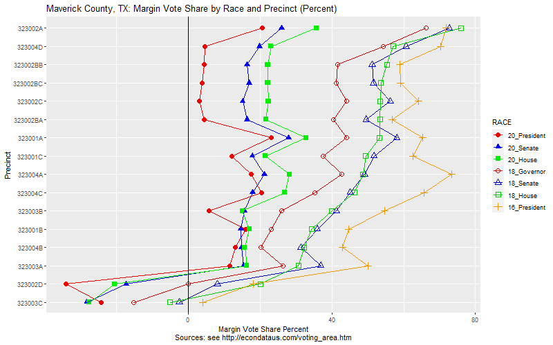
The following plot shows the revised data that was downloaded at the beginning of September 2021, about 9 months after the 2020 election.
Here, the 2020 margins show much less of a pattern. As explained in the section titled Communication with Texas Legislative Council, a reply from the TLC indicated that this was because the final precinct data was not available when the data was initially uploaded and that the precinct totals were simply estimates. The reply stated that its data were not official results and any requests for official results should be directed to the Secretary of State office.
The next section titled Communication with Texas Secretary of State Office describes how the updated TLC data was identical to the Texas Secretary of State data with one exception. That exception was precinct 4D which showed 5,708 votes for Cornyn in the 2020 Senate race in the updated TLC data versus 7,907 votes in the Secretary of State data. The latter number appears to have been an error which was not carried through to the official county totals but was left uncorrected in the SOS data file.
In searching for precinct data, I came across some projects that were seeking to compile various sets of precinct data. The most complete one that I came across is call OpenElections states its goal at this link as follows:
Our goal is to create the first free, comprehensive, standardized, linked set of election data for the United States, including federal and statewide offices.
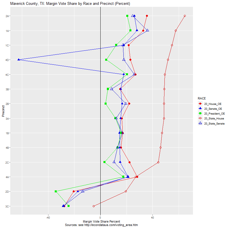
In communicating with them, I found that they are using the exact same shared directory from the Texas Secretary of State as I was using. One benefit was that they also included the data for the State Assembly, State Senate, and the Railroad Commissioner races. The following plot includes those races in looking just at the 2020 races:
The error in the Senate vote from Maverick can be seen as the blue leftward spike in precinct 4D below. Also, it did seem a bit odd that the margin for the State Assembly candidate was much more Democratic than the other candidates. However, the candidate's page on Wikipedia shows that he worked for Langley & Bannack in Eagle Pass so a "favorite son" factor could have been in play.
This analysis of the election data for Maverick does seem to show how precinct data can be useful to look for red flags in the election data. However, it also shows that it can be very difficult, if not impossible, to derive any proof of anything wrong from the data. One must be very careful in interpreting any seeming discrepancies. It is likely that proof of any errors can only be derived from hard evidence such as through an audit or recount of the ballots.
Still, this podcast suggests that precinct data can be very useful in doing election forensics. The speaker thought that the Russians may have been under some pressure to release the data. That's not to suggest that Russian elections are honest and the podcast suggests otherwise. That is based on the data that they have released. It would be a step toward transparency if all U.S. states were likewise pressured to release their precinct data.
Selecting TX for STATE, TX_2016_President_210604 and TX_2020_President_210602 for RACE (in that order), Maverick for COUNTY, Percent for Units, and clicking on the Areas2 tab will display the following table:
The above two screenshots show the precinct with the most votes (1C) and the precinct in the northeast corner (4B) of Maverick County. The popups show the number of votes which exactly match the numbers shown for those precincts in column Biden and Trump in the last table above. As mentioned above, these are the original numbers. In any event, two screenshots below show two more precincts.
The above two screenshots show the precinct in the northwest corner (3C) and the southeast corner (2D) of Maverick County. As before, the popups show the number of votes which exactly match the numbers shown for those precincts in column Biden and Trump in the last table above. However, these are the only two precincts for which the margins were not reported as being in the 8 to 11% range in the original data. It's noteworthy that these are also the only two precincts that don't come close to Eagle Pass, Texas, the county seat.
The prior plot showing the shift in margin vote share from the 2016 to the 2020 Presidential race in Maverick County, Texas can be reproduced via the following steps:
As shown previously, the original data posted at Capitol Data Portal produced the following plot:
As can be seen, all but the top 2 precincts appear to have had a vote share between about 8 and 11 percent (leaning Democratic). A prior table showed the precise range to have been about 7.8 to 11.01. Now, the shift in vote share from the 2020 to the 2024 Presidential race in Maverick County, Texas can be reproduced via the following steps:
As can be seen, all but the top 2 precincts appear to have had a vote share between about -19 and -16 percent (leaning Democratic). A more precise measurement of the range can be found by clicking the Areas2 tab. That should display the following table:
In any case, changing Units to Count on the leftmost sidepanel will display following actual vote counts:
There have been a number of analyses that have looked at the 2016 Presidential Race using something called Cumulative Vote Tally (CVT). I've linked to a number of them at this link. One titled An Electoral System in Crisis describes CVT as follows:
This method is called a CVS (Cumulative Vote Study) or CVT (Cumulative Vote Tally) graph. Precincts are organized from those with the least number of votes to those with the most vote. The statistical patterns that emerge are then examined to see if the candidates' percentages tend to stabilize as more and more of the votes are counted. That is the expected statistical pattern, because as a sample size grows, its average should get closer and closer to the average of the whole population.
The paper goes on to say the following about when this expected behavior does not occur:
When one candidate's percentages go up as the precincts get larger, there may be an explanation - such as an increase in registered Democrats or Republicans - or an increase in a particular demographic that supports that candidate. We try to look at contextual data, when it is available to see if there are reasons for the statistical pattern. If not, a pattern where one candidate gets more and more votes as the precincts get larger may be a red flag that the results have been manipulated.
Hence, the analyses is careful to say that CVT can provide a red flag but that the researcher should also look at contextual data. Another analysis was put out by a group named "Vote Sleuth" on their website at http://www.votesleuth.org/ adds the following regarding CVT:
The political leaning of a given voting precinct should not be strongly related to its size, except for the observation that very small precincts tend to be located in rural areas, which historically have voted more conservatively.
In general, as the vote count is tallied for a given county starting with the smallest precincts and moving to the larger ones, we would expect the percent of votes for a given candidate to quickly stabilize at or near the final outcome, unless for some reason there is a strong bias toward one candidate in larger precincts. A more thorough explanation of the reason for this is here.
The analysis then goes on to describe a simple metric named "deltaM":
We adopted a very simple metric - deltaM* - to describe how "flat" one of these sets of lines is. This estimates numerically the extent to which there is a change in vote margin as we move from adding only smaller precincts to adding larger precincts to the totals. We arrive at this margin by first identifying the median precinct size - where half the precincts are smaller and half the precincts are larger. We then add up the votes for the two candidates in all of the precincts below and including the median to see how different the vote outcome would be if we stopped counting votes after we added only the results from the smaller precincts. If the outcome for all precincts compared to that for only the smaller half of the precincts favors the Republican candidate, deltaM is positive. If the final outcome compared to the "smaller precincts only" outcome favors the Democratic candidate, deltaM is negative.
DeltaM represents the distance between the vote lines at the far right of the graph compared to the distance between the lines at the middle of the graph.
As an example of a county with a large deltaM, the analysis shows the following CVT graph of Milwaukee County, Wisconsin in the 2016 Presidential race:
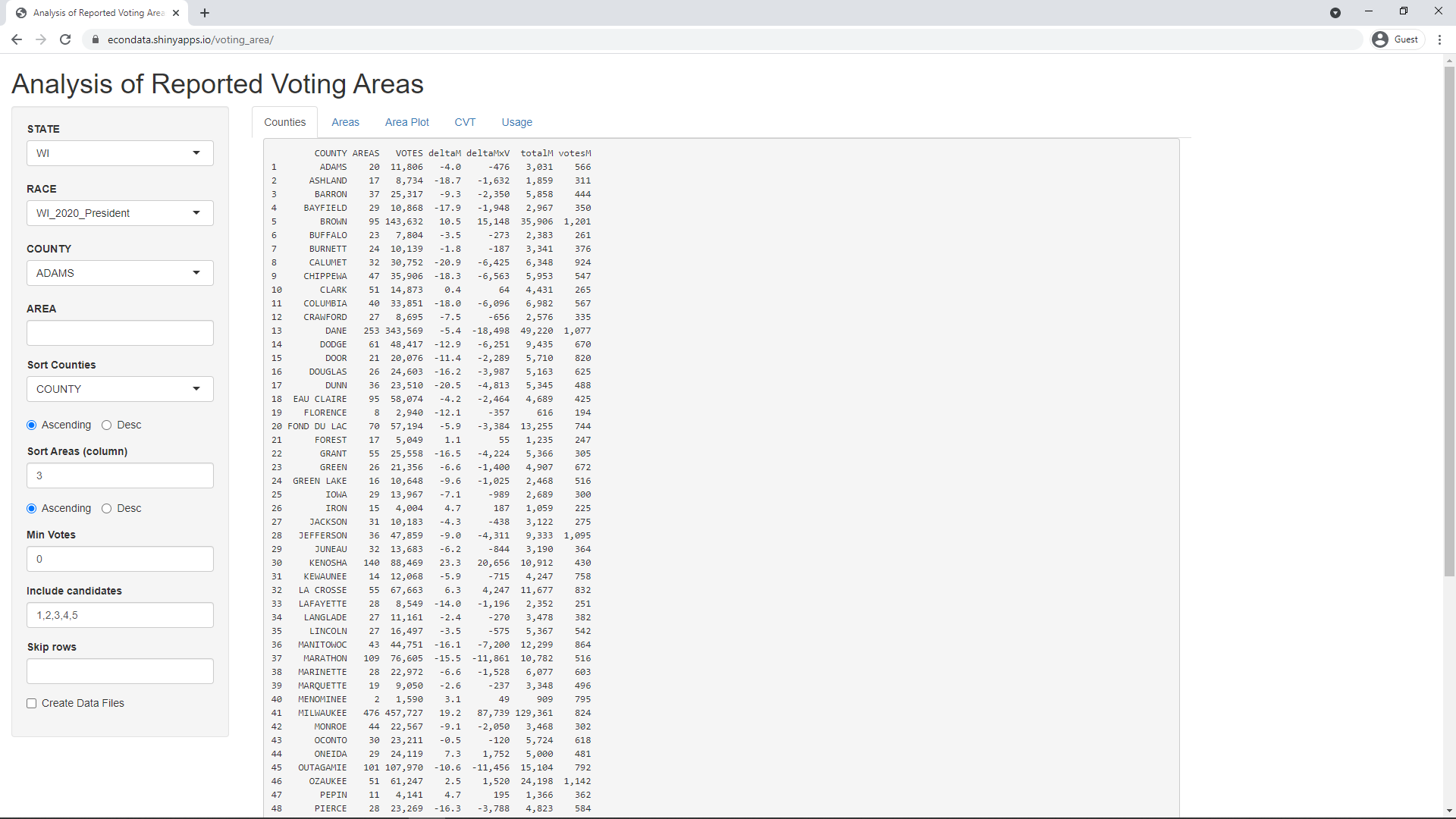
It is possible to reproduce the above CVT graph and check the numbers in the Shiny application at https://econdata.shinyapps.io/voting_area/. Going to that URL will display the following page:
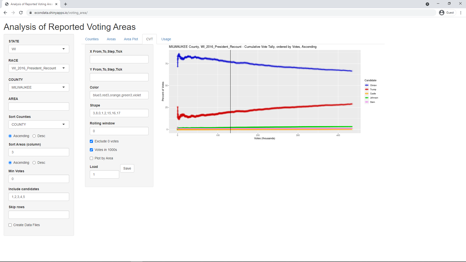
To reproduce the above CVT graph, ensure that STATE is set to WI, RACE is set to WI_2016_President_Recount, and COUNTY is set to MILWAUKEE. Selecting the CVT tab should then display the following page:
This CVT graph looks very much like the one above from Vote Sleuth except that the x-axis contains the cumulative votes instead of the voters per precinct. This is like the CVT graphs at this link. In fact, looking closely at x-axis of the CVT graph from Vote Sleuth shows that its numbers of voters per precinct are not equally spaced. It appears that they are graphing by precinct number (from 1 to number of precincts) and relabeling the x-axis with the number of voters per precinct. This does cause the points in the line to be equally spaced and appears to "stretch" the graph to the right. This can be achieved in the Shiny app by checking the "Plot by Area" checkbox. in the parameters just to the left to the CVT graph. This causes the CVT graph to change to the following:
Now the CVT graph has the same shape as the previous one from Vote Sleuth. The x-axis is not currently relabeled but the numbers can be looked up on the Areas tab. The vertical line in the center of the graph marks the location of the median area (or precinct).
The CVT graph from Vote Sleuth shows the numbers of Voters, Precincts, Average voters per precinct, Votes in median precinct, deltaM, and deltaMxV. The Average voters per precinct is simply the number of Voters divided by the number of Precincts. The other numbers are shown on the Counties tab. The leftmost 2 numeric columns below compare the numbers from the Vote Sleuth graph and the Counties tab:
Next, it's possible to compare the vote numbers by comparing the TOTAL column in the Areas tab with the "TOTAL VOTES" column in the Vote Sleuth Detailed Data. This column should be the same for all of the candidates but you need to click on the "TOTAL VOTES" header to sort it from the lowest to the highest vote count. For the Shiny app, you need to set RACE to WI_2016_President_Recount and set COUNTY blank by clicking on the COUNTY and hitting the backspace key. Also, the input "Sort Areas (column) should be set to 3. Note that this input should almost always be set to 3 with the Ascending button selected below it. This causes the areas to be sorted by the TOTAL column, from lowest to highest. This is ordinarily required for the CVT graph and calculations.
Comparing the two vote columns reveals that "CITY OF MILWAUKEE Ward 180" appears to be missing from the Vote Sleuth data. To find the area number of this area, set "Sort Areas (column)" to zero (this skips all sorting) and find "CITY OF MILWAUKEE Ward 180" in the data. The incrementing number on the far left is 1984, indicating that it is the 1984th row in the unsorted data. Now enter 1984 in the "Skip rows" text box in the far left input panel. Finally, make sure to change "Sort Areas (column)" back to 3. This last step is critical.
The numbers for Milwaukee County on the Counties tab should be equal to those in the fourth numeric column in the table above. As can be seen, the value of Voters, Precincts, and deltaM are identical to what they were for Vote Sleuth. The value of deltaMxV equals deltaM percent of the Voters and differs by only 14. This may due to a slight round off error or update to the data. What's not clear is why Vote Sleuth lists 780 for the Votes in median precinct since the data on the Areas tab shows 780 to be the votes in area 234. The number 792 is the votes in area 238 which would seem to be the median out of 475 areas. In any case, the other 4 numbers are identical or very close to identical.
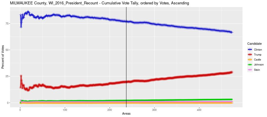
Selecting the "Area Plot" tab at this point should display the following page:
The area plot is a scatterplot of the Vote Margin of each reported area against the Total Votes in each reported area. The vote margin is equal to the Democrat vote share minus the Republican vote share so that a positive margin favors the Democrats. The plot reveals at least two reasons for the inward sloping CVT chart. One is that a number of the higher-vote areas do have a stronger red (Republican) margins. The location of these areas can be identified using the numbers to the right of their markers. For example, the numbers of 5 Republican and Republican-leaning markers in the lower right of the scatterplot are 470, 471, 472, 474, and 474. These can be looked up at the bottom of the table on the Areas tab and shown to be in the City of Oak Creek and the bordering City of South Milwaukee.
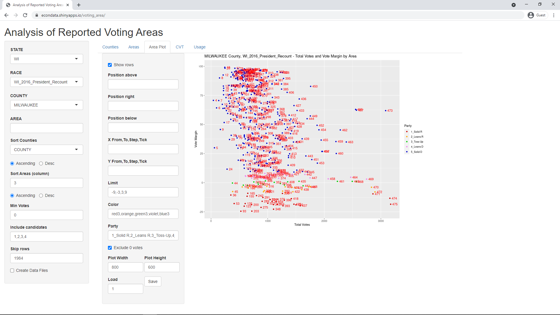
However, another reason for the sloping CVT chart appears to be that many of the lower-vote areas have stronger blue (Democrat) margins, most notably the cluster with vote magins between 90 and 100 and total votes between about 500 and 750. In fact, it's possible to temporarily remove this latter cluster from the CVT calculation by setting the "Min Votes" input on the leftmost panel to 750. Switching back to the CVT tab, this can be seen to change the CVT chart to the following:
Looking back at the Counties tab, this causes the deltaM value for Milwaukee County to drop from 20.2 to 9.8 percent.
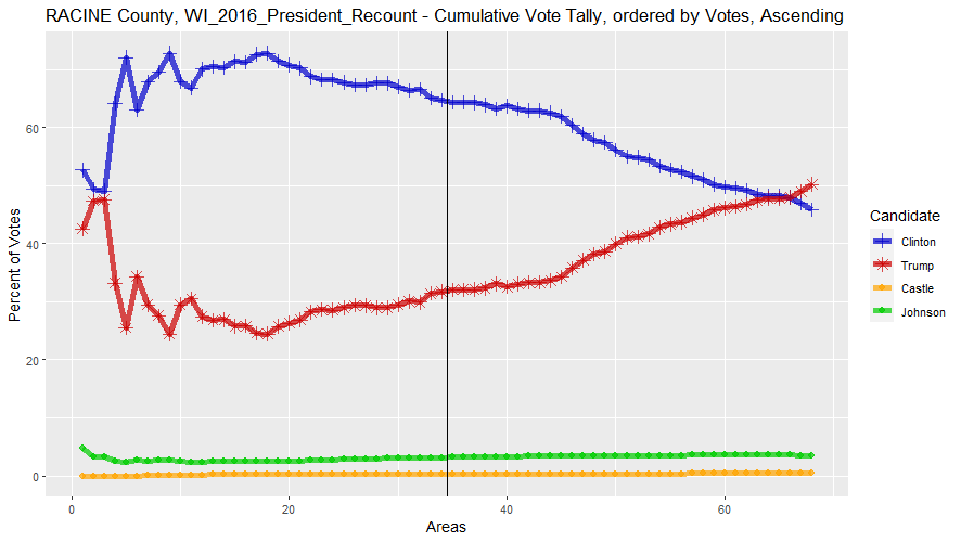
At this link is a chart of 7 Wisconsin counties that show "disturbingly implausible deltaM values". The county with the highest deltaM value is Racine County with a deltaM value of 37.6 percent. Setting the "Min Votes" input back to zero, setting County to RACINE, and selecting the CVT tab shows the following CVT graph:
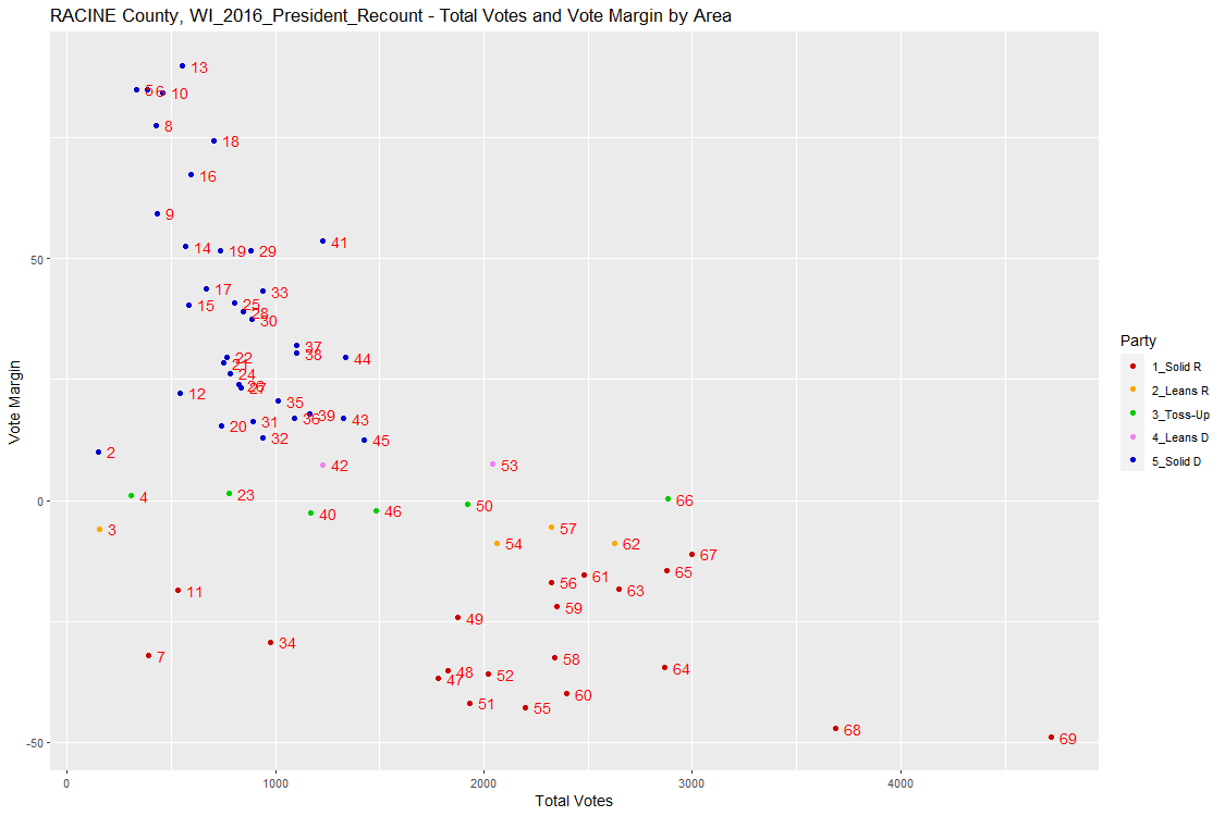
Switching to the Area Plot tab then shows the following scatterplot:
As can be seen, the area up to area 46 are mostly Democratic but those from area 47 on are chiefly Republican. The table on the Areas tab shows that these areas (from area 47 on) are all outside the city of Racine. Also, they are all for areas containing multiple wards whereas the prior areas contained mostly single wards. Hence, it would appear that much of the reason that the latter areas have more votes is that they contain multiple wards. It might be useful to investigate as to why the wards are combined in these areas for their reporting.
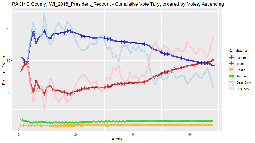
Switching back to the CVT tab and setting the "Rolling window" input in the panel next to the CVT graph changes the graph as follows:
The two lines that have been added are similar to Simple Moving Averages (SMAs) except that they are more precisely Simple Moving Cumulations. They show almost exactly where the margins of the areas switch from Democrat to Republican. This can provide a little additional information to the CVT graph.
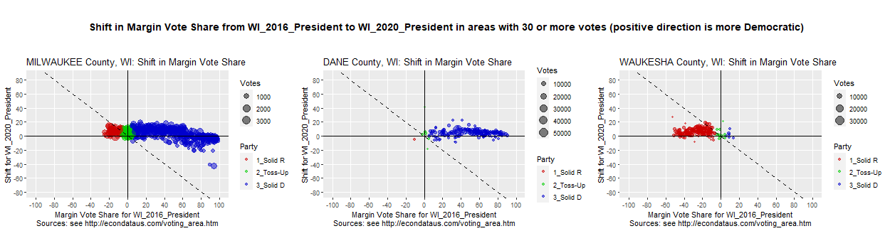
Next, it may be instructive to look at the 2020 Presidential Race in Wisconsin. To do so, ensure that STATE is set to WI and RACE is set to WI_2020_President. In order to look at the counties with the most votes, it's useful to set the "Sort Countries" select list to VOTES. This sorts both the counties listed on the Counties tab and the COUNTY select list. Now, it's easy to select the first county in the COUNTY select list, MILWAUKEE.
Following are the first 10 counties listed on the Counties tab, interespersed with the values from 2016:
Going through the CVT graphs for these counties and comparing them to the CVT graphs from 2016 show that their basic shapes have changed little. This is not too surprising since their deltaM values did not change much.
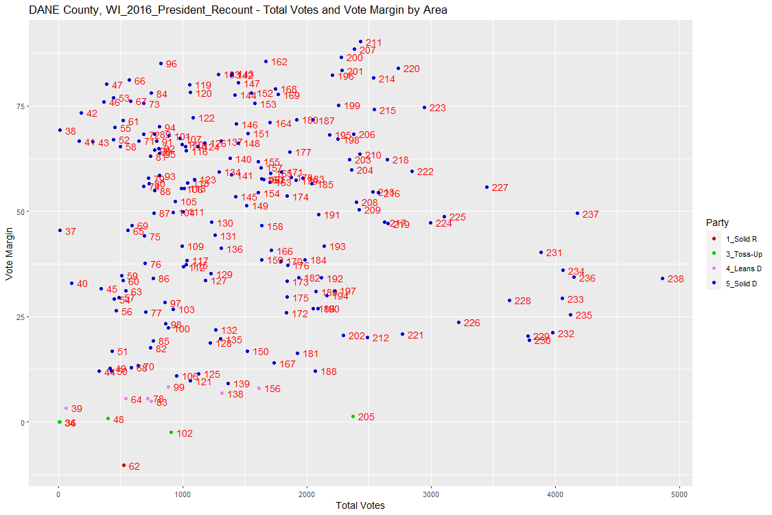
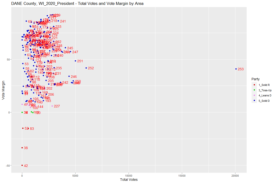
The most obvious change revealed by going through the Area Plots for these counties and comparing them to those from 2016 is in Dane County. Following is the Area Plot for Dane County in 2016:
Following is the same plot for Dane County in 2020:
As can be seen, Dane County now contains an area with over 20 thousand votes. Examination of the Areas tab reveals that this area is for "City of SUN PRAIRIE Wards 1-19,26". Examination of the Areas tab for 2016 reveals that the wards for "City of SUN PRAIRIE" was split up between areas 26 and 233 through 236 in 2016. Furthermore, the wards in 2016 were Wards 1 through 21. Hence, ward 20 and 21 appear to have been replaced by ward 26 in 2020. In addition, the table above shows that the total number of areas reported in Dane County increased from 238 to 253. All of this makes it more difficult to scrutinize the change in election results from one election to the next. This is especially true of "super areas" like "City of SUN PRAIRIE Wards 1-19,26" in which there were over 20 thousand votes.
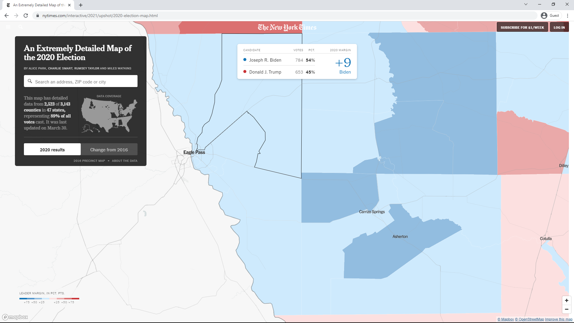
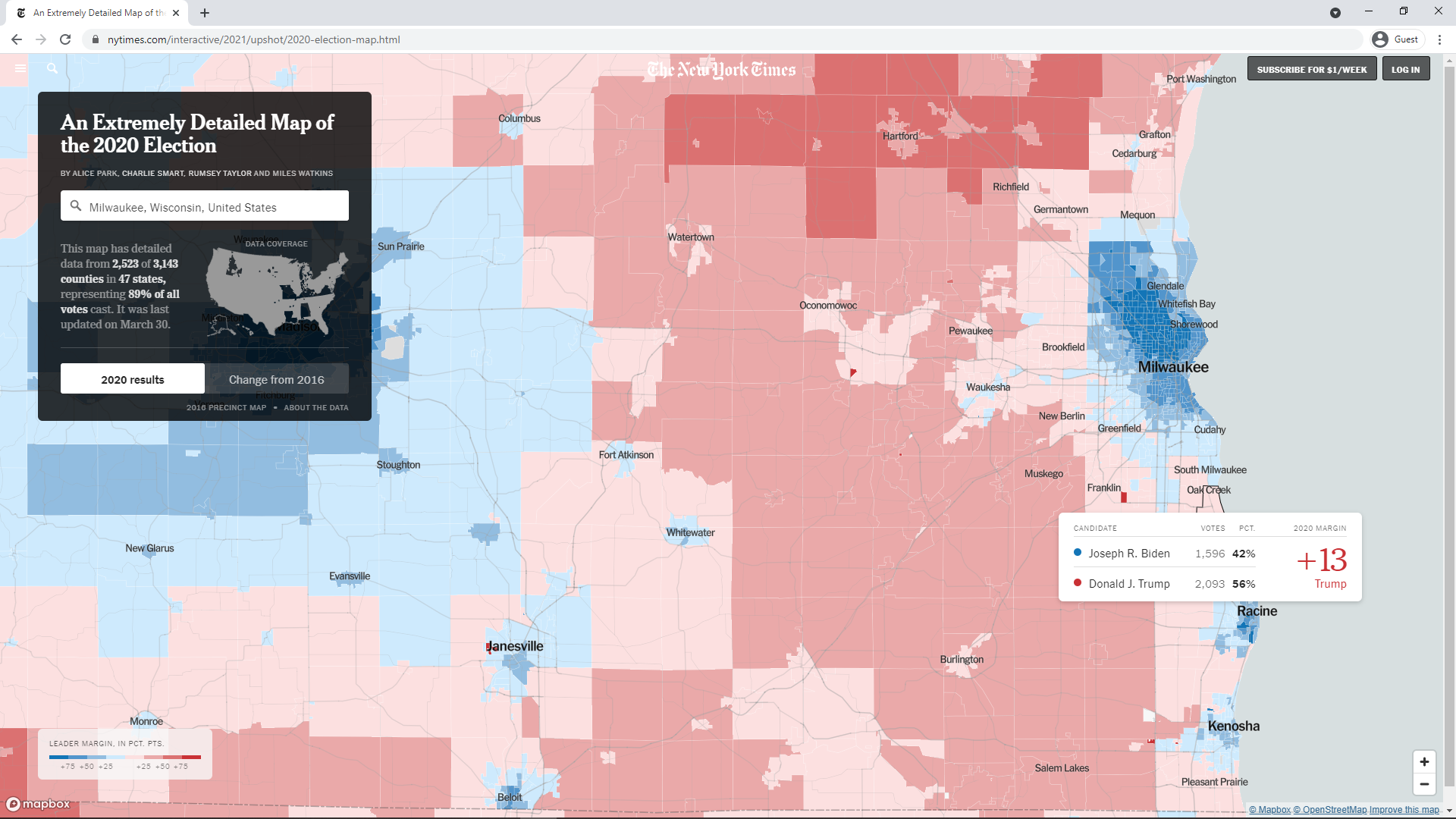
In any event, it is useful to compare results from one election to another when possible. One very useful tool in comparing the 2016 and 2020 Presidential elections is a New York Times interactive map at this link. The following screenshot shows election results of the 2020 Presidential race in the Milwaukee area:
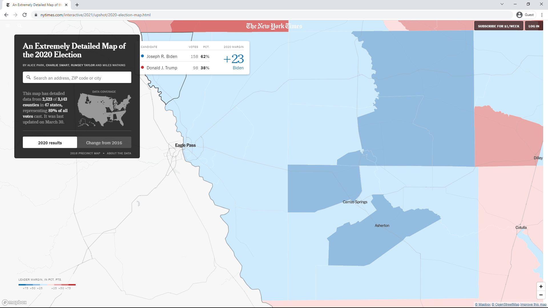
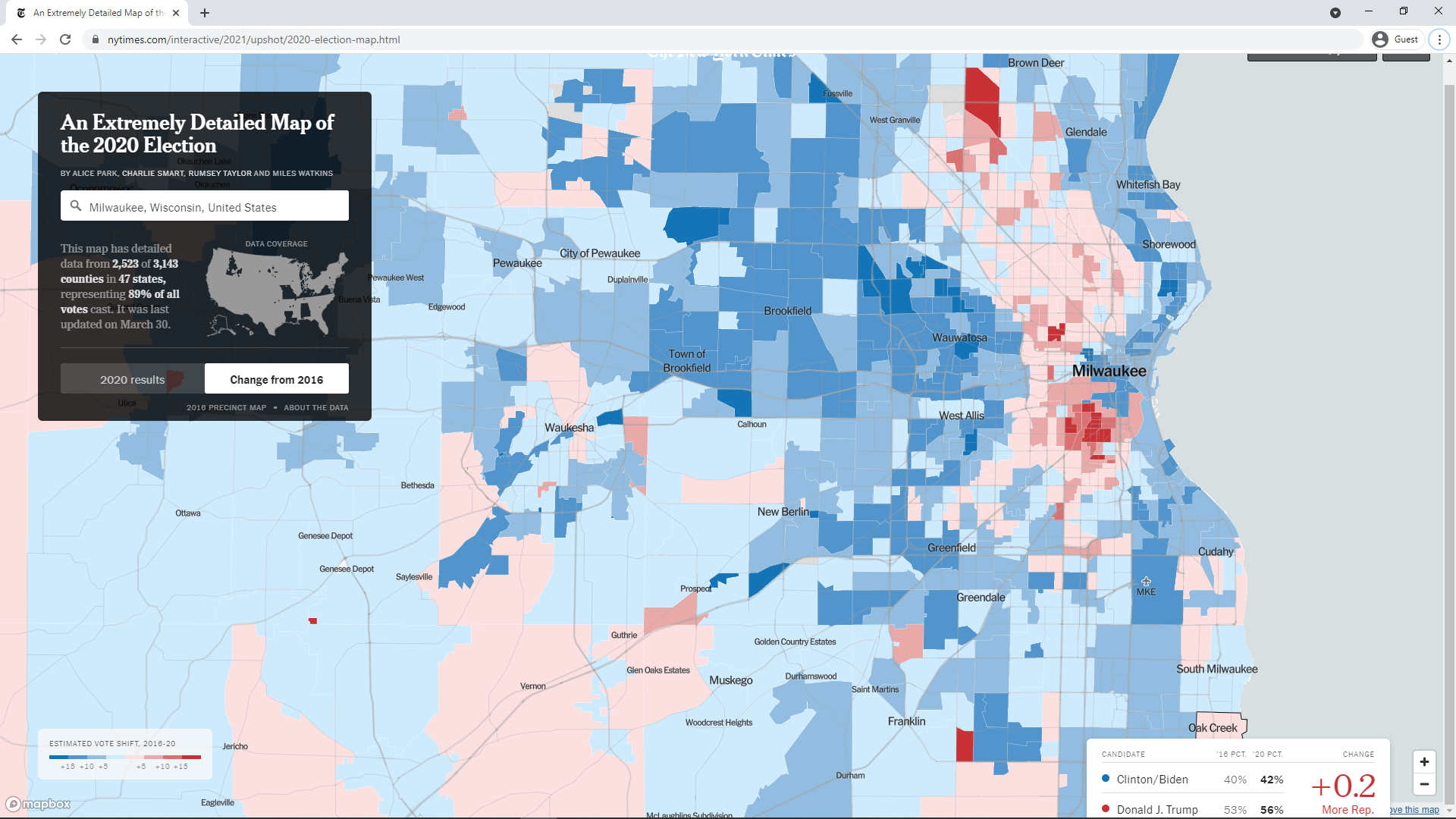
As can be seen, the map also shows the Racine and Kenosha metropolitan areas. A tooltip for an area in Oak Creek shows 1,596 votes for Biden and 2,092 votes for Trump. This matches the numbers for the area with the most votes in Milwaukee County, shown on the Areas tab to be "City of OAK CREEK Wards 10-12". The following map was obtained by clicking the button labeled "Change from 2016" and zooming in on Milwaukee:
As can be seen, there are a number of areas near central Milwaukee in which Republican support increased sharply in 2020. Mousing over shows tooltips with list the increases in margin to have been between 15 and 21 percent in favor of Trump.
As quoted from this source at the beginning of the analysis, "a pattern where one candidate gets more and more votes as the precincts get larger may be a red flag". But that source also states the following:
When one candidate's percentages go up as the precincts get larger, there may be an explanation - such as an increase in registered Democrats or Republicans - or an increase in a particular demographic that supports that candidate. We try to look at contextual data, when it is available to see if there are reasons for the statistical pattern.
In the case of the counties looked at in this analysis, there appears to be another possible reason. There seems to be a policy of Wisconsin election officials to combine wards, especially in areas surrounding the city, to create larger reported voting areas. It would be very interesting to see the effect on the CVT graphs if the wards were reported separately. The most extreme case of this combining of wards observed in the 2020 data was the creation of the "City of SUN PRAIRIE" area containing 20,036 votes. The next largest area in all of Wisconsin was "Village of WESTON Wards 1-13" with 8,172 votes. There is no clear reason to combine wards unless the vote counts are so low as to present privacy concerns. Not only does this combining of wards in reporting likely add to anomalies in the CVT graphs, they make it difficult to detect anomalies via other methods. One might wonder if this is sometimes the intent.
Another reason for the anomalous patterns in some CVT graphs could be a decrease in votes in some Democrat-leaning areas. This could be due to some sort of election irregularities but it could also be due to some form of voter suppression. Of course, some Republicans might charge that it is due to a simple failure of voters to turn out or due to some new shift in the electorate. All of this points to the need for more investigation when an anomaly is seen in a CVT graph. That additional investigation could include comparison to prior races and to other statistics like registrations. Election officials would do well to make such investigation easier. A first step could be to not combine wards to create reporting areas larger than some minimum size. Another would be to standardize the names of those reported areas so that they can more easily be compared between races.
Comparing the 2016 and 2020 Presidential Race in All States
Comparing the 2018 and 2020 Races in Texas
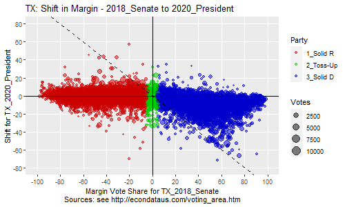
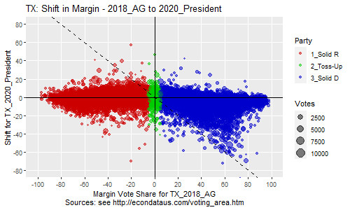
As can be seen, the support of red Republican precincts changed little on average between 2018 and 2020, measuring by the Senate and AG race. However, there was a strong red shift in the blue Democratic precincts. On the other hand, measuring by the Governor race shows less Republican support from Republican precincts in 2020 but similar support from Democrats. This suggests that Greg Abbott was a generally more popular candidate than the other Republicans. Still, all three plots have a similar shape. The main difference with Abbott's plot is just that it's a bit higher on the y-axis.
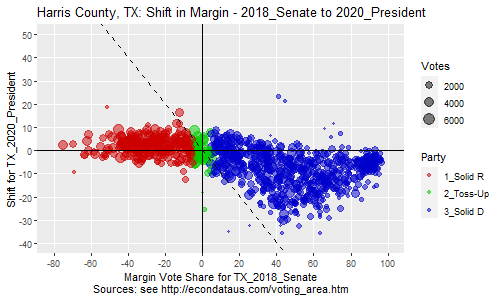
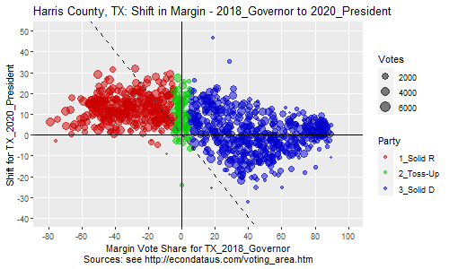
As can be seen, the shapes and levels are all pretty similar for Harris County with the possible exception that the maximum red shift in Democratic precincts appears to move a little to the left, close to a 40 percent margin. Of course, it's always possible that this red shift is somehow related to the 2020 Presidential race. To check that, the following plots show the same information but compare to the 2020 Senate race instead.
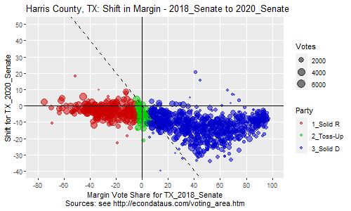
As can be seen, the shapes and levels are again similar with the exception that the levels are a little more red-shifted, especially for Republican districts. This suggests that the Senate candidate, Cornyn, may have been somewhat more popular with Republicans that Trump. This can be seen more clearly in the plot below which compares them directly:
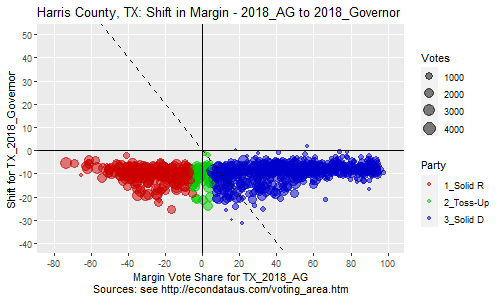
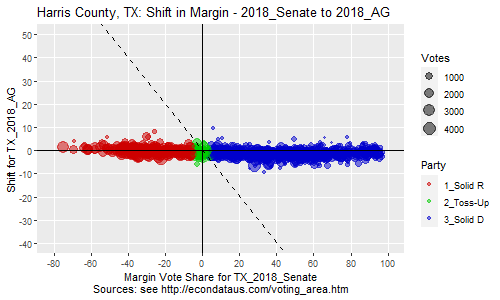
As can be seen in the first two plots, nearly all precincts red-shifted from Cruz and Paxton to Abbott. The last plot shows that Cruz and Paxton had similar support.
Comparing the 2020 and 2024 Presidential Race in Texas
The prior steps should display the following plot:

The prior steps should display the following plot:

Comparison of Races in Maverick County, Texas
Comparing Data Updates for the 2020 Presidential Race in Texas
Maverick County, TX: Shift in Margin Votes from TX_2020_President_210602 to TX_2020_President (Count)

     COUNTY     AREA Biden Trump MARGIN1 TOTAL1 Biden.1 Trump.1 MARGIN2 TOTAL2 DEM_SH REP_SH MAR_SH TOT_SH
1  Maverick  323001A   215   181      34    397     224     139      85    368      9    -42     51    -29
2  Maverick  323001B   613   522      91  1,149     759     550     209  1,317    146     28    118    168
3  Maverick  323001C 1,240 1,034     206  2,295   1,310   1,027     283  2,354     70     -7     77     59
4  Maverick  323002A   234   190      44    425     219     143      76    370    -15    -47     32    -55
5  Maverick 323002BA    87    74      13    165     200     183      17    389    113    109      4    224
6  Maverick 323002BB   171   145      26    317     109     100       9    209    -62    -45    -17   -108
7  Maverick 323002BC   685   572     113  1,270     520     482      38  1,016   -165    -90    -75   -254
8  Maverick  323002C   766   628     138  1,408     576     541      35  1,125   -190    -87   -103   -283
9  Maverick  323002D    34    23      11     57      28      57     -29     85     -6     34    -40     28
10 Maverick  323003A   800   664     136  1,474     968     766     202  1,753    168    102     66    279
11 Maverick  323003B 1,162   948     214  2,126   1,102     981     121  2,118    -60     33    -93     -8
12 Maverick  323003C   158    98      60    256     127     210     -83    341    -31    112   -143     85
13 Maverick  323004A   297   238      59    536     260     182      78    445    -37    -56     19    -91
14 Maverick  323004B   784   653     131  1,452   1,003     769     234  1,784    219    116    103    332
15 Maverick  323004C   348   287      61    637     356     235     121    595      8    -52     60    -42
16 Maverick  323004D   738   624     114  1,382     565     516      49  1,090   -173   -108    -65   -292
17    TOTAL    TOTAL 8,332 6,881   1,451 15,346   8,326   6,881   1,445 15,359     -6      0     -6     13
This table shows that the total votes for Maverick County decreased just 6 votes for Biden and increased 13 votes overall in the data update. However, the margins and totals in most of the precincts varied much more. Regarding an explanation for this strange error, the Maverick County Republican Party did send at least two tweets regarding these data changes. On June 12, 2021, they tweeted "If you want a more accurate precinct by precinct breakdown we recommend you use this info. The Texas legislative Council messed up somehow. This data is straight from our elections office." When asked when the official number would be updated, they tweeted "Not sure when TLC will do it. The precinct by precinct numbers that were all over the place need to be updated by TLC. We have the unofficial tally which should only be off by 8 votes from the official tally like you said because they were mail in ballots that came later."
Communication with Texas Legislative Council
On December 15, 2021, I sent a media inquiry to the Texas Legislative Council via the webform at this link. The main question in the inquiry was the following:
Communication with Texas Secretary of State Office
On February 13, 2022, I sent an email to Elections@sos.texas.gov and asked for the official precinct results for Maverick County. I received a reply that gave a link to a location that had files for Maverick and some other Texas counties. Comparing the data in the Maverick County file to the original and updated TLC data showed that it exactly matched the updated TLC file for the Presidential and House races. The following table shows a comparison of the actual vote counts in the 2020 Presidential race:
Maverick County, TX: Shift in Margin Votes from TX_2020_President to TX_2020_President_SOS (Count)

     COUNTY    AREA Biden Trump MARGIN1 TOTAL1 Biden.1 Trump.1 MARGIN2 TOTAL2 DEM_SH REP_SH MAR_SH TOT_SH
1  Maverick 323001A   224   139      85    368     224     139      85    368      0      0      0      0
2  Maverick 323001B   759   550     209  1,317     759     550     209  1,317      0      0      0      0
3  Maverick 323001C 1,310 1,027     283  2,354   1,310   1,027     283  2,354      0      0      0      0
4  Maverick 323002A   219   143      76    370     219     143      76    370      0      0      0      0
5  Maverick 323002C   576   541      35  1,125     576     541      35  1,125      0      0      0      0
6  Maverick 323002D    28    57     -29     85      28      57     -29     85      0      0      0      0
7  Maverick 323003A   968   766     202  1,753     968     766     202  1,753      0      0      0      0
8  Maverick 323003B 1,102   981     121  2,118   1,102     981     121  2,118      0      0      0      0
9  Maverick 323003C   127   210     -83    341     127     210     -83    341      0      0      0      0
10 Maverick 323004A   260   182      78    445     260     182      78    445      0      0      0      0
11 Maverick 323004B 1,003   769     234  1,784   1,003     769     234  1,784      0      0      0      0
12 Maverick 323004C   356   235     121    595     356     235     121    595      0      0      0      0
13 Maverick 323004D   565   516      49  1,090     565     516      49  1,090      0      0      0      0
14 Maverick   Other   829   765      64  1,614     829     765      64  1,614      0      0      0      0
15    TOTAL   TOTAL 8,326 6,881   1,445 15,359   8,326   6,881   1,445 15,359      0      0      0      0
As can be seen, the numbers are identical. One item of note is that the last AREA labeled 'Other' contains unmatched precincts. This is caused by the fact that the TLC contains precincts 323002BA, 323002BB, and 323002BC but the SOS data combines those into one precinct named 323002B. The following table shows a comparison of the actual vote counts in the 2020 House race:
Maverick County, TX: Shift in Margin Votes from TX_2020_House to TX_2020_House_SOS (Count)

     COUNTY    AREA   DEM   REP MARGIN1 TOTAL1 DEM.1 REP.1 MARGIN2 TOTAL2 DEM_SH REP_SH MAR_SH TOT_SH
1  Maverick 323001A   225   112     113    345   225   112     113    345      0      0      0      0
2  Maverick 323001B   723   510     213  1,258   723   510     213  1,258      0      0      0      0
3  Maverick 323001C 1,346   860     486  2,261 1,346   860     486  2,261      0      0      0      0
4  Maverick 323002A   232   107     125    351   232   107     125    351      0      0      0      0
5  Maverick 323002C   628   393     235  1,054   628   393     235  1,054      0      0      0      0
6  Maverick 323002D    30    46     -16     78    30    46     -16     78      0      0      0      0
7  Maverick 323003A   980   701     279  1,714   980   701     279  1,714      0      0      0      0
8  Maverick 323003B 1,135   830     305  2,026 1,135   830     305  2,026      0      0      0      0
9  Maverick 323003C   119   212     -93    336   119   212     -93    336      0      0      0      0
10 Maverick 323004A   264   146     118    419   264   146     118    419      0      0      0      0
11 Maverick 323004B   982   711     271  1,723   982   711     271  1,723      0      0      0      0
12 Maverick 323004C   353   201     152    565   353   201     152    565      0      0      0      0
13 Maverick 323004D   613   379     234  1,018   613   379     234  1,018      0      0      0      0
14 Maverick   Other   918   580     338  1,537   918   580     338  1,537      0      0      0      0
15    TOTAL   TOTAL 8,548 5,788   2,760 14,685 8,548 5,788   2,760 14,685      0      0      0      0
Once again, the numbers are identical. However, the following table shows a comparison of the actual vote counts in the 2020 Senate race:
Maverick County, TX: Shift in Margin Votes from TX_2020_Senate to TX_2020_Senate_SOS (Count)

     COUNTY    AREA Hegar Cornyn MARGIN1 TOTAL1 Hegar.1 Cornyn.1 MARGIN2 TOTAL2 DEM_SH REP_SH MAR_SH TOT_SH
1  Maverick 323001A   207    113      94    337     207      113      94    337      0      0      0      0
2  Maverick 323001B   693    512     181  1,237     693      512     181  1,237      0      0      0      0
3  Maverick 323001C 1,236    848     388  2,181   1,236      848     388  2,182      0      0      0      1
4  Maverick 323002A   206    117      89    343     206      117      89    343      0      0      0      0
5  Maverick 323002C   547    395     152  1,006     547      395     152  1,007      0      0      0      1
6  Maverick 323002D    30     43     -13     75      30       43     -13     75      0      0      0      0
7  Maverick 323003A   930    673     257  1,666     930      673     257  1,667      0      0      0      1
8  Maverick 323003B 1,093    786     307  1,971   1,093      786     307  1,973      0      0      0      2
9  Maverick 323003C   112    204     -92    325     112      204     -92    325      0      0      0      0
10 Maverick 323004A   235    149      86    407     235      149      86    407      0      0      0      0
11 Maverick 323004B   956    704     252  1,707     956      704     252  1,707      0      0      0      0
12 Maverick 323004C   311    213      98    550     311      213      98    551      0      0      0      1
13 Maverick 323004D   568    371     197    994     568    2,570  -2,002  3,193      0  2,199 -2,199  2,199
14 Maverick   Other   826    580     246  1,477     826      580     246  1,478      0      0      0      1
15    TOTAL   TOTAL 7,950  5,708   2,242 14,276   7,950    7,907      43 16,482      0  2,199 -2,199  2,206
As can be seen, the TLC data lists 371 votes for the Republican candidate Cornyn but the SOS data lists 2570. This is a difference of 2199 votes. Checking the Texas Secretary of State site at https://www.sos.state.tx.us/elections/historical/elections-results-archive.shtml shows that the official total votes that Cornyn received in Maverick County was 5,708. Hence, the SOS data contains an error that was not carried through to the official county totals. In fact, the directory that I was referred to by the Secretary of State office contained files for many, but not all, of the Texas counties and they were all in different formats. It would appear that these are likely the original files received from the counties and that some additional verification and data cleaning was done before the numbers were made official. What was a little disturbing is that it appears that there may be no standard of reporting of precinct data from the counties in Texas and that the data has to be verified, perhaps manually. I will likely send a question about this to the Texas Secretary of State office, along with some other questions.
Comparing the 2018 Senate and 2020 Presidential Races in Maverick County, Texas
Maverick County, TX: Shift in Margin Vote Share from TX_2018_Senate_210605 to TX_2020_President_210602 (Percent)

     COUNTY     AREA ORourke  Cruz MARGIN1 TOTAL1 Biden Trump MARGIN2 TOTAL2 DEM_SH REP_SH MAR_SH TOT_SH TOT1_N TOT2_N
1  Maverick  323001A   78.85 20.79   58.06  99.64 54.16 45.59    8.56  99.75 -24.70  24.80 -49.50   0.11    279    397
2  Maverick  323001B   67.43 31.53   35.90  98.96 53.35 45.43    7.92  98.78 -14.08  13.90 -27.98  -0.17  1,053  1,149
3  Maverick  323001C   75.41 23.70   51.71  99.12 54.03 45.05    8.98  99.08 -21.38  21.35 -42.73  -0.03  1,582  2,295
4  Maverick  323002A   86.18 13.45   72.73  99.64 55.06 44.71   10.35  99.76 -31.12  31.25 -62.37   0.13    275    425
5  Maverick 323002BA   73.83 24.30   49.53  98.13 52.73 44.85    7.88  97.58 -21.10  20.55 -41.65  -0.56    107    165
6  Maverick 323002BB   75.36 24.15   51.21  99.52 53.94 45.74    8.20  99.68 -21.42  21.59 -43.01   0.17    207    317
7  Maverick 323002BC   75.09 23.82   51.27  98.91 53.94 45.04    8.90  98.98 -21.15  21.22 -42.37   0.06    827  1,270
8  Maverick  323002C   77.58 21.29   56.29  98.87 54.40 44.60    9.80  99.01 -23.18  23.31 -46.49   0.13    620  1,408
9  Maverick  323002D   54.00 46.00    8.00 100.00 59.65 40.35   19.30 100.00   5.65  -5.65  11.30   0.00     50     57
10 Maverick  323003A   67.92 31.03   36.88  98.95 54.27 45.05    9.23  99.32 -13.64  14.01 -27.65   0.37  1,334  1,474
11 Maverick  323003B   70.12 28.86   41.26  98.98 54.66 44.59   10.07  99.25 -15.47  15.73 -31.19   0.26  1,476  2,126
12 Maverick  323003C   48.52 51.05   -2.53  99.58 61.72 38.28   23.44 100.00  13.20 -12.77  25.97   0.42    237    256
13 Maverick  323004A   73.66 24.55   49.10  98.21 55.41 44.40   11.01  99.81 -18.25  19.85 -38.10   1.60    391    536
14 Maverick  323004B   65.30 33.96   31.34  99.26 53.99 44.97    9.02  98.97 -11.31  11.01 -22.32  -0.30  1,222  1,452
15 Maverick  323004C   72.56 27.44   45.12 100.00 54.63 45.05    9.58  99.69 -17.93  17.61 -35.54  -0.31    430    637
16 Maverick  323004D   80.03 19.10   60.93  99.13 53.40 45.15    8.25  98.55 -26.63  26.06 -52.68  -0.57    686  1,382
Maverick County, TX: Shift in Margin Vote Share from TX_2018_Senate to TX_2020_President (Percent)

     COUNTY     AREA ORourke  Cruz MARGIN1 TOTAL1 Biden Trump MARGIN2 TOTAL2 DEM_SH REP_SH MAR_SH TOT_SH TOT1_N TOT2_N
1  Maverick  323001A   78.85 20.79   58.06  99.64 60.87 37.77   23.10  98.64 -17.98  16.98 -34.97  -1.00    279    368
2  Maverick  323001B   67.43 31.53   35.90  98.96 57.63 41.76   15.87  99.39  -9.80  10.23 -20.03   0.44  1,053  1,317
3  Maverick  323001C   75.41 23.70   51.71  99.12 55.65 43.63   12.02  99.28 -19.76  19.92 -39.68   0.16  1,582  2,354
4  Maverick  323002A   86.18 13.45   72.73  99.64 59.19 38.65   20.54  97.84 -26.99  25.19 -52.19  -1.80    275    370
5  Maverick 323002BA   73.83 24.30   49.53  98.13 51.41 47.04    4.37  98.46 -22.42  22.74 -45.16   0.33    107    389
6  Maverick 323002BB   75.36 24.15   51.21  99.52 52.15 47.85    4.31 100.00 -23.21  23.69 -46.90   0.48    207    209
7  Maverick 323002BC   75.24 23.68   51.56  98.92 51.18 47.44    3.74  98.62 -24.06  23.76 -47.82  -0.30    832  1,016
8  Maverick  323002C   77.58 21.29   56.29  98.87 51.20 48.09    3.11  99.29 -26.38  26.80 -53.18   0.42    620  1,125
9  Maverick  323002D   54.00 46.00    8.00 100.00 32.94 67.06  -34.12 100.00 -21.06  21.06 -42.12   0.00     50     85
10 Maverick  323003A   67.92 31.03   36.88  98.95 55.22 43.70   11.52  98.92 -12.70  12.66 -25.36  -0.03  1,334  1,753
11 Maverick  323003B   70.12 28.86   41.26  98.98 52.03 46.32    5.71  98.35 -18.09  17.46 -35.55  -0.64  1,476  2,118
12 Maverick  323003C   48.52 51.05   -2.53  99.58 37.24 61.58  -24.34  98.83 -11.28  10.53 -21.81  -0.75    237    341
13 Maverick  323004A   73.66 24.55   49.10  98.21 58.43 40.90   17.53  99.33 -15.23  16.35 -31.58   1.12    391    445
14 Maverick  323004B   65.30 33.96   31.34  99.26 56.22 43.11   13.12  99.33  -9.08   9.14 -18.23   0.06  1,222  1,784
15 Maverick  323004C   72.56 27.44   45.12 100.00 59.83 39.50   20.34  99.33 -12.73  12.05 -24.78  -0.67    430    595
16 Maverick  323004D   79.88 19.24   60.65  99.12 51.83 47.34    4.50  99.17 -28.05  28.10 -56.15   0.06    681  1,090
Comparing the 2018 and 2020 House Races in Maverick County, Texas
Maverick County, TX: Shift in Margin Vote Share from TX_2018_House_210624 to TX_2020_House_210624 (Percent)

     COUNTY     AREA   DEM   REP MARGIN1 TOTAL1 DEM.1 REP.1 MARGIN2 TOTAL2 DEM_SH REP_SH MAR_SH TOT_SH TOT1_N TOT2_N
1  Maverick  323001A 74.26 20.96   53.31  95.22 58.78 39.36   19.41  98.14 -15.49  18.41 -33.89   2.92    272    376
2  Maverick  323001B 66.25 31.92   34.33  98.17 57.57 39.53   18.04  97.10  -8.68   7.61 -16.29  -1.07  1,040  1,103
3  Maverick  323001C 73.48 24.06   49.42  97.54 58.14 39.50   18.64  97.64 -15.34  15.44 -30.78   0.10  1,546  2,205
4  Maverick  323002A 86.72 10.70   76.01  97.42 59.66 39.12   20.54  98.78 -27.06  28.42 -55.48   1.36    271    409
5  Maverick 323002BA 75.24 21.90   53.33  97.14 57.23 39.62   17.61  96.86 -18.01  17.72 -35.72  -0.29    105    159
6  Maverick 323002BB 76.88 21.61   55.28  98.49 58.22 39.47   18.75  97.70 -18.66  17.87 -36.53  -0.80    199    304
7  Maverick 323002BC 75.28 21.91   53.37  97.18 57.87 39.59   18.28  97.46 -17.41  17.68 -35.09   0.27    817  1,220
8  Maverick  323002C 74.84 21.38   53.45  96.22 58.57 38.90   19.67  97.47 -16.27  17.52 -33.78   1.25    608  1,342
9  Maverick  323002D 60.00 40.00   20.00 100.00 60.00 40.00   20.00 100.00   0.00   0.00   0.00   0.00     50     50
10 Maverick  323003A 64.04 33.38   30.65  97.42 57.71 39.94   17.77  97.65  -6.32   6.56 -12.88   0.23  1,318  1,407
11 Maverick  323003B 68.29 28.29   40.00  96.58 58.73 39.15   19.58  97.88  -9.56  10.87 -20.42   1.31  1,460  2,033
12 Maverick  323003C 46.81 51.91   -5.11  98.72 63.27 35.40   27.88  98.67  16.47 -16.52  32.98  -0.05    235    226
13 Maverick  323004A 71.43 22.75   48.68  94.18 59.14 39.10   20.04  98.23 -12.29  16.34 -28.64   4.05    378    509
14 Maverick  323004B 64.93 32.67   32.26  97.60 57.89 39.37   18.53  97.26  -7.03   6.69 -13.73  -0.34  1,209  1,387
15 Maverick  323004C 71.73 25.47   46.26  97.20 57.54 40.00   17.54  97.54 -14.19  14.53 -28.72   0.34    428    610
16 Maverick  323004D 77.24 19.88   57.36  97.12 58.35 39.02   19.32  97.37 -18.89  19.14 -38.04   0.25    659  1,330
Maverick County, TX: Shift in Margin Vote Share from TX_2018_House to TX_2020_House (Percent)

     COUNTY     AREA   DEM   REP MARGIN1 TOTAL1 DEM.1 REP.1 MARGIN2 TOTAL2 DEM_SH REP_SH MAR_SH TOT_SH TOT1_N TOT2_N
1  Maverick  323001A 74.26 20.96   53.31  95.22 65.22 32.46   32.75  97.68  -9.05  11.51 -20.56   2.46    272    345
2  Maverick  323001B 66.25 31.92   34.33  98.17 57.47 40.54   16.93  98.01  -8.78   8.62 -17.40  -0.16  1,040  1,258
3  Maverick  323001C 73.48 24.06   49.42  97.54 59.53 38.04   21.49  97.57 -13.95  13.97 -27.92   0.03  1,546  2,261
4  Maverick  323002A 86.72 10.70   76.01  97.42 66.10 30.48   35.61  96.58 -20.62  19.78 -40.40  -0.84    271    351
5  Maverick 323002BA 75.24 21.90   53.33  97.14 59.46 37.84   21.62  97.30 -15.78  15.93 -31.71   0.15    105    370
6  Maverick 323002BB 76.88 21.61   55.28  98.49 59.80 37.69   22.11  97.49 -17.09  16.08 -33.17  -1.01    199    199
7  Maverick 323002BC 75.43 21.78   53.65  97.20 59.81 37.71   22.11  97.52 -15.61  15.93 -31.54   0.32    822    968
8  Maverick  323002C 74.84 21.38   53.45  96.22 59.58 37.29   22.30  96.87 -15.25  15.90 -31.16   0.65    608  1,054
9  Maverick  323002D 60.00 40.00   20.00 100.00 38.46 58.97  -20.51  97.44 -21.54  18.97 -40.51  -2.56     50     78
10 Maverick  323003A 64.04 33.38   30.65  97.42 57.18 40.90   16.28  98.07  -6.86   7.51 -14.37   0.65  1,318  1,714
11 Maverick  323003B 68.29 28.29   40.00  96.58 56.02 40.97   15.05  96.99 -12.27  12.68 -24.95   0.41  1,460  2,026
12 Maverick  323003C 46.81 51.91   -5.11  98.72 35.42 63.10  -27.68  98.51 -11.39  11.18 -22.57  -0.21    235    336
13 Maverick  323004A 71.43 22.75   48.68  94.18 63.01 34.84   28.16  97.85  -8.42  12.09 -20.51   3.67    378    419
14 Maverick  323004B 64.93 32.67   32.26  97.60 56.99 41.27   15.73  98.26  -7.94   8.59 -16.53   0.66  1,209  1,723
15 Maverick  323004C 71.73 25.47   46.26  97.20 62.48 35.58   26.90  98.05  -9.25  10.11 -19.36   0.86    428    565
16 Maverick  323004D 77.06 20.03   57.03  97.09 60.22 37.23   22.99  97.45 -16.85  17.20 -34.05   0.35    654  1,018
Comparing the Major Races from 2016 to 2020 in Maverick County, Texas
Making Precinct Election Data Available in a Comprehensive, Standardized Format
Comparing Original Data to New York Times Interactive 2020 Election Map
Maverick County, TX: Shift in Margin Vote Share from TX_2020_President_210602 to TX_2020_President (Percent)

     COUNTY     AREA Biden Trump MARGIN1 TOTAL1 Biden.1 Trump.1 MARGIN2 TOTAL2 DEM_SH REP_SH MAR_SH TOT_SH TOT1_N TOT2_N
1  Maverick  323001A 54.16 45.59    8.56  99.75   60.87   37.77   23.10  98.64   6.71  -7.82  14.53  -1.11    397    368
2  Maverick  323001B 53.35 45.43    7.92  98.78   57.63   41.76   15.87  99.39   4.28  -3.67   7.95   0.61  1,149  1,317
3  Maverick  323001C 54.03 45.05    8.98  99.08   55.65   43.63   12.02  99.28   1.62  -1.43   3.05   0.19  2,295  2,354
4  Maverick  323002A 55.06 44.71   10.35  99.76   59.19   38.65   20.54  97.84   4.13  -6.06  10.19  -1.93    425    370
5  Maverick 323002BA 52.73 44.85    7.88  97.58   51.41   47.04    4.37  98.46  -1.31   2.20  -3.51   0.88    165    389
6  Maverick 323002BB 53.94 45.74    8.20  99.68   52.15   47.85    4.31 100.00  -1.79   2.11  -3.90   0.32    317    209
7  Maverick 323002BC 53.94 45.04    8.90  98.98   51.18   47.44    3.74  98.62  -2.76   2.40  -5.16  -0.35  1,270  1,016
8  Maverick  323002C 54.40 44.60    9.80  99.01   51.20   48.09    3.11  99.29  -3.20   3.49  -6.69   0.28  1,408  1,125
9  Maverick  323002D 59.65 40.35   19.30 100.00   32.94   67.06  -34.12 100.00 -26.71  26.71 -53.42   0.00     57     85
10 Maverick  323003A 54.27 45.05    9.23  99.32   55.22   43.70   11.52  98.92   0.95  -1.35   2.30  -0.41  1,474  1,753
11 Maverick  323003B 54.66 44.59   10.07  99.25   52.03   46.32    5.71  98.35  -2.63   1.73  -4.35  -0.90  2,126  2,118
12 Maverick  323003C 61.72 38.28   23.44 100.00   37.24   61.58  -24.34  98.83 -24.48  23.30 -47.78  -1.17    256    341
13 Maverick  323004A 55.41 44.40   11.01  99.81   58.43   40.90   17.53  99.33   3.02  -3.50   6.52  -0.49    536    445
14 Maverick  323004B 53.99 44.97    9.02  98.97   56.22   43.11   13.12  99.33   2.23  -1.87   4.09   0.36  1,452  1,784
15 Maverick  323004C 54.63 45.05    9.58  99.69   59.83   39.50   20.34  99.33   5.20  -5.56  10.76  -0.36    637    595
16 Maverick  323004D 53.40 45.15    8.25  98.55   51.83   47.34    4.50  99.17  -1.57   2.19  -3.75   0.62  1,382  1,090
The columns labeled Biden, Trump, MARGIN1, and TOTAL1 are for the original data. As can be seen, all but two of the AREAs (precincts) have vote shares of close to 54 for Biden and 45 for Trump and the margin ranges from about 8 to 11 percent. Changing the Units input to "Count" will display the following table:
Maverick County, TX: Shift in Margin Votes from TX_2020_President_210602 to TX_2020_President (Count)

     COUNTY     AREA Biden Trump MARGIN1 TOTAL1 Biden.1 Trump.1 MARGIN2 TOTAL2 DEM_SH REP_SH MAR_SH TOT_SH
1  Maverick  323001A   215   181      34    397     224     139      85    368      9    -42     51    -29
2  Maverick  323001B   613   522      91  1,149     759     550     209  1,317    146     28    118    168
3  Maverick  323001C 1,240 1,034     206  2,295   1,310   1,027     283  2,354     70     -7     77     59
4  Maverick  323002A   234   190      44    425     219     143      76    370    -15    -47     32    -55
5  Maverick 323002BA    87    74      13    165     200     183      17    389    113    109      4    224
6  Maverick 323002BB   171   145      26    317     109     100       9    209    -62    -45    -17   -108
7  Maverick 323002BC   685   572     113  1,270     520     482      38  1,016   -165    -90    -75   -254
8  Maverick  323002C   766   628     138  1,408     576     541      35  1,125   -190    -87   -103   -283
9  Maverick  323002D    34    23      11     57      28      57     -29     85     -6     34    -40     28
10 Maverick  323003A   800   664     136  1,474     968     766     202  1,753    168    102     66    279
11 Maverick  323003B 1,162   948     214  2,126   1,102     981     121  2,118    -60     33    -93     -8
12 Maverick  323003C   158    98      60    256     127     210     -83    341    -31    112   -143     85
13 Maverick  323004A   297   238      59    536     260     182      78    445    -37    -56     19    -91
14 Maverick  323004B   784   653     131  1,452   1,003     769     234  1,784    219    116    103    332
15 Maverick  323004C   348   287      61    637     356     235     121    595      8    -52     60    -42
16 Maverick  323004D   738   624     114  1,382     565     516      49  1,090   -173   -108    -65   -292
17    TOTAL    TOTAL 8,332 6,881   1,451 15,346   8,326   6,881   1,445 15,359     -6      0     -6     13
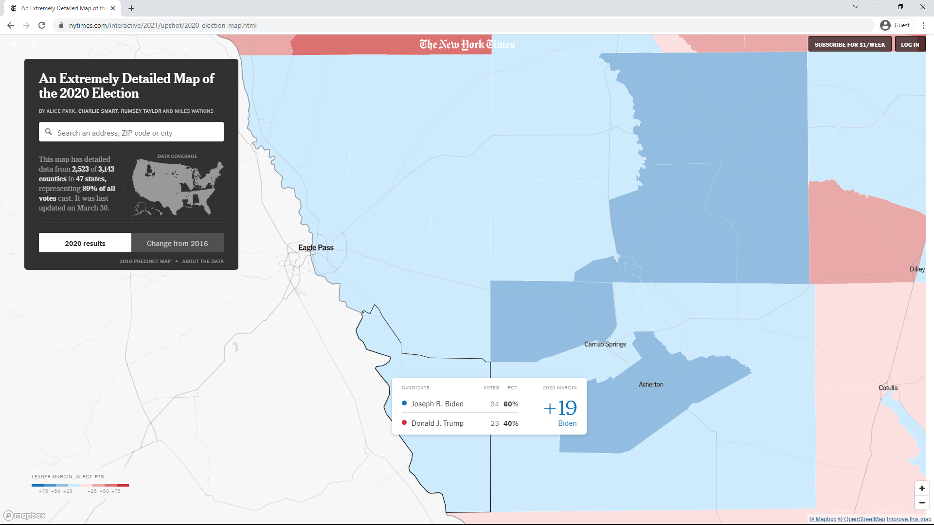
In the above table, columns Biden, Trump, MARGIN1, and TOTAL1 show the actual counts in the original data. As it happens, these counts can be seen in the New York Times interactive map at this link. Going to that link, you can find Maverick County along the border, just northwest of Laredo, TX. You can then center the map on Maverick County and expand it 5 times to view the outlines and number of votes in each precinct as shown in the two screenshots below.
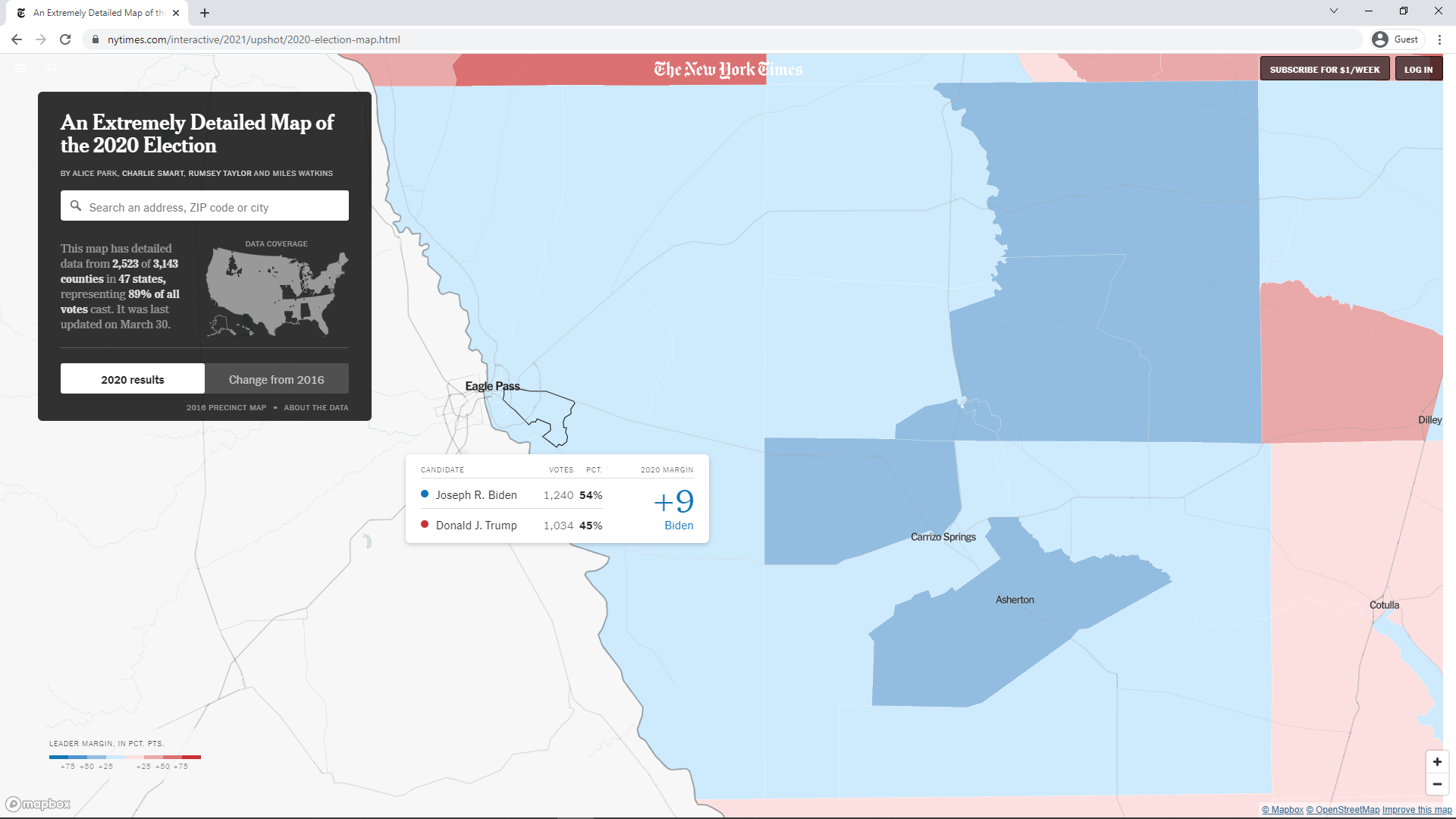
Comparing the 2020 and 2024 Presidential Race in Maverick County, Texas
The prior steps should display the following plot:

The prior steps should display the following plot:

Maverick County, TX: Shift in Margin Vote Share from 2020 President_CDP to 2024 President_CDP (Percent)

     COUNTY  AREA Biden_D Trump_R MARGIN1 TOTAL1 Harris_D Trump_R.1 MARGIN2 TOTAL2 DEM_SH REP_SH MAR_SH TOT_SH TOT1_N TOT2_N
1  MAVERICK    1A   60.87   37.77   23.10  98.64    41.09     58.66  -17.57  99.74 -19.78  20.88 -40.67   1.10    368    774
2  MAVERICK    1B   57.63   41.76   15.87  99.39    40.62     58.73  -18.11  99.35 -17.01  16.97 -33.98  -0.04  1,317    773
3  MAVERICK    1C   55.65   43.63   12.02  99.28    40.66     58.48  -17.82  99.14 -14.99  14.85 -29.84  -0.13  2,354  1,987
4  MAVERICK    2A   59.19   38.65   20.54  97.84    40.80     59.20  -18.40 100.00 -18.39  20.55 -38.94   2.16    370    451
5  MAVERICK    2C   51.20   48.09    3.11  99.29    40.62     58.67  -18.05  99.29 -10.58  10.58 -21.16   0.00  1,125  1,546
6  MAVERICK    2D   32.94   67.06  -34.12 100.00    40.00     60.00  -20.00 100.00   7.06  -7.06  14.12   0.00     85     55
7  MAVERICK    3A   55.22   43.70   11.52  98.92    40.65     58.89  -18.24  99.54 -14.57  15.19 -29.76   0.63  1,753  1,530
8  MAVERICK    3B   52.03   46.32    5.71  98.35    40.50     58.92  -18.42  99.42 -11.53  12.61 -24.14   1.07  2,118  2,247
9  MAVERICK    3C   37.24   61.58  -24.34  98.83    32.26     67.74  -35.48 100.00  -4.99   6.16 -11.14   1.17    341    217
10 MAVERICK    4A   58.43   40.90   17.53  99.33    40.30     59.70  -19.40 100.00 -18.13  18.80 -36.93   0.67    445    866
11 MAVERICK    4B   56.22   43.11   13.12  99.33    40.46     58.74  -18.29  99.20 -15.77  15.64 -31.40  -0.13  1,784  1,493
12 MAVERICK    4C   59.83   39.50   20.34  99.33    40.00     59.29  -19.29  99.29 -19.83  19.79 -39.62  -0.04    595    280
13 MAVERICK    4D   51.83   47.34    4.50  99.17    40.81     58.81  -18.00  99.62 -11.03  11.47 -22.50   0.44  1,090  1,561
14 MAVERICK Other   51.36   47.40    3.97  98.76    40.46     58.93  -18.47  99.39 -10.91  11.53 -22.44   0.63  1,614  1,965
Hence, all but the first two precincts shifted from a range of 7.8 to 11.01 percent in 2020 to a range of -19.4 to -17.57 percent in 2024. That's a shift of about 28 percent. It will be interesting to see if these numbers are cahnged as they were following the 2020 election such that their relationship is less linear. As previously stated, the numbers were updated by September of 2021 following the 2020 election. However, the numbers above were still the ones on the site as of February 19, 2026. It's unclear what could take so long to update the numbers if, in fact, they need to be updated.
Maverick County, TX: Shift in Margin Votes from 2020 President_CDP to 2024 President_CDP (Count)

     COUNTY  AREA Biden_D Trump_R MARGIN1 TOTAL1 Harris_D Trump_R.1 MARGIN2 TOTAL2 DEM_SH REP_SH MAR_SH TOT_SH
1  MAVERICK    1A     224     139      85    368      318       454    -136    774     94    315   -221    406
2  MAVERICK    1B     759     550     209  1,317      314       454    -140    773   -445    -96   -349   -544
3  MAVERICK    1C   1,310   1,027     283  2,354      808     1,162    -354  1,987   -502    135   -637   -367
4  MAVERICK    2A     219     143      76    370      184       267     -83    451    -35    124   -159     81
5  MAVERICK    2C     576     541      35  1,125      628       907    -279  1,546     52    366   -314    421
6  MAVERICK    2D      28      57     -29     85       22        33     -11     55     -6    -24     18    -30
7  MAVERICK    3A     968     766     202  1,753      622       901    -279  1,530   -346    135   -481   -223
8  MAVERICK    3B   1,102     981     121  2,118      910     1,324    -414  2,247   -192    343   -535    129
9  MAVERICK    3C     127     210     -83    341       70       147     -77    217    -57    -63      6   -124
10 MAVERICK    4A     260     182      78    445      349       517    -168    866     89    335   -246    421
11 MAVERICK    4B   1,003     769     234  1,784      604       877    -273  1,493   -399    108   -507   -291
12 MAVERICK    4C     356     235     121    595      112       166     -54    280   -244    -69   -175   -315
13 MAVERICK    4D     565     516      49  1,090      637       918    -281  1,561     72    402   -330    471
14 MAVERICK Other     829     765      64  1,614      795     1,158    -363  1,965    -34    393   -427    351
15    TOTAL TOTAL   8,326   6,881   1,445 15,359    6,373     9,285  -2,912 15,745 -1,953  2,404 -4,357    386
The New York Times has posted an extremely detailed map of the 2024 election at this link. The + symbol near the lower right can be pressed to zoom in and the mouse can drag the map so as to zoom in on Maverick County, located in South Texas along the southern border. By zooming in and hovering over the precincts, the counts for those precincts can be read. They appear to match the vote counts in the table above.
Use of Cumulative Vote Tallies (CVTs) in Wisconsin
Description of the Cumulative Vote Tally (CVT)

Reproducing the CVT graph for Milwaukee County in the 2016 Presidential race
Reproducing the CVT numbers for Milwaukee County in the 2016 Presidential race
                             Vote  Counties  (delete (skip row
             Measurement   Sleuth       Tab   Stein)      1984
------------------------  -------  --------  -------  --------
                  Voters  428,650   434,271  429,743   428,650
               Precincts      475       476      476       475
Votes in median precinct      780       806      794       792
                  deltaM     20.2      19.6     20.0      20.2
                deltaMxV   86,383    85,324   85,752    86,397
As can be seen, the numbers are very close. In investigating the minor differences, however, a couple of apparent errors were found. First of all, the Vote Sleuth numbers can be reproduced by going to its interactive graph. If the graph does not already show Milwaukee, set County to Milwaukee and click the "Redraw Graph" button. You can then see the number of votes for any of the candidates by clicking on the Data button beneath their name and looking at the VOTES column. If you do that for Jill Stein, however, you'll find that VOTES is equal to zero for all precincts. Hence, the Vote Sleuth graph appears to be using the vote counts for just the other 4 candidates. This can be reproduced in the Shiny app by setting the "Include candidates" textbox on the far left input panel to "1,2,3,4". This specifies that the app is to use the first 4 candidates in the data file. These appear as the first 4 candidates listed in the header on the Areas tab. This gets the numbers closer to the Vote Sleuth numbers as seen in the third numeric column of the table above.
Description of the Area Plot
Looking at Racine County
Looking at the 2020 Presidential Race in Wisconsin
                2016  2020    2016    2020   2016   2020     2016     2020    2016    2020   2016   2020
        COUNTY AREAS AREAS   VOTES   VOTES deltaM deltaM deltaMxV deltaMxV  totalM  totalM votesM votesM
-------------- ----- ----- ------- ------- ------ ------ -------- -------- ------- ------- ------ ------
1    MILWAUKEE   476   476 434,271 457,727   19.6   19.2   85,324   87,739 130,337 129,361    806    824
2         DANE   238   253 304,610 343,569   -1.6   -5.4   -4,891  -18,498  55,993  49,220  1,058  1,077
3     WAUKESHA   197   203 233,176 267,214    8.7    9.5   20,341   25,297  57,125  59,875  1,100  1,248
4        BROWN    97    95 127,423 143,632    9.4   10.5   11,964   15,148  33,914  35,906  1,093  1,201
5    OUTAGAMIE    98   101  93,346 107,970   -6.2  -10.6   -5,746  -11,456  15,642  15,104    752    792
6       RACINE    69    69  93,776 106,157   37.0   37.9   34,702   40,194  22,372  24,549  1,032  1,174
7    WINNEBAGO    82    91  85,769  93,791    0.9   -0.5      768     -472  18,509  14,132  1,026  1,001
8      KENOSHA   116   140  75,769  88,469   21.7   23.3   16,440   20,656  14,918  10,912    476    430
9   WASHINGTON    44    45  76,192  88,031    0.7   -0.1      556     -106  21,364  23,674  1,966  2,212
10        ROCK    96   100  74,961  85,164   -1.0   -2.6     -768   -2,197  17,306  17,897    642    713

Note: The above totals are for the first 5 candidates listed in the data and include all areas.
As can be seen, the number of votes increased modestly in all 10 counties. This and a fairly steady deltaM caused the absolute value of deltaMxV to generally increase modestly. Most of the other numbers seemed to have remained relatively steady. One interesting thing is that the number of AREAS changed in every county except MILWAUKEE and RACINE. The number rose in every other county except for BROWN where it decreased by two.
Using the New York Times Interactive 2020 Election Map
Conclusions
Precinct Data Locations
If anyone should run into any issues or have any suggestions for additional features, feel free to let me know via the Contact box at the bottom of this page.
2020 U.S. Election
Polling Election Data
Comparing Polling and Election Results via R Shiny
Red Shifts for 2020 Election Cycle, November 18, 2020
Precinct Election Data
Analysis of Reported Voting Areas via R Shiny
Analysis of Reported Voting Areas in Florida via R Shiny
Analysis of the Distribution of Precinct Margins by County via R Shiny
Precinct Results in Florida through 2020
Precinct Results in Iowa through 2020
Precinct Results in Maine through 2020
Precinct Results in North Carolina through 2020
Precinct Results in South Carolina through 2020
Precinct Results in Texas through 2020
County Election Data
Exploring Federal Election Results by County via R Shiny
County Results in Arizona in 2020
County Results in California in 2020
County Results in Florida in 2020
County Results in Iowa in 2020
County Results in Kentucky in 2020
County Results in Maine in 2020
County Results in Montana in 2020
County Results in Pennsylvania in 2020
County Results in South Carolina in 2020
County Results in Texas in 2020